





Reverse contrast type flips a rule so old most people have forgotten why it was a rule in the first place: thick verticals, thin horizontals, that's how a serif is supposed to carry its weight. Turn it upside down and something interesting happens. This week's ten drops all share that spirit of visible, nameable construction. Four typefaces built on historical letterform logic, a racing-emblem set drawn from motorsport iconography, paper grain pulled off a real flatbed, a print effect that copies a worn photocopier pass, a screen effect that recreates scan-line physics, and two mockups that get client comps out the door. Everything here shows its working.
CS Gladys – Reverse Contrast Font
The whole appeal of CS Gladys by Craft Supply Co is in that inverted stress. Where a classic serif loads the weight into its verticals, Gladys hangs it off the horizontals, so the letters read heavy across the top and bottom and slim through the middle. It gives the whole thing a slightly wrong, slightly theatrical energy that traces straight back to deco-era show lettering and old poster type. Warm and high-contrast on the page, it wants to be big: masthead scale, logo lockups, poster headlines, merch fronts. Set it small and you lose the trick, so let it run large and own the space.

Cafespro Weekend Elegant Serif
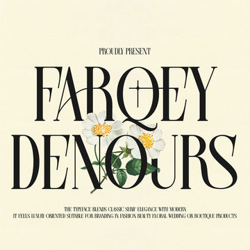
Amorfatype Studios built Cafespro Weekend for the top of a fashion editorial or the front of a cosmetics box. It's a high-contrast display serif with graceful proportions and expressive detailing in the terminals, the kind of face that reads expensive without shouting about it. There's a deco elegance in the way the thick and thin strokes trade off, and it holds together beautifully at large sizes where those fine hairlines get room to breathe. Reach for it on beauty branding, boutique identities, luxury packaging and statement headlines where you need the type doing the heavy lifting.

Krisle - Bold Chunky Sans Serif Font
Say Studio's Krisle is all appetite. Fat geometric forms, compact proportions, rounded details and a few odd letter shapes that give it character over anonymity. It sits somewhere between a chrome-y future-retro look and the springy optimism of 70s display lettering, which is a fun place to be. This is a poster and album-cover face, a streetwear front, a logo that needs to punch at thumbnail size on a feed. Pair it with something restrained if you want balance, or lean all the way in and let it dominate. If chunky display type is your thing, we've got more heavyweight faces worth a look over in the newest drops.

Chelory
Where Cafespro goes ornate, Chelory by Marvadesign plays it cool and modern. It's a high-contrast serif with refined proportions and dramatic stroke shifts, tuned for contemporary editorial and fashion work. The curves are elegant and the italics do something distinctive, so it carries pull quotes and book covers as well as it handles a brand wordmark. Neutral and monochrome by nature, it slots into web layouts and print identities without fuss. This is the face for the client who wants chic and current, carried by the type itself with no extra styling required.

Racing Dept. Design Collection
Twenty-eight vintage racing designs from cd-design.co, all pulled from the visual language of classic motorsport: department emblems, speed-crew graphics, checkered flags, racing numbers, wings, globes and the chunky retro typography that goes with them. Each of the Racing Dept. designs ships individually in Vector AI, EPS, SVG and PNG, plus an all-in-one master file, and the text, colours and fonts are fully editable so you can rework a badge for the brief in front of you. Bold, energetic and dripping with garage nostalgia, it's built for apparel, stickers, posters, prints and merch. If you do band tees or automotive-adjacent branding, this is a fast way to a finished graphic.

Paper Textures Collection
Every sheet in Pixelbuddha's Paper Textures Collection started life on a flatbed scanner, and it shows. Twelve surfaces run from smooth wove sheets to toothy speckled pulp, some crossed by the faint diagonal wire lines of laid paper, others dusted with the tiny inclusions of recycled stock. The palette stays in soft off-whites and cool paper greys, so nothing fights your artwork. They come as 4500x3000px JPGs at 300dpi. Set them to Multiply or Overlay to press grain onto flat work, or run one full-frame as a scanned backdrop for a branding board or packaging comp. There's plenty more paper grain to dig through if this is your lane, and it pairs nicely with the scanned stock we covered in Weekly Drops #38.

Grunge Paper Print Effect
A photocopier's mechanical failings became a design feature decades ago, and Pixelbuddha's Grunge Paper Print Effect bottles exactly that. Drop text, a logo or vector artwork into the Smart Object and it stamps onto worn, near-black paper: warm sepia grain flecked with dust, scratches and creases, light blooming at the edges as the print sinks into the fibres. It ships in landscape and portrait, two PSDs at 4500x3000px and 3000x4500px, 300dpi, built for Photoshop. Gig posters, album covers, band merch, zine spreads and logo presentations all take to it instantly. We ran a similar real-source approach back in Weekly Drops #37 if you want the through-line.

Spray Paint Can Mockup
Sometimes you just need the client comp done before lunch. Morrobati's Spray Paint Can Mockup gives you three PSD files across three angles, tidy layers and folders, easily swapped object colours, all at 4500x3000px and 300dpi. Drag your label design into the placeholder and it's on the can, ready to present. It reads clean and industrial with a streetwear edge, which suits paint-brand packaging, graffiti-adjacent merch and any label that wants to look like it belongs on a shelf.

Transparent Plastic Pouch Packaging Mockup
Pouch packaging is everywhere on DTC shelves right now, and the Transparent Plastic Pouch Packaging Mockup from Morrobati keeps pace. Three PSDs, three angles, organised layers, changeable object colours, 4500x3000px at 300dpi. The clear plastic renders with enough realism to sell a coffee bag, a snack pouch or a supplement sachet in a pitch deck. Drop your artwork into the smart layer and you've got a photoreal comp without booking a shoot. There are more true-to-life mockups worth a look if you're building out a full packaging presentation.

CRT Screen Text Effect Bundle
Rumi Visual's CRT Screen Text Effect Bundle recreates the physics of an old tube monitor: phosphor glow, scan lines, RGB fringing, screen noise and that soft pixel bloom you remember from arcade cabinets and VHS overlays. Eight PSD effects turn text into vintage screen graphics, each running on a Smart Object layer for quick edits. Cool-toned and dark by mood, it lands on retro-tech branding, gaming graphics, album art and social content that wants a proper analogue nostalgia hit. It reads convincing because it references a real thing.

Two camps, one instinct: know where the marks come from. Have a poke around and see what fits the brief on your desk this week.



















