

The stand you are pitching does not exist. There is no fabricated structure to photograph, no venue light falling across the panels, no stranger slowing down to read the headline as they pass. There is a brief, a brand file, and a deck that has to make a client comfortable releasing a fabrication budget for a thing that is, at this moment, imaginary. That is a steeper persuasion job than a flat packaging shot, and it has got harder lately, because every client who has sat through a few show-floor renders has learned to spot the fakes: AI scenes with shadows pointing three different ways, reflections that ignore the object casting them, crowds pasted in at the wrong scale. Once someone has seen that, they arrive at the next render already suspicious. The mockups below earn that trust back by being built the way a real photographer or 3D environment artist would build the shot, with lighting that behaves, perspective that holds, and architecture that obeys its own logic.
Exhibition Booth Mockup by Morrobati
Start with the clean baseline. Morrobati's Exhibition Booth Mockup gives you a direct, uncluttered stand you can read from two camera angles, two PSD files at 4500 x 3000 px and 300 DPI, with smart object layers doing the colour and artwork swaps. There is a drag-and-drop placeholder workflow and a guide PDF, so you are not reverse-engineering someone else's layer naming at 1am. This is the shot for the early concept round, when the client needs to see the stand idea sitting plainly in space before anyone talks about lighting rigs or hanging elements. It is a plain, correct read of the form from two sides, with nothing competing for attention. When the conversation is still "do we like this layout," that restraint is exactly what you want in the deck.

Conference & Event Branding Mockups by Vitora Mockup
Pitching a conference is rarely about one object. It is the stage, the badge on the lanyard, the directional sign at the escalator, the screen behind the keynote, the booth on the far side of the hall, and the client wants to know the identity survives all of it. Vitora Mockup's WAC covers that whole footprint in one go: 40 PSD files at 4000 x 3000 px and 300 DPI, spanning stages, exhibition booths, digital screens, banners, badges and wayfinding, all built around a single conference identity with an organised layer structure and a guide PDF. Vitora works in full environmental systems rather than loose scenes, so the throughline across their work is consistency from one end of a built world to the other. For a tender where the client is deciding whether your brand can carry an entire event, showing it applied across stage, badge and signage in one coherent set does more than any single hero frame.

Cube Event Display by Blank Studio
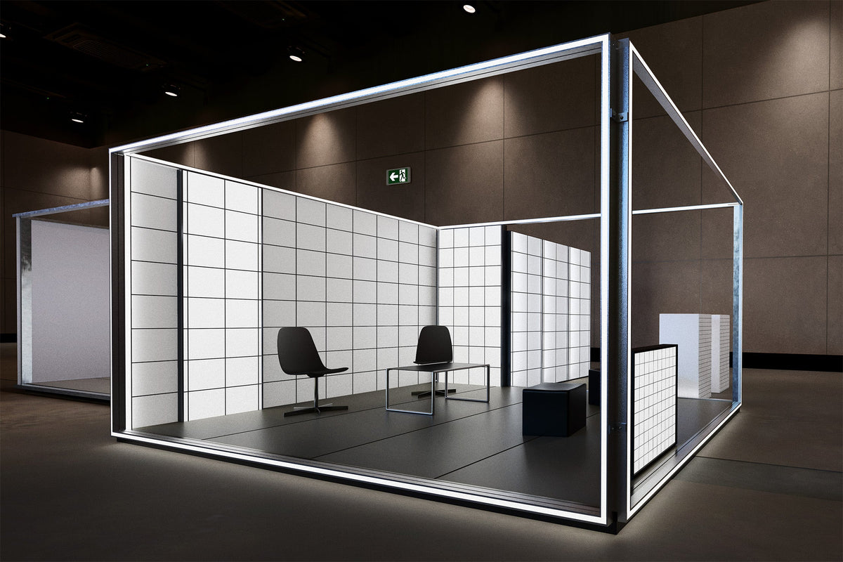
Some stands are meant to be sculpture. Blank Studio's Cube Event Display drops a freestanding cube installation into a cinematic concrete space, part of their Monolith Event set of 19 brutalist-leaning event environments covering auditoriums, halls, concrete corridors, hanging banners, cube installations, billboards and keynote stages. The PSDs run on smart object layers, and the selling point is the dramatic lighting and the perspective holding true against those heavy industrial surfaces. With 2026 floors chasing height variation and architecture-led, highly photogenic design, the kind trade press keeps calling selfie-bait, a sculptural concept needs a render that treats it as built form rather than signage. This is the frame for when you are proposing a stand that works as an object people walk around and photograph, and a plain evenly lit shot would flatten the whole idea.

Atrium Poster Display by Blank Studio
From the same Monolith Event world, the Atrium Poster Display solves a different scale problem: the hero graphic that has to land across a soaring atrium rather than on a booth panel. Large-format poster placement, a towering architectural space, the same dramatic lighting, and because it shares the collection's built-venue consistency with the cube scene, you can pull multiple touchpoints from one architectural world without the deck looking stitched together from unrelated stock. This is the shot that gets a client to approve a launch-scale graphic moment, the thing someone sees from the far end of the hall and walks toward. Showing it tucked onto a tabletop would undersell it; showing it at venue height makes the ambition legible before a single banner is printed.

Event Hall Digital Signage Mockup by Pixelbuddha
The persuasion in Pixelbuddha's Event Hall Digital Signage Mockup is in the things most fakes get wrong. A freestanding unit in black metal housing sits centred in a bright, glass-roofed hall, crowds blurred in motion on both sides, afternoon sun coming through floor-to-ceiling glass and throwing long shadows across a polished floor. The PSD runs at 4500 x 3000 px and 300 DPI on a smart object. That crowd blur and that correct daylight are doing real work, because they make a signage concept look like it is already standing at a live event. Pixelbuddha lists it for trade show displays, corporate event signage, conference branding, museum wayfinding and agency pitch visuals, which is the realistic spread of jobs it covers. When you need the client to believe the sign is operating in a real building full of real people, the natural light settles the question.

Wide LED Wall Mockup by Pixelbuddha
A keynote visual lives or dies on glow. Pixelbuddha's Wide LED Wall Mockup puts a large illuminated screen in a dark, gallery-like space with silhouetted visitors standing and walking in front of it, and the detail that sells it is the realistic screen glow bouncing onto the floor in convincing reflections. The PSD runs at 4500 x 3000 px and 300 DPI. A flat screen insert pasted into a template always reads as pasted; a screen that lights its surroundings reads as present. The listed uses run through gallery installations, keynote visuals, trade show screens, launch presentations and large-format media previews, so this is the frame for the main-stage moment, the wall the client is about to spend serious money on. Get the glow and the floor reflection right and the render stops looking like a proposal.

Circle Hanging Banner Mockup by Fakhroo
Overhead branding is its own pitch, separate from anything standing on the floor. Fakhroo's Circle Hanging Banner Mockup suspends a circular banner against a sleek industrial ceiling and gives a full 360-degree read of the artwork, with clean lighting and sharp shadows, at 4500 x 3000 px and 300 DPI on a smart object, readme included. Hanging signage is what defines a hall from a distance, the element a visitor clocks before they are anywhere near your stand, and it behaves nothing like floor furniture in a render. The circular form means the client sees the branding wrap the whole way around, not just a front face, which matters when the banner is meant to be legible from any approach on the floor.

Retractable Banner Mockup by Farabion Studio
The retractable banner is the least glamorous thing in this list and the one that shows you have thought it through. Most booths, under all the architecture and lighting, still run on a roll-up standing at the entrance. Farabion Studio's Retractable Banner Mockup presents that humble piece in a professional, realistic setting built for trade shows, promotional events and in-store work. Putting it in the deck signals that your thinking goes past the hero shot down to what is literally planted at the door on the day. Clients notice that kind of completeness, and it is often the detail that makes an agency look like it has run a floor before, not just rendered one.

Why the render has to hold up
Every frame here is asking someone to spend real fabrication money on a stand that is still a file. That only works if the image survives scrutiny, because the client reading it has learned to look for the tells, the shadow going the wrong way, the reflection that forgets the object, the crowd floating at the wrong height. Correct light, true perspective and architecture that obeys its own rules are what separate a render that gets a budget signed off from one that gets politely questioned. If you are putting together a deck like this, there is also more on building presentation mockups with real weight, and plenty more worth digging through for the touchpoints a booth brief always sprouts once it gets approved.