



A week that kept circling back to one question: who, or what, made the thing? Customers hand-painting a wordmark at a pop-up. A civic identity built while news crews chased a bigger headline. An AI illustration system dressed up to look like it wasn't one. And a folk graphic tradition getting flattened by image generators. Human hands versus the machine ran through nearly every story. Also, Apple broke a browser icon. Let's go.
ONBOX built Bar Supernova's wordmark from 100 letters painted by customers
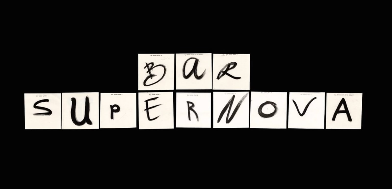
Bar Supernova is a new Vancouver Chinatown bar from bartenders Max Curzon-Price and Andrew Kong with chef-partner Shaun Couzelis, built on a waste-conscious idea: take food byproducts from other venues and turn them into shelf-stable ingredients. For the identity, studio ONBOX ran a pop-up and had customers hand-paint 100 letters, then assembled them into a modular wordmark. Creative Strategist Chris Rodgers told PRINT Magazine the team kept "coming back to how we could build that same spirit of experiment." Putting the construction of a mark in a hundred untrained hands is a real risk, and it's the whole point. The brand runs on reuse and participation, and the identity was built the same way: provenance no prompt can fake.

StudioDBD's Ashton-in-Makerfield identity was the story the press pack missed
When a by-election made Andy Burnham the UK's Prime Minister this summer, international crews descended on Ashton-in-Makerfield, a market town in Wigan, filed their post-industrial-decline-and-vape-shops cliches, and left. What they walked past: a car park being turned into a public square on the town's historic market ground, chartered back in 1284, with a regeneration identity by StudioDBD described as inspired by making. Creative Boom caught what the parachute journalists didn't. The design work was already underway, grounded in the place itself. There's a lesson in it for anyone doing civic work: the good stuff rarely announces itself to a news cycle. It gets made locally, for people who'll use the square.

Untold's rebrand avoids AI cliches while being built with AI
The Working Assembly gave voice-journalling app Untold a new identity. The app listens to spoken thoughts and turns them into what it pitches as "deeper self-understanding, personalised insight, and lasting growth." The rebrand steers hard around the usual generative-AI visual tells, the shiny gradient orbs and blobby mascots, and yet the illustration system underneath it was itself built with generative AI tools. Creative Boom frames the tension plainly, and it's worth sitting with. A brand signalling "we're not soulless AI slop" while the tool and the message pull in opposite directions is the design problem of the moment. The craft here holds up. But the pushback against AI-smooth design exists precisely because audiences can smell the seams.

AI is turning small-business menus into Lovecraftian horrors
Delis, food trucks and small restaurants have started running their own menus and food photography through image generators, and the results are grim: warped, uncanny, faintly inedible-looking renders of the food they're trying to sell. Screenshots doing the rounds have people nostalgic for the clumsy, charming amateur-Photoshop menu era. A tech reporter posting on X, quoted by Creative Bloq, argued the tools are killing folk graphic design, the vernacular hand-assembled signage tradition of local businesses, with a deli's worth of evidence. This is the flip side of the Untold story. Amateur, wonky, hand-made menu design had soul because a person made it. The generated version is smoother and worse. We wrote about the deliberate return to grain and imperfection for exactly this reason.

Teddy Blanks on the deeply human craft of film titles
Teddy Blanks co-founded Brooklyn studio Chips in 2009 and has done the title sequences for Barbie and Weapons, with Robert Eggers' upcoming Werwulf on his desk. His first title client was Lena Dunham, a friend from Oberlin, back when she was making experimental shorts before Tiny Furniture. "Would you let me do the titles for your short films? And she let me do whatever I wanted," he told It's Nice That, describing the wild lettering that followed. His research pulls from eBay dolls, hidden Alcoholics Anonymous symbolism, a 14th-century manuscript, all filtered into lettering most audiences never consciously register. No prompt gets you to a 14th-century manuscript by accident.

OneMay gave Sam Kerr's WAWA sparkling water an aura
Liverpool agency OneMay built the identity, packaging and visual world for WAWA, a sparkling water launched with footballer Sam Kerr and creative venture company Spark&Ace. The brief pushed against the category's default: most sparkling water leans on visual restraint, all zero-sugar functional minimalism, positioning itself as the sensible fallback. OneMay went the other way with a platform called "Water With Aura," a flexible system where each variant gets its own character inside a surreal, collage-based visual language, without burying the health credentials. Design Week has the full breakdown. Set the celebrity aside; the interesting bit is the structure. A variant system with room to move is harder to build than one locked-down look, and it's what keeps a shelf presence from going stale.
Apple's new Safari icon is getting roasted
iOS 27 beta testers have spotted a redesigned Safari icon ahead of the OS's expected mid-September release, which also brings new Apple Intelligence generative features and a rebuilt Siri. The icon swaps the familiar compass for a central pin with two overlapping needles that seem to move independently, like watch hands, and the internet promptly christened it the great Safari logo controversy. Creative Bloq collected the mockery, including X users posting joke simplified follow-ups. There's something fitting about a trillion-dollar company shipping headline AI features while fumbling one of the most-tapped icons on the planet. A compass told you what a browser did. Two floating needles tell you the design review was on holiday.

The thread this week: the making matters as much as the mark. Hand-painted letters, local civic work, a title designer with a manuscript obsession, all on one side; generated deli menus and a confused browser icon on the other. Back next week. Bring your own aura.



















