




The Color Overprint Effect in this week's drop rebuilds a two-plate riso ink separation as a working Smart Object rig, and the Premium Paper Textures next to it come from twelve real sheets someone scanned by hand. Both encode a physical process into a file you can open right now. The good tools this week carry a specific way of making something, whether that's ink hitting paper, a scanner catching pulp flecks, or geometric primitives snapped into a grid. Style follows.
Bisre by Marvadesign
Fat, rounded, and grinning. Bisre is a display sans with oversized proportions and soft organic curves that pull straight from the joyful end of sixties and seventies commercial lettering, then drag it into the present. Marvadesign has kept the chunk without letting it tip into pastiche, so it reads warm and familiar but never like a costume. Set it big on food branding, a record sleeve, or packaging that wants to feel friendly the second someone clocks it. It does nostalgia with a straight spine.

Fluswag Organic Liquid Display Font by Afterimagine
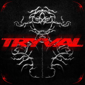
Everything Bisre keeps tidy, Fluswag melts. Afterimagine built Fluswag Organic Liquid Display Font from flowing liquid forms and handcrafted lettering, so the silhouettes bulge and pinch with irregular curves that feel poured rather than drawn. It's a loud, psychedelic-leaning face with a distinct personality, the kind of type that carries a poster or a logo on attitude alone. Reach for it on streetwear graphics or anything that needs to look like it's still moving.

Pedroc – Display Typeface by Craft Supply Co
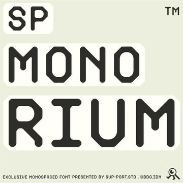
Built from geometric blocks and stacked into something condensed and industrial, Pedroc – Display Typeface from Craft Supply Co reads as pure engineering, all hard, forward-leaning, future-minded forms with the sort of structural logic that sits well on tech branding, merch, and posters that want to look like they came out of a machine shop. High contrast is its native habitat. Give it neutral colours and let the proportions do the talking.

Noblemoon Futuristic Typeface Font by Vadova Studio
Sci-fi with its edges tightened. Vadova Studio's Noblemoon Futuristic Typeface Font runs on condensed geometric forms and space-inspired detailing, and it comes loaded with uppercase, lowercase, numerals, punctuation and multilingual support, so it's a headline face that can carry real jobs across scripts. It's built for impact at large sizes and tech-leaning branding, but the full character set means it won't leave you stranded when the client wants a strapline in another language.

Norveza - Family Condensed Sans Serif Font by Say Studio
The workhorse of the type releases this week. Norveza from Say Studio is a condensed sans family with a clean geometric structure and strong proportions, drawn for bold headlines, branding, and contemporary editorial. With six variable weights running Thin to Black plus matching italics, it holds readability at speed while keeping a strong presence on the page, which is the balance most condensed faces fumble. This is the one you build an identity system around.

ROTOW – Streetwear Fashion Instagram Post & Story Templates by Shinra Studio
This is where the type above meets a deadline. Shinra Studio's ROTOW streetwear templates are twelve editable Photoshop layouts split across six post and six story formats, built for clothing, fashion, and urban lifestyle brands with bold typography, vibrant colour, and editorial layout choices. Drop your product shots in, swap the copy, and a drop announcement is ready before your coffee goes cold. It's the production layer that gets a campaign out the door on schedule.

Retro Music Covers V.2 by Pixflow
Six PSD templates from Pixflow for presenting album art, CD covers, social posts, and web mockups in a modern frame. Retro Music Covers V.2 keeps images, text, shapes, and backgrounds on separate smart layers, so customising a cover is a matter of minutes rather than an afternoon of digging through a merged file. Muted, cinematic, and quick to reskin, it's the presentation stage for anyone pitching music visuals to a label or an artist this week.

Color Overprint Effect by Pixelbuddha
The one that started the whole argument. Pixelbuddha's Color Overprint Effect renders your artwork as a two-ink print with a third lighter tone rising where the inks overlap, the exact trick riso and screen-print studios built their look on. Normally that means manual channel splitting and blend-mode fiddling. Here it's a Smart Object rig: artwork drops in, both ink colours swap through simple controls, and a halftone dot with rough paper grain lands on top on its own. Photos break into duotone dots, line art comes out looking hand-pulled, and it earns its keep on gig posters, zine spreads, album sleeves, apparel, sticker sheets, and riso-style social visuals.

Premium Paper Textures by Pixelbuddha
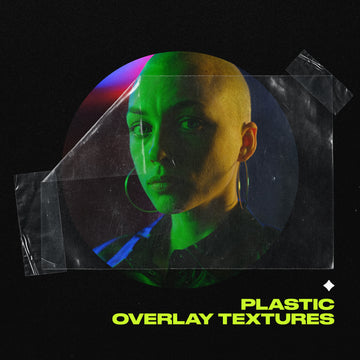
Pixelbuddha scanned twelve real sheets one at a time to build this pack, and each one carries its own character: smooth vellum, the fine ribbing of laid paper, the soft tooth of cold-press stock, loose pulp flecks caught in the fibre. These are Premium Paper Textures, running 4500x3000px at 300dpi, big enough for a full poster or a book cover. Lay one over branding, packaging, album art or an editorial spread on Multiply to drop in paper's own shadows and flecks, or use it flat as a clean scanned base.

Water Bottle Mockup by Morrobati
Last stop, presentation. Morrobati's Water Bottle Mockup puts your label or packaging design on a clean, cold, industrial-looking bottle with customisable colours and smart layers for fast swaps. It's a simple, quick way to show a client what their drinkware brand looks like sitting in the world rather than flat on an artboard. Function over drama, which is exactly what a mockup should be.

Ten drops, one week, all of them carrying a process worth putting to work. Go grab something.



















