A week where everyone wanted you to know a human made the thing. Apple built a physical rig to prove its new logo came from real sound. Etsy had to formally remind sellers that the product photo should show the product itself. And a Newcastle fan wrote a love letter to crests before the corporate wind tunnel smooths them flat. Craft and provenance were the thread, whether the brands said so out loud or not.
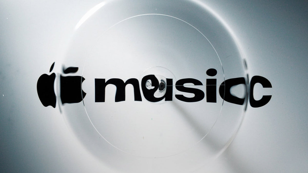
Apple Music made its new logo out of sound, oil and a vibrating rig
Apple revealed the first rebrand of Apple Music since the service launched in 2015, built with musician Fred Again.. and sound design outfit NEST Acoustics. The process, written up by Dezeen, was properly analogue: an app-icon-shaped piece of plastic sat in a shallow pool of mineral oil, Fred's frequencies were pushed through a transducer, and the resulting ripples were filmed and turned into the identity. The wordmark also went fully lowercase, a custom bold cut of SF Pro.

There is something telling about a trillion-dollar company staging a physical rig to prove a mark was handmade, at the exact moment AI can spit out a thousand ripple effects before lunch. The hero film is gorgeous. The problem is where it lands: the new home-screen icon arrived as a plain black-and-white mark, and users have already called it miserable. All that liquid, all that colour, and it evaporates by the time it reaches your phone.

Uncommon rebrands White & Case and bins the law-firm rulebook
White & Case, the New York global law firm, has its first major rebrand in 13 years, done by Uncommon Creative Studio. Out goes the navy and the sober serif; in comes an electric blue the studio calls Catalyst Blue, kinetic headline serifs, and what Uncommon describes as a "bedrock ampersand, carved with the weight of ancient stone." The photographic system turns human motion into spotlit vignettes and infrastructure into vertical streams of data, built, in the studio's words, for "a chaotic, hyper-complex world." Full write-up at Creative Boom.

Law firm branding has run on the same unspoken rulebook for decades: navy, serifs, a stock skyscraper, a handshake, trustworthy by way of boring. Breaking that takes nerve from both the client and the studio, because electric blue on a global firm's letterhead is a fight you have to win in a boardroom. Credit Uncommon for the category-break, and credit a firm this size for signing it off.

Etsy now requires a real photo of the real product
Etsy, the marketplace built on handmade, has told sellers that every listing must include at least one unedited photo of the item itself against a real background. The move came from VP of customer operations James Ossman, who said AI should support craftsmanship rather than replace it. As Creative Bloq notes, it puts Etsy alongside Spotify, Snap and LinkedIn in pulling against the slop.

Read that rule again: a marketplace founded on "handmade" now has to legislate that a product photo should show the product. The whole mess comes down to provenance, knowing who made the thing and whether it exists. When buyers can't tell, trust rots, and the honest makers pay for it first. Naming the human behind the work isn't a nice-to-have anymore; it's the floor.

Corporate branding is flattening football crests into wind-tunnel mush
Art director and lifelong Newcastle fan Will Knight wrote a sharp POV column for It's Nice That on what he calls the "wind tunnel effect" on club rebrands, where crests get stripped of their quirks and personality in the name of a clean system. For most football-mad kids, he argues, the crest is their first ever encounter with a brand, something drawn obsessively on schoolbooks and cupcake icing. He points to Newcastle's own crest, irregular, historic, a bit messy, complete with a mythical sea-horse, and says the mess is the point.

This is the critique every designer doing identity work should sit with. Cleaning up a mark feels like progress on a grid in Illustrator. But some logos carry decades of earned emotion, and the "unnecessary detail" is exactly what people drew from memory as kids. Legibility at small sizes is real, but so is the cost of sanding off the thing people loved.
Melbourne Star reopens with a 'Rise Above' rebrand that owns its past
The Docklands observation wheel is back under new owner Skyline Attractions, reopened on 15 October, with a rebrand by 3Scoops centred on the line "Rise Above." As covered by Mi3, the new marque fuses an "M" and a star with circular motion nodding to the wheel's rotation, and the palette shifts through the sky from dawn to dusk across out-of-home, social and merch. Head of brand Lach Ryan put it plainly: "We couldn't simply put a new logo on it and expect that story to disappear."

Melbourne Star has had a rocky public run, so the smart move is a positioning that owns the baggage instead of pretending a fresh logo erased it, and Ryan clearly knows it. The dawn-to-dusk palette does real work. Whether "Rise Above" carries enough weight to shift how locals feel about the thing is another question. Taglines rarely do the heavy lifting on their own.
Bound Agency's new site is pure 2000s Tumblr, and it works
Most agency websites are interchangeable: looping showreels, big bold type, vague "building brands that matter" copy, a contact form nobody fills in. Denver studio Bound Agency went the other way with a new site built by fellow Denver outfit Wunder Werkz, described in its own announcement email as "messy, meaningful and made by humans." Handwritten logo, a feel that lands somewhere in late-2000s Tumblr territory. Creative Bloq called it a standout against the sea of sameness.

A nice note to end on, because it rewards specificity over polish. Anyone can order the template agency site off the same shelf. Building something that looks like a person touched it, with the handmade logo and the slightly scrappy energy, is a choice, and increasingly a differentiator. The web could use more of this and less of the wind tunnel.

Six stories, one undertow: the brands and studios owning their fingerprints came out ahead this week, and the ones hiding behind a system or a shortcut got called on it. Back next week.