




A dimension line is a promise that somebody measured something. That is the appeal underneath the whole Tech Spec look, and it explains why designers have suddenly filled their work with grid rules, call-out numbers, and annotations pointing at nothing in particular. Branding commentator Denny Kurien folded it into his run-down of the ten graphic design trends shaping 2026, sitting Tech Spec next to Naive, Grainy Blur, Glass Block, and Bronze Age, and framing the lot of them against the clean, minimalist, perfect design that ran the last decade. Parallel trend commentary circulating under an anti-polish banner describes the same thing in almost the same words: grid lines, annotation typography, schematic layouts, blueprint aesthetics, design that looks like it was pulled straight out of an engineering document.
The visual vocabulary is consistent wherever you find it. Monospaced mechanical type on a dark textured field. Bold uppercase in cold blues and warning oranges doing the hierarchy work. Hard geometry, structured grids, everything laid out as if it has to pass an inspection. It reads like function doing all the talking.
Why designers are reaching for paperwork
This is a provenance move. The version of clean that dominated the 2010s got smoothed down to nothing: rounded sans, soft gradients, an empty field and a centred wordmark, a mood board full of vibes and no visible decisions. Generative tools then learned to produce that exact look on demand, endlessly, from an averaged guess with no process behind it. When the machine can hand you a decisionless soft gradient in four seconds, the soft gradient stops meaning anything.
A schematic layout carries the opposite signal. A dimension line, a stamped approval mark, a hand-lettered label, a revision number in the corner, each one is the residue of a person measuring, drafting, checking, and revising something real. You cannot fake that convincingly by averaging, because the marks only make sense as the trace of a working method. It is the same instinct pulling everyone back toward film grain and archival scraps, redirected here toward technical drawing conventions. Where grain reaches for warmth, Tech Spec reaches for rigour. Both are testing for the same thing: a visible human decision somewhere in the piece.
None of this contradicts the case for restraint. Minimalism is still doing real work when there's a considered mind behind the empty space. The problem was always empty white space with nothing decided inside it.
Where it's turning up in real work
Techwear and streetwear brands got there first. The garment spec sheet, flat sketches ringed with measurements, seam call-outs, material codes, has become a genre of its own on drop pages and lookbooks, borrowed wholesale from the tech packs those brands produce internally. Product packaging has picked up QC stamps and approval marks. Zines and drop pages lean on grid overlays and annotation type. And architecture and construction studios have leaned into it hardest, because for them the engineering-document look is the language of the job itself. It shares DNA with the brutalist and industrial type that's been building for a while now.
The tools worth reaching for
Type is the fastest way in. Wireframe Blueprint Text Effects from Creative Veila takes a plain headline and renders it as a wireframe, outline geometry and grid structure standing in for solid letterforms, the schematic treatment applied straight to a word. Drop it on a poster title or a landing-page hero and the copy reads as a technical render of itself.

For source material with real history behind it, Massive Supply Co.'s DIAGRAMS2 - 400+ Mathematical / Scientific / Engineering Vectors is the provenance argument made literal. Over four hundred graphs, charts, blueprints and figures, sourced from and inspired by 19th and 20th century textbooks and manuals, pre-distressed for a hand-drawn feel. These are real diagrams that once explained real things. That difference shows. If you build with vectors a lot, there's more vector work worth a look.

Cyanotype is where the word blueprint comes from. It's a photographic printing process that produces that unmistakable cyan-blue image, and engineers used it well into the 20th century as a cheap way to copy technical drawings by the stack. Digi Life's Cyanotype Print (Blueprint) Effect Procreate Brushes turns that exact process into a brush kit, so the trend's literal origin point becomes something you can paint with. Handy for photographers, collagists and illustrators who want the blue without faking it in filters.

Every schematic needs a voice for its labels. Architect-style hand lettering has a documented past: drafting in the early 20th century needed text that stayed legible at small sizes and stayed consistent across a whole set of drawings, all done by hand before computer-aided design existed, which produced a disciplined, authoritative lettering convention still recognisable today. Wingsart Studio's Architect Pro: Handwriting Font is that annotation layer. Use it for the call-outs, the labels, the small human margin notes that sit inside a composition and make it feel drafted rather than generated.

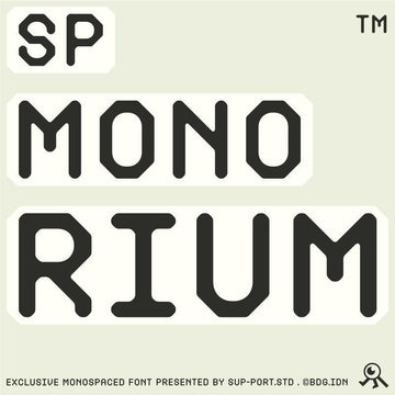
Where Architect Pro whispers, 403 Edsonna from 403TF shouts. It's a variable display face its own maker calls Technical Brutalism, pulling from terminal data streams, logistics labelling, and architectural schematics. Modular, wide, cold, built to construct an environment rather than sit politely on a page. This is the headline voice of the aesthetic, the display type that sets the tone before any of the smaller marks arrive.

Packaging and merch get their own dialect. Pixelbuddha's Retro Stamp Printer Template pulls its character from engineering paperwork, production checklists, and office approval marks, with grainy paper, scuffed edges, and uneven ink laydowns doing the work. Reach for it when you need a QC badge, a batch code, a warranty seal, or a shop-floor stamp that looks like it passed through a real machine.

Proof the look already lives in paying client work: Vitora Mockup's 35+ Construction & Architect Mockups is built for architecture and construction branding, with site signage, safety panels, and stationery ready to receive a system. This aesthetic already lives on real client work: site hoardings, hi-vis vests, stationery systems for firms that measure things for a living. If you're leaning on mockups more these days, that shift is a whole thing worth reading about, and there's plenty more trending work to dig through.

Use it like a spice
The trend collapses the moment every element carries a dimension line. Load a layout with call-outs, revision stamps, grid overlays and annotation type all at once and you've made a costume, a page cosplaying as a document, which is exactly the hollow decisionless thing the aesthetic was supposed to answer. The strongest uses treat schematic marks as a single seasoning. One dimension line running off a product shot. A single stamp in a corner. A lone hand-lettered call-out on an otherwise plain grid. One or two pieces of proof that somebody was measuring, and then you stop. The mark works because it's the exception, the visible decision in a field of restraint. Season the whole plate and it tastes of nothing.



















