There's a reason the best logo designers don't always start from scratch. Not laziness, not shortcuts, but an understanding that the most distinctive marks often come from working with material that has history, texture, and specificity baked in. The problem with most vector packs is that they're built for decoration. Drop one on a flyer, call it done. But a handful of packs are genuinely different: they're raw material, the kind of source you pull from when you need a mark to feel like it came from somewhere, not just like it was made last Tuesday.
The shift toward "provenance" in brand identity is real. Clients want marks that feel found, earned, specific. Spirits brands, streetwear labels, gaming companies, dark editorial imprints: they all want the same thing, which is something that couldn't have come from a generator. The right vector pack gives you that starting point. Here are eight worth keeping in your toolkit.
The Decorative Frame and Border Repository Vol. I by MiksKS

This is archival work in the truest sense. The Decorative Frame and Border Repository Vol. I pulls from trade catalogues of the early 20th century, giving you 350 ornamental elements that carry the visual weight of the era they came from. Intricate borders with Victorian-era flourishes, gothic frames with the kind of dense linework you'd find in a letterpress specimen book, art deco-adjacent structures with disciplined symmetry. Nothing here looks like it was drawn to fill a template.
For brand work, this is most powerful in the hands of a designer working on spirits labels, luxury packaging, or any identity that needs a heritage feel without leaning on clichés. The elements are dense enough to anchor a label design on their own, or refined enough to use as supporting detail around a wordmark. The high-contrast nature of the linework means they print cleanly and reproduce well at small sizes, which matters more than most designers consider when sourcing decorative material.
Abstract Symbol Pack by hvnter

Sixty-one symbols built for work that sits at the harder end of the spectrum. The Abstract Symbol Pack by hvnter is grunge-adjacent but not grungy in the throwaway sense. These are abstract marks with genuine compositional logic: shapes that feel like they were arrived at through a process, not just distressed until they looked edgy. There's a nineties underground energy here, the kind of graphic language you'd find on an independent record label's early catalogue or a skate brand that took its visual identity seriously.
Merch designers will find the most immediate use here. But the pack is versatile enough for streetwear branding and any identity that needs a mark with attitude and ambiguity. The SVG individual files mean you can pull elements into Illustrator and work with them properly, scaling, recombining, modifying without losing resolution. This is a good sign that the creator understands how designers actually use these things.
Cybersigil Graphic Craft Kit by Softulka

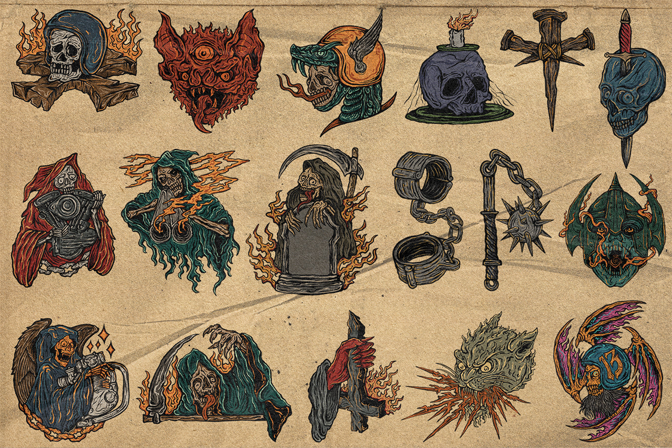
432 elements is a serious number, and the Cybersigil Graphic Craft Kit by Softulka earns it. This pack sits at the intersection of neo-tribal aesthetics and digital gothic: sigil-like marks, distorted organic shapes, border systems and dividers that feel like they were drawn with a dip pen and then corrupted. There's a lineage here that runs from medieval manuscript marginalia through to the kind of tattoo flash that's been circulating on Behance for the past few years.
Where this gets genuinely useful for brand work is the systematic thinking behind it. These aren't just 432 random shapes. There's a visual language running through the pack, which means you can build a full identity system from it: a primary mark, secondary lockup elements, decorative borders, texture. That's the difference between a decoration pack and a design system. Strong fit for gaming branding, dark streetwear, festival visual identity, or any music project operating in the heavier end of the spectrum.
Circuit Line Kit by Vanzyst

Where the Cybersigil kit leans organic and distorted, the Circuit Line Kit by Vanzyst goes clean and structural. These are vectors built around the visual logic of circuit boards and neural network diagrams: interconnected nodes, signal paths, data flow structures rendered in minimal linework. The mood is futuristic without being retro-futuristic. This isn't eighties computer nostalgia; it's closer to the visual language of contemporary AI branding done with actual craft.
Tech companies, cybersecurity firms, and fintech brands are obvious territory. But the more interesting application is using these elements to build complexity into a mark that would otherwise feel too simple. A strong wordmark with a circuit-derived graphic element in the right position can shift a brand's visual register considerably. The linear quality of these vectors also makes them unusually adaptable: they work at large scale on screens and at small scale on business cards without losing their integrity.
DIAGRAMS2 by Massive Supply Co.

Sourced from 19th and 20th century textbooks and technical manuals, DIAGRAMS2 by Massive Supply Co. gives you over 400 vectors pulled from the kind of material that used to live in university libraries and nowhere else. Graphs, blueprints, engineering schematics, scientific diagrams rendered in the precise, slightly imperfect linework of pre-digital technical illustration. These have the quality that contemporary design often tries to fake: specificity that comes from being made for a real purpose.
The applications are broader than they might first appear. Album artwork, poster design, and streetwear graphics are the obvious moves, and they work well. But for brand identity, the most interesting use is treating these as raw material for abstraction. A fragment of a mid-century engineering diagram, cropped and repositioned, can anchor a brand mark with a weight and authority that a from-scratch construction rarely achieves. There's more worth digging through if this kind of technical archival material interests you, plenty of vectors in the same territory.
TRYVAL Neo Tribal Shapes Pack by Chrphb

Neo-tribal as a visual language has been gaining serious traction in independent fashion branding and music art direction. TRYVAL by Chrphb is one of the better packs working in this space. The shapes are abstract and deliberately chaotic, organic forms with a graphic tension that sits somewhere between brutalist design logic and traditional mark-making. It's not referencing any single culture's visual traditions; it's operating in the territory that emerges when those traditions are processed through contemporary graphic sensibility.
The inclusion of an abstract font built from the shapes is a strong detail. It means you can build a mark system that has typographic coherence with the graphic elements, which is genuinely useful when you're trying to create something that feels designed rather than assembled. This is merch and album art territory primarily, but ambitious streetwear brand work is an equally strong fit.
Occult Drawings by secret-cache

Every element in Occult Drawings by secret-cache originates from authentic historical sources: ancient tomes, period documents, wood carvings dating from the 1500s to the 1800s. They've been vectorised for high-definition reproduction but the hand-drawn quality is preserved throughout. These aren't recreations or interpretations; they're faithful vectors of the actual objects, which is exactly why they work as design material in a way that generic "occult-inspired" clip art never does.
The specificity here is the entire point. A mark derived from a genuine 17th-century occult illustration carries a visual authority that a contemporary imitation simply cannot replicate. For dark editorial brands, independent spirits labels, music projects in the gothic or black metal adjacent space, or any identity that needs to feel like it comes from a real lineage of arcane imagery, this pack delivers. The range of subject matter across the pack means you have genuine variety to work with, not just minor variations on a single motif.
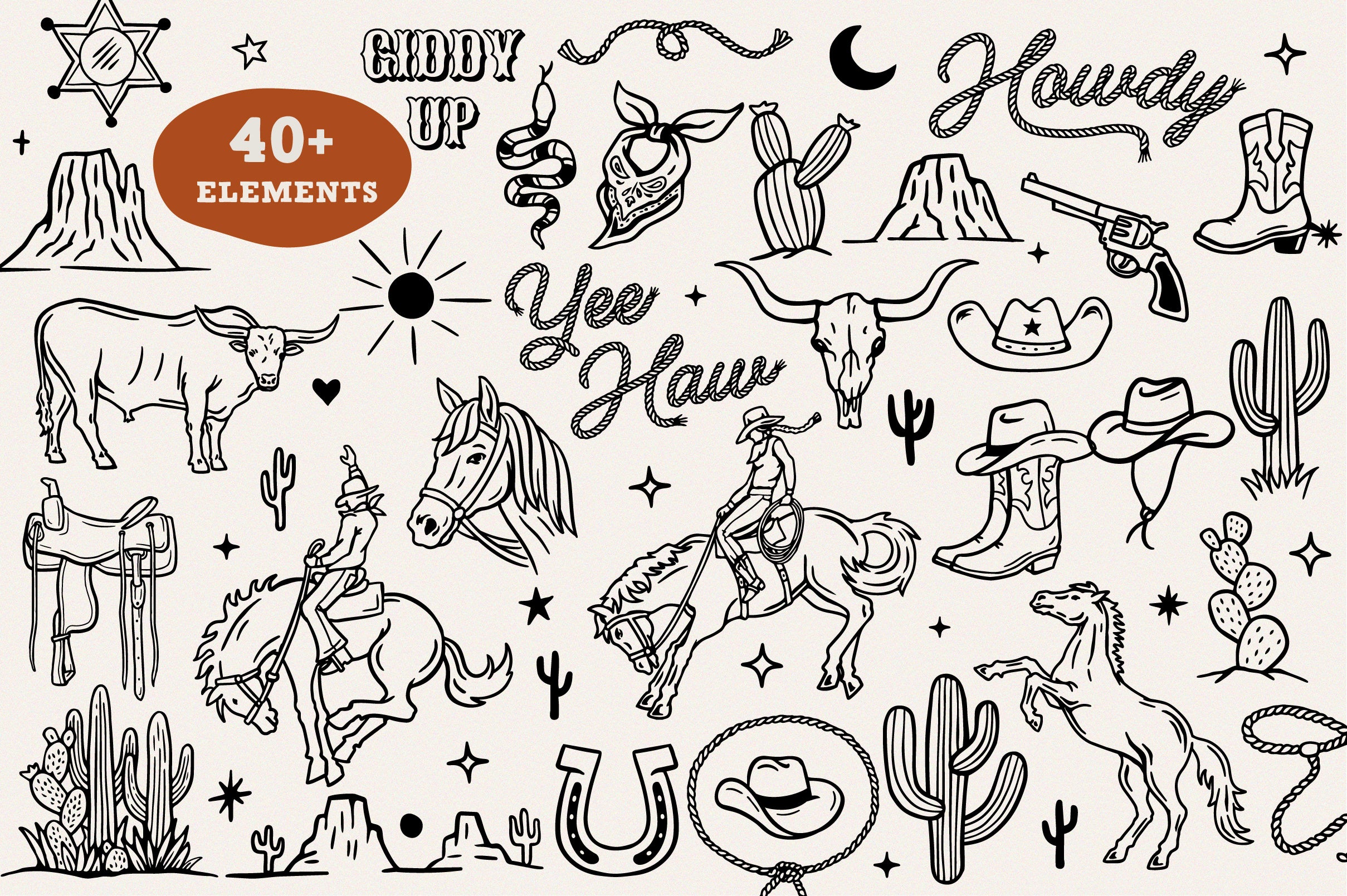
+110 Logo Elements Hand-Drawn Shapes V.03 by züli
![]()
This one is built explicitly for logo work, which makes it worth including on that basis alone. +110 Logo Elements Hand-Drawn Shapes V.03 by züli gives you over 110 hand-drawn elements across four different style packs, covering enough visual range to be genuinely flexible across different brand briefs. The hand-drawn quality is real rather than simulated: these have the warmth and irregularity that separates a mark with craft from one that reads as digitally constructed from the start.
Where this earns its place in a serious logo workflow is in the bridging work: the smaller elements, the supporting marks, the connective tissue around a primary logomark that gives an identity system depth and completeness. A strong central mark paired with hand-drawn supporting elements from a pack like this creates a visual language that feels considered rather than minimal-by-default. Strong territory includes independent brand identity, DTC packaging, and any logo brief where warmth and approachability need to coexist with edge.
Vector packs only earn their reputation as cheap shortcuts when you use them like shortcuts. Treat them as archival sources and raw material, and they become something else entirely: a way to give a mark specificity, history, and visual authority that purely from-scratch construction can struggle to match. The eight packs above are worth having on hand. There's more across the staff picks if you want to keep looking.