Something shifted. If you've been paying attention to the visual direction of the brands that are actually cutting through right now, you'll have noticed that the maximalist arms race has started to feel exhausting. Not just aesthetically, but commercially. Feeds are saturated with AI-generated imagery that looks like everything and nothing at once, gradients that shimmer without purpose, and layouts packed so tightly there's nowhere for the eye to rest. In that environment, a brand that shows up with genuine restraint doesn't look minimal. It looks confident.
Envato's 2026 design trends report names "neo-minimalism" as one of eight key visual directions shaping design culture right now, describing it as a balance between high-impact aesthetics and practical cross-channel execution. That framing matters. This isn't minimalism as aesthetic philosophy or a nod to Müller-Brockmann. It's minimalism as a commercial strategy. LinkedIn's own design analysis found that in 2025, the work characterised by "clarity, structure and functionality" was what actually performed, not in a design award sense but in a converts-and-retains sense. DTC brands building audiences on Instagram and TikTok are discovering that visual hierarchy and breathing room outperform pattern-matched advertising in cluttered feeds. Restraint is doing measurable work.
The cultural signals are there too. Charli XCX's move from BRAT's deliberately lo-fi anti-design to the clean, almost academic minimalism of her Rock Music era was flagged by Creative Bloq as a meaningful visual shift, not a retreat but a recalibration. Prada at Milan Design Week 2026 reinforced this with stripped-back tailoring that let craft speak without decoration. These aren't isolated moments. They're part of a broader pattern where the brands and artists with enough cultural currency to do anything are choosing to do less. That's the signal worth reading.
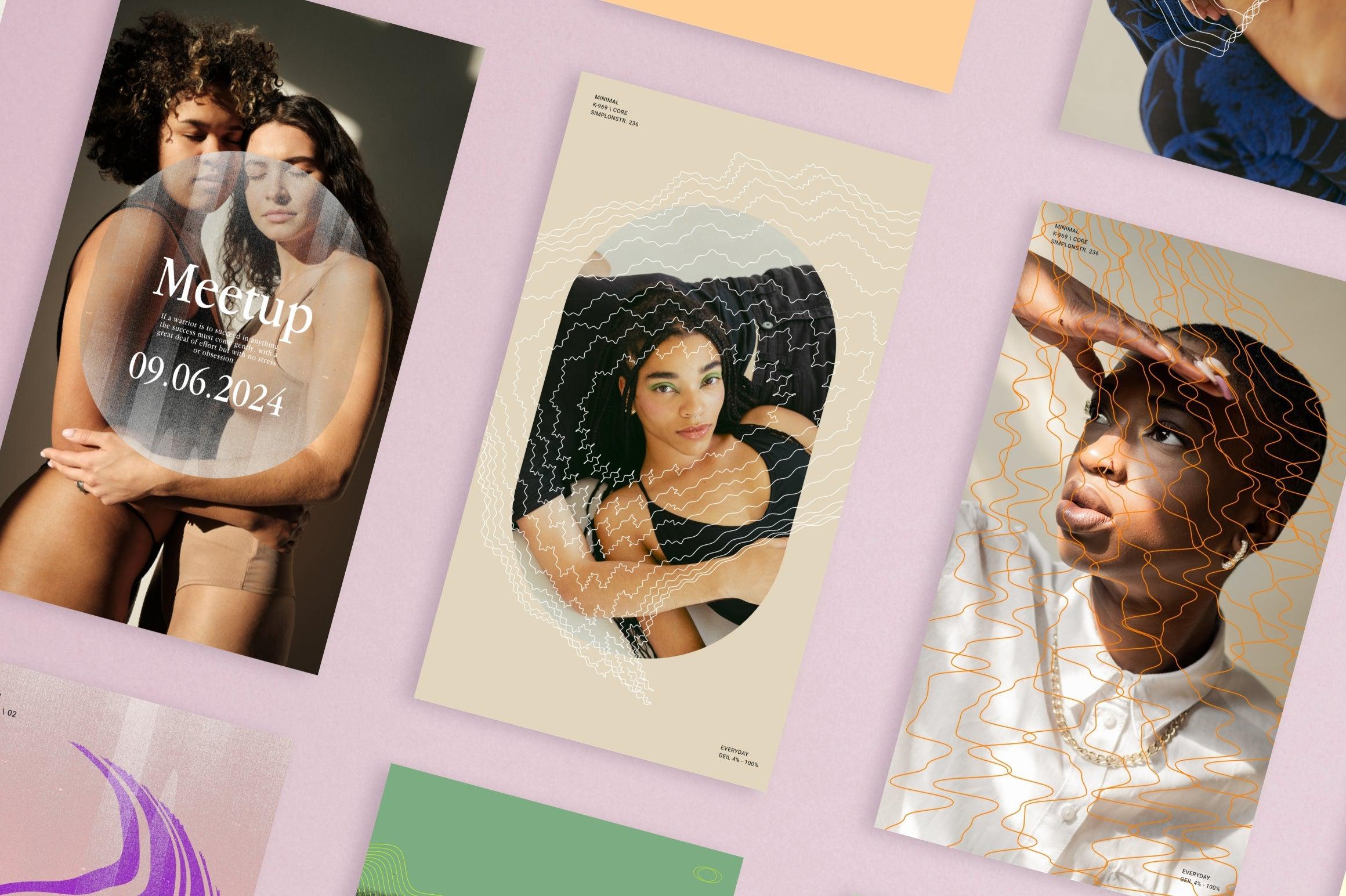
What's interesting about the current wave is that trend commentary keeps landing on the same phrase: "sterile minimalism is making way for typography with a heartbeat." The implication is that the cold, clinical end of minimal has had its moment, and what's coming is spare but alive. Warm grids. Type with personality. Texture that suggests rather than shouts. TikTok design discourse in 2026 frames it as a polarity between bold brutalism and stripped-back minimalism, and increasingly the minimal side is winning not because it's safer but because it's harder to do well. Anyone can add elements. Knowing what to remove takes taste. The tools below are built for that kind of work.
Future History by Sarid Ezra

Future History is a genuinely clever structural decision: sans-serif uppercase paired with serif lowercase in a single font, so every word becomes a built-in typographic contrast. The result is editorial without being fussy, and it has a high-fashion quality that doesn't need to lean on ornamentation to get there. For branding and poster work where you want a single typeface to carry both authority and elegance, this is the kind of find that saves you from stacking two fonts and hoping they cooperate. Sarid Ezra has built something that reads as completely intentional because it is.
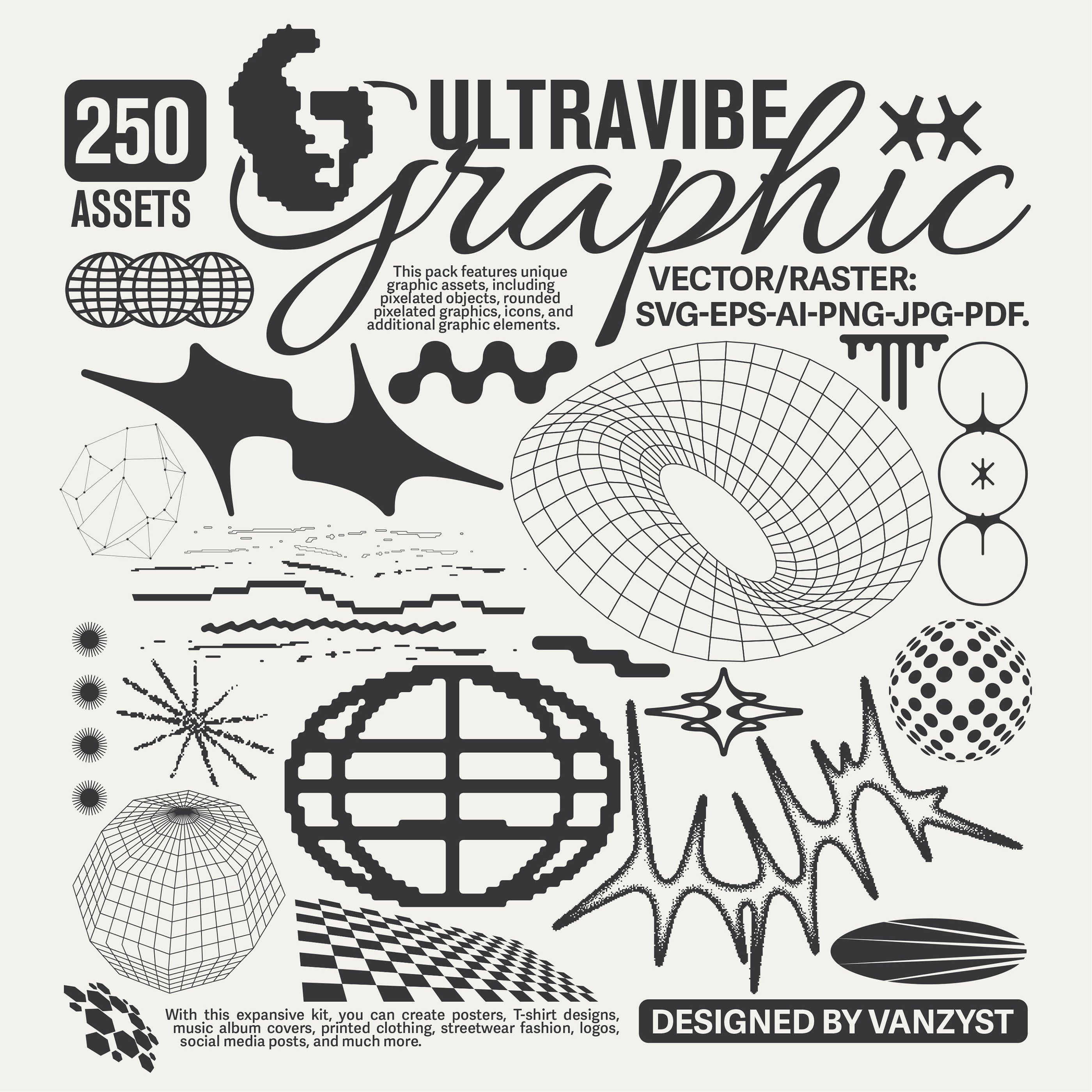
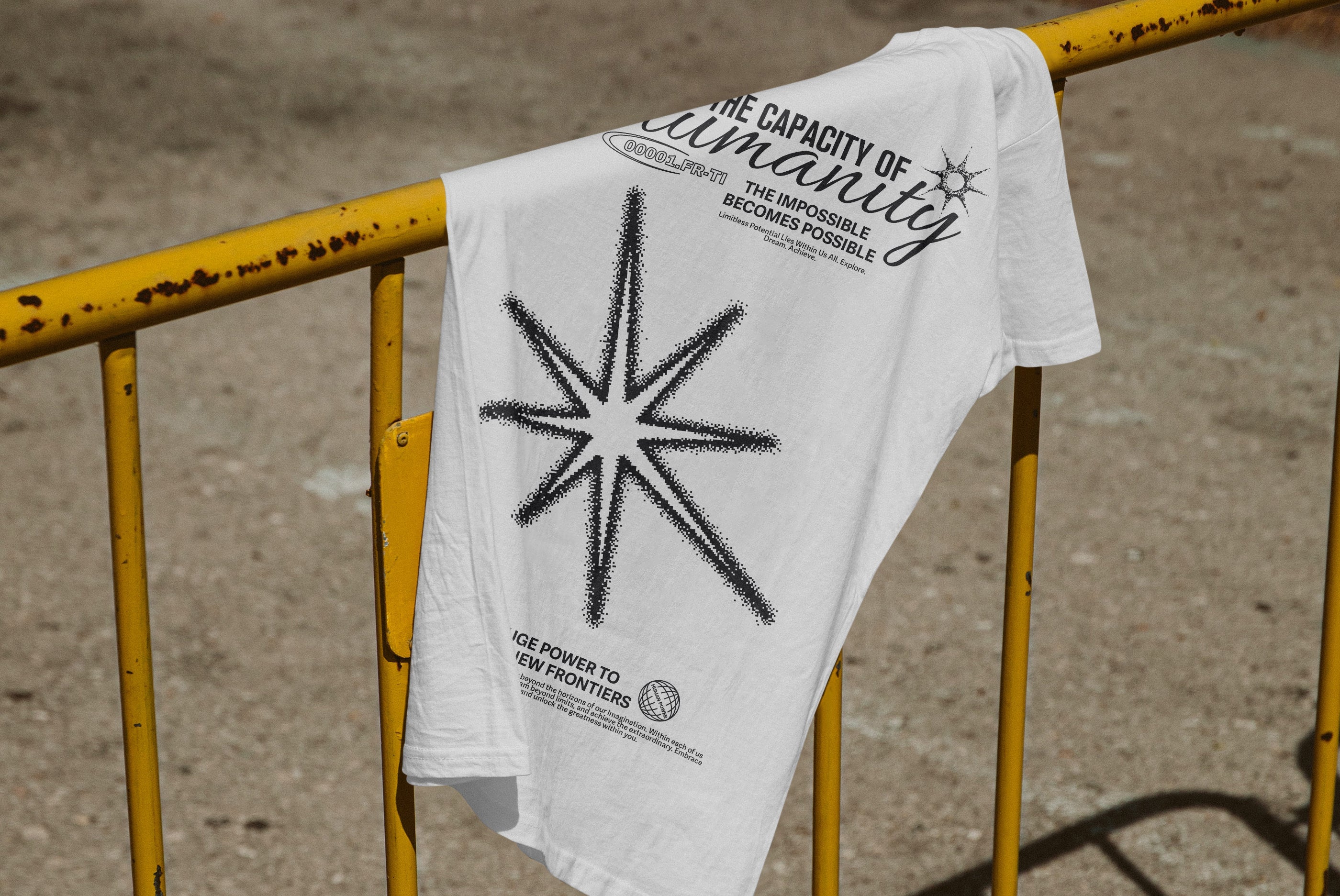
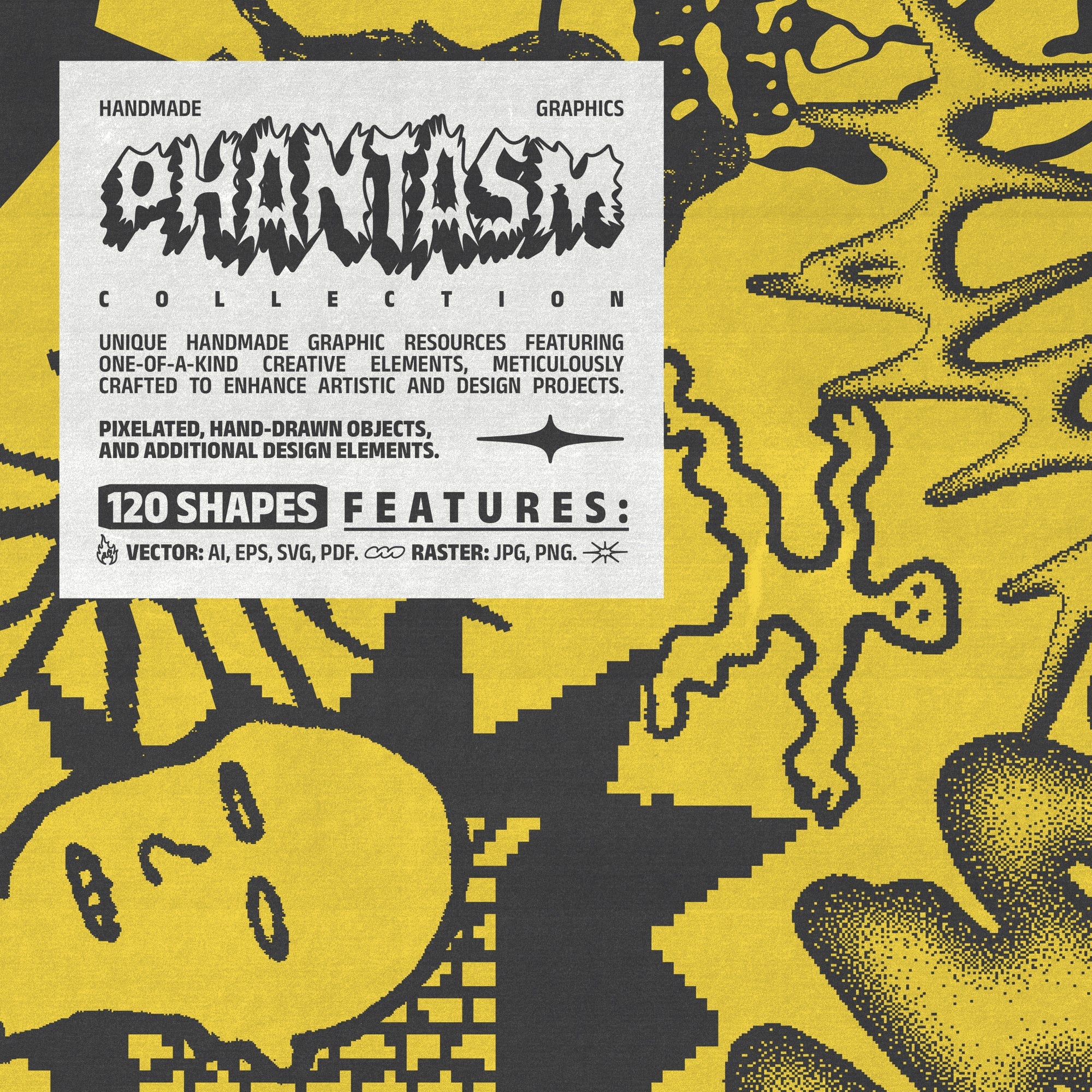
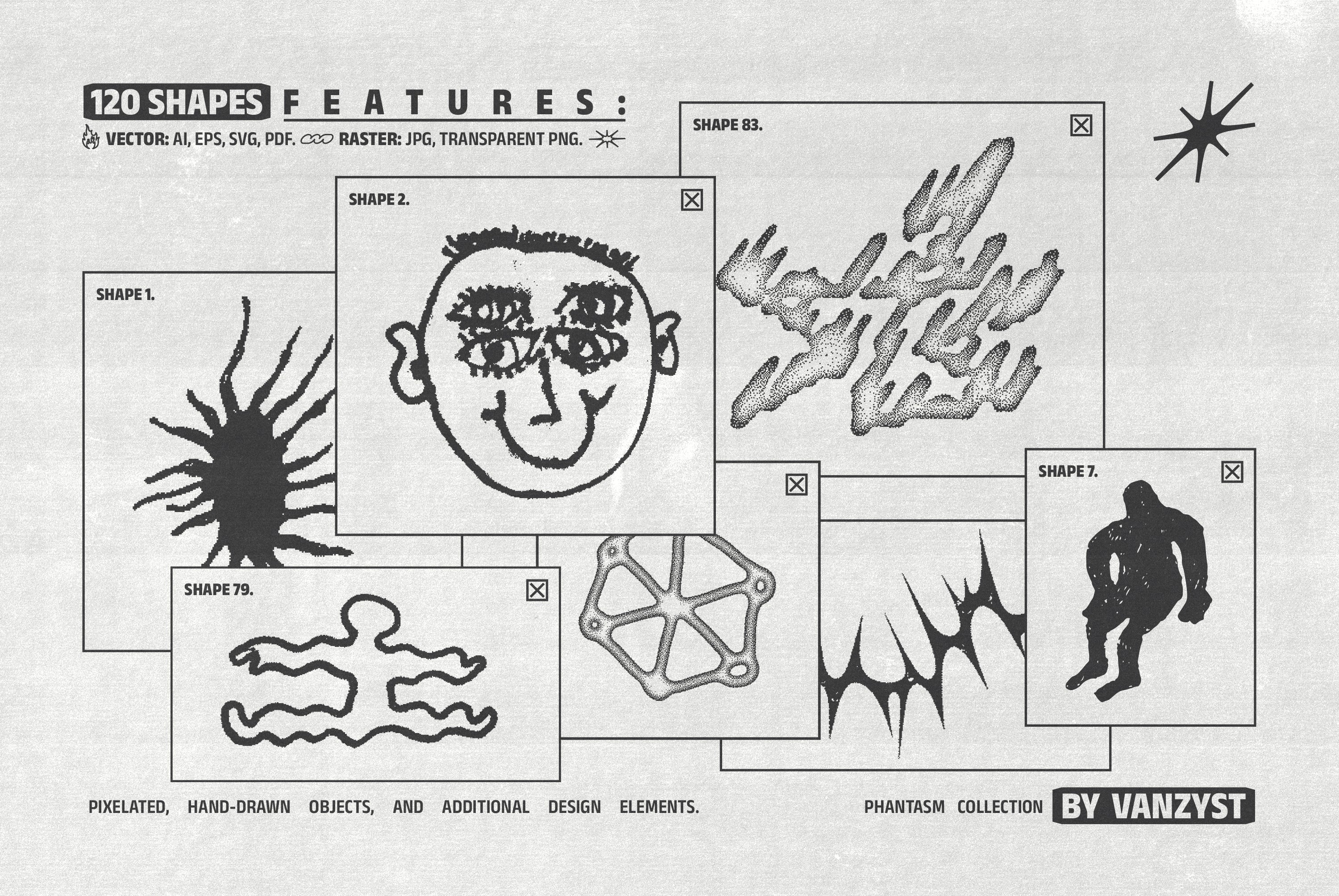
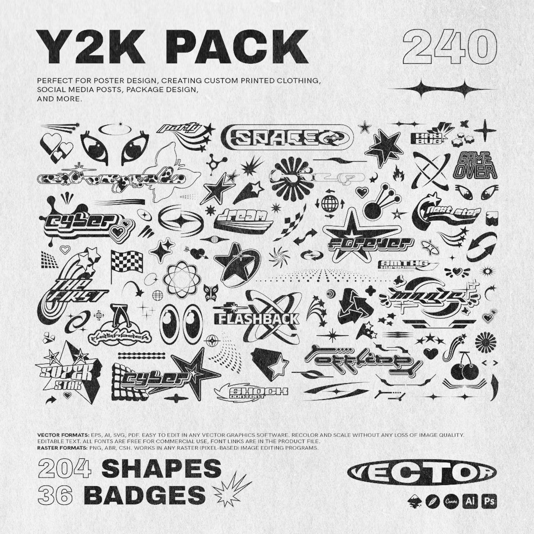
Geometric System Collection by Vanzyst

One of the harder problems in minimal design is staying visually interesting without adding noise, and Vanzyst's Geometric System Collection is a sharp answer to that. One hundred and forty abstract geometric shapes built around a pixel-influenced logic, structured and modular but with enough variation to avoid feeling mechanical. They work as compositional elements rather than decorative fill, which is the distinction that matters. Use them to build layouts that have visual tension without clutter, or to give social content a graphic quality that holds up at scroll speed without looking overworked.
FBS Poffen by Febspace Studio

Four styles, each available in rounded and pointed corner variants, plus a slanted option: FBS Poffen gives you a lot of range from a single typeface family without any of it feeling like filler. The forms are clean and blocky with a density that reads well large, and the choice between rounded and pointed corners is more meaningful than it sounds. Rounded softens the weight and pushes it toward approachable brands; pointed sharpens it into something more assertive. Febspace Studio has built versatility into the structure rather than bolting it on, and for editorial work and branding that needs to flex across contexts, that's exactly what you want.
Lavara by Afterimagine

High-contrast strokes, tall proportions, sharp serifs that don't apologise for themselves: Lavara is the kind of display serif that luxury packaging and fashion editorials are built around. Afterimagine has given it a vertical emphasis that feels genuinely refined rather than simply narrow, and the contrast between thick and thin strokes is calibrated to hold up at large sizes without becoming decorative. If you're working on a brand that wants to occupy the Celine or Toteme end of the visual spectrum, this is doing that job without needing any supporting elements to read correctly.
TRT Fluke by True Type Lab

Expanded sans-serifs carry a particular kind of authority: they own horizontal space rather than just filling it, and TRT Fluke handles that tension well. True Type Lab has extended the proportions with intention, so the letterforms feel wide and confident rather than stretched, and the rhythm across a headline is controlled and even. It's a strong choice for logotypes, magazine headers, and any brand application where you need something that feels architectural. The restraint is in how little it needs to do to land.
Folded Paper Textures by Gromov Design

Tactility in digital work is one of those things that reads immediately even when viewers can't name it, and Gromov Design's Folded Paper Textures get that balance right. Six high-resolution white paper scans with soft folds, visible grain, and subtle fibre structure, clean enough to layer over minimal layouts without introducing grit or grunge. They work as backgrounds, overlays, or surfaces for mockups, and they add the kind of material warmth that stops a white-heavy design from feeling flat. For packaging concepts, editorial layouts, or brand identity work that wants physical presence without losing its cleanliness, these are genuinely useful. If you want to explore more textures in a similar register, there are plenty more textures worth digging through.
TBJ Cota Sans Grotesk by Taboja Studio

A variable font grotesk that runs from extra light to extra bold, TBJ Cota Sans sits in the warm-rational corner of the sans-serif spectrum. Taboja Studio has designed it around clarity and purpose, and the product description even frames it in those terms: "not created to shout, designed to speak clearly." What that means in practice is a typeface that works across UI, editorial, and brand applications without losing coherence, and variable font functionality that lets you tune weight without switching files. For designers building systems rather than one-off visuals, this is the kind of workhorse that earns its keep quickly.
Vasio by Marvadesign

Where Lavara is vertical and sharp, Vasio goes deeper into craft. Marvadesign has built a display serif with art deco-influenced detailing that's intricate without tipping into pastiche, and each letterform has the kind of considered construction that only reads clearly when you look closely. For luxury brand identities, jewellery packaging, and editorial work where the brief calls for something that signals heritage without being stiff, this is a strong option. The detailing rewards larger applications, and the contrast between its refined structure and contemporary spacing gives it a quality that feels current rather than costumed. If you're interested in what else is landing right now, there's a lot of new work worth looking at.
The Point
Minimalism right now isn't a retreat from ambition. It's a particular kind of ambition: the confidence to let one well-chosen typeface do what three decorative ones can't, to let a texture suggest material without screaming it, to build a layout with enough space that the thing you're actually saying can land. The brands doing this well aren't playing it safe. They're making a harder, more considered call in a visual landscape where the default has become more. The tools above are built for that kind of decision-making. What you do with the space is up to you.