



Welcome to the first edition of This Week in Design, our weekly sweep of the rebrands, type drops and studio moves worth your attention. This week leaned heavily on identity work at every scale: a 140-year-old soft-drink giant tightening its bolts, a state and a city trying to sell themselves with graphic design, a Melbourne agency getting rebranded by its own talent, and a display face that reads like an illuminated manuscript without the cosplay. Let's get into it.
Coca-Cola rolls out a global identity system across 200-plus markets
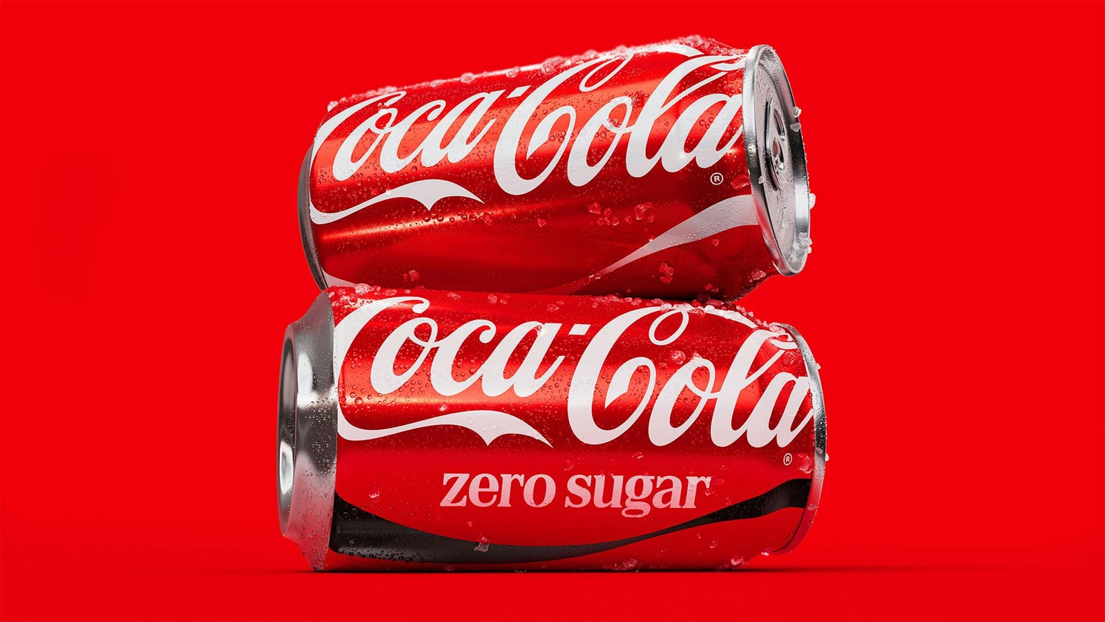
Coca-Cola has unveiled a new global visual identity, led by JKR, rolling out across Latin America, Europe, the Middle East and Asia. The work refines what's already there: the red-and-white palette, the Spencerian script, the Dynamic Ribbon and the Arden Square all get renewed emphasis, with Zero Sugar getting bigger typography, a bolder black ribbon and black caps. Behind it sits a sprawling roster including The Superultrarare, Brody Associates, Forpeople, Monks and Adobe, plus AI-powered "Design Intelligence" tools for rollout. JKR's Tosh Hall called it "a love letter to what makes Coca-Cola, Coca-Cola." Fair enough, though as Creative Review details, this is a governance exercise dressed as a philosophy. Coke's VP of design Rapha Abreu framed it as "designing the operating system rather than every application," which is the read that rings true. Branding experts gathered by Creative Bloq debated whether an already-iconic brand needed any of this. The takeaway for the rest of us: small tweaks at this scale are enormous logistics, and the new typography drew instant comparisons to a certain cigarette pack. Not the vibe.


Elizabeth Goodspeed on the civic branding of NYC's municipal grocery stores
In late May, the New York City Economic Development Corporation issued an RFP for a branding consultant to build the identity for "NYC Groceries," a placeholder name for a network of five city-supported stores, one per borough, opening over the next two and a half years. It sits inside Mayor Zohran Mamdani's affordability agenda: lower prices, fewer food deserts, and a demonstration of public-sector leadership in food. The winning studio builds the whole public-facing system, from naming to logo to visual identity. Writing for It's Nice That, critic Elizabeth Goodspeed reframes the interesting question as what a public identity like this should do once it's out in the world, more than which studio wins the pitch. Designing a government grocery brand carries different stakes than a DTC client: it has to feel trustworthy, legible and civic without looking cheap or looking like it's spending your rates on a logo. That tension is the whole brief, and it's a hard one to solve.

DNCO gives Vermont its first-ever tourism brand
Vermont has launched its first dedicated tourism identity, "State of Inspiration," built over nine months with place-branding studio DNCO (past work spans San Francisco, DUMBO, the Mayor of London and the British Museum). The problem was a gap: 79% of Americans find Vermont appealing, but only 15% intend to visit. DNCO's Mendoza described visitors talking about a place where they "levelled up," not switched off, and landed the line on that shift "from escape to gain." The identity centres on a hand-drawn "Vermont" wordmark with letters shaped after local features like Camel's Hump, backed by taglines like "Farm to table. We just call it dinner." Commissioner Heather Pelham confirmed the spend at roughly $275,000 and, as Creative Boom reports, argued the state can't "just expect tourism to happen." The craft here is real; a hand-drawn wordmark that carries geography is a lovely idea, and the strategy is sharper than most tourism boards manage. Whether a quarter-million-dollar wordmark closes a 64-point intention gap is the state's gamble to make.

Adoratorio Studio rebrands eyewear label Indice as an "Eyewear Lounge"
For Indice's tenth anniversary, the eyewear brand brought in Adoratorio Studio, the independent agency working across Brescia and Amsterdam, to build a new identity and campaign. The idea driving it is the "Eyewear Lounge," repositioning Indice away from the conventional optical store and typical luxury-retail codes toward a warmer, more considered lifestyle space. Co-founder Camilla Zampolini told It's Nice That the studio gravitates to clients who "care deeply about how things are made," believing design can shape culture as much as it drives growth. That soft-but-technical register is having a real moment in premium retail, and it's a smart lane for a brand trying to feel human without shouting about it. Worth watching how the campaign holds up beyond the mood boards.

Stanley Chow fills Manchester's Arndale with 13 giant inflatable icons
Illustrator Stanley Chow, known for his bold, pared-back portrait style, has installed 13 giant inflatable portraits of Manchester icons throughout the Arndale shopping centre for a free public summer trail. Subjects run from the Gallaghers to suffragette Emmeline Pankhurst, and a brand-new portrait of Ellen Wilkinson was unveiled for the occasion. The context, per Creative Boom, is that Chow's style has become "a language of its own" for the city; new UK Prime Minister Andy Burnham even uses one of his illustrations as an avatar. This is what happens when an illustrator's visual grammar gets adopted as civic shorthand. Reducing a face to a few confident shapes is hard, and Chow makes it look inevitable. A rare case of merch-scale illustration earning its space.

The Artline rebrands, designed by TRiC, one of its own talents
Melbourne creative and production agency The Artline has rebranded five years after founder Amy Henderson launched it as a multidisciplinary talent agency. It now runs as a creative partner spanning representation, strategy, production, publishing and community, and the rebrand introduces a "Creative Partners" model where brands engage the agency on an ongoing basis instead of one job at a time. The neat twist, via AdNews: the identity was designed by TRiC, a studio on The Artline's own roster. Henderson said it "gave me a rare opportunity to be on the client side." Alongside it, the agency launched A&DR, an industry resource hub, and keeps publishing its digital title TheArticle. An agency getting rebranded by its own talent is a good look, and a decent proof of the model it's selling.



















