
Over at the Internet Archive, they tried the robots. Vacuum arms that turn pages on their own, commercial scanners built for volume. Then they hit the brittle stuff, the rare volumes and the paper-thin four-hundred-year-old bindings, and the machines choked. Ars Technica reported this in August. Andrea Mills, who helps run the Archive's book-scanning work, put it plainly: clean, dry human hands are the best way to turn pages. Their operators sit with concentration you can feel, catching a skipped or blurry page and rescanning it, one leaf at a time. There's no shortcut into old material. Somebody has to touch it.
Most of this week's ten releases carry that same fingerprint. Things that got scanned, shot, printed, or torn before they became files. And where nothing physical was handled, the marks were drawn on purpose, breaks and cuts built in by a person who wanted them there.
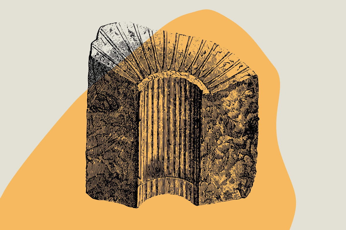
Sacred Ornaments by Pixelbuddha
Pixelbuddha got their hands on a Triod, the Orthodox Lenten service book that hand-operated print shops set through the 16th and 17th centuries. The illustrations inside were cut into wood and engraved into metal, inked and pressed by people who are very long gone. Those pages got scanned and traced into clean vectors, 24 ornaments carrying the weight of woodcut line and the fine bite of metal engraving. You can feel where the tools dragged. For anyone doing book covers, editorial spreads or anything that wants real liturgical gravity, Sacred Ornaments is the anchor of the week. This is provenance you can point to.

Plastic Wrap Texture Overlays by Pixelbuddha
Everyone born before 2005 knows the exact sound of shrink-wrap coming off a CD jewel case. Pixelbuddha scanned that memory, plus the loose crinkle over a record sleeve and the sun-warped creases of a bootleg tape that spent a summer in a glovebox. Twelve sheets of real plastic wrapping at high resolution, every fold and highlight caught the way a scanner bed sees it. Drop these over album art or packaging and the surface stops looking rendered. There's a whole grimy nostalgia in polyethylene, and it reads instantly.

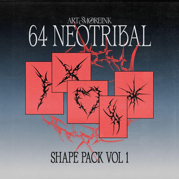
Mystic Glyphs by Designimento
Not everything traceable came off a scanner bed. Designimento drew these 45 glyphs from scratch, abstract symbols and logo marks with organic edges and a shape language that feels dug up rather than designed. Some read as ancient, some as freshly invented, all of them built for identities that want a mark nobody else is running. Mystic Glyphs is authored provenance, marks that came out of a hand and a head, ready for branding, merch and tattoo work that leans into the mysterious.

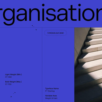
Paper Cut by Roomspace Creative Lab
Irregular proportions, angular cuts, letters that refuse to line up neatly. Roomspace Creative Lab built Paper Cut so the imperfection does the talking. Every wonky edge is a decision, giving headlines a handmade, torn-from-construction-paper energy that a tidy geometric face could never fake. It swings between playful and bold depending on how big you set it. Good for festival posters, zine covers, food packaging, anything that wants personality over polish.

Death Bones by Blankids
Bouncy serif letterforms with the breaks written into the design. Blankids made Death Bones for logotypes and packaging that want a bit of menace, letters that look eroded and busted while still holding their shape. There's a no-wave, punk-flyer lineage to it, distressed type that earns its edge. Comes in OTF and TTF. If broken and gritty is your lane, we've got more grunge fonts worth a look.

Umbrella Mockup 002 — Solace by CURĀ
CURĀ works by holding back. Solace is a product mockup shaped through restraint and detail, editorial lighting doing the heavy lifting while the composition stays calm. Balanced light, soft shadow, real material feel, all delivered as a fully layered Photoshop PSD with smart object editing so your artwork sits into the scene properly. Warm, elegant, built for hospitality and resort branding that wants to look expensive without shouting about it.

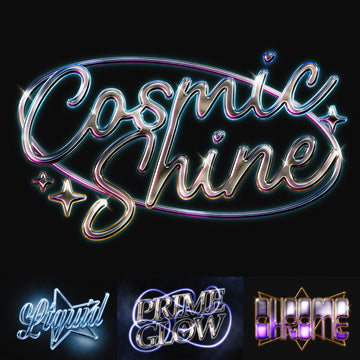
Signal Loss by Gromov Design
Before an image was clean, it had to travel. Through air, through wires, across magnetic tape, picking up phosphor glow and colour shift on the way to the screen. Gromov Design bottled that journey into a Photoshop plugin. Signal Loss recreates CRT, VHS and analog distortion, the kind of degradation that only exists because an image passed through imperfect physical systems. Point it at social content, posters or editorial work and it puts the static back. We ran real scanned grain in last week's drop too, if you're chasing that texture.

Rodeo Graphic Collection by Skilline Supply Co
Cowboy culture, rodeo tradition and dusty Americana, all handcrafted. Skilline Supply Co built this set out of retro illustrations and vintage-inspired logo layouts with warm, worn-in palettes and the confidence of an old feed-store sign. Rodeo Graphic Collection is aimed at apparel graphics, merch and Western branding, the sort of work that wants to feel like it's been sitting in a saddle shop for forty years.

Torn Paper Procreate Brushes by Creative Veila
Tearing paper is a physical act, and the edge you get is impossible to draw convincingly by hand. Creative Veila turned that act into a repeatable tool. Torn Paper Procreate Brushes shape natural, ragged edges for collage, editorial layouts and vintage-inspired compositions, giving your digital rips the fibre and irregularity of the real thing. For anyone building moodboards and cut-paper spreads in Procreate, these save you a mountain of faking it.

RP V8 Tube Box 02 Mockup by Mockup Flock
Tube and box standing upright, side by side, against a warm terracotta studio backdrop. Mockup Flock lit this cosmetic mockup with even overhead light so the full label area stays sharp and legible on both pieces, with a bold cast shadow behind for depth. Built for skincare and beauty packaging where the artwork has to read cleanly. If mockups are your thing, there's plenty more to dig through.

Ten pieces, most of them carrying dust from somewhere real. Go touch the pages.