

The strongest arrivals this week aren't trying to look expensive. They're trying to look like something happened to them. A text effect that behaves like a printer running out of toner mid-job. A texture pack graded from a faint scanline haze up to a screen that has fully given out. A slab serif whose maker walks you through the exact glyphs where he broke the rules, and why. The value is in the visible logic, the sense that a real material or machine misbehaved and someone caught it. Here's what landed.
Ultra Ink Printer Effect by Pixelbuddha
Most print effects fake distress by scattering grime on top. This one builds it from the mechanics up: heavy pigment sinking into coarse recycled stock, edges bleeding and clogging, patchy coverage that leaves type looking stamped instead of cleanly laid down. It's built from stacked stain, dust, and light and shadow passes, with an inner shadow and outer glow so the ink reads as pressed into the paper like a proof pulled off a jammed riso drum. You drop artwork into a single smart object, three ink passes rebuild around it, and a run of adjustment layers pushes the density from a saturated solid hit to a faded low-coverage print. Ultra Ink Printer Effect is aimed straight at gig posters, zine spreads, streetwear graphics, and band logos that want the look of a bad print run.

CRT Glitch Textures Collection by Pixelbuddha
What makes these worth the download is the grading. The set of 12 JPGs runs across the full arc of signal decay, from a few clean scanlines through chromatic tearing into red, green and blue channels, phosphor-grid dot patterns, datamoshed streaks over pure black, right up to rows collapsing into static. You get both the faint digital haze and the completely dead screen, so you can dial the failure to match the mood. Set a sheet to Screen blend mode to drop the RGB glow onto a photo or title card, then pull the opacity back until the signal sits underneath the artwork. CRT Glitch Textures suit music video key art, cyberpunk covers, and anything that wants to look like it's fighting the transmission. If broken screens are your thing, there are more textures to dig through.

Golden Retro Enamel Pin Text Effect by Matsero
Enamel pins have their own physics: dimensional metal walls, a hard gloss catching light, colour trapped inside raised borders. This set from Matsero rebuilds all of that as a type treatment, with metallic textures, glowing highlights, warm golden lighting, and decorative outlines that read like a badge you'd pin to a jacket. Five PSDs and a help file, so you're setting up lettering for merch, music artwork, or vintage-leaning branding without hand-painting every bevel. Golden Retro Enamel Pin Text Effect is the one to reach for when the type itself needs to feel like an object.

Signboard Mockup by Farabion Studio
Pitching a cafe menu or a street-level identity is a lot easier when the client can see it standing on a real footpath. Farabion's A-frame sits against a modern storefront with a dark glass facade and tiled pavement, shot from three angles: a dramatic close-up, a straight eye-level front, and an elevated perspective. Smart Object layers handle the artwork swap with edge alignment and lighting that holds up, and the PSDs run in both Photoshop and Affinity. Signboard Mockup earns its place in retail promo work, outdoor branding, and directional signage decks.

VT Borlasino Handcrafted Vintage Font by Viactiontype Studio
Brush fonts live or die on whether the strokes feel drawn or drawn-by-committee. Borlasino comes from hand-drawn brush work, so every character carries organic texture, natural imperfection, and the bold movement of classic brush lettering. Two styles, Regular and Oblique, plus full multilingual support, which keeps it usable beyond the usual apparel one-liner. VT Borlasino is built for coffee labels, packaging, apparel, and album covers that want a bit of grit in the ink. For more in this vein, we've got plenty more vintage lettering worth a look.

Brikton Slab by Glyphofik Type
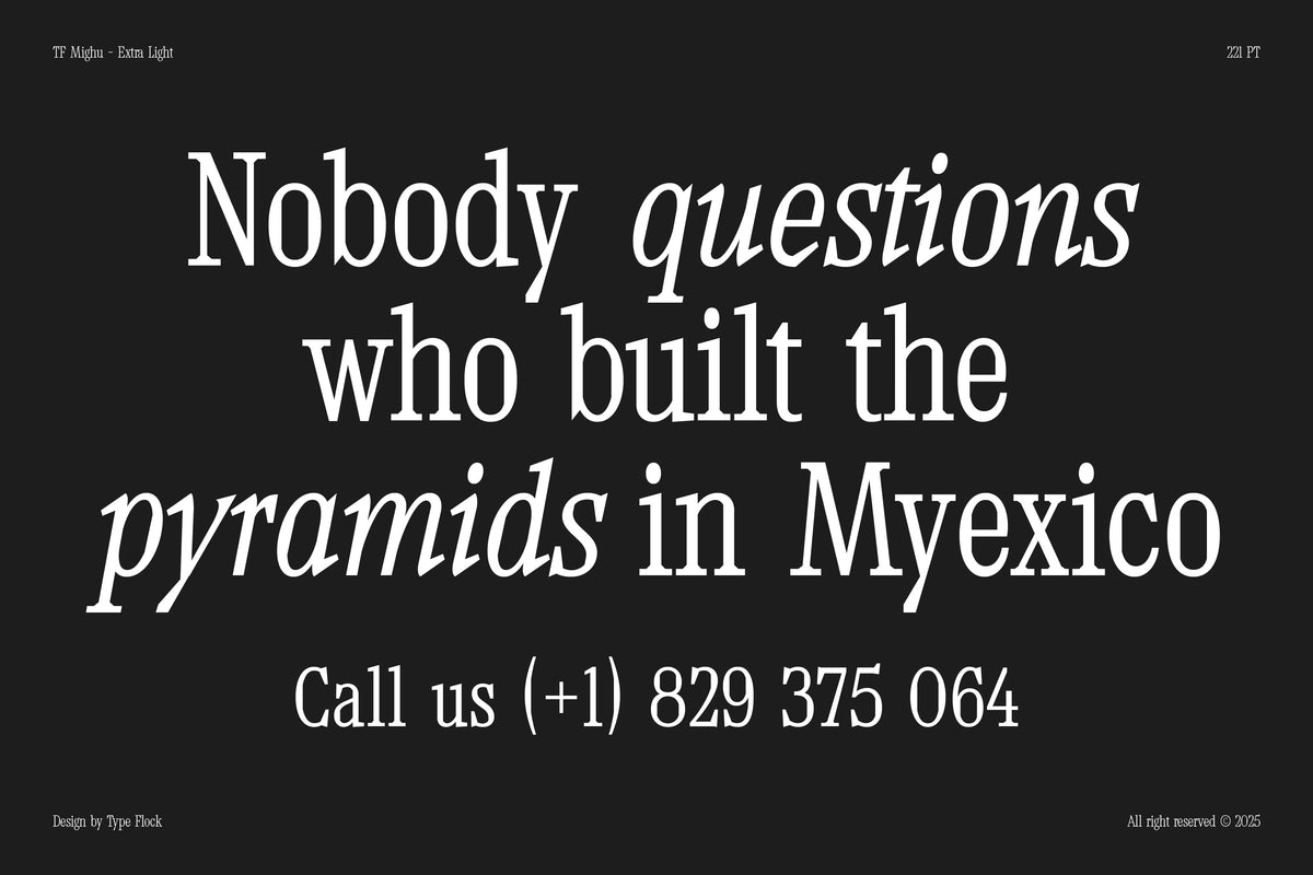
Glyphofik gets specific about where Brikton breaks slab convention, and that's exactly why it's interesting. Letters like d, h, m and n skip the expected terminal serif and instead follow the tail shape of the a, a small playful move that runs through the whole family. The left inner serif, on the n for instance, is extended and cut at an angle so the counter doesn't read as dead space. The diagonals, A, K, R, V, W, X, Y and their lowercase, drop the serif entirely for a sans form with cut-off ends and an inner serif on one side only. Across seven weights, Brikton Slab is a display face for titles and logos where the text is the whole image. If you like a serif with opinions, Drops #43 had a few more.

Spray Procreate Brushes by Sko4
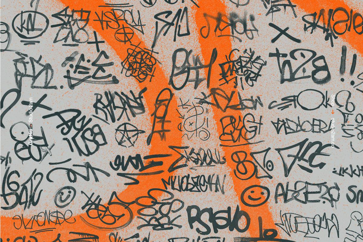
The detail that sells this one is the nozzle logic. Sko4's 14 brushes imitate real spray can caps, fat cap, thin cap, flat cap, and they respond to pressure and tilt the way paint does: light pressure gives a fat, transparent line, heavy pressure tightens it into something thinner and more solid. That inversion is the whole point of spray, and getting it right on iPad is rarer than it should be. Spray Procreate Brushes are built for graffiti lettering, tag work, and street-style drawing in Procreate.

The through-line
Pull any of these into a job this week and you're working with something that behaves like a real material under real conditions. Run the printer effect over a gig poster and let the coverage go patchy, or grade the CRT set so a title card looks like it's losing signal in real time. The construction shows, and that's the reason to use them. More of this week's arrivals are over in the latest drops, and last week's Drops #44 ran on the same wavelength.