

Drop a needle on a well-worn record and look at the sleeve while it plays. The distress on that jacket comes from paper doing what paper does under a printing press and thirty years of hands: toner sitting on a coated surface, fibre lifting, ink cracking along a fold. Now pull a fresh tee off a screen-print press. The distress there is a different animal entirely. Plastisol ink pushed through a mesh onto woven cotton breaks up according to thread count and squeegee pressure, and paper grain never enters into it. Two completely different physical processes, two completely different-looking kinds of grit.
Most designers reach for the same grunge pack for both, and it shows. A fine-grain scan of degraded printed paper reads as history on a sleeve or a large-format print because that surface is exactly what it's imitating. Put that same scan on a screen-printed shirt and the detail collapses into mud, because ink on fibre through a mesh behaves nothing like toner on paper. Go the other direction and it fails just as loudly: a texture built around how spray drifts or how photocopier toner shatters looks thin and pasted when you slap it on a poster where paper grain was supposed to carry the whole thing.
The renewed appetite for this stuff isn't nostalgia for its own sake. As generated visuals flatten everything into the same uniform smoothness, a distressed, hand-processed surface has become a signal that a person made deliberate decisions. That only holds if the imperfection came from a real process. Fake degradation reads as fake fast. So the packs worth your time are the ones built by running paper, ink, and spray through the machines that wreck them. Here are eight, sorted by where they belong.
Rough Print Textures by Textexp
Scanned, printed, re-scanned, printed again, each pass shedding a little more fidelity until the grain turned to something you couldn't fake in a filter stack. Rough Print Textures came out of over 200 copies run through that process, with the best 49 kept. They land at 9000 x 6000px, 300 dpi JPEGs, which is the part that matters for cover work: at that size you can crop hard into a single fibre-and-toner patch and blow it up across a gatefold without it falling apart. The palette stays neutral and monochrome, so it sits under type without fighting for attention. Built for Photoshop-friendly workflows, and the resolution is doing the heavy lifting here.

Off Black Textures by h0vado
Dark, wet, and dramatic, this scanned set leans into water damage as its signature, the kind of blooming stain that spreads through a page and dries into a tidemark. That makes it a natural for moody cover art and editorial spreads where you want the black to carry real depth and history in the surface itself. Off Black Textures ships high-resolution in PNG, so you can drop a surface straight over a layout and knock back the parts you don't need. Cool-toned and heavy, it does its best work when the rest of the design is restrained enough to let the damage breathe.

X5 Worn Waveform Textures by GFX DATABASE
Here's a texture that references the format it's decorating. X5 Worn Waveform Textures is five distressed waveform surfaces built on that gritty analogue 90s feel, layered and roughed up so they read as a played-to-death cassette or a fourth-generation dub. Five 4500 x 4500px JPGs at 300 DPI, print-ready, and they open across Photoshop, Illustrator, Affinity Designer, Affinity Photo, and Canva. The maker points them at poster and flyer backgrounds, album and EP artwork, digital collage, streetwear graphics, and music event visuals, which tells you the range. On a single cover the waveform motif does a lot of narrative work without you having to spell anything out.

Ink Bleed Mockup by Pixelbuddha
Type set clean will always look like type set clean. Ink Bleed Mockup from Pixelbuddha fixes that by dropping your artwork into a Smart Object that simulates damp stock, where the ink spreads at the edges, soaks into the fibre, and prints back as a blurred, imperfect impression. Feed it a wordmark, a logo, or a full photo and the bleed rebuilds it. It runs at 4500 x 3000px, 300 dpi, and works in Photoshop with a recent Creative Cloud version for full Smart Object support. The maker's own use list covers poster headlines, album and single covers, zine spreads, editorial layouts, streetwear prints, wordmark studies, packaging accents, and gig flyers, so it bridges toward the merch side too. This is the one for a sleeve where the title needs to look like it soaked in. If effects that fake a real press run are your thing, there are more of those worth a look.

Photocopy Machine by God Control
Tour merch and zine flyers carry a specific kind of damage: the shatter and smear of a photocopier that's low on toner and running its tenth pass. Photocopy Machine from God Control bottles that. It's a single .atn Photoshop file with 8 actions, each mimicking a different flavour of xerox breakup, plus a step-by-step tutorial built in. A staff pick, and rightly so, because this is the exact reproduction degradation that ends up on a punk flyer or the back of a screen-printed shirt. Coarse, high-contrast, and mesh-friendly: the toner drops out in a way that survives being pushed through a screen without turning to sludge.

Sprayed Procreate Brushes by Tim Hankins Design
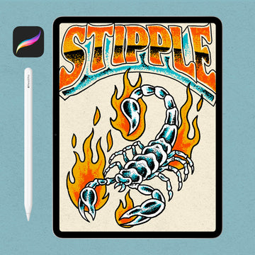
Graffiti-adjacent apparel graphics live or die on how the spray behaves, and no digital brush gets there by faking the falloff. Sprayed was built from hi-res scans of real spray paint cans, so you get the natural feel and flow of a real can without the fumes. Tim Hankins Design packed in a spread of shapes, sizes, and patterns, from drips and heavy splatter through to smooth lines and crisp edges, which means you can rough out a stencil-style graphic and hand-detail the overspray in the same pass. Another staff pick, and a Procreate set that earns the phone-to-press trip. If you like your brushes very specific, this is that.

Stamp Kit by Divided.co
Patches, woven tags, and branded merch marks want the look of ink pressed hard into a surface, uneven and a little clogged. Stamp Kit from Divided.co handles it as a Photoshop effect: drop a logo or a piece of typography into the Smart Object and it takes on one of 7 detailed ink textures. Specs are 300 dpi, RGB, 3508 x 2480px, with a video walkthrough to get you moving. Another one from the staff picks. The stamp read carries its own weight against paper grain, and this pack understands that, which is why it holds up on a tag where a scan would look wrong. It pairs well with the kind of thinking behind building a whole merch drop around a mark.

Damaged Paper Collection by Pixelbuddha
Every so often a project needs to carry a sleeve and a shirt in the same season, and swapping texture systems halfway through wrecks the continuity. Damaged Paper Collection, the second Pixelbuddha entry here, covers that gap. It's 32 high-quality JPG scans of paper damage plus a high-resolution PSD that arranges them for previewing, mixing, or quick layout tests, all at 4500 x 3000px, 300 dpi. The damage is worn and grainy without being so paper-specific that it dies on fabric, so you can run one surface family across mockups, branding, portfolio shots, banners, and print and keep the whole drop feeling like it came from one hand. It skips the guesswork about which world a project belongs to and covers both equally well. There are always plenty more textures to dig through if you want to go deeper on the paper side.