The screen is too perfect. Every gradient smooth, every edge crisp, every pixel sitting exactly where it was placed with zero argument. That precision is exactly what's making so much digital work disappear into the noise. The stuff that actually stops the scroll right now carries weight in a different sense: toner drag, ink bleed, halftone scatter, the kind of surface evidence that implies a design existed somewhere physical before it arrived on your monitor. These nine picks are the ones worth building into a permanent workflow.
CopyCat - Photocopy Effect by MiksKS

CopyCat is the benchmark for this entire category. Where most photocopy effects lean on generic grain filters, MiksKS built this Photoshop action from toner marks sampled off real machines, which means the degradation reads as authentic rather than simulated. You get full control over intensity, texture, grit amount, print pattern, and image levels, so the difference between a barely-touched original and a sixth-generation photocopy is entirely in your hands. It runs non-destructively, meaning you can dial the whole thing back or push it harder without committing to a flattened result you'll regret. The 1.2GB package reflects how seriously this was put together: this isn't a one-slider job. If you do any work that needs to feel like it was made before the internet, poster work, zine layouts, album covers, xerox-influenced merch graphics, this one earns its place in the toolkit permanently.
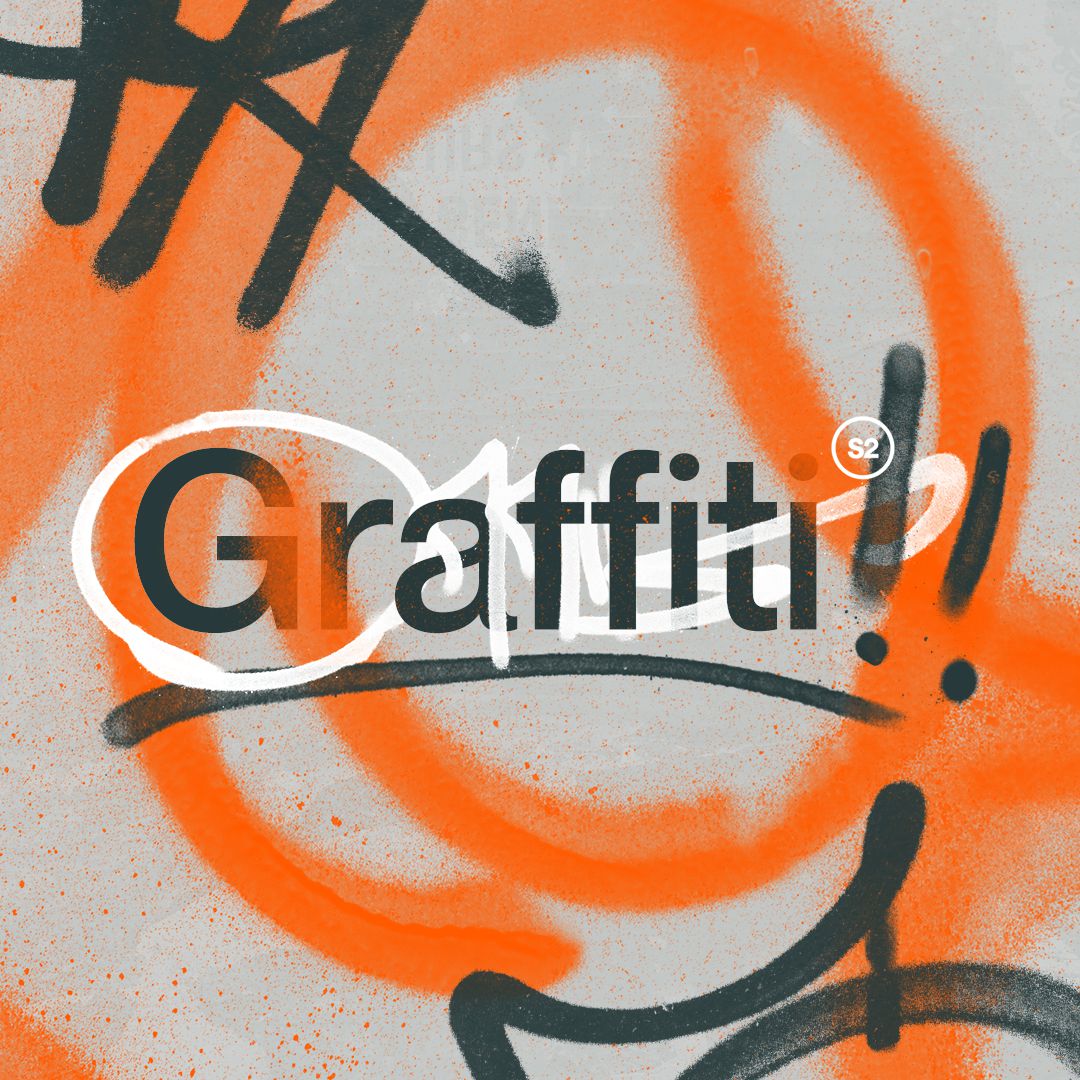
Stencil Offset Text Effect by Pixelbuddha
Currently the top trending effect on the platform, and it's easy to see why. Stencil Offset runs type through two distinct layers of damage: a coarse halftone dot grid that breaks up fills, and a concrete-worn surface that pulls the whole thing toward something spray-painted through a cut stencil on a wall. There's an invert option that flips between dark-on-light and light-on-dark, which doubles the use cases without any extra work. This one belongs on streetwear graphics, gig posters, and album art where the type needs to look like it was made with physical tools rather than assembled on a screen. If you're into halftones, there's more where that came from.
Ink Smudge Print Text Effect by Pixelbuddha
Think about the way a rubber stamp looks when the ink isn't evenly distributed, where some edges bite hard and others trail off into almost nothing. Ink Smudge Print replicates that behaviour across graphics and type, combining rough ink grain with uneven print pressure so lines blur at their edges and surfaces pick up dusty paper noise. It reads warm and analogue in a way that sits naturally on zine spreads, packaging labels, book covers, and any editorial work that's trying to avoid the sterile look of a perfectly rendered file. Particularly strong on logotypes and stamp-style treatments where inconsistency is the whole point.
Lapse Chromatic Aberration Text Effect by Divided.co

Chromatic aberration as a design tool has been running hot for a few years now, and Lapse is the cleanest implementation of it for type work. Drop your logo or typography into the Smart Object, and the pre-built effect handles the RGB channel separation that mimics the colour fringing you get from old CRT monitors, cheap VHS transfers, and misaligned print registration. The result sits somewhere between a signal fault and a deliberate aesthetic choice, which is exactly the tension that makes it useful for poster work, album art, and social content that wants to reference early-digital or broadcast-era visual culture without being too literal about it.
Distress by Studio 2am

This is our own product, so take that context as you will, but it's in here because it genuinely earns its place as a workhorse pick. Distress handles text distressing in a single step: grain, halftone, and distortion combined across three damage levels, light, medium, and heavy, all within one customisable PSD at 6000x4000px. It's the kind of file you keep open in the background and use constantly across branding, streetwear layouts, and poster work whenever something needs roughing up quickly without losing resolution. Straightforward and effective.
Static Distortion Effect by Divided.co

Where most distortion effects go for broad stroke grunge, Static Distortion works through stippling: a dense, dynamic dot texture that builds grit through accumulation rather than smearing. Drop your design into the Smart Object at 4000x3500px and the stippled surface wraps around your image with a quality that reads closer to screen-printed risograph output than standard Photoshop noise. Good for album art and branding work where you want vintage weight without the piece looking like it was processed through a generic filter. The included textures give you enough to work with before you start customising. If you want to dig further into distortion effects, there's plenty more to look through.
Dithering Automator by MiksKS

Dithering sits in a specific corner of the retro-digital conversation, one that references early bitmap graphics, printed circuit aesthetics, and the visual language of lo-fi game art rather than analogue print processes. MiksKS built this one with 12 dithering patterns and 74 colour options, which means the range goes from strict one-bit black and white all the way to full-colour treatments that still carry that pixelated, quantised quality. The conversion rate on this one is notably high, which tracks: once you understand what dithering actually does to an image, it becomes a go-to for poster work, gaming-adjacent design, and any project where you want a handmade-pixel sensibility rather than clean digital finish.
Vintage Stamp Texture Effect by mockstar

Six stamp texture presets that age artwork convincingly into mid-century territory, specifically the kind of worn, ink-heavy quality you see in sixties and seventies print ephemera: record sleeves, paperback covers, travel posters with sun damage and handling marks. It works in both Adobe Photoshop and Affinity Photo 2, which broadens the use case considerably. The presets are strong enough to use as-is but customisable enough to dial into a specific era or level of decay. Best applied to branding, logo treatments, packaging, and merch where the brief calls for heritage weight rather than contemporary polish.
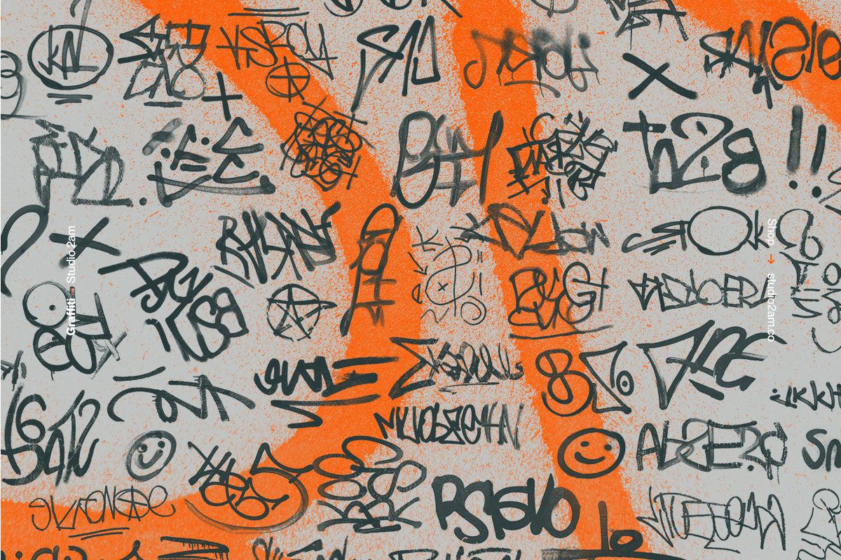
Photocopy Machine by God Control

A Photoshop action that commits fully to the xerox aesthetic: grunge, toner drag, worn edges, the visual language of flyers that got pinned to a corkboard and photocopied until the image started falling apart. The influence is clearly eighties and nineties in origin, the same visual DNA that runs through hardcore show flyers, independent zine culture, and the DIY streetwear graphics that keep resurfacing on Behance every couple of years. It applies fast, reads strongly at small sizes, and holds up well on poster and merch work where the goal is to look like something that existed in the physical world long before anyone scanned it.