
A badge only has to be one thing: instantly readable at the size of a hoodie patch. Same with a tribal line running down a sleeve, or a corporate logo parody sitting dead centre on a tee. Merch design is small-format design, and small-format design lives or dies on shapes, not detail. There's no room for gradients that muddy under a screen printer's mesh, no room for photographic texture that turns to mud on a woven patch. What survives is clean linework, bold fills, and silhouettes strong enough to read from across a room. That's why vector packs are the actual raw material of merch work, more than any font or photo effect. When a streetwear brief lands, you're not starting from a blank page, you're digging through shapes looking for the ones that already have the attitude the brief is asking for.
These are the eight we'd reach for first.
For the gothic streetwear capsule
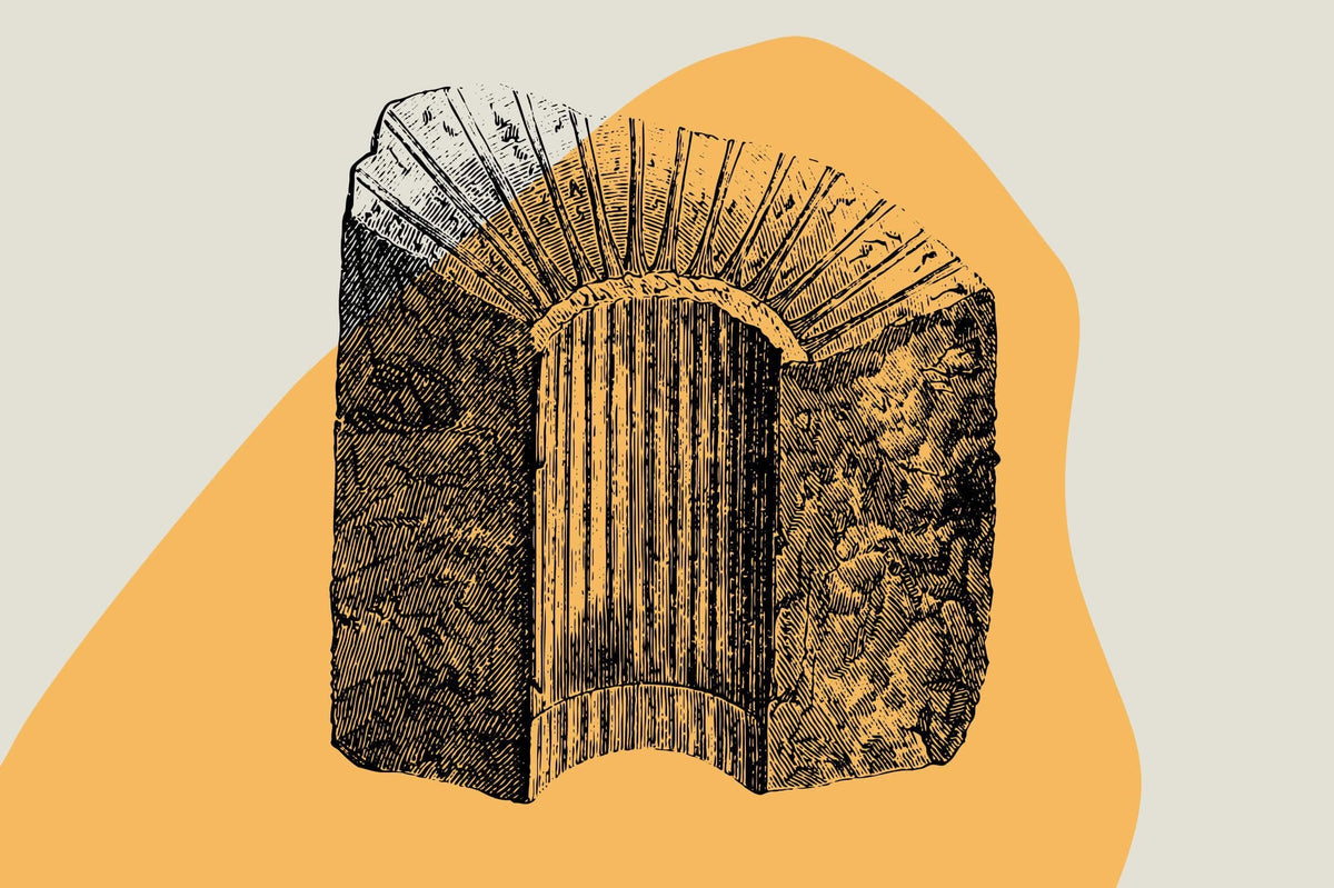
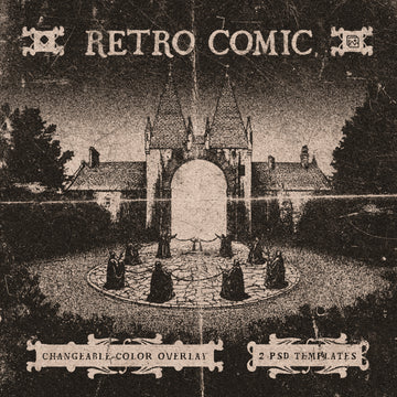
MiksKS built Medieval Vectors from actual historical sourcing, pulling over 400 elements from museum collections and manuscripts spanning the medieval period through to the 19th century. This isn't clip-art gothic, it's the real texture of illuminated manuscripts and renaissance ornament, which means the linework has an authority that generic "spooky" packs don't. Drop a filigree border behind a logo and the whole design reads expensive rather than costume-y. It's the pack you want when a client says "gothic" and means Rick Owens, not Halloween.

Pair it with the Ornamental Vectors pack, also from MiksKS, which leans further into baroque flourishes and victorian-era motifs across 200-plus elements. Where the medieval set gives you the heavier, more dramatic pieces, this one is built for framing devices and negative space work, the kind of ornament that wraps around a tee graphic or fills a zine spread without fighting for attention. Both come through in multiple formats including vector smart objects, so swapping colourways for a limited run doesn't mean rebuilding the file from scratch.

For the ironic corporate parody drop
Every few seasons, streetwear circles back to mocking the aesthetics of corporate branding, and hvnter's Corporate Asset Pack is built for exactly that cycle. Seventy-two fake corporate symbols, icons and logo-style marks that look like they escaped a 1980s annual report, delivered in both vector and high-resolution PNG. The trick with this kind of design is that the satire only lands if the source material actually looks corporate, not like a joke about corporate design. These assets have that deadpan straight-faced quality, geometric and slightly retro, that makes a fake logo believable enough to be funny. Screen print one on the back of a plain tee and it does the whole joke without needing a caption.

For a playful, high-volume streetwear run
hvnter also put together the Cartoon Bundle, which is less about a single mood and more about having a deep well of playful, energetic characters and objects to pull from when a drop needs personality rather than edge. With over 170 assets plus 30-odd bundled font styles, this is a pack built for volume, the kind of project where you're producing hang tags, sticker sheets, tee graphics and social assets all in one sitting and need a consistent visual language across all of it. The style sits somewhere between mid-century cartooning and 90s energy, bold outlines, flat colour, nothing that gets lost when it's shrunk to a patch.

For Y2K badge-and-patch work
Badge and emblem graphics have stayed a constant in streetwear for a practical reason: they're fast to deploy at small scale, and Vanzyst's Y2K 240 Shapes Badges Graphic Styles pack understands that better than most. Two hundred and four shapes, 36 ready-built badges, and 33 bonus graphic styles for Illustrator that replicate the chrome-and-gradient finishes that defined early-2000s design. This is the toolkit for anyone chasing that late-90s to mid-2000s pop aesthetic, whether that's a hang tag, an embroidered patch, or a badge sitting on a sleeve. The shapes are simple enough to survive stitching, and the included graphic styles mean you're not spending an afternoon trying to recreate a chrome bevel from memory.

For neotribal linework and sleeve graphics
Uncarving Nation's Artmoreink Neotribal pack is 64 hand-vectorised shapes that read as modern tribal linework rather than a dated clip-art trope. The drag-and-drop simplicity is the point here, these are built to sit as-is on a poster, a tee back, or wrapped around a sleeve print without needing much manipulation. What makes this pack worth having on hand is the line quality itself, confident and continuous, the kind of mark that looks like it was drawn by hand and then cleaned up, not generated. For any drop chasing that edgy, slightly aggressive graphic language that sits between gothic and streetwear, this is the shape vocabulary that does the work.

For layout structure and abstract fills
Softulka's 230+ Bold Graphics Super Pack is the odd one out on this list in the best way, a genuinely huge set of geometric and abstract linear elements with fully editable strokes. There's a psychedelic, esoteric thread running through it, astrology symbols, boho linework, jungle motifs, collage elements, which makes it less about a single drop and more about having a deep bank of shapes to build a layout around. Use it to fill negative space on a poster, to build a repeating pattern for an all-over print, or to pull individual line elements into a badge design. The strength here is versatility rather than a single strong aesthetic statement.

For structure, motion and grid work
Sometimes a drop needs less ornament and more architecture, and that's where assetpro's Wave Lines - 100 Vector Shapes pack comes in. A hundred wave line shapes delivered in three colour versions each, built with a brutalist, wireframe sensibility that suits anything chasing a futuristic or acid-graphic feel. These aren't decorative flourishes, they're structural, the kind of line work that gives a layout direction and movement, useful for cover art, packaging, or backing graphics that need energy without competing with a main logo. If you're working on anything with a grid-heavy, retro-futurist edge, this is the shape set that does the heavy lifting.

None of these packs are trying to be everything to every brief, which is exactly why they're worth having on hand. A merch drop usually only needs one strong shape idea executed well, and having the right raw material ready means you spend your time on the layout and the print, not hunting for a badge shape that doesn't look like it came from a template site. If you're stocking up for the next one, there's more where these came from, and the full spread of vector work is worth digging through when a brief calls for something more specific than what's here.