What Is a Grunge Font?
A grunge font is a typeface that deliberately breaks from the clean, precise aesthetics of conventional typography. Distressed letterforms, irregular stroke weights, ink bleed, rough edges, hand-drawn imperfection: these are the hallmarks. If you're Googling "what is a grunge font" mid-brief, the short answer is this: it's type that looks like it came from a photocopied zine, a torn concert poster, or a skateboard graphic. It signals rawness, authenticity, and a specific kind of subcultural weight that polished sans serifs simply cannot fake.

Where Grunge Fonts Come From
The lineage runs through the late 1980s and early 1990s, when punk and hardcore zine culture collided with DIY desktop publishing. Designers like Ed Fella and the output of Emigre magazine were pushing type into deliberately ugly, anti-corporate territory. Around the same time, skateboard brands, Sub Pop Records, and the broader grunge music scene out of Seattle were producing flyers, album sleeves, and merch graphics that looked deliberately rough. Not rough because the budget was low. Rough as a statement.
Xerox culture played a massive role. When you photocopy a photocopy of a photocopy, letterforms start to bleed, fill in, and break apart. Designers noticed that this degradation had its own visual language: one that felt more urgent, more human, and more honest than the clean output of professional print. That aesthetic got absorbed into type design, and it stuck.
In 2026, grunge typography is having a serious resurgence. The indie sleaze revival has pulled raw, lo-fi aesthetics back into fashion and music branding. Streetwear labels are leaning into distressed graphics as a counter-signal to the AI-generated smoothness flooding the visual landscape. There is a growing instinct among designers to reach for imperfection as a deliberate, legible choice.

What Makes a Typeface a Grunge Font
Grunge fonts share a set of visual characteristics, though not every grunge font uses all of them. Distressing is the most common: letterforms that look worn, eroded, or damaged, with missing ink and rough outer edges. Irregular stroke width gives the impression of hand-drawing or inconsistent pressure on a pen. Ink bleed and blot textures simulate the way ink spreads when it saturates paper. Hand-drawn construction means letterforms that deviate from geometric precision, with wobble, variation, and visible human decisions baked into the curves. Some grunge fonts also layer in texture directly, so the grit lives inside the letterforms rather than being applied externally.
The common thread is this: wherever a professional type designer would refine and smooth, a grunge typeface leans into the mark. The imperfection is the point.
Types of Grunge Fonts
Pure distressed type starts with a standard letterform and degrades it. Think eroded edges, missing ink, broken strokes. The underlying structure is often conventional; the distressing is the treatment. Bootzy Condensed TM falls into this space.
Hand-drawn grunge is constructed from scratch with hand-drawn letterforms, so the irregularity is structural rather than applied. Meat Typeface and Skimmer Typeface sit here.
Grunge script applies the same rough, textured logic to connected or brush-style letterforms. The imperfection follows the flow of handwriting rather than blocky forms.
Gothic grunge blends medieval blackletter or gothic structure with distressed, aged textures. The result feels like an old manuscript that's been through something. Fable Dust Typeface operates in this territory.
Pixel and photocopy grunge draws on the specific degradation of low-resolution printing: dropout, halftone break-up, xerox noise. No Bones handles this kind of analogue photocopy texture particularly well.
Graffiti and street grunge takes letterforms rooted in hand-style lettering and urban mark-making. Crows and Trackvia both work in this zone.

What Grunge Fonts Are Used For
Streetwear is the obvious home. Grunge type has been central to skate and surf brand graphics since the 1980s, and it remains the default visual language for brands that want to communicate underground credibility. Band merch, album art, and gig poster design are equally natural territory. The genre has deep roots in music graphics, and that association still carries cultural weight.
Editorial headers and magazine design use grunge type to signal a specific editorial voice: independent, unpolished, opinionated. Zines and independent publications have always leaned into this. So have mainstream fashion magazines when they want to borrow some subcultural energy.
Merch design, event branding, horror and Halloween content, tattoo-adjacent aesthetics, and certain kinds of game UI all have genuine use for grunge typography. The key is that the surrounding context should be able to hold the weight the type brings.
What to Pair Grunge Fonts With
Contrast is the principle. Heavy, distressed display type needs breathing room and a clean counterpart. A grunge headline paired with a neutral grotesque body copy at small sizes works because neither competes with the other. Helvetica, Inter, or a simple geometric sans in a light to regular weight will sit back and let the grunge face do the work.
Texture is another layer worth considering. Grunge type on a clean white background reads differently from the same type dropped over a paper texture, a halftone, or a concrete photograph. The latter context reinforces the aesthetic; the former can feel intentionally stark, which is its own valid move.
Avoid pairing grunge fonts with other display faces that are fighting for attention. One grunge face per layout is almost always the right call. If you need a second display element, a clean, heavy sans or a simple geometric works better than stacking two textured faces.
8 Grunge Fonts Worth Using
The purest hand-drawn grunge in our catalogue right now is probably Meat Typeface by hvnter. Nothing about this was drawn with a ruler. It has two styles covering upper and lowercase, numerals, and basic symbols. The construction is raw and the weight is confident. It suits streetwear branding, bold poster headers, and any brief where the design needs to feel like it was made by a person rather than a machine.

From the same designer, Skimmer Typeface by hvnter packs four distinct hand-drawn styles into one file. Having four grunge variations at your disposal matters: it lets you mix within a system or pick the right level of aggression for a specific job. Broad coverage for streetwear, merch headers, and editorial work that wants some grit without going full chaos.

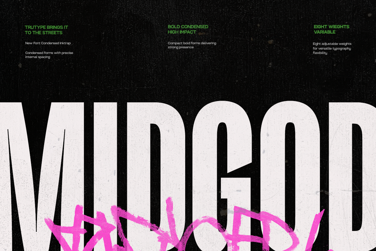
Type Mania's pair of Bootzy faces come at the distressed sans from two different angles. Bootzy TM is a tough display sans with three stylistic sets that shuffle automatically through OpenType, building in visual variety without manual work. Bootzy Condensed TM tightens the letterfit for headlines that need to run long and loud: flyers, zine covers, and anything carrying the DIY bootleg energy the font was named for. Both sit squarely in the punk and underground poster tradition.


Street culture built into three weights: Trackvia by Uncarving Nation is a font trio pulling from skate aesthetics, hand-style lettering, and urban mark-making. The set gives you range across different applications, from marker-rough to brush-driven. Built for branding and poster work where the brief has some concrete and no serif in it.

Graffiti meets display type in Crows by Any-Type Foundry. Irregular strokes, organic curves, and a hand-style that references the wall rather than the drawing board. It carries genuine urban energy without tipping into parody. Album art, festival branding, and editorial work that wants to feel like it belongs in a city rather than a studio.
Built directly from ink bleeding into paper, No Bones by Wingsart Studio is the most analogue-feeling typeface in this group. The texture lives inside the letterforms: you see the paper grain, the ink spread, the photocopy dropout. Wingsart developed it from skate branding and magazine editorial contexts, and it shows. Strong for zine work, gig flyers, horror-adjacent content, and anything that should feel like it was physically made.
Medieval structure distressed into something stranger: Fable Dust Typeface by Softulka takes blackletter-adjacent letterforms and applies a hand-inked, aged finish that references old manuscripts rather than punk flyers. The result is gothic grunge with fantasy and folklore overtones. Book covers, game design, horror branding, and editorial work with a dark or historical mood are where it earns its place.

If these eight don't cover it, there are more grunge fonts worth a look, and if texture is what you're actually after, plenty more grunge graphics and textures to dig through beyond just type.