The FIFA World Cup 2026 kicks off in June across the US, Mexico, and Canada, and this cycle is different. FIFA's official YouTube partnership gives creators direct access to match footage and every angle for custom content. TikTok is a preferred platform for streaming match segments. Brazil's CazéTV is streaming all 104 games alongside original creator content. The infrastructure for fan-made design work has never been more built out, and the audience for it has never been bigger.
That means a wave of work is coming: countdown posts, match-day graphics, fan merch, team branding for local clients, street posters, social content. FIFA's own visual identity this year is bold and design-forward, with each of the 16 host cities carrying its own distinct colour palette and motifs. The bar is high. Here are the assets that will help you clear it.
The grunge workhorse: Bootzy TM by Type Mania

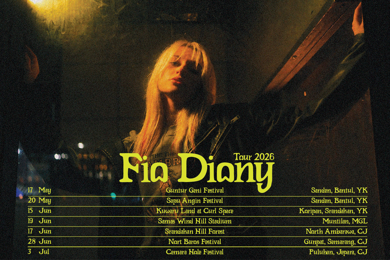
Fan culture doesn't do polished. Bootzy TM is a tough, eroded sans serif with three stylistic sets that shuffle glyphs automatically, so every headline lands with a slightly different character. Built for flyers and merch, it reads immediately at poster scale. If you're making anything that's meant to look like it came off a screen press or a wall, this is the font. There's more grunge fonts worth a look if you want to go deeper.
403 Neudron by 403TF: condensed and built to dominate

403 Neudron is a geometric condensed sans that's built for one thing: making headlines feel unavoidable. The tight proportions mean you can stack country names, match stats, or countdown numbers large and loud without losing structure. Clean enough for broadcast graphics, heavy enough for street-level poster work.
When the brief calls for maximum impact: Action Hero by Wingsart Studio

Action Hero is a hand-drawn brush font that pulls straight from the visual language of eighties and nineties action movie posters, which is exactly where fan merch aesthetics have been sitting lately. Grungy, textured, high-energy. Pair it with a national flag colour and you've got a tournament graphic that looks like it was designed by someone who actually cares about the game.
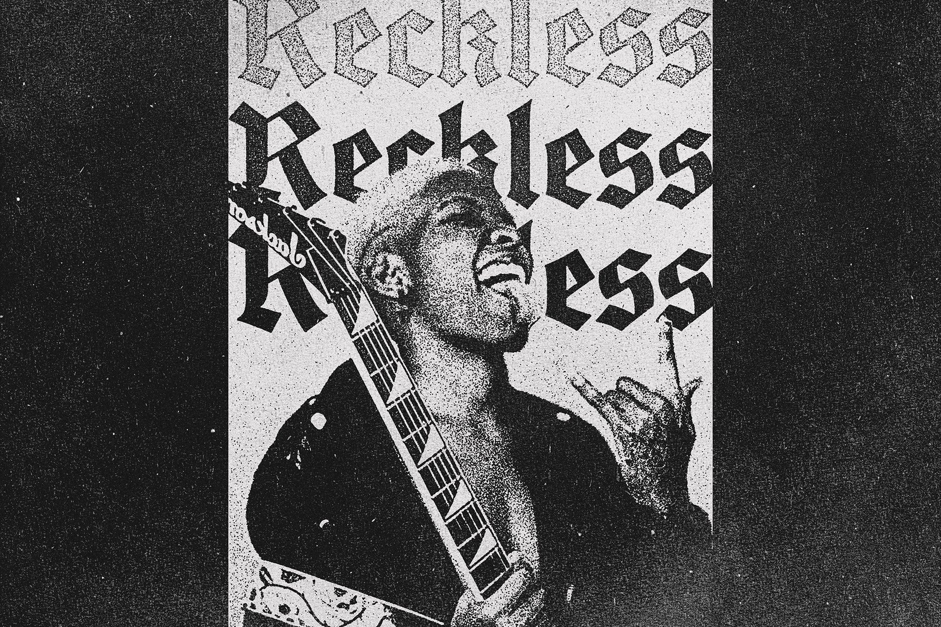
Brivela by Uncarving Nation

Street-facing World Cup content, supporter culture graphics, anything that needs to feel like it came from the terraces rather than a marketing team. Brivela is chunky, hand-sketched, and carries genuine tagger energy, the kind of letterforms you see on scarves, banners, and the backs of away-end seats. It does not look like it was made in a corporate design system, which is the point.
Five widths, one font: PC Merchis by Prioritype

Variable-width capability is underrated for sports content, where you're constantly adapting the same graphic across different formats and aspect ratios. PC Merchis runs from condensed to expanded across five widths, with a brutalist weight that holds up at any size. Good for social templates, merch layouts, and anywhere you need a single typographic system to do a lot of different jobs across a campaign.
96 Retro Wavy Backgrounds by Softulka

Ninety-six black and white op-art wave backgrounds, plus paper and dust textures, plus a bonus PSD template for fast application. This pack is the kind of thing that makes a basic countdown graphic look considered. The retro wave patterns read well behind bold type, give stadium-energy posters the right amount of visual noise, and are versatile enough to work across both print and social. There's plenty more poster-ready texture to dig through if you need it.
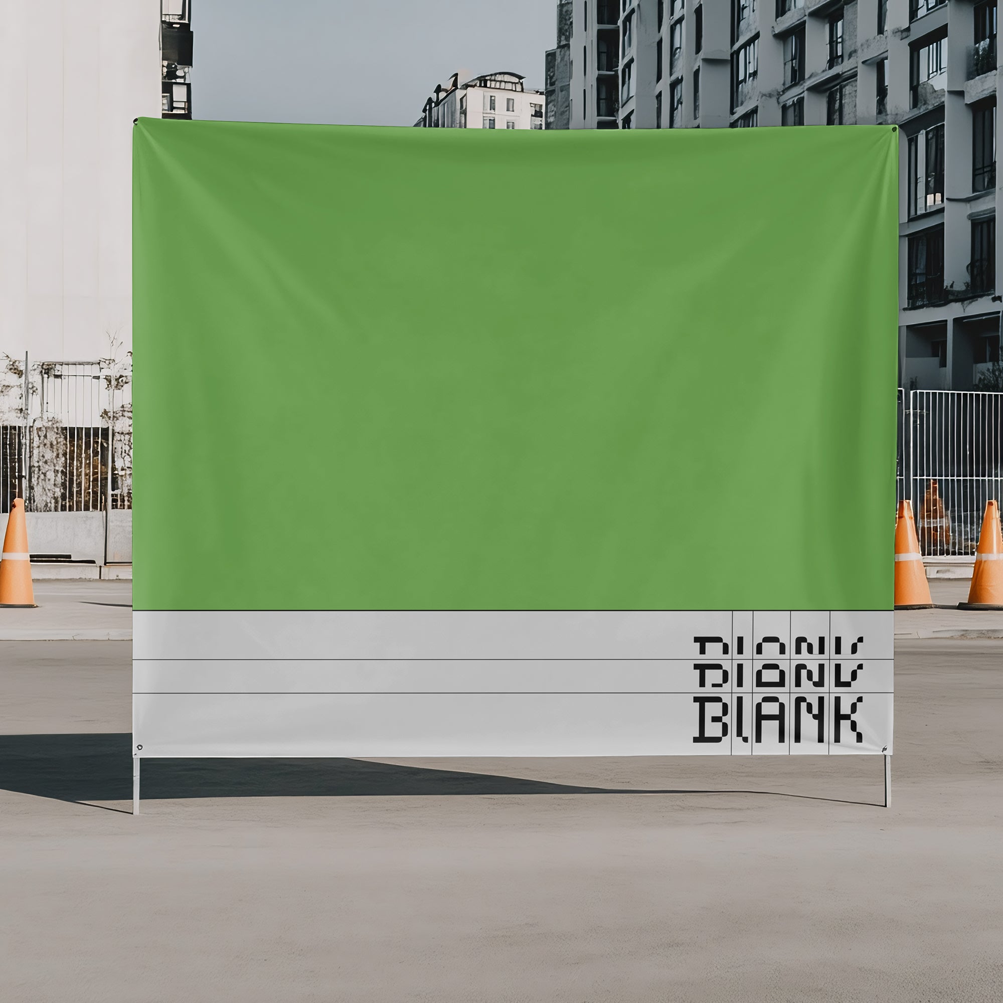
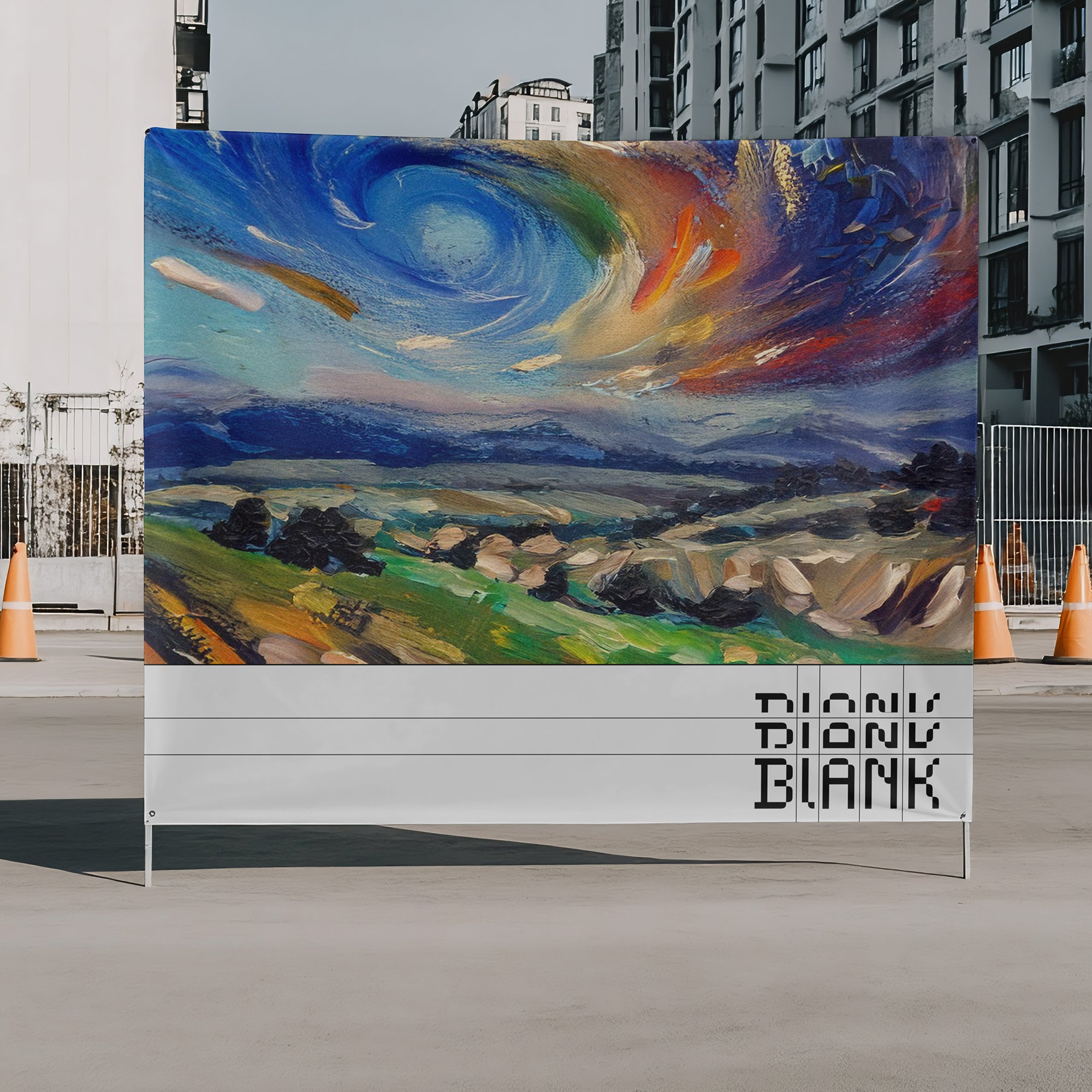
The presentation closer: Billboard PSD Mockup by Cruzada Supply

You've made something good. Now show it properly. This billboard mockup from Cruzada Supply puts your work into a photorealistic urban context, which is exactly where World Cup graphics are going to live: city streets, outdoor advertising, environmental placements. Useful for client presentations, portfolio documentation, and social process posts.
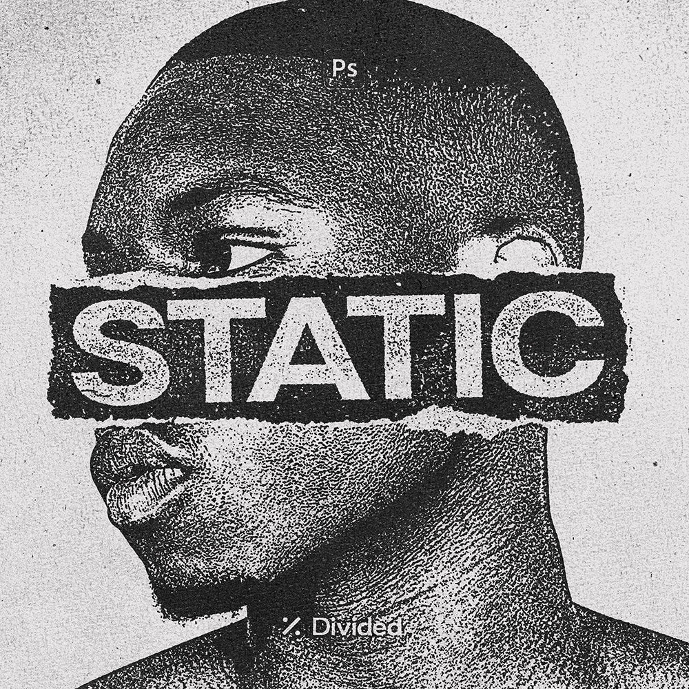
Marker by Studio 2am

A pack of ultra high-resolution permanent marker lines, scribbles, shapes, and hand-drawn letterforms that add the kind of raw, human mark-making that fan content thrives on. Marker is the layer between your polished type and a finished graphic that makes the whole thing feel like a person made it. Annotations, overlays, textures, rough framing elements. Everything that keeps World Cup content from looking like it came out of a template generator.