Eight new products across vectors, fonts, textures, effects, and graphics. Here's what landed this week and what's actually worth your attention.
Medieval Vectors by MiksKS

Over 400 vector elements pulled from historical sources spanning the medieval period through to the 19th century, including museum collections. The range covers ornamental frames, heraldic imagery, gothic lettering details, and illustrative flourishes that feel genuinely researched rather than surface-level costume. If you're doing any kind of heritage branding, dark merch, or poster work that needs historical weight, this is the kind of reference-backed asset pack that saves hours of illustration time.
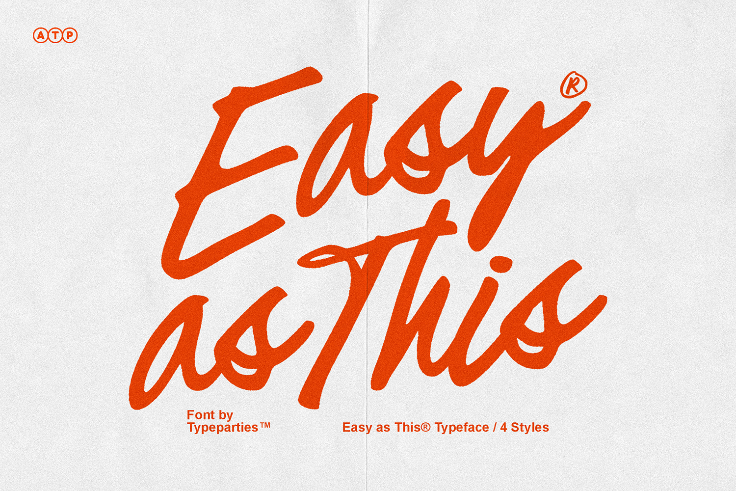
Casualte Alt by Typeparties
Chunky, condensed, and deliberately rough around the edges. The distortion baked into this display font reads like something that's been photocopied too many times in the best possible way, with a tension in the letterforms that makes it feel alive rather than just stylised. Strong candidate for poster headlines, streetwear graphics, or any brand identity that needs to look like it means business without being slick about it. There are more grunge fonts worth a look if this direction is where you're headed.
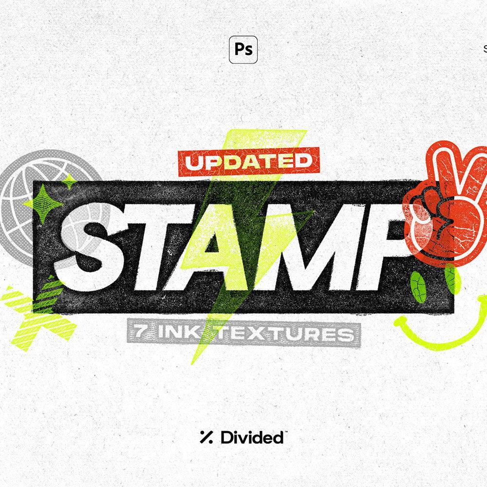
Vintage Paper Textures by MiksKS

Two hundred high-resolution scans sourced from aged books, old documents, and weathered paper stock, all delivered at 300ppi and 4000px wide. That's not a filler pack with twenty variations of the same beige sheet. The variety across foxing patterns, grain types, and tonal warmth means you're working with textures that behave differently depending on how you blend them. Solid foundation for anything that needs to feel tactile, worn, or like it predates the internet.
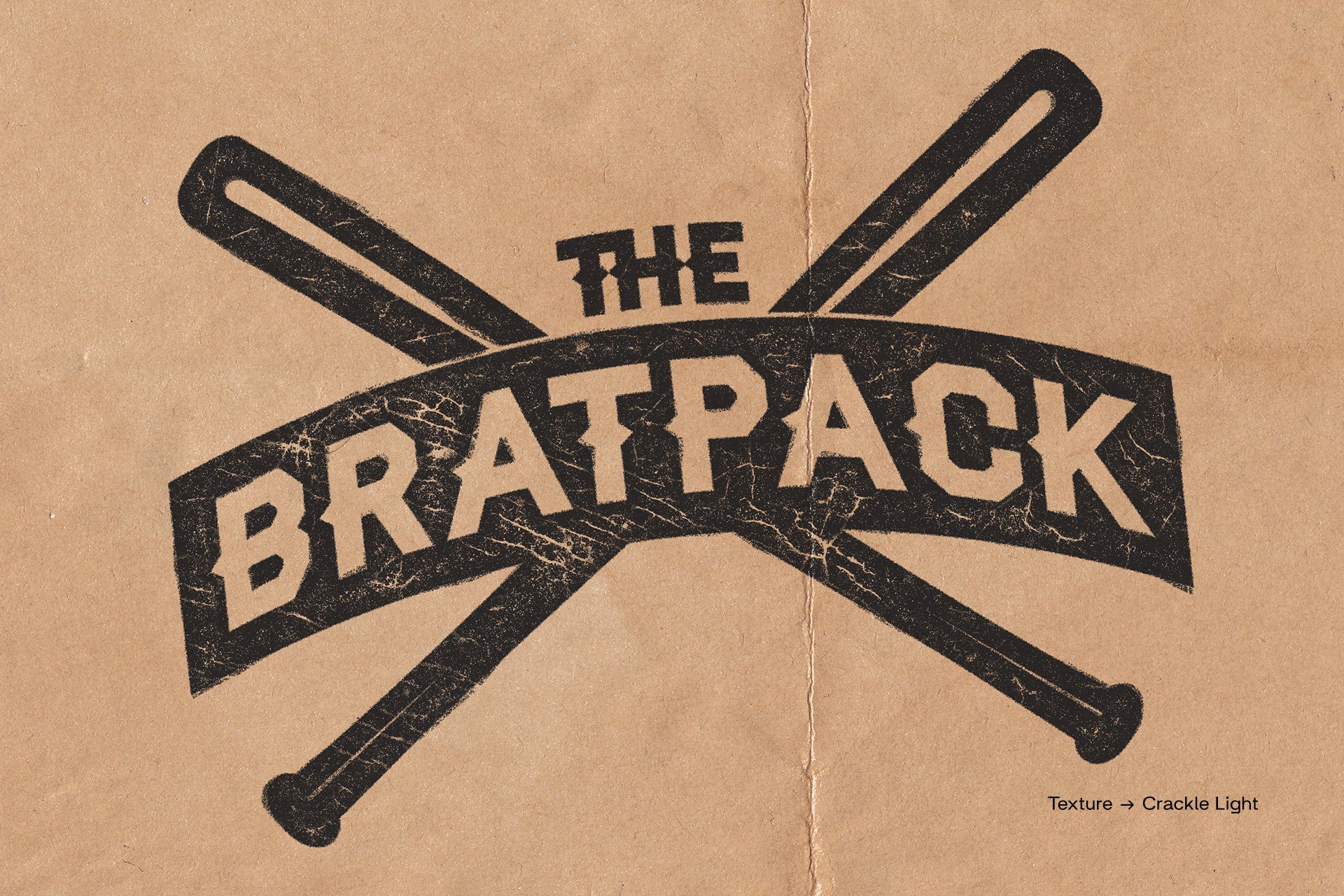
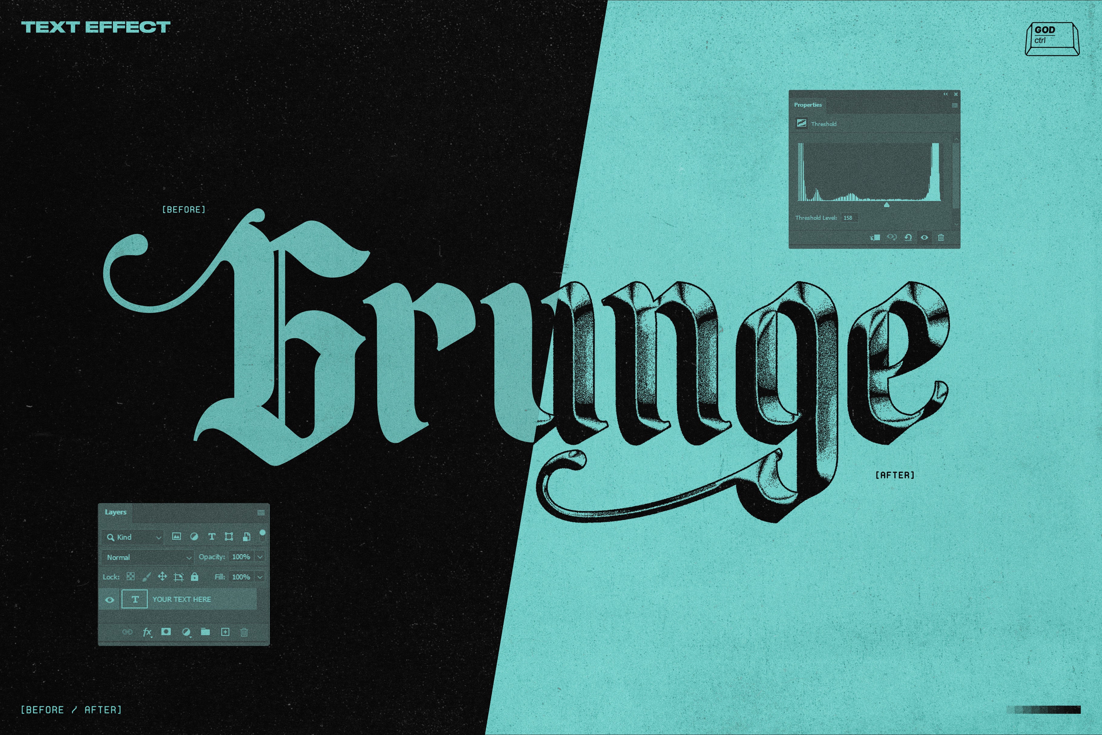
Grunge Halftone Photo Effect by Pixelbuddha
Drop a photo in, get back something that looks like it was reproduced on a dodgy xerox machine and then scanned from a zine. Coarse dot patterns, heavy shadow areas, and a worn paper surface that kills clean digital photography in a way that feels intentional rather than accidental. Works well for gig posters, album art, and social content that needs to look like it existed before smartphones did.
CS Amenity by Craft Supply Co
Rooted in uncial script, the kind of hand-lettering tradition that comes from medieval manuscripts and illuminated texts. CS Amenity takes that foundation and shapes it into something usable for contemporary branding, book covers, and editorial work where you need authority and atmosphere rather than neutrality. The gothic influence is controlled enough that it doesn't tip into novelty territory, which is the hard thing to get right with this style.
Kraft Paper Overlay Textures by Gromov Design

Six high-resolution kraft paper scans with real fibre structure, natural grain, and the kind of subtle imperfections that tell you immediately these weren't generated. Smaller pack than some of the others this week, but the focus is quality over quantity. These sit well over packaging mockups, editorial layouts, and brand identities where the analogue warmth of the material is part of the message. Plenty more textures to dig through if you need to mix and match.
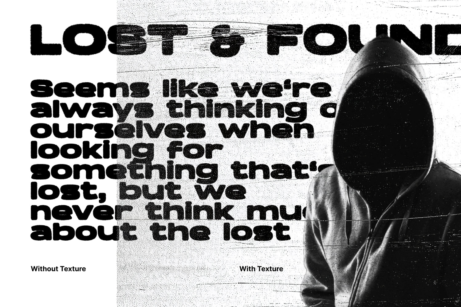
Retro Halftone Overlay Textures by Pixelbuddha
Ten overlay files with irregular dot patterns that break gradients into a noisy, screenprinted look. The multicolour options and faded paper tones give these a risograph or zine quality that's hard to fake convincingly by hand. If you're working on retro posters, music packaging, or anything with a seventies print sensibility, these add the kind of crunchy surface detail that makes flat digital work feel like it came off a real press.
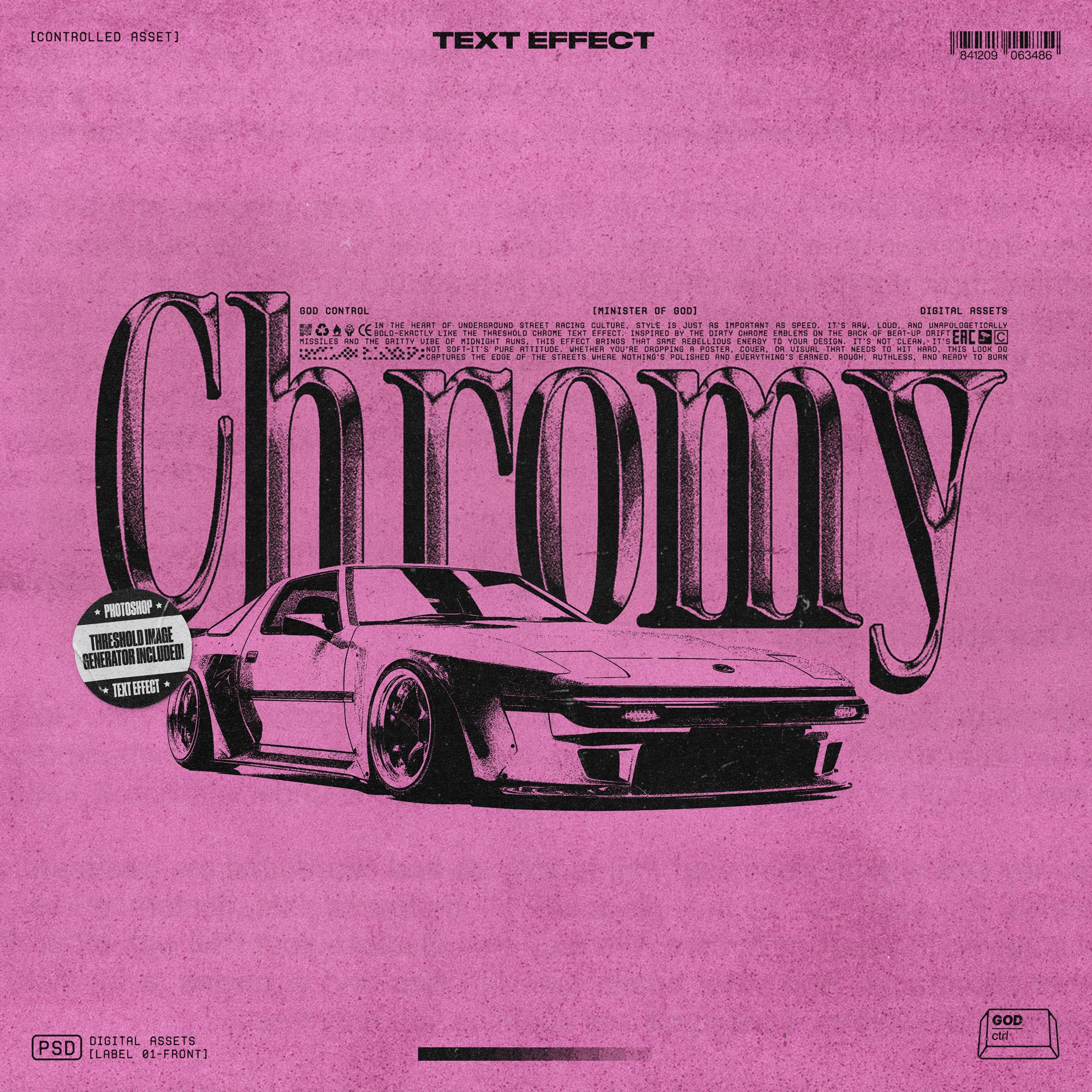
Textured Metal Text Effect by Matsero

A PSD template for chrome typography that covers cracked metal, liquid chrome, icy surfaces, and embossed finishes across the one file. The surface detail is dense enough to hold up at large scale, which matters when you're using this kind of treatment for posters or album covers where texture needs to read at a distance. The style sits in that current sweet spot between late nineties chrome nostalgia and the harder-edged aesthetic that's been moving through gaming and streetwear visuals for the past couple of years.