

The Grain Editor has two controls that matter when you build a texture brush: the two-finger invert gesture and the Scale slider. Every tutorial on this keyword covers both, usually with a before-and-after, and then stops. None of them explain why your finished brush still lays down flat and chalky after you've dialled those settings exactly as instructed. The settings were never the bottleneck. The source file was. The Grain Editor reads your imported image in greyscale and amplifies the tonal information already sitting in it. Hand it a file with no dark-to-light range and it has nothing to work with. It can read a scene; it cannot light one.
Think of the editor as an exposure, closer to a camera than a filter. If the physical history of the surface was captured properly, the editor exposes it beautifully. If the surface was photographed flat under a ceiling light, the editor just makes the flatness bigger. This is the whole skill that nobody talks about, so let's talk about it properly.
What separates a live grain source from a dead one
Three things decide whether a texture file will become a working brush. The first is tonal range. Open your source and look at it in greyscale. A good grain source carries genuine darks and genuine lights with a full spread in between, because those value shifts are the only thing the Grain Editor can read and translate into stroke texture. A phone photo of a napkin under even household lighting flattens that spread into a narrow grey band. You can push the sliders all day; there is no information there to pull apart.
The second is resolution, and specifically how clean the file is when you scale it. Grain lives in the fine detail, so when you push the Scale setting the editor magnifies whatever is in that detail. If the source is a heavily compressed JPEG, it magnifies the compression blocks too, and those read as a grid of soft square noise rather than fibre. A high-resolution scan downsamples cleanly and keeps its structure. A re-saved screenshot of someone else's texture falls apart the moment you enlarge it.
The third is physical history. Foxing, the brown age-spotting on old paper. Creasing that catches and holds shadow. Ink bleed where a letterpress plate pushed pigment into the fibre. Water staining with its hard tide-lines. These are the marks of an object that existed in the world and got handled, and they produce irregular, non-repeating tonal variation that no generated surface replicates convincingly. A filter-faked paper texture gives you an even, mathematically regular grain that the eye clocks as fake within one stroke. Designers are reaching for real scans right now for exactly this reason: scanned material reads differently on screen, and that difference is the physical history the scanner captured and a procedural filter never had.
Choosing a paper source the editor can read
The clearest example of a source shot correctly is Antiquarian Papers by Pixelbuddha. The sheets were pulled from real encyclopedias, ledgers and letterpress catalogues and scanned off the physical object, not reconstructed in a filter. That matters inside the Grain Editor because each sheet arrives carrying its own coffee staining, soft foxing, creased folds and torn edges, which is precisely the irregular dark-to-light variation the editor needs to build a stroke with depth. Load one of the warmer kraft sheets, drop the Scale right down, and the foxing and crease shadows become the grain structure of your ink. The brush gets a tooth that shifts across the stroke because the paper it came from was never uniform.

Run the same test on a flat generated paper texture and the failure is obvious. The generated file has its "damage" distributed evenly, so when the editor reads it there is no large-scale tonal event for the stroke to catch on. You get a consistent fizz with no character, the chalky look again. The Pixelbuddha scans work because a real ledger got old in a real way, and that irregularity survived the scan intact.
Sources that aren't paper fibre
Paper fibre is one kind of grain. There are others, and they produce brushes with completely different behaviour. Water Damaged Scans by h0vado are a set of 70 high-resolution PNG scans built around mottled, high-contrast staining. These behave very differently at the invert step than a clean paper scan does, because the tonal information is concentrated in big soft blooms and hard tide-lines instead of fine even fibre. Build a brush from one of these and you get something loose and wash-like, grain that pools and breaks the way watercolour settles. It's the source to reach for when you want a stroke that feels soaked rather than one that feels inked.

For the opposite character, the 50 Grainy Film Textures Frames Pack by züli gives you grain engineered for consistency. These are 4000x4000px film textures at 300dpi, and film grain is built to be even across the frame, so the tonal variation is fine and regular rather than clustered into physical damage. That evenness makes them the right source for airbrush and spray-style brushes, and for grain you want sitting over a gradient without any single area grabbing attention. Where the water scans give you incident, the film frames give you an even dusting. Match the source to the stroke you're chasing and half the calibration work is already done. For more on getting that grain to read as texture instead of a flat overlay, there's a piece on noise brushes that don't look like a filter worth reading alongside this.

Import and calibration at a working level
Once you've chosen a source, bring it in from Photos, Files or iCloud and place it as a grain layer, with its own Scale, Opacity and Blend Mode. You can stack more than one grain layer here, which is how you combine, say, a broad stain with a fine fibre.
The two-finger tap inverts the light and dark reading of the loaded source, and whether you use it comes down to whether you started from light paper or dark. On a white-ground scan the dark marks become your pigment and the white becomes empty stroke. Flip that logic and you need the invert. Black Paper Textures by Gromov Design make this concrete: these are dark-ground scans, speckled noise and natural grain sitting on black. Load one straight and the editor reads the black field as pigment and the speckles as holes, which is backwards for most inking. Two-finger tap and the whole relationship flips, so the speckles become your grain and the black becomes the gaps. Starting from a dark scan and inverting gives you a different speckle distribution than you'd ever get by inverting a white one, because the physical surface was lit and marked differently to begin with.

Scale controls the felt size of the grain inside the stroke without touching the source resolution, so you can take one scan and build a coarse version and a fine version of the same brush. The last piece is Stroke Path. Spacing and pressure response decide how the grain reads at light pressure versus heavy, and this is where most of a brush's feel gets tuned. The same source can break up into sparse tooth at a whisper and fill in solid under pressure, and dialling that curve is the difference between a brush that feels like a tool and one that feels like a stamp.
Brushes built through this exact pipeline, worth taking apart
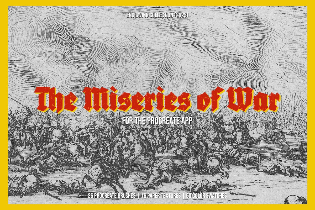
The fastest way to improve your own calibration is to study brushes that were clearly built this way. The Lithography Procreate Kit | Birds by Digi Life is built on Victorian engraving-era reference, drawing on the bird lithographs of Theo Van Hoytema. Lithography prints from a smooth stone or plate through the resistance of oil and water, so its grain is controlled and high-contrast in a way paper fibre never is. Study this kit for how tight the tonal control is: the grain holds its structure at small scale and never smears into mush, which is the signature of a printing-plate source handled carefully.

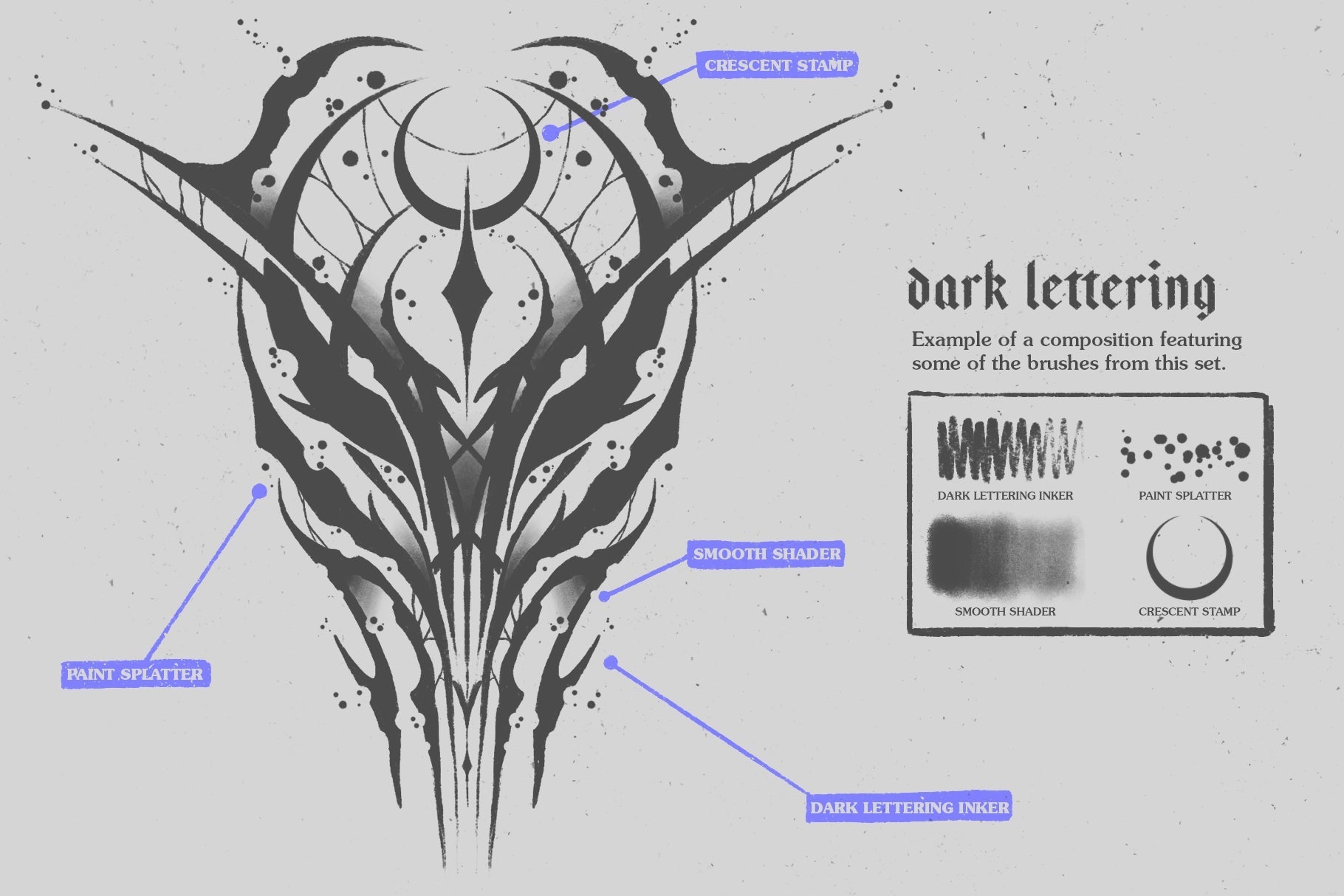
For grain that lives inside the ink itself, look at Chaos Procreate Brushes by MiksKS, 113 brushes organised into categories including a set of inkers, built around neo-tribal and cybersigilism mark-making. The texture in these brushes varies with pressure as part of the stroke, so the grain breathes with the line instead of sitting on top as a static overlay. Pull one apart in the Brush Studio to see how the Stroke Path curve was married to the grain source, because that marriage is the thing most home-built brushes get wrong.

For the full pipeline laid out across several brush types in one place, Distressed Brushes for Procreate by cd-design.co is the set to deconstruct. Thirty brushes: five distressed texture brushes, five liners, six halftones and five stipplers, each one a worked answer to the same grain-to-brush decisions this piece has been describing. Run them stroke by stroke and watch how the grain curve was tuned differently for a liner than for a halftone. If you want the wider layering picture around work like this, a guide to stacking paper and analog textures sits well next to it, and there's a broader round-up of Procreate packs that pull their weight if you want more to study.

Why the real scan wins
A brush built from a scan with genuine physical history carries a signature a generated brush cannot fake, because the grain came from an object that existed and got handled. The foxing on that ledger happened over decades. The tide-line in that water stain dried in one particular shape and never repeats. When you build from that material and tune the curve properly, every stroke carries a trace of it. The work doing the heavy lifting here is the scanning and the tuning: Pixelbuddha pulling real sheets off a flatbed, h0vado capturing the blooms at full resolution, cd-design.co marrying a grain curve to a liner. Credit the people who did that work, because their craft is the thing your brush is standing on, and no filter has lived long enough to match it.