Texture Is a Craft Decision, Not an Afterthought
Most designers treat texture as the last thing they do. You've got a poster looking a bit flat, so you drop a grunge overlay on top, knock the opacity down to 30%, and call it done. Sometimes that works. More often it produces something that looks vaguely textured rather than something that feels genuinely physical. There's a difference, and it shows.
The designers whose work actually holds up, the ones whose posters and covers look like they've been through something, are thinking about texture the same way they think about type hierarchy or colour relationships. Each layer has a job. The stack has a logic. And the result isn't "texture applied to design" but a piece where the surface and the content feel like they came from the same place.
What follows is how to build that kind of stack, using real texture packs that are worth your time, not the watermarked freebies you've been tolerating.
The Logic of Layering
Before you touch a blend mode, think about what you're actually trying to achieve. Texture stacking works because different textures operate at different visual frequencies. Heavy industrial corrosion sits in the low frequencies, big tonal shifts, dark marks, structural damage. Fine paper grain and film noise sit in the high frequencies, subtle surface detail that reads almost subliminally. When you mix them without thinking, they fight each other and the result looks muddy. When you build them in the right order, each layer adds something the others can't.
The general order that holds up across most projects: start with your base image or colour, bring in your heaviest structural texture mid-stack, layer organic or paper textures above that, then finish with light analog noise or film grain at the top. Think of it as geology. The coarse stuff is foundational, the fine stuff settles on top.
Blend modes are where most designers either get it right or waste an hour wondering why things look wrong. Multiply is your workhorse for dark textures on light backgrounds, paper, ink marks, burnt edges. It darkens by multiplying pixel values, so pure white in the texture layer disappears and the dark marks stay. Screen does the inverse, ideal for light film grain and halation effects. Overlay and Soft Light both push contrast and colour simultaneously, with Soft Light being the gentler option, useful when you want the texture to integrate rather than dominate. Luminosity is the underrated one: it applies the texture's tonal variation without touching the colour of your base layer at all, which is exactly what you want when you've worked hard on a colour grade and don't want a sepia-toned paper destroying it.
Opacity is obvious but worth saying anyway: texture at full opacity almost never looks good. The stack should feel cumulative, where no single layer is doing all the work. If you can point to one layer and say "that's where the texture is," you've probably over-committed to it. The goal is a surface that feels built up, not stamped on.
One more thing on order: heavier textures below, lighter above. If you put film grain under a heavy industrial layer, the grain gets buried. If you put the industrial texture on top of everything, it flattens whatever detail is below. The stack should read from coarse to fine as you move up through the layers.
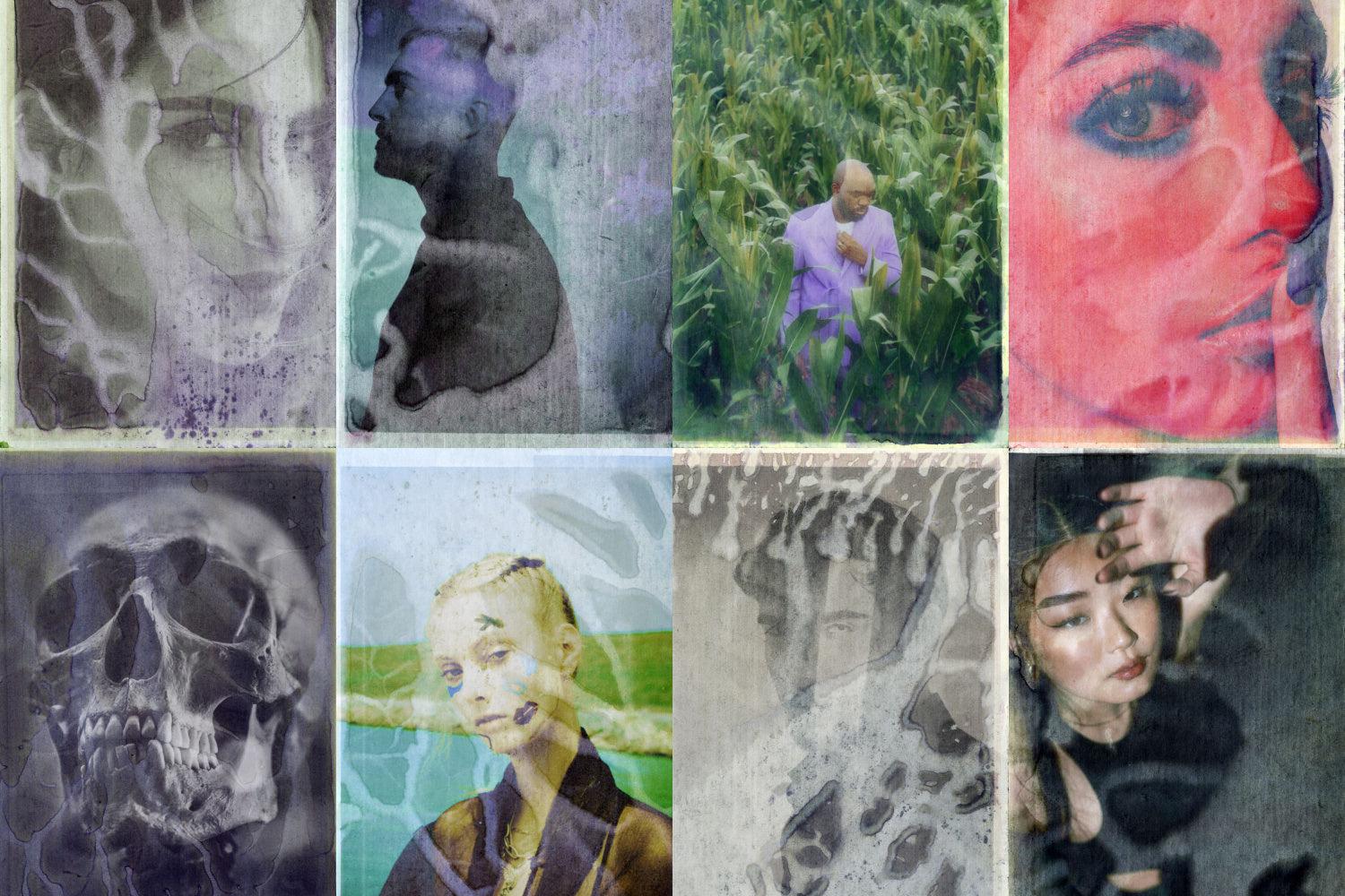
Texture Types and What They Each Do
Not all texture is the same thing. Grunge textures carry structural weight, dark marks, corrosion, erosion. They shift the tonal landscape of whatever they're applied to. Paper textures are about surface materiality, the weave, the tooth, the way light catches a physical substrate. Archival ink textures introduce the specific language of printed matter, offset bleed, ink spread, the ghosting of heavy coverage on absorbent stock. Scanned print textures bring registration drift, moiré, the slight unsharpness of physical reproduction. Bitmap and dither textures operate differently again, they're essentially a rendering system, converting gradients into dot patterns, and they carry a very specific cultural memory of early digital output and photocopied zines. Water damage textures add unpredictable organic movement, tide marks, staining, the kind of marks that happen to paper over decades. Plastic textures are the odd one out in a grunge stack but increasingly relevant for anything with a contemporary edge, shrink wrap and cellophane introduce a very different kind of surface tension. Analog film textures are the finest layer in most stacks, grain, halation, slight colour contamination.
Understanding what each type contributes means you can be deliberate about which ones you reach for and in what combination. A poster that wants to feel like it was pulled from a 1970s record crate needs archival ink and paper, not plastic. A streetwear graphic that wants to sit between nostalgia and digital needs bitmap dither layered over something organic. The texture pack you use matters less than understanding what job you're asking it to do.
The Packs Worth Using
Textexp's Bad Archive Printed Inks Texture is one of those packs that immediately tells you what it is. Fifty-five textures at 6000x9000px, all sourced from actual archival ink on paper from the 1960s. The character here is specific: washed-out, slightly cool, with the kind of uneven ink saturation you get when heavy coverage hits absorbent stock that's had sixty years to breathe. These aren't generic grunge marks. They read as printed matter, which is exactly what you want when you're building album artwork or editorial collage that needs to feel like it was retrieved rather than designed. In a stack, these work well in Multiply mid-layer, sitting between your base image and a finer paper texture above. The tonal variation is broad enough to add real structural weight without turning everything dark.

Paper textures are where a lot of designers underinvest, reaching for the first generic kraft scan they find. Pixelbuddha's Black Assemblage: Paper Textures is worth more attention than that. Forty JPGs across five distinct categories, subtle paper, cardboard, glued paper, distressed paper, and kraft, at 4500x3000px. The range matters because "paper texture" covers an enormous amount of ground. The glued paper category is particularly useful for collage work, the slightly raised, uneven surface reads as genuinely tactile. In Multiply or Soft Light, the darker versions add depth without the drama of an industrial grunge layer. These sit naturally in the upper-middle of a stack.
Züli's Print Scanned Textures Pack is built around a specific kind of imperfection: the artefacts of physical print reproduction. Four thousand by four thousand pixels at 300dpi, these carry the moiré, registration inconsistency, and tonal drift of scanned printed matter. Where archival ink textures give you the feel of the original print run, scanned print textures give you the feel of the copy, the photocopy, the scan of a scan. That's a different quality of degradation, and it's the right one for anything referencing the visual language of 90s zines, punk flyers, or early internet aesthetics. Overlay or Soft Light works well here, letting the registration noise do its thing without overwhelming the base.

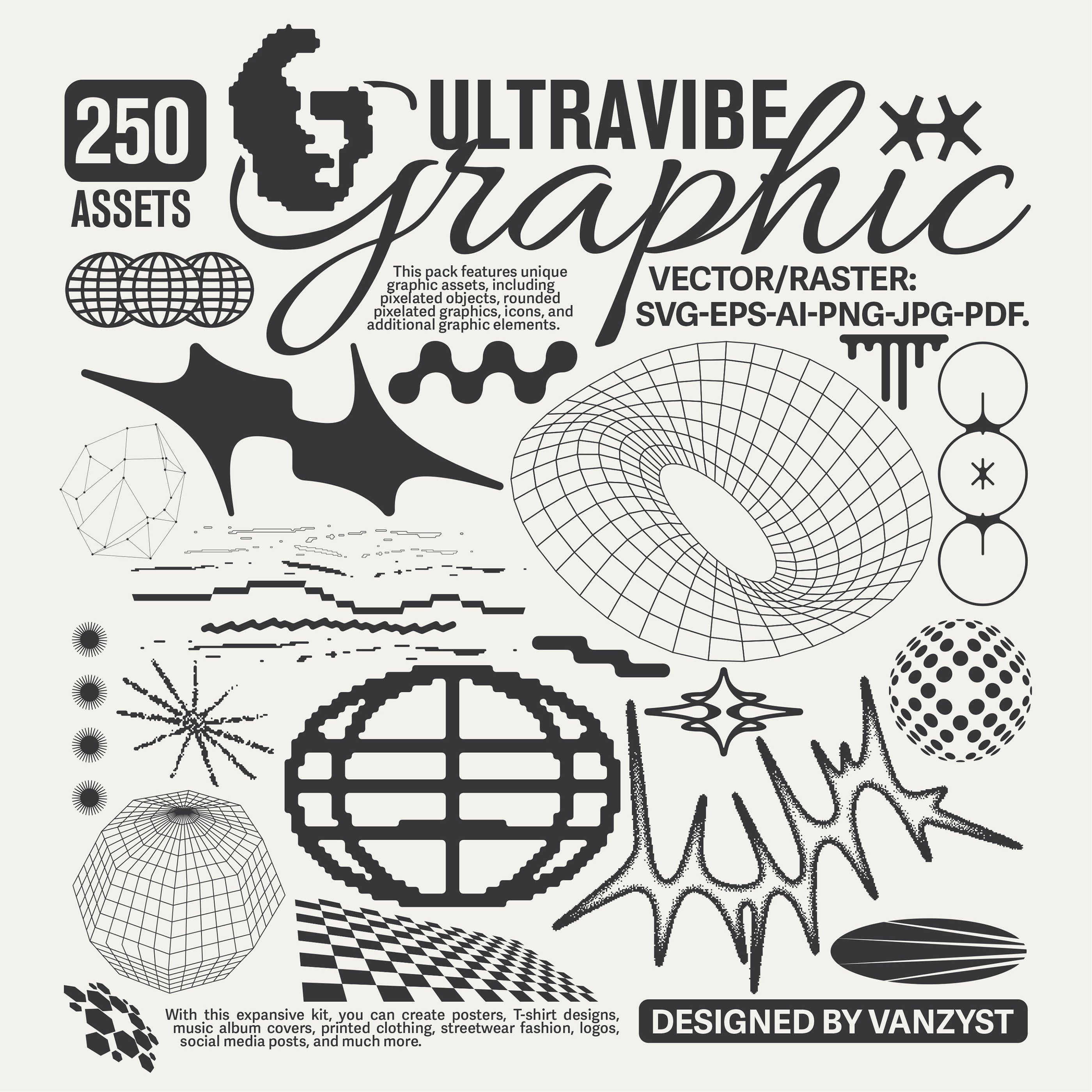
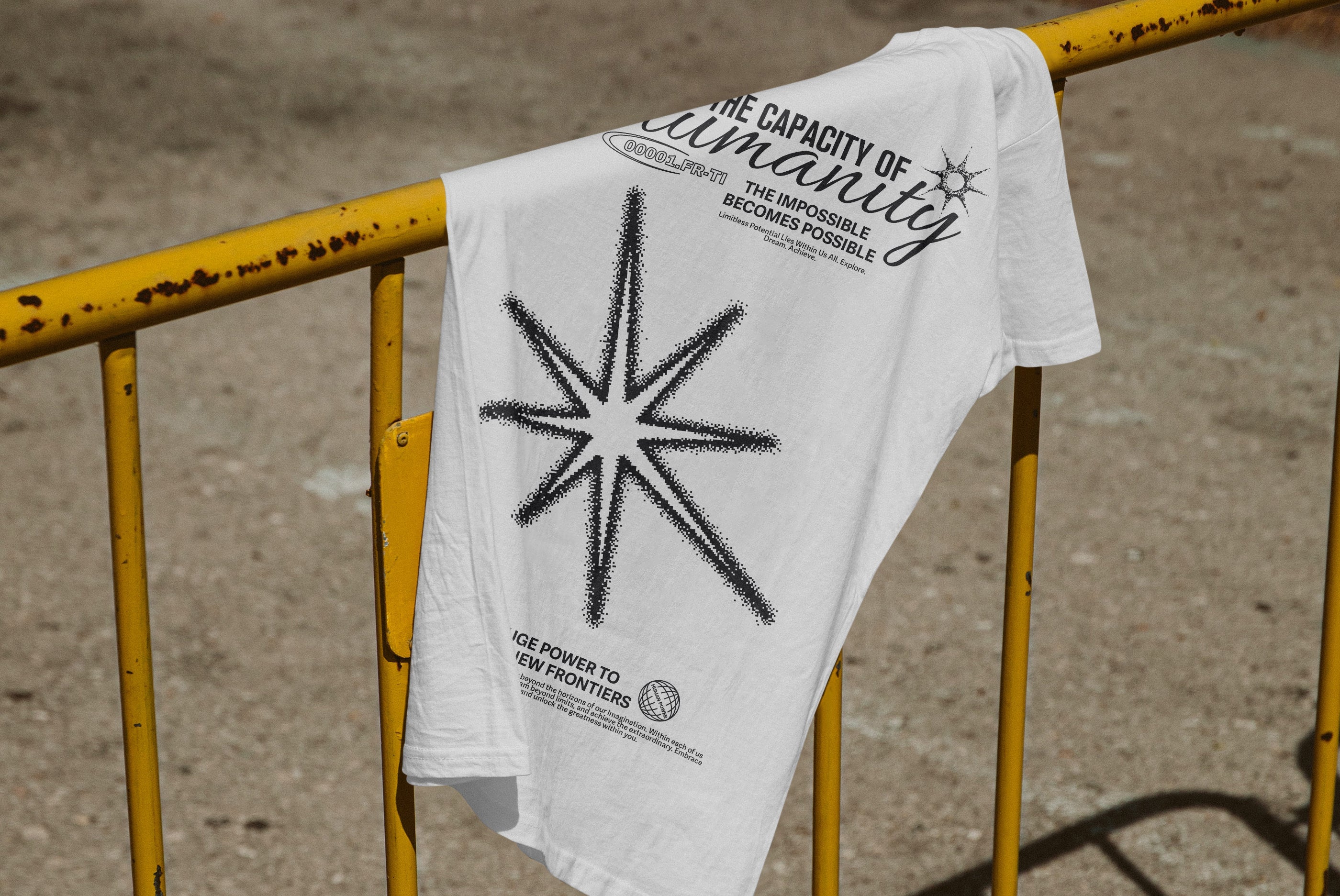
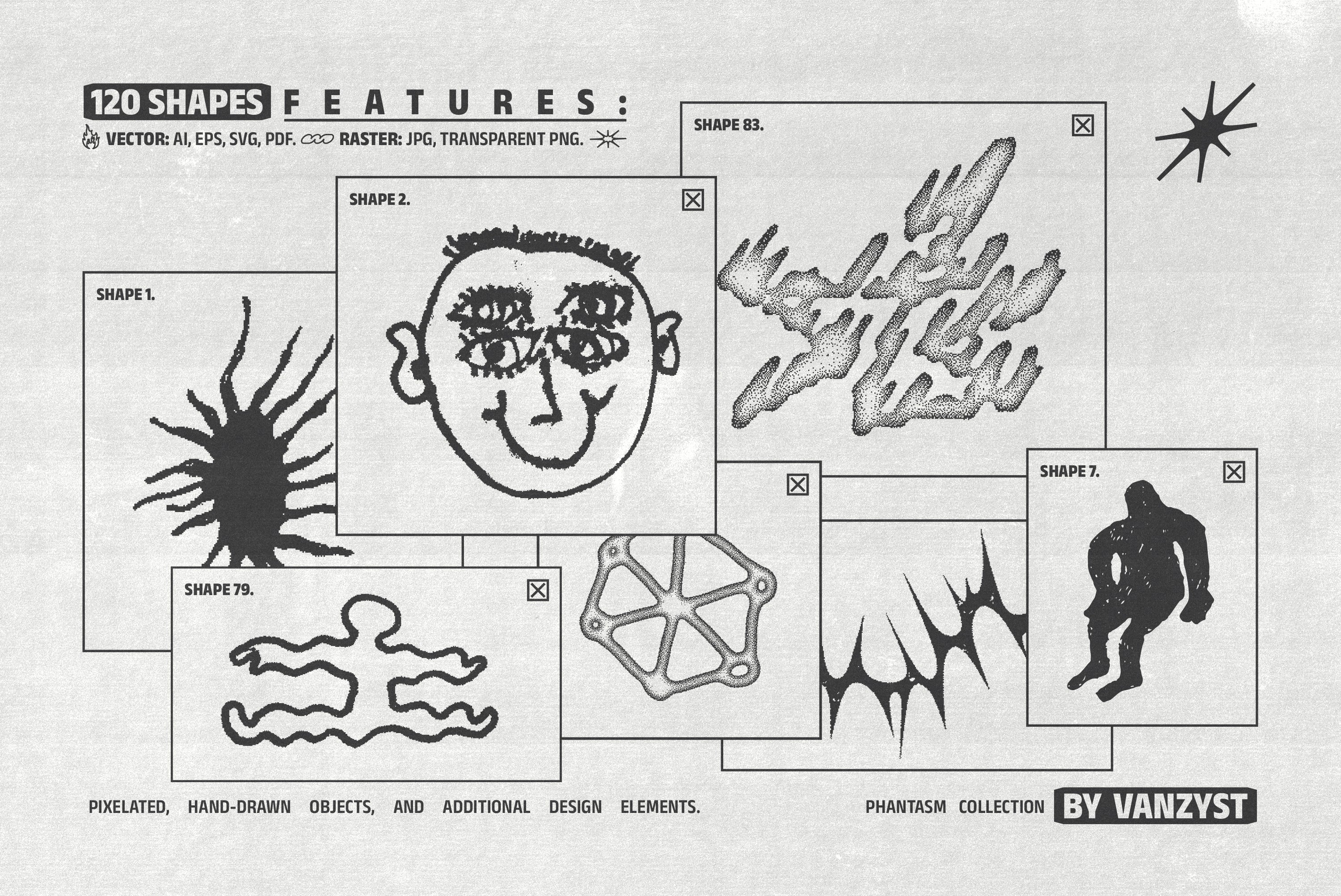
The 100 Bitmap Vector Textures from Vanzyst occupy genuinely different territory from the rest of this list. One hundred textures in AI, EPS, SVG, and PDF formats, plus 100 PNG files at 6000x8000px. The vector-native format is the key thing here: these are infinitely scalable bitmap and dither patterns, which means you can use them on large-format work without any resolution concerns. The aesthetic references early digital output, the dithering patterns of 8-bit graphics, halftone dot structures, pixel-grid degradation. In a Photoshop stack they work as a Screen or Overlay layer to introduce structured noise rather than organic randomness. They're also compatible with Illustrator, Figma, and Canva, and can be imported into Procreate as brushes, which makes them genuinely versatile. If you're into halftones, there's more where that came from.

h0vado's Water Damaged Scans are one of the more unusual offerings in this space. Seventy meticulously scanned PNG textures, all sourced from actual water-damaged paper. What makes these distinct is the movement in them: water damage creates tide marks, bloom, staining patterns that have a directionality and organic logic that purely grunge textures don't. The marks aren't random deterioration, they're the record of something that happened to the paper over time. In a stack, these work best in Multiply at moderate opacity, where they add a kind of melancholy weight that's hard to achieve with standard grunge marks. Particularly strong for anything with a muted, archival, or genuinely aged quality.

Sparrow's High Quality Plastic Textures Kit is the one that doesn't obviously belong in a grunge stack, and that's precisely why it's interesting. Fifty JPG and PNG files at 4000x4000px, photographed rather than scanned: plastic wraps, shrink wraps, bubble wrap, plastic bags. The visual language here is contemporary and slightly unsettling, the kind of surface you associate with packaging and product photography but pushed into a design context. In Screen or Soft Light over a dark base, the light refraction in the plastic creates a subtle iridescence. These are particularly strong for anything with a fashion or music-adjacent brief that wants to feel current rather than nostalgic, or for layering over a grunge stack as a finishing surface that cuts against the warmth of paper and ink below.

Züli's Analog Textures Pack is where you go for the top of the stack. One hundred and ten textures across four-plus styles at 300ppi, these are the film grain, light leak, and analog noise layers that unify a stack and make it feel like it came out of a single process rather than several different ones. The value of a good analog texture layer isn't that it's visible on its own, it's that it smooths the transitions between heavier layers below and gives the whole surface a coherent grain. Screen or Soft Light at low opacity, 15 to 25 percent, is usually all you need. Think of it as the varnish on the stack.

Rounding out the paper side of things, Pixelbuddha's Craftsman's Paper Textures Collection is a serious resource: 100 JPGs at 5000x3500px, each sourced from real paper materials, with both natural and black-and-white versions included. The dual-version approach is genuinely useful because it means you can choose between adding the paper's colour character or just its tonal variation. The black-and-white versions in Luminosity mode give you pure surface without any colour interference, which is exactly right when you've got a precise colour palette you don't want disturbed. The range within the pack is broad enough to cover everything from fine writing paper through to heavier craft stock. If you find yourself wanting more to work with, there are plenty more paper textures worth digging through.
Putting It Together
The temptation with a stack like this is to use everything at once. Don't. A good texture stack for most projects uses three to four layers, each doing a distinct job. Heavy structural texture mid-stack for tonal weight. An organic paper or ink layer above that for surface materiality. Analog noise or film grain at the top to unify everything. The plastic or bitmap layers are situational, reaching for them when the brief calls for something that cuts against the warmth of the organic layers below.
What you're building is a surface that feels like it has history, not a design that has a texture filter on it. The difference is in the thinking before you open the blend mode dropdown. Know what each layer is doing, know why it's in that position in the stack, and be willing to pull a layer entirely if it's not earning its place. Restraint is part of the craft too.