
The fixed-width grid did not start in a terminal. It started in a typewriter, where every key struck the same amount of horizontal space because the carriage had no other way to move. One unit per glyph, mechanically enforced, the i taking as much room as the m because a steel arm couldn't be asked to measure. The coding mono everyone reaches for today, the IDE default, the font inside your terminal window, is a direct descendant of that constraint. The lineage runs unbroken from a platen roller to a cursor blinking in a dark theme.
Most coverage of this keyword treats the two ends of that rope as separate species. Typewriter faces get filed under nostalgic branding; coding mono gets filed under tech branding. They are the same family, split only by a few decades and a change of machine. What makes right now interesting is that independent type designers are working both ends at once, warm analog grit and cold digital precision, often folded into a single typeface, because current editorial branding wants that tension on the page: something that reads handmade and engineered in the same breath.
Part of the pull is coming from software. A wave of design-led developer-tool brands, Vercel, Linear, Cursor, Raycast, Resend, PostHog among the names cited over and over, adopted monospace as a deliberate brand signal, and that signal leaked outward. Designers who follow those companies absorbed the visual language, the command-line simplicity, the high-contrast layouts that echo a terminal window, and started applying it to magazines, packaging and zines. At the same time, the oldest end of the same lineage came back: the analog typewriter face, the drafting-table texture, the look of a machine you can hear. That return runs alongside the tech wave, not against it, both of them part of a broader reach toward visible human craft and away from generated sameness.
The generic version of this topic sends you to the same six free system fonts every time. What follows is a walk along the full spectrum, from the rawest analog end to pixels on a screen, built by hand by eight different independent studios.
Typegrit Rustic Typewriter Font, Vadova Studio
Ink that pooled in the bowl of an e. A serif that printed heavier on the left because the ribbon was wearing thin on the right. Typegrit by Vadova Studio is built from exactly those accidents, a rugged serif that carries the distressed texture and irregular letterforms of a real vintage machine. It reads warm and journalistic, the kind of face you want behind a crime documentary title card or a memoir cover. This is the proof that the lineage never began in precision at all. Fixed width was a mechanical limitation that happened to look good, and Typegrit leans into the look instead of cleaning it up. It sits comfortably across zine layouts, book covers, poetry collections, newspaper-style spreads and heritage product branding. Supplied in TTF, OTF and WOFF.

Rochilo, Say Studio
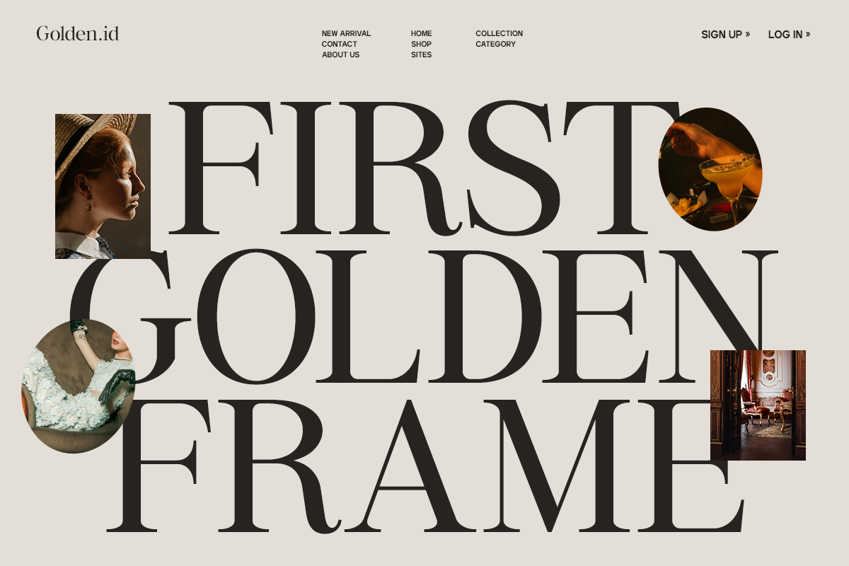
Take that same typewriter heritage and run it through a fashion-editorial filter, and you get something closer to Rochilo by Say Studio. The mechanical edge is still there in the slab characteristics and the slightly machined terminals, but the proportions are elegant and the stylistic ligatures give it room to perform on a cover line. Typewriter-inspired type can arrive polished. Rochilo can carry packaging, high-end branding and fashion editorial with real composure. It ships with Regular and Italic styles, stylistic ligatures, full uppercase and lowercase, numbers, symbols, punctuation and multilingual support, in OTF, TTF and WOFF. If you're weighing it against softer serifs for premium work, our notes on elegant fonts for high-end branding cover that territory in more depth.

Zine TM, Type Mania
Nostalgia usually runs in a straight line, backwards. Zine TM by Type Mania bends it. The distortion here isn't inherited wear from an old machine; it's drawn into the DNA on purpose, a deliberate warp that gives the face an edge a clean typewriter revival never has. That register, personality over politeness, is what a gig poster, an underground zine or an editorial credits block is after. The character set covers Basic Latin, Western European, Euro, Central European and Pan African Latin, totalling 193 glyphs, supplied in OTF, TTF and WOFF2. It's a Studio 2am staff pick, and it earns it. For more in this lo-fi, roughed-up vein, there are more grunge fonts for poster work.

Diorama Mono, Blank Studio
Here is where the two ends of the rope meet in a single face. Diorama Mono by Blank Studio is a true monospaced typeface, uniform spacing and all, that openly carries vintage typewriter aesthetics into a modern, minimalist structure. Subtle serif details keep it from reading sterile; the fixed-width precision keeps it disciplined. One typeface, built on the grid, that still visibly remembers where the grid came from. That double citizenship is the point: it holds up in editorial design, branding and a coding interface with equal confidence. For the structural breakdown of why a mono like this reads as considered rather than decorative, we went deep in what makes a monospace font work beyond looking like code.

Rigidon Mono, RASIO STD
Push further toward structure and the serif detailing starts doing editorial work. Rigidon Mono by RASIO STD is a high-contrast serif monospace with prominent serifs, rounded letterforms and a distinctive curved accent on the lowercase g that gives the whole thing a signature. The consistent spacing supplies a technical rhythm; the serifs keep it warm enough to set a headline that wants to announce itself as deliberate. This is the one for a masthead, a fashion identity or a magazine title that needs to feel engineered and designed at once. It positions itself across editorial layouts, fashion branding, creative portfolios, packaging and visual identities, and ships in OTF, TTF and WOFF.

403 Obrinda, 403TF
No typeface on this walk states the thesis more plainly than its own maker does. 403 Obrinda by 403TF is positioned as a tribute to the golden age of typewriters reimagined for the digital frontier, which is the lineage argument in a single sentence. Robust serifs and clean architecture give it a structured rhythm; mechanical precision is paired with a humanistic warmth instead of the usual flat fixed-width uniformity. Confident serifs ground it in a heritage of utility and trust, while small design quirks keep its voice approachable. If you want to see how slab-heavy faces hold their nerve at real sizes, our piece on slab serifs that survive signage and shipping is worth a look.

Gubero Mono, Ragamkata Studio
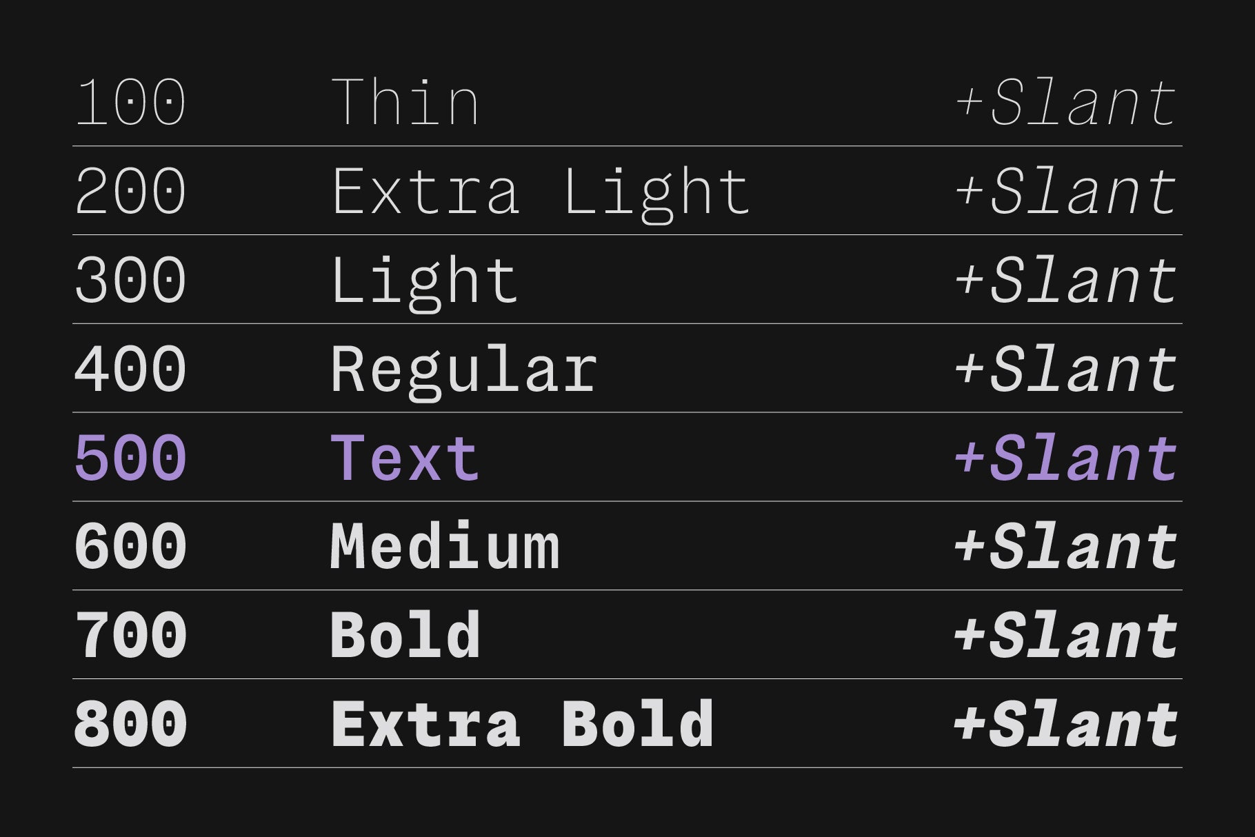
And here the lineage grows up and moves into software. Gubero Mono by Ragamkata Studio is a bold monospace with geometric letterforms, clean proportions and slab-inspired terminals, drawn loud and confident where the earlier faces were quiet and warm. Its maker points it straight at futuristic interfaces, startup identities, AI branding, coding-inspired graphics and UI work, which is the terminal-native end of the family tree. Stylistic alternates and ligatures give it range for expressive headline settings; Regular and Italic styles cover the working set, in OTF, TTF and WOFF. This is the register that developer-tool branding made mainstream, and if that's the exact job you're briefing, our rundown of monospace fonts for tech and UI branding beyond the usual six stays on that angle the whole way through.

CS Robert Mono, Craft Supply Co
The furthest point on the spectrum skips the machine entirely and renders the idea as literal pixels. CS Robert Mono by Craft Supply Co builds every character from small square pixels set to equal width, a display face that reaches past the typewriter toward early computer interfaces and 8-bit games, playful and gridded and sharp. The same fixed-width logic that once came from a steel carriage returning to the start of a line now arrives as glowing squares on a screen, nostalgic for a different machine entirely, still the same single idea underneath. The grid began as a limitation a typist couldn't argue with, and it ends here as a look designers choose on purpose, which is the lineage completing itself.