
Every asset in a drop comes from somewhere, and this week that somewhere splits cleanly down the middle. Half of these products pulled their material out of a real, named, dated place: a US government case file, a 1530 Italian pattern book, the mark-making of an 18th-century Dutch engraver who has been dead for two centuries. The other half built their material out of a system: a grid pushed past comfort, a distortion algorithm, a simulation of what happens when ink meets a bad press run. One camp shows you its sources. The other shows you its working. Both can hand you receipts, which is the one thing statistical averaging can never do.
Unclassified Texture Pack by Disrupted Studio
Disrupted Studio has made a habit of raiding the archives, and Unclassified is their most forensic haul yet: 243 case-file papers scanned from genuine US National Archives records, public domain, with every letterhead and agency name stripped out before release. The breakdown reads like an evidence log. Sixty-nine office papers, 64 onionskin carbon copies split evenly between colour and high-contrast, 94 microfilm pages and 16 manila envelopes. High-res JPGs run up to 3,479 x 5,648px, and the whole thing ships with a source list naming the archive record and page for every single file. That paper trail is what makes the redaction feel earned rather than styled on. Drop these under a poster, an album cover, a zine spread or a merch graphic and the grime has provenance behind it.

Colophon Graphics Pack by Disrupted Studio
Five centuries of printers' marks and ornament, cut from real old books, packed into 1,370 pieces. Colophon is a history of the first logos in one download: 161 printers' marks, including work from Aldus and the Kelmscott Press, plus 89 moresques redrawn from Francesco Pellegrino's 1530 pattern book. There are 23 head-pieces and 29 tail-pieces from early printers, 14 pointing hands, 182 Aubrey Beardsley panels, 137 of his grotesques and 12 Burne-Jones panels. Then 650 smaller pictures on top, emblems, animals, ships, coaches, arms and crowns, frames, flowers, people. For book covers, album art and branding marks that need to read as hand-printed rather than keyed in, this is the deepest well going. If you grabbed their 500-year-old book covers from last week, this is the ornament that belongs on them.

Cornelis Bogerts Procreate Kit by Digi Life
Cornelis Bogerts (1745-1817) was a Dutch draughtsman, engraver, etcher and lithographer, and this is the purest statement of the sourced-from-a-real-place position in the whole drop: a specific dead craftsman's mark-making, rebuilt stroke-logic by stroke-logic for Procreate. The kit is the third issue in Digi Life's ongoing Engraving Collection, which keeps turning historical printmakers into working digital tools. You get 30 brushes in .brush and .brushset formats, 120 colour swatches, 10 paper textures as PNGs, with output at 4,606 x 6,260px and 300dpi. It is built for hatching, cross-hatching and engraving linework, the slow kind of shading that takes patience, and it comes with a Spotify playlist to sketch to while you put the hours in.

VT Pistachio Matcha by Viactiontype Studio
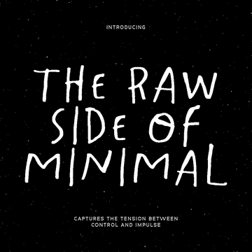
Here is the hinge between the two camps. Pistachio Matcha from Viactiontype Studio takes its cue from the messy, carefree handwriting of kids scribbling on paper, so a human hand is its source, but it arrives as a proper font system with three engineered styles: Regular, Bold and Rough. The letterforms are irregular on purpose, the shapes imperfect, the strokes spontaneous. It is the rare display face that stays charming at size without tipping into twee, which makes it a strong call for playful branding, packaging and poster work that wants warmth without a saccharine aftertaste. Pair the Rough style with a distress effect and it reads like it was written in crayon and photocopied forty times.

403 KRAG by 403TF
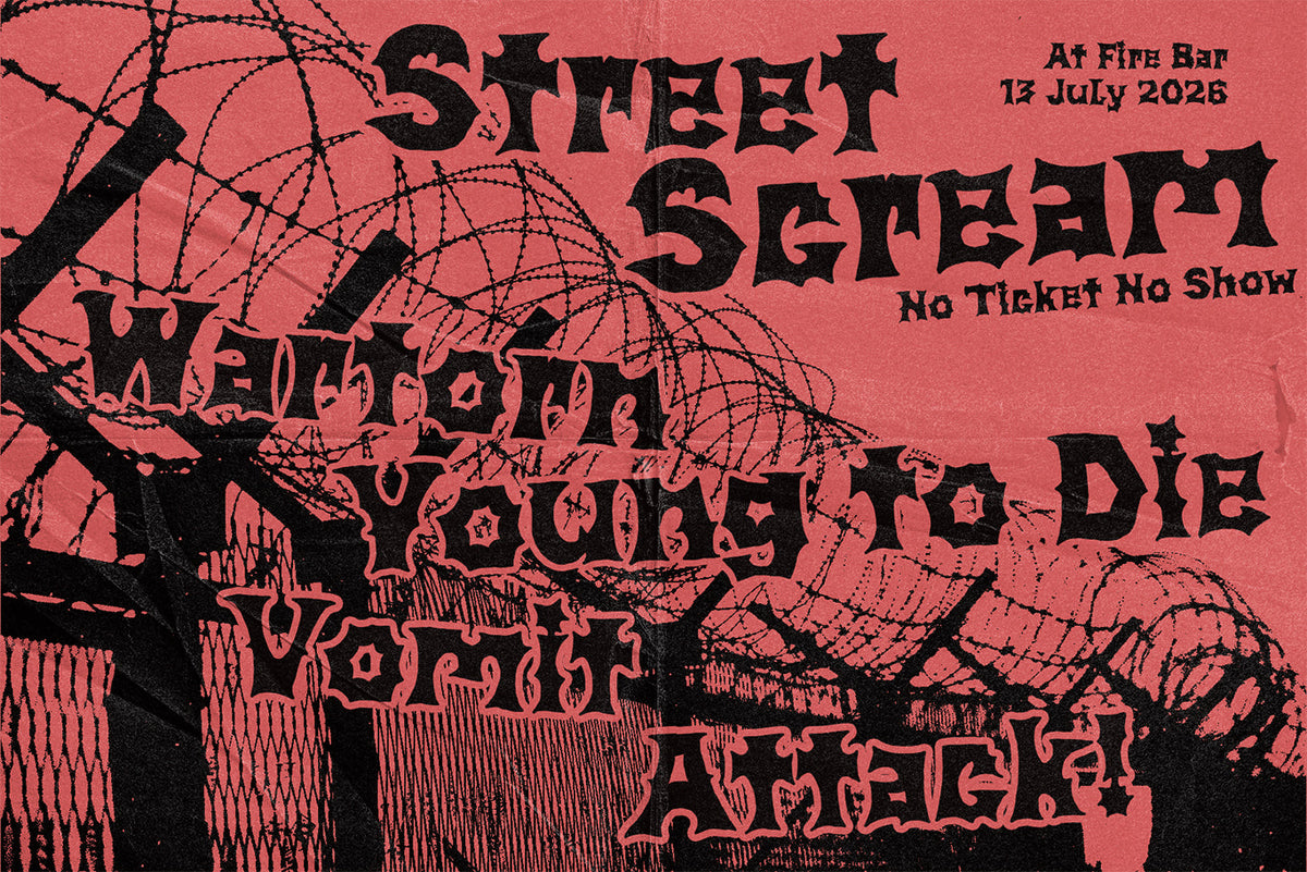
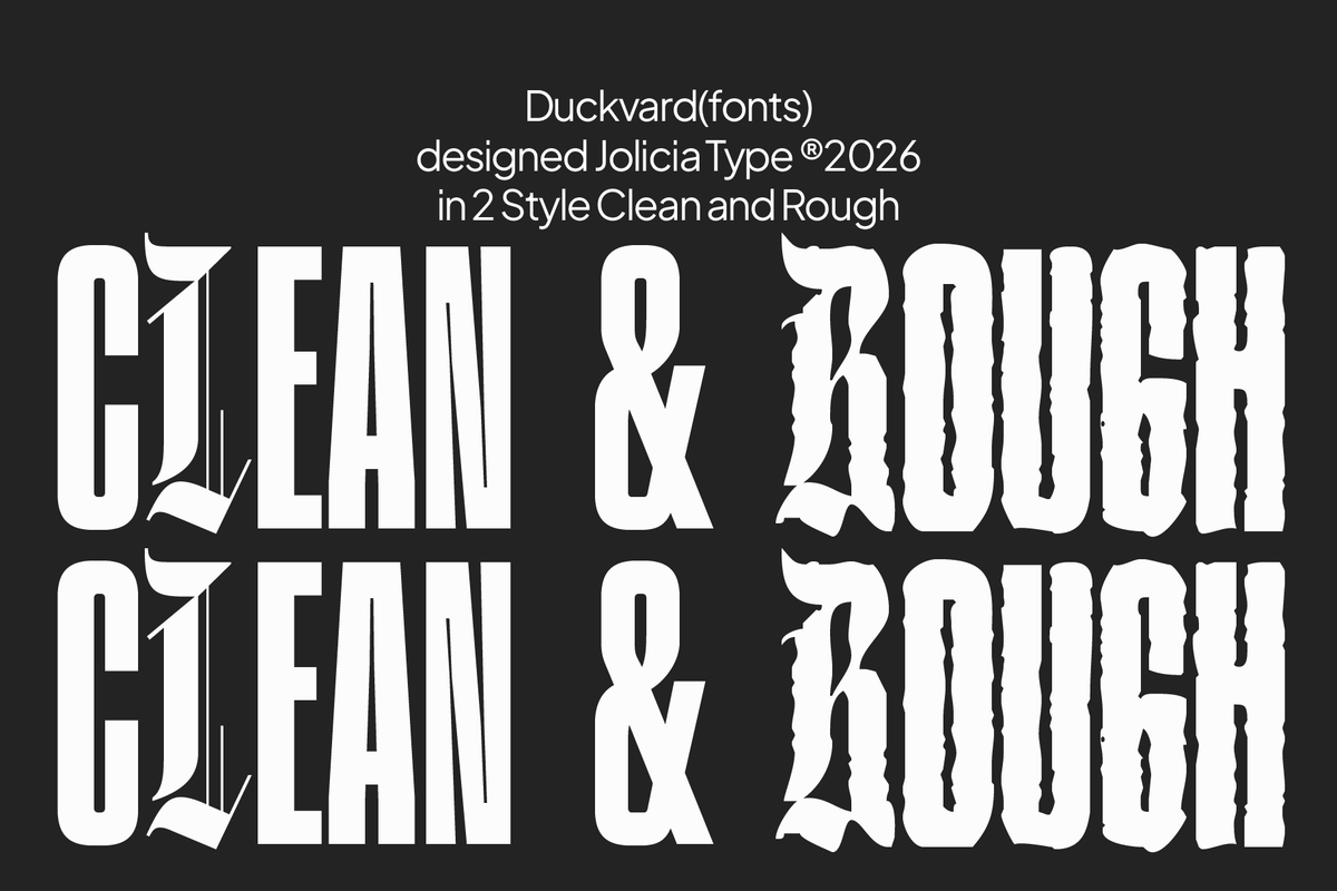
No source material anywhere in sight. 403 KRAG from 403TF is construction logic taken to the limit: a variable brutalist sans built on an architectural grid, wide and uncompromising in its default geometry, drawing on brutalist buildings and heavy machinery instead of any historical letterform. It ships as a true multi-axis system of 27 distinct styles, with width and slant control for everything from condensed to ultra-wide, plus slant and backslant. This is a face you drive rather than set, dialling the axes until the word hits the exact weight the layout needs. For branding, posters, streetwear and large-format identity work, it has the kind of presence that holds a wall. Filed next to more sharp brutalist type if that is your register.

Glitch CTR Screen Text Effect by Catalystco Studio
Lime-green illumination burning against black, typography shredded into fragmented vertical lines and bent through horizontal wave distortion. The Glitch CTR Screen Text Effect from Catalystco Studio is a layered PSD at 3000 x 3000px and 300dpi, smart-object based so you swap your lettering in and the interference wraps around it instantly. The damage here is simulated through a distortion system built from scratch, a cathode-ray breakdown with no cathode ray anywhere near it. Built for cyberpunk artwork, gaming posters, electronic music covers and tech branding, it sits comfortably alongside more glitch fonts and graphics when you want the whole piece to flicker.

Damaged Print Effect by Pixelbuddha
This one occupies a curious middle ground: engineered in Photoshop, but engineered specifically to fake a real physical process. Damaged Print Effect from Pixelbuddha renders lettering and logos as worn, cracked print, with ink flaking, peeling and scratching along every stroke as though the piece survived a rough press run. Drop your artwork into the Smart Object and the decay follows your shapes; an invert option flips it between white ink on black and black on white. It is a 4500 x 3000px PSD at 300dpi, and it earns its keep on band lettering, gig posters, streetwear graphics, apparel prints and merch art. If you liked the screen-print cracks from drop #47, this is the same instinct taken further.

Store Sign Mockup by Brandearth Studio
Wherever your asset came from, archival scan or engineered system, it eventually has to stand on a wall in front of a client. The Store Sign Mockup from Brandearth Studio is where that test happens: raised dimensional lettering and a geometric logo mounted on a dark exterior facade, shot in realistic architectural perspective with natural daylight and soft shadows. Three fully editable PSD files at 4000 x 3000px and 300dpi, Smart Object replacement, multiple scenes to choose from. Mount a brutalist wordmark here and the geometry reads as serious; mount a hand-drawn mark and the warmth survives the jump to daylight. Either way, the storefront tells you whether the design holds.