




This week's intake reads like someone raided three different type conferences at once. You've got Craft Supply Co swinging in with a bold, funk-leaning sans that wouldn't look out of place on a 1974 record sleeve, and by the other end of the list you're deep in hand-inked beauty italics with swashes for days. In between: a stencil face built for something closer to sci-fi packaging than print, and a luxury branding font with the kind of restraint you only get from someone who understands negative space. Add a print-damage effect pack and a mockup so quiet it barely announces itself, and that's the shape of this week's new font releases and drops.
Fulcher, and starting loud on purpose
Fulcher doesn't ease you in. Craft Supply Co has built a bold sans with rounded terminals and a real sense of weight distribution, the kind of face that reads corporate at a glance until you notice the funk in the letterforms, the slight swagger in how the counters sit. It's built for logotypes and headline work where you need something confident but not sterile, think DTC brand refreshes, packaging that wants a bit of 70s warmth without going full pastiche. If you're doing identity work for a client who wants "bold but still professional," this solves that brief better than most.

The Daily Midtones, ornamentation with intent
Amorfatype Studios has clearly spent time studying what makes editorial serifs feel expensive rather than just decorative. The Daily Midtones leans into art-deco-adjacent curves and refined ornamentation without tipping into kitsch, which is a harder balance than it sounds. This is a magazine masthead font, a fashion logotype font, the kind of face you reach for when a beauty or boutique client wants "elegant" but means it. Pair it with generous tracking and it does a lot of the heavy lifting on its own.

Lineres and the art of looking unplanned
Handwritten fonts live or die on whether the imperfection feels earned or engineered, and Typeparties has nailed the former with Lineres. The strokes wobble just enough, the baseline drifts the way real handwriting does when someone's actually in a hurry, and the result reads as confident rather than sloppy. Good for packaging call-outs, social content that needs a human voice, any brand trying to sound like a person and not a press release. It's loose without being illegible, which is the whole trick.

Timeline, for briefs that say "romantic" and mean it
Every studio eventually gets the wedding stationery brief, or the skincare launch that wants to feel like a love letter. Say Studio's Timeline is built for exactly that moment: flowing swashes, a proper italic slant, and enough restraint in the base letterforms that it doesn't tip into novelty. Use it sparingly on packaging or lean into the full swash set for invitations and editorial spreads where the type itself needs to carry the mood.

Retro Misprint, when clean isn't the point
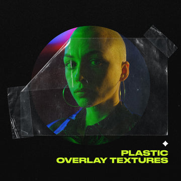
Not everything needs to be pixel-perfect, and Matsero's Retro Misprint Typography Text Effect pack understands that better than most effect libraries. Built around offset registration errors and the kind of colour separation you'd get from a printer running low on patience, it's suited to streetwear graphics, album art, poster work, anything that wants to look like it's been through a few decades of wear. Layer it over your own type and you get that gritty, slightly-off-register look without faking it in Photoshop from scratch. If you're chasing that aesthetic, we've got more grunge fonts worth a look to go with it.

Regbout, built for the future nobody's designed yet
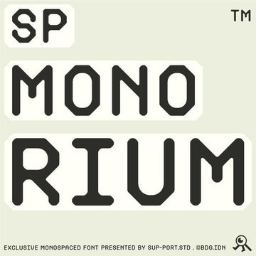
Stencil fonts usually read military or industrial, but Drizy Font's Regbout pushes somewhere more synthetic, more high-contrast, like signage from a building that hasn't been built yet. It's a display face first and foremost, suited to tech branding, gig posters, anything that wants to feel forward-leaning without falling into generic sci-fi cliché. The cut-outs are sharp enough to hold up at large sizes and still read clean when you scale it down for digital use.

Melorane, quiet luxury done properly
High contrast strokes and ligatures that actually earn their place rather than existing for decoration, that's Melorane in a sentence. RASIO STD has built a luxury branding font that sits comfortably next to the big fashion-house serifs without copying any of them directly. Good for skincare, fashion, invitation suites, anywhere the client's budget and expectations are both high. It's confident enough to work as a wordmark on its own, no extra dressing required.

SFC Frizola, two fonts doing one job well
Skilline Fonts Co. has gone the duo route with SFC Frizola, pairing a bolder handwritten headline style with a softer companion built for supporting text. It's got that mid-century, sign-painted warmth that works brilliantly for cafe menus, bakery packaging, anything food and hospitality related that wants to feel handmade rather than mass-produced. The two weights working together means you're not stuck hunting for a second typeface to pair it with, which saves a step most duo releases skip.

Umbrella Mockup 002, restraint as a design choice
CURĀ's Umbrella Mockup 002, Solace is the kind of asset that doesn't try to impress you immediately, and that's exactly the point. Warm light, soft shadow work, a genuinely editorial finish that feels shot rather than rendered. Fully layered PSD with smart objects, built for hospitality and resort branding, fabric and logo placement work where the mood matters as much as the logo itself. If your client's brief mentions "Mediterranean" or "considered" even once, this is your mockup.

Rowdin, the poster face with no interest in being polite
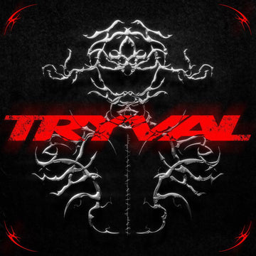
AROKA True Independent Studio's Rowdin Serif closes out the week with something hand-drawn, a little gothic, built for the kind of poster and merch work that wants texture over polish. Cinema one-sheets, festival lineups, apparel graphics, anywhere you want type that looks like it's been carved rather than set. It's got just enough darkness in the letterforms to feel dangerous without losing legibility at display sizes.

What's coming
Ten drops in, and there's already more in the queue for next week, a few of them further out from anything currently in the new font releases lineup this month. Keep an eye on what lands next, and if this week's picks were your kind of thing, the ones the team keeps coming back to are worth a look too.



















