

A jammed photocopier and a frozen video frame are two different kinds of failure. One is paper choking on itself. The other is a signal dropping out mid-transmission. That difference matters more than it sounds, because it decides which kind of damage looks native to a brand and which kind looks borrowed.
We've written before about the effects that make a file look like it came off a press: photocopy toner spread, riso misregistration, halftone dots gone gritty. All of it fakes age that happened to a physical object. Paper yellows, ink smears, a scanner flattens something that used to be tactile. That's an aesthetic for brands with a foot in the physical world.
Glitch, chromatic split and scanline decay come from somewhere else entirely. A red channel drifting off its blue twin, a horizontal band tearing through a clean broadcast, colours flaring at every edge like a cable that came half loose: none of that ever happened on paper. It happens on a screen, in transmission, when the signal itself gives out. Weblium's read on the 2026 web design trends puts chromatic aberration exactly there, colours flaring at the edges to fake a transmission failure. This is the damage a brand reaches for when it has no physical form to begin with, when the whole thing lives on a phone display, a stream, a feed. Streaming platforms, gaming studios, music labels, social-first DTC brands, tech startups that skip print completely. Their identity is made of light and pixels, so their wear and tear should be too.
The catch is that a one-tap AI glitch filter almost never sells it. Ask a model to glitch something and it averages a giant pool of examples into a symmetrical, evenly spread hum of noise, tidy in a way a real broken signal never is. A designer building the effect has to make asymmetric calls: which direction each colour channel drags and how far, where the halftone screen corrupts, how much of the frame stays readable while the rest falls apart. That specificity is the whole difference between a filter pass and something that reads as a real fault. The six below all make those calls for you, and every one of them makes them with intent.
VHS Tape Text & Logo Effect by Pixelbuddha
Feed a logotype into the VHS Tape Text & Logo Effect and it comes back looking like it was recorded onto a cassette that's been rewound a thousand times too many. Tracking lines, flicker, the soft bloom of a tape deck losing its grip on the picture. There are four effect styles built into the one file, so you're not stuck with a single flavour of decay; you pick how far gone the transmission is. It runs through a Smart Object, so any typeface you drop in inherits the artifact directly, with no preset word required.

The reason it works for music and artist branding is that it reads like real signal decay, the same warm instability a dying tape deck leaves behind. Plenty of retro packs slap a scanline over the top and call it nostalgia. This one behaves like a tape eating itself, warm and unstable, the kind of look that suits a logotype meant to feel like it came off a dying deck at 2am. If you're building around the era it draws from, our take on what Y2K design looks like now is worth sitting alongside it.
Glitched Halftone Effect by Pixelbuddha
Every edge in the Glitched Halftone Effect carries a coloured fringe. That's the tell. It runs a coarse halftone screen and then splits the CMYK channels apart, offsetting them so each edge leaves a visible border of misaligned colour behind it. Grain sits across the whole frame, and the background drops to a flat solid you can swap to whatever the layout needs.

This is the one that takes a print-adjacent mechanic, the halftone dot, and shoves it into pure screen failure by tearing the channels apart. It's the hinge the whole piece turns on. The halftone whispers press while the channel split screams signal, and the two fighting each other is what gives it teeth. It carries festival and event promo, fashion editorial, album art, rave-adjacent social content, anything that wants to look loud and slightly broken. If you're into halftones, there's more where that came from.
Lapse Chromatic Aberration Text Effect by Divided.co
Divided.co built Lapse around a single deliberate decision: how far to let the light drag. It splits your letters into red, green and blue ghosts and pulls them outward into radial streaks over heavy noise, like type caught in a long exposure while the camera shook. It's tuned to sit on dark backgrounds, where the colour ghosts have room to glow.

This is the pack that looks least like a filter, and the reason is baked into how it works. A radial streak has a direction and a length, choices a person makes deliberately, the kind no slider assigns on its own. That's what marks it out as a real motion artifact instead of a canned blur. Drop a logo into the Smart Object and it does the drag for you, but the effect was designed by someone who decided where the light should travel. It's the pick for club flyers, cyberpunk editorial, techno merch and synthwave campaigns, anything that wants type to feel like it's moving even when it's still.
Dunk Text Effect by God Control
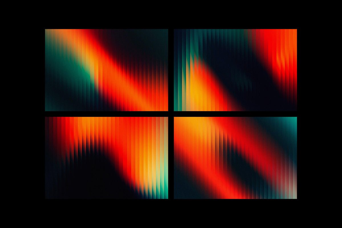
Not every brand chasing signal damage wants to look like it crawled out of 1999. The Dunk Text Effect from God Control keeps the idea of a picture breaking up but runs it through motion blur, grain and smooth gradients for something sleeker and more current. The blur gives it that sense of a frame smearing as it moves, the grain keeps it from feeling too clean, and the gradients pull the whole thing toward a contemporary polish.

Load your text into the smart objects and it applies without you having to hand-build the blur. Reach for this one when the brand wants the digital-native damage idea without going full retro: a tech startup, a contemporary music release, a product launch that wants motion and edge without slipping into a nostalgia costume. It sits closer to now than the tape and the halftone do, and that's why it earns a spot in the mix.
Retro Phone Screen Effect by MiksKS
The Retro Phone Screen Effect by MiksKS is the most literal version of the whole argument, because the damage it fakes is a screen surface, full stop. It recreates the artifacts of an early-2000s phone display: the specific colour cast of those old panels, overlay options for the screen texture, and a companion dithering tool for pushing a crisp image down into that chunky, low-bit look those handsets couldn't escape. It works on text, logos or full images, and it ships with a phone mockup so you can show the design sitting in a physical device.

Where the other packs simulate a signal falling apart in transit, this one simulates the thing the signal lands on. It's the surface itself failing, which makes it the clearest proof that this kind of wear belongs to the screen and nothing else. Since it doubles as a mockup, it fits the shift we wrote about in how mockups are replacing photography for small brands, giving a design a physical home without a photoshoot.
Broken by Studio 2am
There's a point where glitch stops being decorative and turns into a picture of the thing itself failing. Broken is that point. It's a one-step cracked glass distortion with realistic blur, grain and chromatic aberration built into the fracture, so the colours split and warp along the break lines the way they do on a phone you've dropped one too many times. It comes as three PSD files, portrait at 2000x3000px, landscape at 3000x2000px and square at 2500x2500px, which covers most of what a poster or a social frame needs.

A spidered screen is the one image every person carrying a phone shares, the universal shorthand for digital fragility, which gives this effect real weight as a design choice. It's ours, and we're holding it to the same bar as everything else here: the crack has to read as glass giving way under real pressure, and the chromatic split along the fracture is what does the convincing. If you want more in this vein, we've got plenty more worth digging through.
Building the fault yourself
Run any of these next to a one-tap filter and the gap shows up fast. The filter spreads its noise evenly because it's guessing at an average of every glitch it's ever seen. These packs were built by people who decided where the picture breaks, how far the red channel wanders from the blue, which corner of the frame stays legible so the rest can fall to pieces. What you get from that is a fault with a location and a reason, a signal that reads as though it failed for a specific cause. On a screen, where the whole brand lives, that's the difference between wear that looks lived-in and noise that looks applied.