




Monospace type has walked out of the terminal and onto everything. It's on coffee bag labels, on gig posters stapled to poles, running down the credits column of editorial spreads, holding together brand systems for companies that have never shipped a line of code. Part of that is a wider pull toward technical, engineered-looking visual language, the barcodes and registration marks and regulatory ticks that a UK studio's 2026 trends write-up described as borrowing the language of the factory and the spec sheet and then making it look intentional. Designers are reaching for that grammar on purpose, as a considered move away from the flat sameness of AI-generated visuals and back toward things that look built.
Most monospace fonts fall over the moment you ask them to carry a design, and the culprit is almost always execution: a code font dropped onto a poster and left there, doing nothing the brief needed. A handful of structural decisions determine whether a monospace typeface reads as considered work, and you can check for them before you commit to anything for client work.
Start with the characters that give it away
The fastest way to tell whether a font was drawn for fixed width or force-fit into it is to look at the ambiguous characters. Zero against capital O. Lowercase l against capital I against the numeral 1. Every roundup on r/typography and Superside keeps landing on the same point, because it's the functional core of the thing: if you can't read dense technical strings at a glance, the font hasn't done its job. A slashed zero, a dotted zero, a distinct bowl shape, a lowercase l with a tail or a foot, these aren't decoration. They're the tell that a type designer sat down and solved the reading problem instead of stretching a display face to fill even columns.
GC 707 Mono from Glyphonic earns its keep here. Built on a true monospacing system, it carries coding-font clarity into something with the refinement of a proper sans. The numeric characters hold their own weight, which matters the second you use it for anything data-heavy: a price grid, a spec panel, a nutrition-style block on packaging. When the numbers read clean, the whole system reads considered.

Disambiguation works from the other direction in Podjog, from Casloop Studio. Its minimalist construction leans on repetitive geometric structures, and the standout T, S and N are drawn to create a rhythmic flow across a line. That kind of internal consistency is what keeps a stripped-back mono from turning into visual mush. When every character shares the same logic, the eye stops tripping and starts reading.

Watch what happens to the gaps
Fixed width is a cruel constraint on the letters that don't want it. An i, an l, a j, all of them get the same box as an m or a w, and a badly drawn monospace font just leaves the narrow letters stranded in a puddle of white while the wide ones jam up against their edges. A good one fixes this in the sidebearings and the proportions, opening up the m and w so they breathe and giving the thin letters serifs, slabs or generous spacing so every gap reads as a deliberate spacing decision.
Strict monospacing is easiest to see in Kiota Mono, by Drizy Font, which works to keep every character aligned across coding blocks, design grids and looser creative layouts. The geometry does a lot of the load-bearing: when letterforms are built from a shared set of clean shapes, the rhythm stays even because the parts are already related. Set it in a caption run or a repeating label and the column edges stay honest.

Montase Mono, from The Native Saint Club, is the pick when you want that even rhythm to carry poise. It pairs a clean technical structure with distinct display character, and it holds its spacing in neutral, monochrome settings where any awkwardness would show up instantly. Blow it up to headline size on a poster and the negative space around each glyph stays deliberate, spaced by someone who clearly sat with the proofs before shipping it.

Personality has to come from somewhere other than width
Monospace makes personality hard to draw because one whole tool is off the table. With proportional type you can express character through width, a condensed cut for tension, a wide cut for confidence. Take width off the table and every scrap of personality has to come through the terminal shapes, the stroke contrast, the structural quirks, the way a corner is cut or a curve is closed. This is where the real work shows, and it's why the best technical faces, the Recursives and OCR-B-adjacent designs that coding-font testers keep flagging, feel distinct despite the constraint.
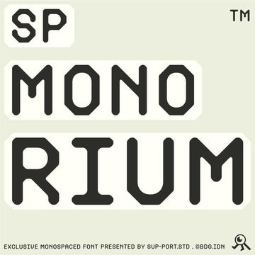
Flatface Thermo, from Flatface Type, demonstrates this most clearly of the set. The whole family is built from a modular design system, a limited set of geometric components that every glyph is assembled from, so each character shares the same structural DNA. Those octagonal-influenced cuts give it a hard, machined edge that swings from cyberpunk to brutalist to a Y2K interface look depending on how you set it. It's the widest-ranging face here in terms of mood, and all of that range comes from the shapes, because the widths can't move. If you're working that harder edge, it sits comfortably next to what we get into in our guide to brutalist display fonts and the ongoing Y2K revival.

The category is wider than "coding font"
Lump all monospace together and you miss how much ground it covers. A strict geometric mono, a typewriter-heritage mono and a monospace serif carry completely different moods, and knowing the difference is what lets you pick with intent.
The typewriter end of the spectrum belongs to Gail Rock, also from Casloop Studio. It takes its cues from the raw mechanics of a typewriter and fuses that grit with digital clarity, which gives it warmth and a bit of wear where the geometric faces stay cold. That heritage reads instantly as human and slightly analogue, which is why it moves so easily from a coding block into editorial layouts and onto packaging that wants a handmade feel. If you like a little roughness in your type, it shares territory with our grunge font guide.

Then there's the unusual one. Nickota, from Say Studio, is a monospaced serif, drawn from classic typewriter mechanics, retro coding terminals and structured developer type all at once. Putting serifs on a fixed-width body is an unusual combination, and it works because the serifs do double duty: they solve some of the spacing problem the way slabs do, filling the gaps around narrow letters, while giving the whole thing an editorial, almost bookish quality you never get from a grotesque mono. Use it for long-form captions or a masthead and it reads engineered and literary at the same time.

The bridge between technical and readable
Not every job wants a face that screams machine. Sometimes you need the discipline of monospace with enough softness that it can carry body-length copy without fatiguing the reader. RCL Monoskrn, from Roomspace Creative Lab, sits precisely on that line, rooted in monospaced heritage but refined with the clarity of a proportional sans, keeping the coding-font rhythm while staying comfortable at length. That balance point is where a lot of contemporary brand systems live now, technical enough to signal precision, readable enough to run everywhere from web to print. It pairs well with the restraint we wrote about in our piece on minimalism doing real work.

Where it earns its place, and where it's costume
Monospace does real work in a few specific spots right now. Spec-sheet-style brand systems, where the fixed grid becomes the visual identity. Packaging copy, where a technical label voice makes even a soft product feel considered and made. Editorial captions and credits, where the even rhythm sets small text apart from the body without shouting. Technical and streetwear branding, where the engineered look is the point. In all of those, the fixed width is carrying an idea.
Where it falls down is when it's reaching for the trend and nothing else. A monospace headline on a wedding invitation because it looked cool on someone's feed, a code font on a wellness brand with no relationship to structure or systems, these read as costume, and the moment the trend cools they'll look like a timestamp. The tech-spec moment works because it looks intentional, and that only holds up when the font was chosen for a reason.
The tech-spec look is going to be everywhere for a while, and that's the opportunity. Pick the face that solves the reading problem, check how it handles the gaps, understand what its terminals are saying about mood, and match its heritage to the job. Do that and monospace becomes a real typographic decision with reasons behind it. If you want more to work through, we've got plenty more type worth digging through, and the same craft argument runs through our guide to futuristic fonts if this is the direction you're heading.



















