Not Just Pointy Letters
"Futuristic font" is one of those search terms that means everything and nothing at once. It covers clean geometric sans-serifs used by tech startups, glitched-out pixel type on cyberpunk album covers, monospaced terminal lettering in developer tooling, and extreme wide-set display faces on festival posters. What ties them together isn't aesthetics, exactly. It's construction philosophy. Futuristic type tends to be built rather than drawn. Letterforms derived from grids, modules, repeated units, or strict geometric logic. They reference systems, machines, and screens rather than handwriting or calligraphic tradition.
Eurostile is still the canonical reference point for this category. That squarish, superellipse-derived construction from the early 1960s essentially invented the visual grammar of "type that looks like it belongs in space." But the market has moved a long way from there. What's interesting about 2025 and into 2026 is that futuristic type is sitting alongside an anti-design sensibility in editorial and branding work. It's not aspirational in the smooth, corporate sense anymore. Cyberpunk grit, pixel decay, and deliberate rawness have equal footing with precision and cleanliness. The two poles of the category are further apart than they've ever been, which makes it a more useful and more interesting territory for working designers.
This guide covers eight specific fonts that span that territory. Each one occupies a distinct position. Understanding what makes each of them work, and where they actually belong, is more useful than just pulling up the most aesthetically pleasing preview.
What Makes a Futuristic Font Actually Useful
A font can look incredible in a full-bleed mock-up and fall apart the moment you try to use it in a real project. This happens constantly in the display font category. Preview images are often set at massive sizes, carefully letterspaced, in high contrast. Real briefs involve hierarchy, body copy relationships, multiple weights, variable sizing, and clients who need to read things.
The questions worth asking before committing to a futuristic typeface are: Does it hold up below display size, or does it become unreadable below 40pt? Does it have enough weight variation to build hierarchy, or is it a one-trick novelty? Does the stylistic range match the brief, or is it so specific in its mood that it only works for one kind of project? And critically: is the character set complete enough? Plenty of display fonts in this category ship with A-Z and 0-9 and nothing else, which is fine for some applications and unusable for others.
The fonts below are chosen because they each answer these questions differently. Some are specialist tools for a single purpose. Others are genuinely versatile. Knowing which is which saves you from committing to a font mid-project that won't scale.
Dot.Font by hvnter

Constructed entirely from dot-grid matrices, Dot.Font is one of the more interesting modular typeface experiments in the catalogue. The bundle includes three distinct styles, all built from the same underlying dot-grid logic, which gives you flexibility without abandoning the system. This is the kind of font that arrives with a clear visual concept behind it rather than just a visual mood.
The dot-grid construction puts it squarely in pixel-art lineage without being nostalgic about it. It reads contemporary rather than retro, which is a difficult balance to strike. The modular approach also means letterforms feel consistent across the full character set in a way that more hand-adjusted display fonts often don't. Where it earns its keep is in applications where the construction itself becomes part of the concept: streetwear graphics, poster work, branding that needs to signal both digital-native origins and some editorial weight. The three-style bundle gives you enough range to build a simple typographic system within a single project if you need it, which is rarer than it should be at this price point in the display font space.
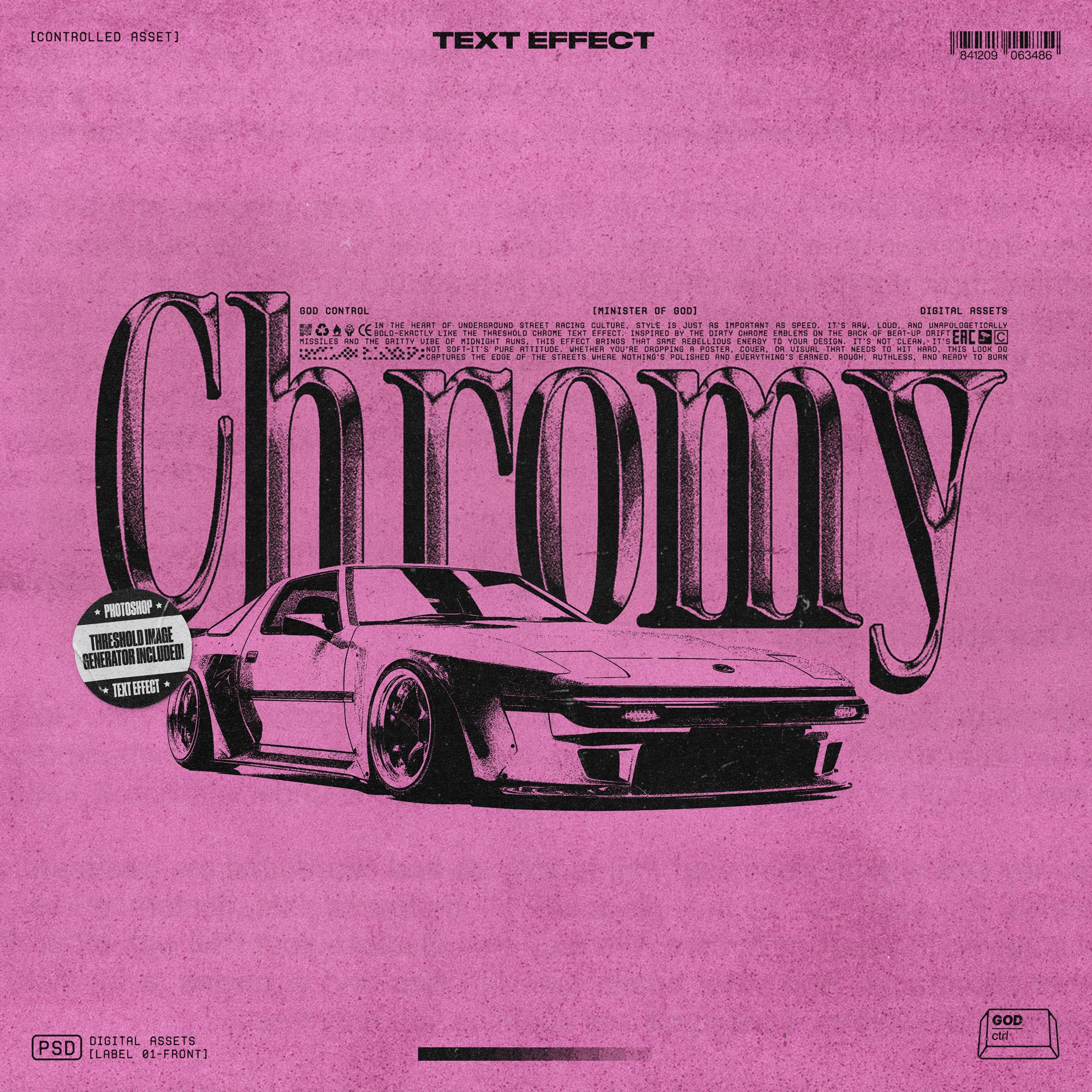
Digi Decay Pixelated Typeface by Softulka
![]()
Where Dot.Font is precise and systematic, Digi Decay is deliberately broken. The intentional gaps in the letterforms, the rounded pixel corners, the sense that something has corrupted mid-render: this is glitch art applied to type with actual craft behind it. The distress isn't randomised noise. It's controlled enough to stay legible while still reading as decayed.
The design lineage here runs through glitch art, broken CRT screens, and the aesthetic of corrupted data visualised as form. That language has stayed relevant well past its initial wave because it maps onto a genuine cultural anxiety about digital infrastructure and the fragility of systems. In streetwear, techwear, and cyberpunk-adjacent visual culture, that anxious-technology mood has become fluent enough that Digi Decay reads as purposeful rather than edgy-for-its-own-sake. Best applications: album artwork, poster campaigns, apparel graphics where high contrast and strong silhouette matter, and any brief where you need type that communicates both technology and instability at the same time. If you're working across that territory, there's more in that vein worth looking at.
GC Tenwork by Glyphonic

Clean geometry, strong stroke weight, no unnecessary personality. GC Tenwork is the futuristic font you reach for when the brief is professional without being corporate, modern without being generic. It sits in the same conversation as Space Grotesk and Exo 2, fonts that have become the default for tech startup branding and digital product UI, but with a more confident weight and better editorial presence.
The precision here is the point. This isn't a font with interesting quirks or moments of character; it's a font that does exactly what it's supposed to do at every size. That's genuinely hard to execute well and undervalued when evaluating display fonts. Condensed and extended variants extend the range considerably, making it usable across headline, subhead, and label applications without switching typefaces. Works across branding, packaging, presentation decks, website headers, and editorial layouts where you need something that signals forward-thinking without signalling chaos. The versatility puts it in a different category from most futuristic display faces.
Boomer TM by Type Mania

Not every futuristic font is trying to look serious about the future. Boomer TM comes at pixel type from a different angle: the chunky, character-rich, slightly chaotic end of the spectrum that connects early digital gaming typography to the broader wave of late nineties and early 2000s internet aesthetics that have been cycling back through fashion and design for the past few years.
There's genuine energy in how funky this is. The letterforms have personality that most modular pixel fonts sacrifice for consistency. It's not going to work for a fintech rebrand or a serious editorial headline, and it's not trying to. Where it earns its place is in poster work, merch graphics, and social content that needs to signal a specific cultural moment without being overly literal about it. The pixelated construction gives it retro credibility; the looseness of the forms keeps it from feeling like a museum piece. Pair it with strong colour and plenty of white space and it carries a layout confidently.
Ocera by Uncarving Nation

Sharp, aggressive, built for impact. Ocera occupies the cyberpunk display end of the futuristic spectrum with total commitment. The letterform construction is angular where other fonts in this space are rounded, forceful where they're restrained. This is type designed for gaming, for sci-fi visual identities, for apparel brands that live in a hard-edged visual language.
What keeps Ocera useful rather than just intense is that the underlying geometry is clean. The angles are deliberate, not approximate. At display sizes the sharpness rewards close inspection rather than collapsing into visual noise. It's a specialist tool in the best sense: extremely good at the specific thing it's for. Apply it outside that context and it will fight the brief. Use it in the right one and it has authority that softer futuristic faces can't match. Gaming assets, posters, apparel graphics, event branding in the electronic music space: these are its natural habitats.
AOT Serial Mono by Arena of Type

Monospaced fonts have had a sustained revival driven by coding culture, terminal aesthetics, and the broader mainstreaming of developer visual language into brand design. AOT Serial Mono is a serious entry into that space: five weights, clean structure, enough personality to distinguish itself from the system-default monospaceds that most designers fall back on.
The five-weight range is the thing that separates it from novelty status. You can actually build typographic hierarchy with this. Light for supporting text, regular for body, bold for headlines: the system holds together across applications. That makes it genuinely useful for editorial work, annual reports, branding that wants to nod to engineering culture without being literal about it, and web design where a monospaced type system needs to carry real content rather than just appear in one headline. The contemporary execution avoids the typewriter nostalgia that drags a lot of monospace fonts into retro territory when they should be reading as current.
Glendale by Sarid Ezra

Width is a design choice. Glendale pushes the expanded sans format to an extreme, particularly in the lowercase forms, and that extremity is the whole point. Extended type signals scale, ambition, and authority in ways that a conventionally proportioned sans-serif simply can't. It commands horizontal space rather than occupying it.
The interesting move in Glendale is the contrast between the unique lowercase and the overall restraint of the design. This isn't a font with constructed quirks scattered through it. The expanded construction is the quirk, and it's applied consistently. That discipline is what makes it viable for serious brand and editorial work rather than just being a statement piece. Works strongly in fashion contexts, large-scale poster applications, brand identities that need to communicate without relying on visual tricks, and headline treatments where a single word or short phrase needs to own the full width of a layout. If you want to see more display fonts worth considering, there's plenty to dig through.
NEWCAPS by Enxyclo Studio

If Glendale owns the wide end of the spectrum, NEWCAPS owns the opposite: condensed, bold, stacked tall, designed to dominate a vertical space rather than a horizontal one. The condensed-with-lowercase-letters approach gives it a different energy from all-caps condensed display fonts. There's drama here, but also legibility; the lowercase keeps longer headline settings readable where pure caps settings can become a decoding exercise.
The boldness is aggressive in the best way. At full weight, set tight, NEWCAPS has the kind of presence that makes a poster layout feel resolved rather than still in progress. It sits at the intersection of editorial confidence and the kind of graphic directness you see in high-impact social content and billboard work. Branding, magazine headlines, website hero sections, merch graphics: the applications are broad enough that this one justifies a permanent slot in the toolkit. The condensed format also makes it practically useful when you're working with constrained horizontal space and can't afford to sacrifice legibility to fit the layout.
Choosing the Right Register
The best way to think about this category is as a spectrum from technical precision to expressive distortion, with multiple dimensions running alongside it: wide to narrow, clean to corrupted, playful to authoritative. GC Tenwork and AOT Serial Mono sit at the precision end. Digi Decay and Ocera sit at the expressive end. Dot.Font, Boomer TM, Glendale, and NEWCAPS each occupy distinct positions in between.
The mistake most designers make with futuristic fonts is treating them as interchangeable variations on a single aesthetic. They're not. Each one is calibrated for a specific kind of work. Getting the match right between font and brief is what separates a layout that feels considered from one that just looks like it was made with a futuristic font. If you want to keep exploring the category, there's a lot more futuristic type worth a look.