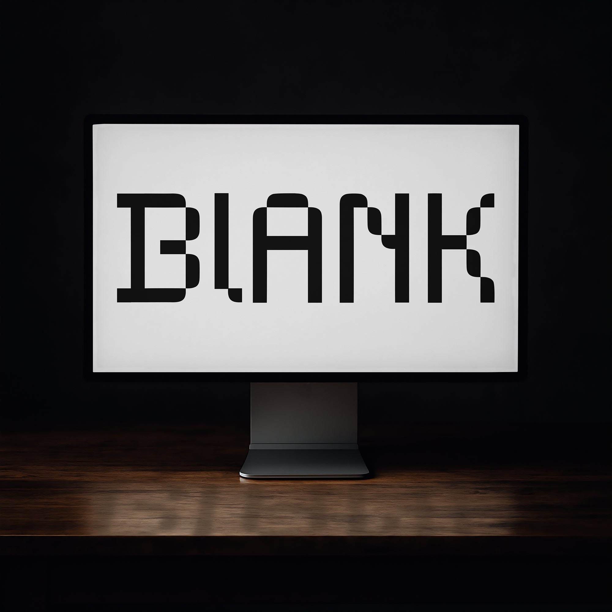
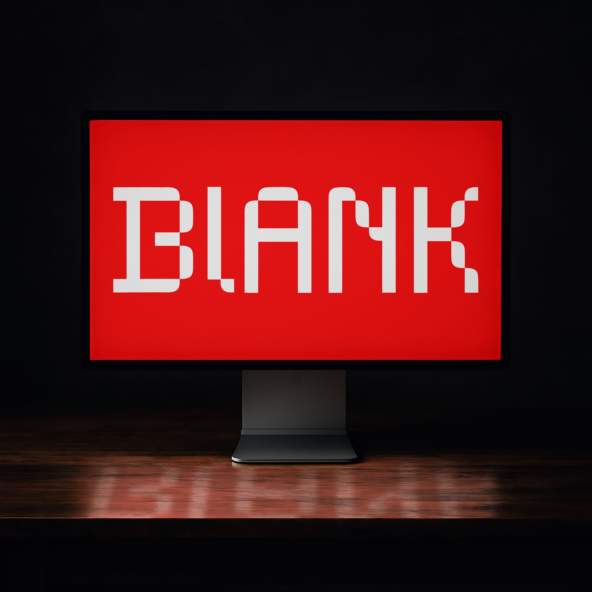
A display font is a typeface designed to be seen, not read continuously. It's built for large sizes, short bursts of text, and maximum visual impact. Where body fonts prioritise legibility across long reads, display fonts prioritise personality, presence, and character. If you're working on a headline, a logo, a poster title, or any moment where a single word or phrase needs to carry weight, you're in display font territory. The term covers an enormous range of styles, from slab serifs to hand-lettered scripts to experimental type that barely looks like type at all. What they share is intent: they exist to make an impression at a glance.
How Display Fonts Differ from Body Fonts
The distinction isn't just stylistic, it's structural. Body fonts are engineered for readability at small sizes across long runs of text. That means consistent stroke weights, generous x-heights, open apertures, and careful spacing designed to reduce eye fatigue. Display fonts don't carry those constraints. They can have extreme contrast between thick and thin strokes, heavily stylised letterforms, tight or even overlapping spacing, and details that would become visual noise at nine points but sing at ninety.
That freedom is exactly what makes them interesting to work with. A display typeface can have ink traps that become part of the character at scale, or swash alternates that would clutter a paragraph but look like a deliberate design choice on a poster. The intended size isn't just a technical spec, it's the lens through which everything about the design was made.
The Main Categories of Display Fonts
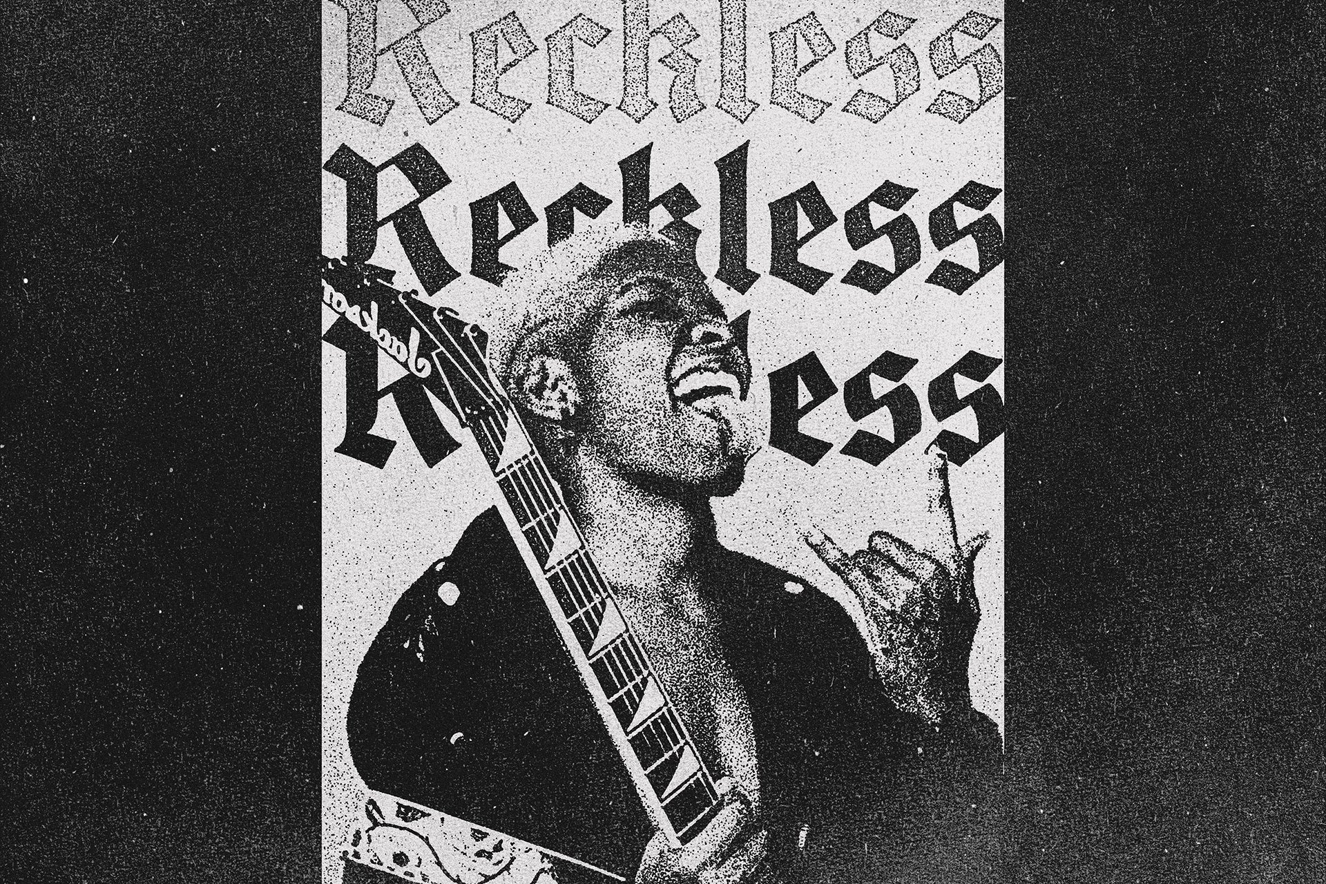
Display serif faces tend to draw from historical type traditions, think wood type, letterpress printing, early advertising typography, reinterpreted through a contemporary eye. They carry weight and authority. Display sans serifs range from geometric brutalism to soft organic forms, often the choice when you want impact without the historical baggage of serifs. Script and hand-drawn display fonts sit in their own space, from formal calligraphic letterforms to loose marker-drawn type that reads as immediate and human. Then there's the experimental end: reverse-contrast faces, distorted letterforms, type that plays with expectation. That's where things get genuinely interesting.
What Display Fonts Are Actually Used For
Practically speaking, display fonts are doing the heavy lifting on posters, album covers, merch graphics, brand logotypes, editorial headlines, packaging, social content headers, and anything else where type needs to function as a visual element first and a communication tool second. They're the first thing someone sees on a gig poster, the word a customer reads on a hoodie before they even register the brand name, the headline on a magazine cover that tells you what kind of publication this is before you've read a single article. Used well, a display font isn't decoration. It's strategy.
Pairing Display Fonts
The standard approach is contrast: pair a loud display face with something quiet and functional underneath. A geometric sans at regular weight or a clean serif for body copy both work well as counterparts to a heavy display font. The display font sets the tone; the body font supports without competing. Marker or hand-drawn type sits interestingly in the middle, textural enough to feel display-adjacent but legible enough to carry a supporting line of text. When pairing within a headline itself, stick to one display font and let it do the work. Two display fonts in the same composition is usually one too many unless you really know what you're doing with scale and contrast.
Display Font Examples Worth Knowing
HARDC0RE UNIVERSITY by h0vado is heavy, blocky, and built for maximum presence in minimum space. The varsity influence comes through in the letterforms without tipping into cliché, which is harder to pull off than it sounds. All caps, single weight, no ambiguity about what this font wants to be. It works for merch graphics and cover art because it reads at a thumbnail and hits at full size equally well.
What makes Chunk by Matsero interesting is the balance between chunky mass and playful geometry. The letterforms have serious optical weight without feeling heavy-handed. It includes ligatures, which matters for logo work where custom character connections can lift a wordmark above the generic. Solid across logos, posters, and social headers where you want bold without intimidating.

Reverse contrast is one of those techniques that shouldn't work but consistently does in the right context: thick horizontals, thin verticals, the inverse of what classical type training tells you is correct. Broski by Sekyra Lab leans into that heritage directly, pulling from wood type and early poster printing where the constraints of the medium created an aesthetic all its own. It comes in regular and rounded styles with alternate characters, giving you enough flexibility to push it toward different project tones.
Not every display font needs to shout. Marker Typeface by hvnter brings a hand-drawn, immediate quality that sits well alongside heavier display faces as a secondary typographic element. The regular and light styles across upper and lowercase give you genuine range for layout work. It's the kind of face that makes a composition feel less mechanical without sacrificing legibility.

Fashion and lifestyle branding has specific typographic expectations: it needs to feel current without being trendy, reference history without being retro. ROMIEN by Enxyclo Studio navigates that well. The letterforms reinterpret vintage forms through a contemporary structure, and the alternates and ligatures give it the kind of customisability that editorial and brand work demands. Available in normal and slanted versions, so you've got built-in options for dynamic layouts.

Rémi Bordet's Hydra 2.0 occupies a genuinely specific niche: soft rounded edges and an organic quality that reads almost like ink on uncoated stock, but with a structural logic that feels more mechanical than handmade. It's the right call for album artwork and type-based logos where you want something futuristic but not cold. The cyberpunk reference is there if you want to lean into it, but it doesn't force the aesthetic on you.

There's a whole lineage of mid-century commercial lettering that's been largely underused as type reference, particularly the hand-painted signage from American delis and grocery stores of the sixties and seventies. Flatface Grosy by Flatface Atelier draws directly from that tradition. It ships with regular, rounded, and outline styles, plus over a hundred badges and logo elements, making it more of a complete branding toolkit than a standalone font. Strong for packaging and retail identity work.

Bubble type has had a proper resurgence, and most of it is mediocre. Bloomeries by Typeparties is the version that actually holds up at brand level. The wave-like contours give it movement without looking unstable, and the psychedelic poster energy reads as confident rather than nostalgic. It works for headlines and packaging where you want something with personality that still functions as a logotype or display headline rather than just a decorative texture.
If you're looking for more to work with, there's a lot more display type worth digging through across a wide range of styles and sub-categories.
Choosing the Right Display Font for the Job
The question isn't just "does this font look good?" It's "does this font do the right job for this project?" A reverse-contrast retro face and a bubble display font can both be correct answers depending on what you're building. Think about the scale it'll live at, the context it'll sit in, and the one impression it needs to make before someone looks away. Display fonts are unforgiving in that sense. They're designed to be noticed. Make sure what gets noticed is intentional.