Most Photoshop effects are bought once and forgotten. They look good in the preview, fall apart on a real project, and end up buried in a folder you never open. These eight are different. They solve specific visual problems, hold up at print resolution, and are built well enough that you'll actually reach for them again.
DreamPrint35 by Ghost Who Walks

Film emulation presets live or die by their grain, and DreamPrint35 gets it right. Five Lightroom presets built around soft glow, punchy contrast, and fine film grain that reads as genuine rather than processed. The palette range across Neutral, Cine, Forest, Royal, and Candy gives you coverage from muted editorial to something warmer and more saturated without any of them feeling like Instagram filters from 2014. If your work touches photography-led branding, social content, or editorial, this belongs in your preset folder permanently.
Engrave Printed Stamp Text Effect by Pixelbuddha
![]()
What separates Engrave Printed Stamp from the dozen other stamp effects floating around is the linework. It genuinely recreates fine hatching and engraved ink on textured paper, the kind of dense illustrative quality you see on currency or old botanical prints, not just a blurry overlay with some grain dropped on top. Two PSDs at 4500x3000px, 300dpi, which means it's actually usable for print. Packaging, premium branding, labels where heritage credentials matter. It earns its place.
Vintage Print Text Effect by Pixelbuddha
![]()
The sibling to Engrave Stamp but with a different personality entirely. Where that effect leans illustrative and precise, Vintage Print Text Effect is about the imperfection of a hand-pressed stamp: outlines that break at the edges, ink fills that carry subtle grain, registration that's just slightly off. The result feels genuinely handled rather than digitally aged. One PSD at the same 300dpi resolution. It's the go-to for anything that needs to look like it came off a real press rather than a printer. Pixelbuddha builds both of these with care, and it shows. There's more print-style effects worth digging through if this direction is your thing.
Y2K REBORN: Pixel and Glitch PS Actions by Textexp
![]()
The difference between Y2K REBORN and every other glitch action pack is source material. Textexp built these from actual LCD screens and real camera interfaces, not from someone approximating what glitch looks like from memory. The result is a set of actions that includes liquid glitch, broken glass, displacement maps, and pixel degradation that reference genuine hardware artefacts. Liquid glitch in particular has a physicality that you don't normally get from a Photoshop action. If you're doing anything for the nostalgia-adjacent end of social, merch, or album art, this is the serious version of that toolkit.
Cyber Machine CRT Effect by Divided.co

Not every project calling for a neon-drenched, screen-distorted visual needs to be built from scratch. Cyber Machine CRT is a full PSD at 4000x3000px with smart object replacement, which means the technical infrastructure of the effect is already handled. CRT scan lines, digital screen distortion, neon colour treatment: it's all there and composited properly. Drop your image in and the result looks like a still from a mid-budget sci-fi production, in a good way. The smart object workflow makes iteration fast, which matters when a client wants to see three directions before lunch.
BYTE Bitmap Actions by Massive Supply Co.

Fourteen actions, four bitmap styles (pattern, diffusion, diamond, cross byte), three weights per style. BYTE is the kind of product where the structure tells you everything: Massive Supply Co. thought about this systematically rather than throwing a bunch of looks in a folder and calling it done. Bitmap dithering sits at an interesting intersection right now, credible in both the early-internet nostalgia space and contemporary editorial design, and having a set that gives you weight control across four distinct pattern types means you can dial in exactly how raw or refined the result reads. Poster work, merch, and social graphics that want some texture without going full grunge.
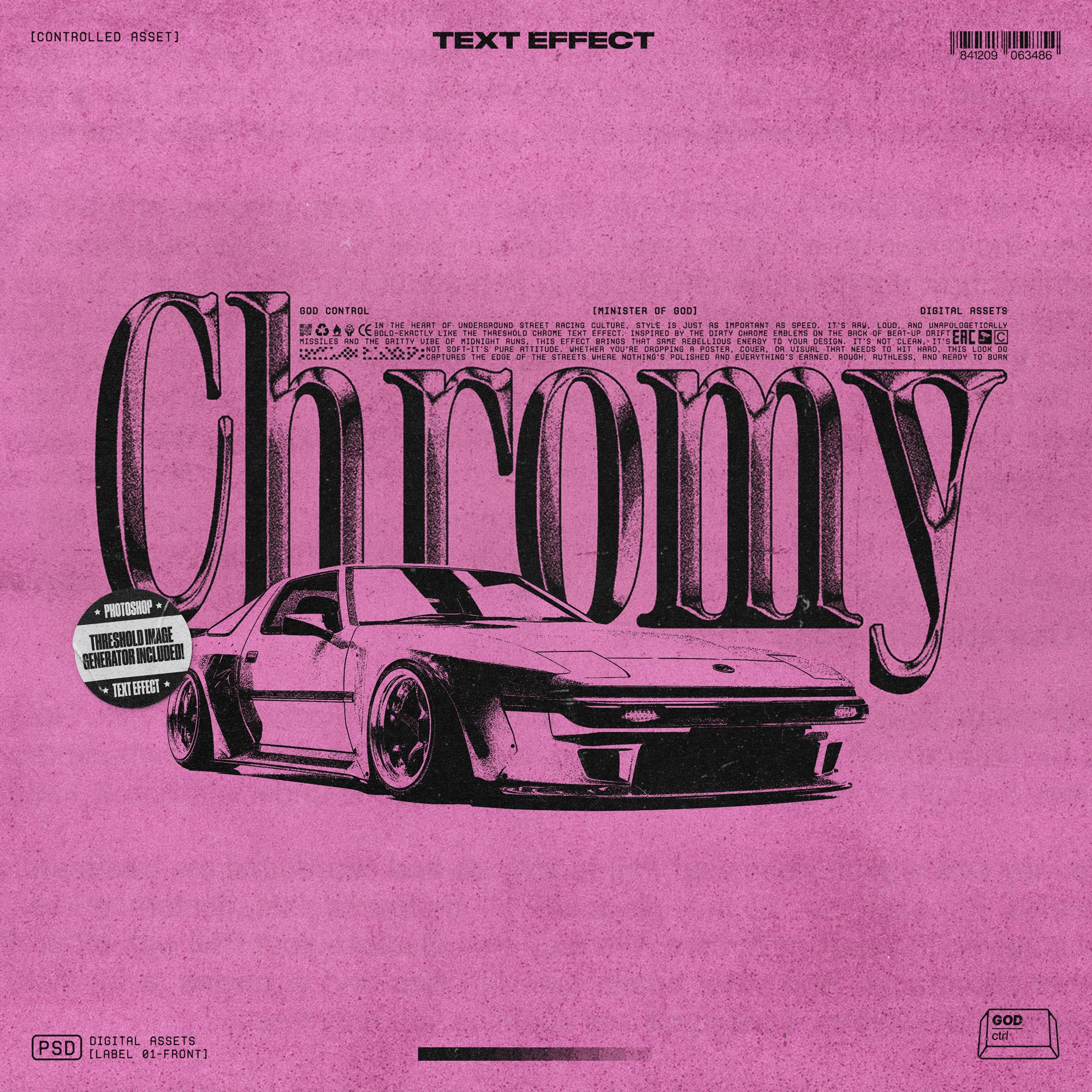
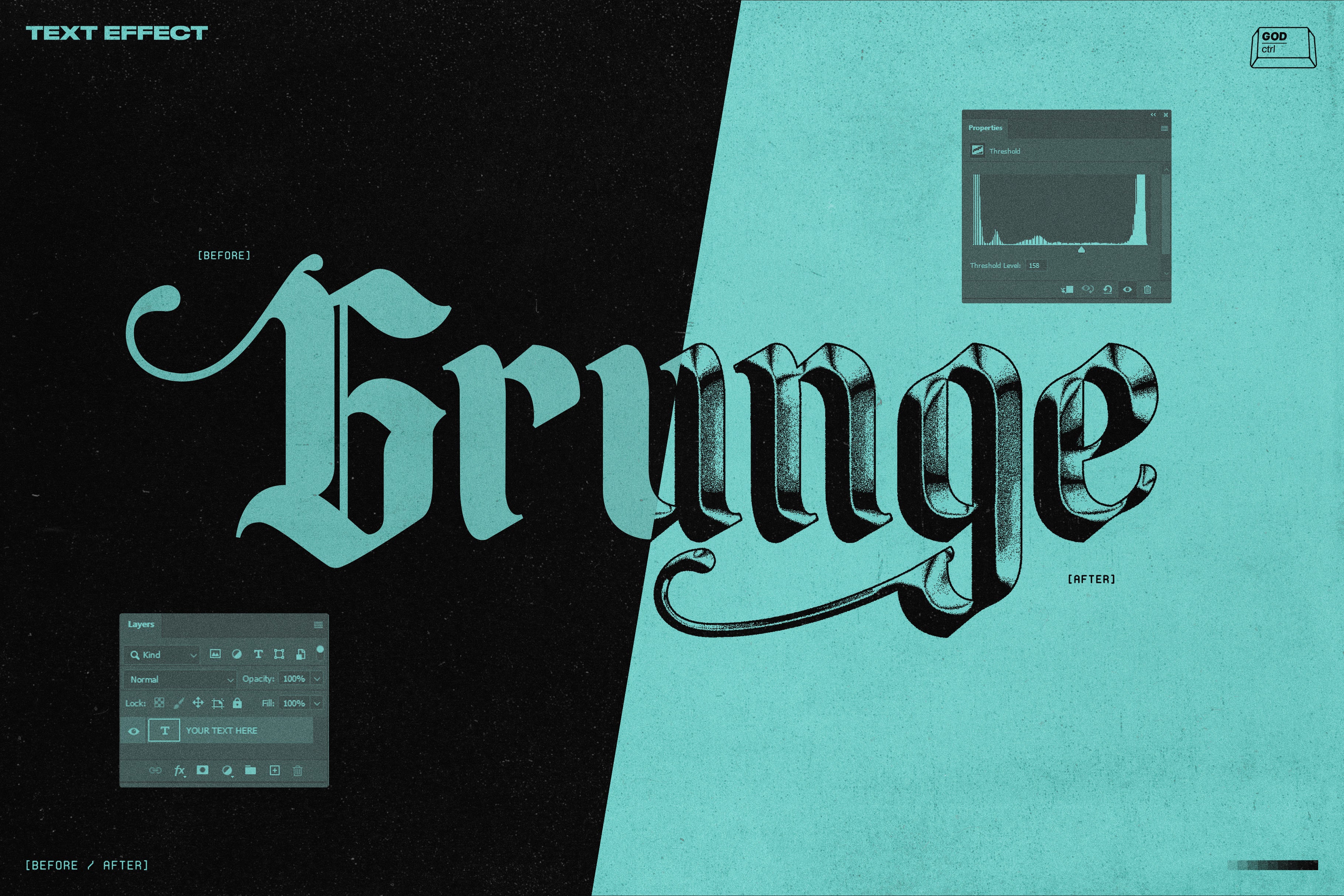
Chromy Text Effect by God Control

Heavy grain, dirty chrome, bold enough to read at a distance and gritty enough to feel like it was made with intent rather than polish. Chromy comes with ten textures, six customisable gradients, and a threshold image generator, which is actually the part that makes it worth it. The threshold playground approach means you're not stuck with one chrome look; you're working with a system that lets you push the effect toward clean or completely wrecked depending on what the project needs. The aesthetic sits squarely in bootleg shirt, album cover, and aggressive poster territory. God Control built this for a specific creative moment, and it lands.
Retro Chrome Effect by Divided.co

Where Chromy is about texture and grit, Retro Chrome is about surface quality. Drop a logo or wordmark into the smart object, and you get a chrome treatment at 3508x2480px that reads as considered rather than slapped on. The reflection detail has genuine depth to it, the kind of chrome finish you associate with period car badges or classic hardware, not the specular gradient that passes for chrome in most quick tutorials. For branding and logo work where a client wants something with weight and metallic presence, this is the clean and credible version. There's plenty more effects we rate if you want to keep looking.