

A week where the two big forces shaping design right now, corporate nostalgia and the AI question, kept crossing paths. A heritage soda giant reordered two words and called it disruption. Two platforms holding a decade of digital art careers changed hands. And a run of studios and illustrators made the case that human process still wins the brief.
7UP renames its flavour and calls it a bold reinvention
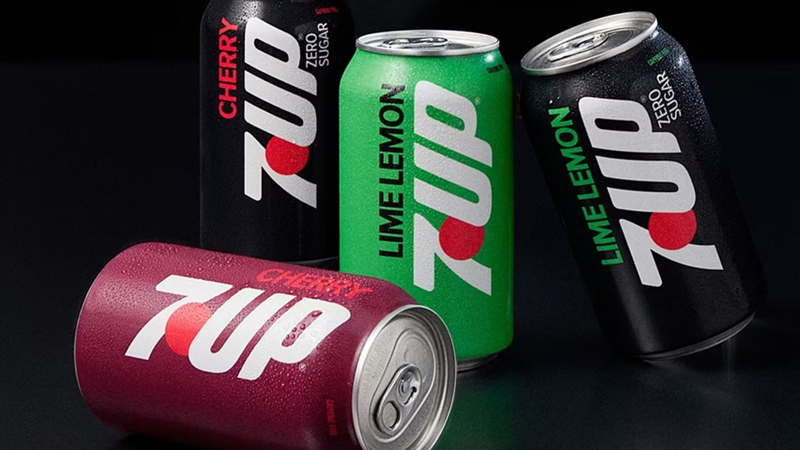
7UP, owned by Keurig Dr Pepper, has landed its third major look in three years, and this time it went past the logo into the drink itself. The reformulated recipe arrives under a new name: the classic "lemon and lime" is now "lime lemon", putting lime first for the first time in the category. The visual side plays it safe, a soft retro wordmark riding the heritage-nostalgia wave, while the copy leans hard on citing that "72% of Gen Alpha and Gen Z consumers gravitate toward citrus-forward flavours." As Creative Bloq points out, "lime lemon" breaks an irreversible binomial, the kind of word pair your ear refuses to reorder, like flipping chalk and cheese. Calling a flavour rename a "bold reinvention" is a lot of marketing weight on two swapped words, and longtime drinkers will notice the wobble before they notice the wordmark.

Epic Games sells ArtStation and Sketchfab to KitBash
Five years after buying them, Epic Games has sold ArtStation and Sketchfab to KitBash, the company behind KitBash3D and Greyscalegorilla. ArtStation, founded in 2014 by Leonard Teo and Kevin Strike, grew into a portfolio hub for over 10 million digital artists across gaming, film and entertainment; Sketchfab handles 3D model publishing. Terms weren't disclosed, and Epic says the move lets it refocus on Unreal Engine 6, Fortnite and the Epic Games Store. Reporting from Creative Bloq notes no changes to how creators access either platform, and KitBash is talking up "a more open, standards-based 3D future." For working artists, portfolio infrastructure is career infrastructure. When your body of work lives on someone else's server, every ownership change is a small breath held. Nothing's broken today; keep a local backup anyway.

Karlssonwilker builds a slow identity for Calder Gardens
New York studio Karlssonwilker, run by Jan Wilker and Vera Yuan and 26 years deep, designed the identity for Calder Gardens, a new Philadelphia cultural space with landscaping by Piet Oudolf, a building by Herzog & de Meuron, and rotating works by Alexander Calder. Yuan describes the brief as "a place for contemplation and reflection, to personally experience and interpret nature, architecture, and art." Writing for PRINT Magazine, the framing sets this slow, collaborative process against the current pitch that AI can hand you a full branding programme in five minutes. This is the argument worth having. A contemplative space gets its identity from people sitting with the work until the right answer surfaces, not from a template that scraped a thousand other identities, and you can feel the difference.

Honest Toil bet its olive oil brand on illustrators
Honest Toil is a Greek olive oil brand from Tom Woodgate and Juli Laki, who moved to Kyparissia in the Western Peloponnese and inherited a small olive grove, now producing cold-pressed, unfiltered extra virgin oil from Koroneiki olives. When they were building the packaging, the advice was the usual: illustrated packaging is expensive, complicated, hard to manage. They ignored it and commissioned illustrators anyway, and the drawn identity became the whole brand's visual language. The full story, with photography by Sarah Rainer, runs at Creative Boom. Walk any supermarket aisle and count the food brands leaning on the same clean sans-serif and stock-styled photo. An illustrated shelf presence is a real risk that reads as confidence, and it pays because nobody else is doing it.

Nosheen Ahmed doubles down on the human hand
Nosheen Ahmed spent more than two decades as a dentist before adding illustrator to how she describes herself. Then she lost a side illustration business to AI-generated competition. Instead of stepping back, she has staked her career on hand-made work as AI-generated imagery floods publishing, and stayed optimistic about the industry while doing it. She's convinced no experience is wasted on the way to a creative career, dentistry included. The profile, from a Manchester meet-up, sits at Creative Boom. Stories about AI and illustration usually get told as either panic or shrug. This one is someone who got hit directly and chose the harder, human path, which is the only response that leaves you with a body of work worth signing.

Studio Dial treats code like paper and ink
Studio Dial is a young, female-led design and creative technology studio in London with a client list already spanning Google, Azra and Inner City Consulting. The work jumps around: brand refreshes, cocktail menus, campaign identities for generative tools, insurance platforms, plus projects touching Afghan textiles and city planning. Their line, via It's Nice That, is that "we treat code as a material, something to be shaped and tested like paper and ink." Plenty of studios still file code under technical and craft under creative, as if they're separate departments. Small hybrid shops that collapse the two can move on a brief in ways the big single-discipline places can't, and Studio Dial's range is the proof.

The through-line this week: the people making the strongest work are the ones treating their process as the point, not the obstacle. More citrus wars next week, probably. Until then, there's plenty of hand-drawn work worth digging through if this run of stories has you in the mood.