
A week pulling in two directions. On one side, three identity jobs grounded in real-world research: a stadium mural, a strip of car window stickers, the colours of banknotes. On the other, the AI question keeps circling, this time showing up as both the villain and the tool. A trust mark built to fence off face-cloning, a global rebrand that swapped photoshoots for generative output, and an ocean of hope projected across a square in Cambridge.
Fulham FC turns a stadium mural into a bespoke typeface
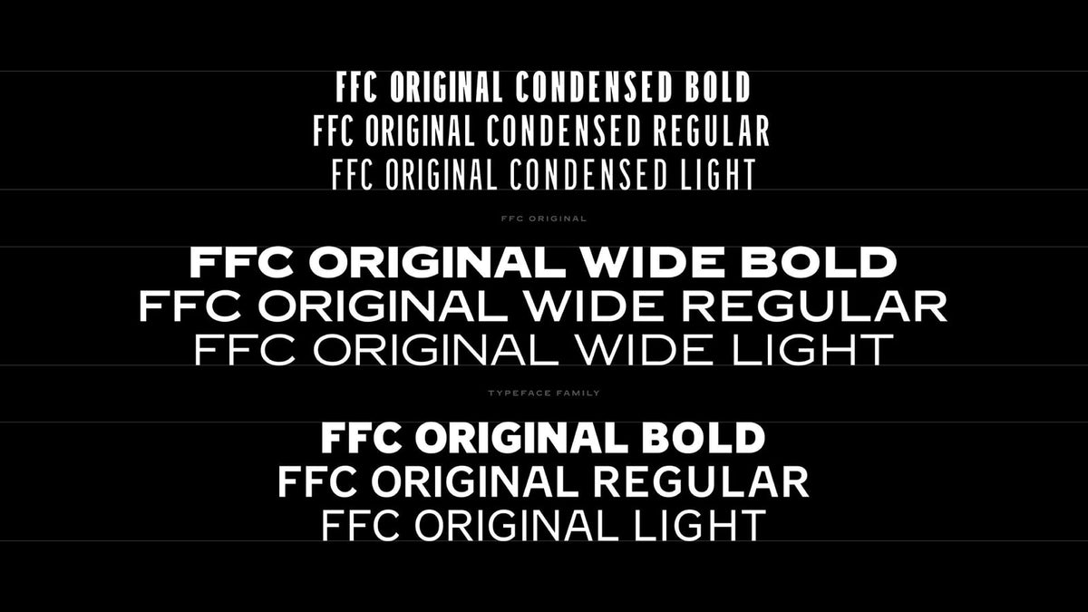
Fulham Football Club, founded in 1879 and playing out of Craven Cottage, the oldest ground in London, has refreshed its identity around a piece of lettering found inside the stadium itself. Long-term agency Music, the Manchester studio behind work for the Brit Awards and London Fashion Week, discovered a hand-painted "Fulham Football Club" mural in the fabric of the Cottage and brought in foundry F37 to build it out. The result, detailed over at It's Nice That, is FFC Original, an uppercase display family running across Condensed, Regular and wide widths.

This is the good kind of club rebrand. Instead of chasing the sterilised sans-serif every team seems to land on, Music and F37 kept the mural's loose, warm, slightly off-kilter rhythm and made it function as a proper system. It arrives in a busy season for football branding, with Newcastle's first new crest since 1988 and Arsenal's bespoke blackletter both landing nearby. Provenance you can point at a wall beats a mood board every time.

UnitedUs gives Twinnin a "Human Verified" trust mark against AI
Twinnin is a registry that lets people control how AI uses their face: verify as human, then either licence your likeness and get paid, or defend it and opt out entirely. The platform already existed but wanted an identity that reached past its original base of actors and celebrities to everyone. Brighton agency and B Corp UnitedUs distilled the pitch to "Your face. Your control," and built a "Human Verified" trust mark styled like a security hologram. The two user choices became distinct shimmering, three-dimensional badges, as Creative Boom reported.

The holographic treatment is a smart call. We've all seen security foils on passports and banknotes, so the visual language of "this is verified, this is real" is already wired into our heads. Whether a trust mark can hold back AI face-cloning is a bigger question than any design can answer, but the design side is doing its job: making consent legible. More brands will be reckoning with this consent problem soon.

Studio Herrström builds Milkshake a lightning logomark from car stickers
Milkshake, the Stockholm music label and management hybrid founded in 2019, went to Vienna's Studio Herrström for a visual overhaul to match its growing roster of alternative pop acts. The label runs an artist-first, disruptor posture while sitting structurally inside Sony Music. Herrström translated that into a system drawn from the familiar forms of car window stickers, anchored by a lightning-bolt logomark, with a palette lifted straight from milkshake flavours. The studio describes the feel as both extra and ordinary, punchy and grounded, detailed on It's Nice That.

Taking the window-sticker as a starting point is a nice piece of lateral thinking: it's vernacular, a bit trashy, instantly readable, and it carries that teenage-bedroom-window energy a pop label wants. The lightning bolt could tip into cliché in weaker hands, but paired with those sugary flavour tones it reads as deliberate. Craft-forward work that knows exactly who it's for.

Collins centres Remote's new identity on banknote colours and cubes
Remote, the San Francisco payroll and employment company founded in 2019, now bills itself as "the financial operating system for the global workforce," paying people across more than 150 countries and past $300 million in annual recurring revenue. Feeling its old look had fallen behind the business, it brought in brand consultancy Collins for a new identity built on banknote colours, a stackable cube motif and a chunkier wordmark. The challenge, as framed by Creative Boom, was making payroll feel like something worth looking at.

Payroll is about as unglamorous as a category gets, invisible until it fails and someone doesn't get paid. Pulling from the visual language of money itself is the obvious move done well, and the building-block cubes give the system a modularity that suits a company stacking up markets and clients. It won't win awards for daring, but it's a confident, legible look for a brand that outgrew its old one.

Axi swaps a hundred photoshoots for an AI-assisted workflow
Axi, the online trading broker running across 100-plus markets with 1.4 million users, had Warsaw's Properly Studio rebuild its brand, a 150-page-plus website and the visual direction of its trading product as one system in four months. The logo and signature red stayed. Properly grouped the markets into four regions, each with its own personas and landscapes, and the detail worth the raised eyebrow is this: the persona imagery came from "a custom AI-assisted production workflow built for Axi and finished by hand, in place of a hundred separate photoshoots," per the studio's announcement.

The logistics argument is real. Shooting consistent personas across dozens of jurisdictions, then animating and re-versioning them, is a genuine production nightmare. But "finished by hand" is carrying a lot of weight in that sentence, and it's worth naming plainly: generative renders did the job photographers, stylists and crews used to do. Efficient, sure. We'll keep backing the work that still books the shoot.
Behnaz Farahi projects an ocean of hope across MIT
For MIT's inaugural Future Fest, designer Behnaz Farahi, who leads the Critical Matter Group at MIT Media Lab, created "Ocean of Dreams," projecting an aerial, hyper-realistic view of tides from the roof of the MIT Museum down onto Kendall Plaza. Two 30,000-lumen laser projectors threw the waves across roughly 264 square metres of public square that people could walk straight through. Under the water sat short phrases in dozens of languages, crowd-sourced from more than 400 participants, as covered by Dezeen. Farahi and her students pulled it together in three weeks.

What lands here is Farahi's framing of hope as agency: the capacity to imagine things could be otherwise. In a year where the future mostly shows up as anxiety, a walkable ocean carrying "end to all wars" in dozens of languages is a reminder that design can still ask big questions in public space. Public, temporary, human. The opposite end of the week from Axi's render farm.

A wall-painting turned typeface, a hologram built to prove you're real, and an ocean asking what could be otherwise: plenty to chew on from this week's identity crop. If this run has you thinking about identity systems with some grit to them, we've got plenty more branding-ready type and mockups to dig through. Back next week.