


It's 1am before the Series A pitch and the deck still has three section dividers that don't match, a hero slide carrying a lonely screenshot, and an empty-state illustration that never got made. The logo was signed off months ago. What nobody scoped was everything the logo has to sit next to: the deck backgrounds, the dashboard accents, the onboarding graphics, the investor one-pager diagram, the twelve social assets due Thursday. Geometric shape work is the connective tissue across all of that. A logo is one surface. A tech brand ships dozens every week.
The logo-trend commentary has clocked something true, even if it stops short of the useful part. Plain circles and squares no longer read as a tech brand doing anything on purpose. What signals intent now is unexpected proportion, unusual combination, and construction that looks engineered: modular grids, stroke systems, shapes that fit together with logic behind them. Agency roundups will tell you that and then hand you a psychology-of-shapes chart. None of them give you an asset you can drop into a slide at midnight.
So here are seven shape systems built for the working surfaces, each made by a named independent creator with real construction thinking under the shapes. Every one solves a specific deliverable, and none of it is the generated primitive-shape filler that clogs stock sites.
1. Geometric System Collection by Vanzyst: the deck vocabulary
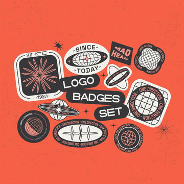
Most decks end up looking like a scrapbook because every slide invents its own shapes. Vanzyst's Geometric System Collection solves that at the source: 140 abstract shapes arranged on a pixel grid, triangles and circles and squares that speak the same language because they were drawn to. Pull section dividers, pattern fills and background texture from one place and the whole pitch reads as one brand. There's a playful, slightly chaotic energy to the set, which keeps it off the boring end of corporate geometry while staying disciplined enough for a style guide. Build your visual vocabulary once, then every artefact is drawn from it.

2. Liquid Glass 3D Shapes by Pixelbuddha: the interface moment, right now
Glass is having its year. Apple pushed a translucent, refractive surface language across its 2026 interface design, and suddenly dimensional glass is the visual grammar every product team is reaching for on onboarding screens and feature announcements. Pixelbuddha's Liquid Glass 3D Shapes gives you that quality without opening a 3D renderer: 60 forged glass sculpture forms with chromatic gloss, rainbow dispersion and caustics that behave the way real light does through real glass. Drop one behind an app onboarding graphic, anchor a feature-launch visual with it, or build a landing page hero that carries depth instead of another flat screenshot. Cool, monochrome, and expensive-looking in the good way.

3. Prism Glass 3D Shapes by assetpro: one object, whole hero
Where the liquid forms curve and swirl, assetpro's Prism Glass 3D Shapes lean faceted and angular: 160 prism shapes delivered as transparent PNGs, 80 unique forms in two versions each. That angularity makes them better at being the single loud object on a page. When a landing page hero or an app store feature graphic needs one refractive thing to carry the whole composition, a sharp prism throwing spectral light does more than a busy layout ever will. Same glass conversation as Pixelbuddha's set, pointed at a different job. If you're mining the crossover between refraction and that early-2000s optical shine, our read on Y2K design in 2026 is worth a look.

4. CircuLab – Vector Circle Kit by Softulka: for the dashboard
Radial progress rings. Loading states. Those decorative arcs looping around a headline metric in a product screenshot. Data-viz and dashboard work runs on circles, and it runs on being able to change their stroke weight without rebuilding them. Softulka's CircuLab packs 169 fully editable vector circles with adjustable strokes: dotted circles, halftone fills, rings, dynamic arcs. Because the strokes are live, you set the weight to match your UI's line system and the accents look native to the interface, not pasted on top of it. This is the kit for the metric cards and the onboarding flow, the stuff that has to look precise or it looks broken.

5. Vector Pack v01 by secret-cache: the small stuff that holds it together
A SaaS site isn't only hero moments. It's the footer accent, the favicon-adjacent mark, the little geometric detail in an email header, the divider between two feature rows. secret-cache's Vector Pack v01 is the base kit for that unglamorous daily work: 100-plus minimalist geometric vectors with colours and sizes you can push around freely. Edgy and neutral-leaning, high in contrast, they read as intentional at tiny sizes where fussier shapes fall apart. This is the connective glue between the big set pieces, and getting the small marks right is often what separates a system that feels designed from one that feels assembled. More on that in our piece on minimalism doing real work.

6. Electronic Vector Line Art by Font For Zula™: figurative tech, drawn clean
Sometimes you need to show the thing, not abstract it. A hardware-adjacent SaaS product, a developer tool, a brand that wants literal devices in its imagery without resorting to stock photography or that tired circuit-board clipart everyone's seen. Font For Zula™'s Electronic Vector Line Art covers that gap with 21 line-art items: cameras, watches, devices, computer bits, drawn as clean geometric line work in black, red and white. It carries a sharp, slightly retro edge that suits merch and posters as easily as a product page, and it's figurative tech imagery that still looks engineered.

7. Vector Shapes Volume I by MiksKS: accents for dense UI
A dashboard mockup crammed with cards and charts starts to feel like a wall. You need somewhere for the eye to rest and something to break the density without redesigning the layout. MiksKS's Vector Shapes Volume I is the accent utility for exactly that: 145 vector shapes that combine into compositions or drop in as standalone pieces, shipping in AI, EPS, PNG and Photoshop custom-shape (CSH) formats so they slot into whatever tool the mockup lives in. Scatter a few across a slide for geometric texture, or use them to give a dense product screen some rhythm. The CSH support means they're a click away inside Photoshop, which matters when you're moving fast.

The throughline across all seven is intent you can feel in the geometry: proportion that was decided, strokes built as a system, shapes that fit together because someone worked out how. That is what separates a shape pack made by a person who draws for a living from the endless primitive-shape output flooding stock sites, where nothing was constructed and nothing quite matches. Tech branding leans geometric because geometry reads as precision and systematic thinking. These sets carry that reading because the systematic thinking is real. If you want more in this territory, our notes on what makes a bundle worth buying hold up well against any of them.