
Serif selection is one of the decisions that separates a considered identity from a forgettable one. The wrong serif looks either stuffy or try-hard. The right one carries a brief on its own. Heading into 2026, the best serif fonts aren't playing it safe. They're doing expressive work in fashion, editorial, spirits, streetwear, and luxury branding, and the designers reaching for them know exactly what they're doing. Here are ten modern serif fonts worth keeping close this year.
1. Alchemion by Nomad Visuals
Pull from sixteenth-century alchemical manuscripts and you get letterforms with genuine weight behind them. Alchemion has the texture of hand-lettered type that's been pressed into paper, with ink-trap-adjacent details and irregular strokes that feel sourced from a real hand rather than a grid. It's a dark academia font that doesn't overcook the drama. Book covers, occult-adjacent branding, editorial headers with a historical bent. It ships with numbers, punctuation, and special characters for international language support. Pair it with a neutral body and let it anchor the page.
2. Fallen Angels by Set Sail Studios
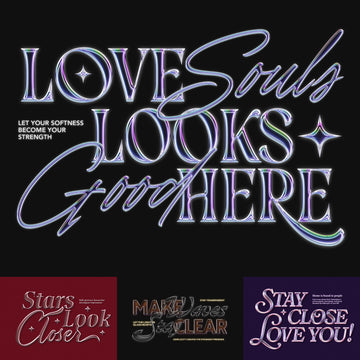
The stylised capitals are where Fallen Angels earns its reputation. Romantic curves land against sharp, clean serifs in a way that feels modern rather than period-costume. This is the font for fashion editorial that wants edge without tipping into costume goth, or for a brand identity that needs to hold tension between glamour and rebellion. Alternate characters are available for E, F, r and k via stylistic alternates or the glyphs panel, plus six built-in icons (three halos, three stars). Think fragrance, alternative fashion labels, or any brief where the mood board has both velvet and black leather on it.
3. Schiller by Any-Type® Foundry
Schiller is built for the kind of high-contrast luxury typography that's been dominating fashion and beauty branding since independent magazines started pushing back against corporate sans. Thick-thin stroke variation is sharp enough to read as sculptural, and the ornamental cuts add personality without undercutting the authority. Run it large in a luxury goods campaign or as a headline face in an editorial spread and it holds. Any-Type® Foundry understands that contemporary serif fonts in this space need presence, not just elegance. It comes in OTF and TTF formats with multilingual support.
4. GC Troja Pro by Glyphonic
One of the strongest modern serif fonts in this list for editorial work with a heritage slant. GC Troja Pro from Glyphonic draws on vintage editorial aesthetics without getting nostalgic about it. The old-style proportions are balanced, the details are restrained, and the sharp terminals give it authority. It carries the sensibility of a well-produced independent magazine, with enough flexibility to work across covers, pull quotes, and logo lockups. The classic old-style construction reads beautifully in both print and digital, and the alternates extend its range considerably.
5. Chrone Typeface by Genetypeco

Some briefs need a serif font that arrives at full volume. Chrone by Genetypeco has the bone structure for spirits branding, album covers, and identity work where physical weight is part of the message. The serifs are bold and sculptural, the overall texture sits somewhere between Victorian display type and contemporary streetwear aesthetics, and it handles a poster headline as confidently as a logo mark. For whisky labels, independent music releases, or any project where refinement and rawness need to coexist, Chrone is worth shortlisting.
6. Sirkel by Marvadesign

At the quieter end of the spectrum, Sirkel operates as a minimalist serif that skews close to geometric without fully crossing over. Clean, balanced construction with proportions that feel considered rather than restrained. This is the font doing serious work on DTC packaging, wellness branding, and product identity where the design language needs to feel edited. It comes in regular and italic, and its unique ligatures and alternate characters add a distinctive flair while keeping the minimalist essence intact. If your moodboard has lots of white space and one or two strong typographic moments, Sirkel fits that brief cleanly.
7. Rolmes by Marvadesign

Where Sirkel is restrained, Rolmes leans into decorative character. The alternative letterforms and ligatures give it the kind of distinctiveness that works for luxury product branding, beauty editorial, and high-end packaging where the typography needs to feel bespoke. It reads more contemporary than retro revival, and its multilingual support keeps text consistent across European, Asian, and less common languages. The alternate characters are usable, not just show pieces. Designers who spend time with the glyph set will find combinations that are hard to achieve with more conventional serif fonts.
8. Alchimia by Rémi Bordet

Rémi Bordet's Alchimia is a medieval-inspired all-caps Roman that's found an unlikely second life in streetwear and independent label design. The ligature system is extensive and the letterforms have the kind of structural rigidity that holds at large scale on garment graphics, posters, and brand marks. It brings historical craft to contexts that usually source from fast-moving trend cycles, which is exactly why it cuts through. If your brief has any crossover between heritage reference and contemporary culture, this is one of the more interesting serif fonts to test.
9. ENIGMATIC WAESBENDIY by Enxyclo Studio
The blackletter revival has been building for a few years now, visible across independent fashion, metal-adjacent subcultures, and high-end editorial that wants to signal something darker than standard luxury. Enigmatic Waesbendiy by Enxyclo Studio sits at the intersection of medieval source material and modern typographic sensibility. It runs 705 glyphs total across three styles — Regular, Slanted, and Reverse Slanted, 235 glyphs each — with alternates and multilingual support. The letterforms are rooted in Gothic tradition but carry enough contemporary refinement to function outside strictly niche contexts. For branding or poster work where gothic edge needs to read as intentional rather than borrowed, this is a considered choice.
10. Altotype Typeface by hvnter

Closing the list with something that reads differently from everything above. Altotype by hvnter brings geometric construction and mid-century warmth into a serif package that lands well on logo work, retro-inflected branding, and poster design that draws from the visual language of fifties and sixties print. It includes A–Z, 0–9, and basic symbols as an OTF file. The forms are confident and the overall character sits closer to bold editorial than decorative display. It fills a specific gap: clients who want period-adjacent warmth without full retro pastiche.
How to Choose the Best Serif Font for Your 2026 Brief
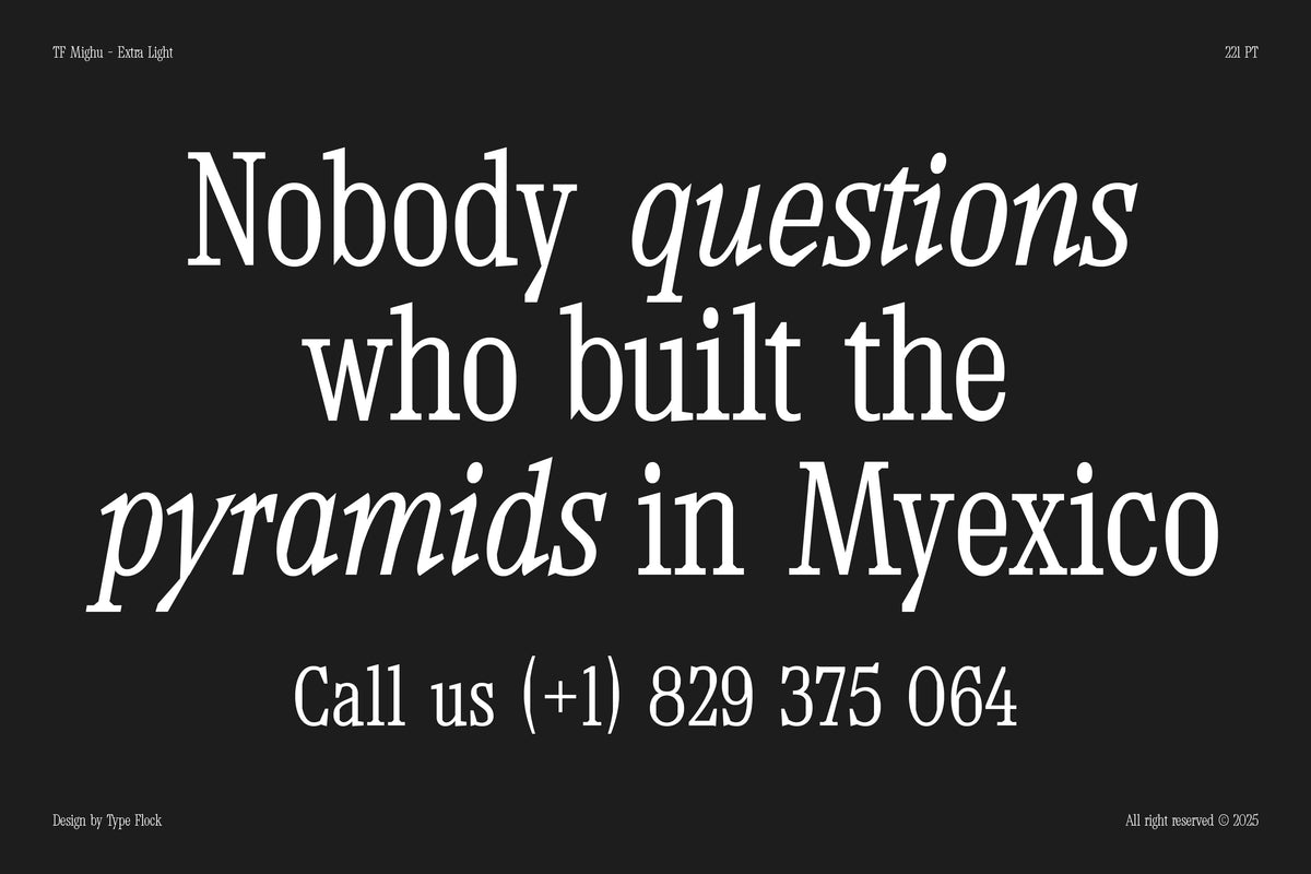
Match the serif to the job rather than the trend. For high-contrast luxury and fashion branding, Schiller and Rolmes carry sculptural weight that reads premium at headline scale. For editorial and heritage work, GC Troja Pro and Alchemion bring restraint and craft. For identity systems that need to feel edited and minimal, Sirkel's clean geometric-adjacent construction is the safer body-and-logo pairing. And when a brief needs raw physical presence — spirits, album covers, streetwear — Chrone, Alchimia, and Enigmatic Waesbendiy hit harder.
Which of these serif fonts suit luxury-brand mobile interfaces?
For elegant, refined interface work, favor the fonts with cleaner construction and balanced proportions over the heavily ornamental display faces. Sirkel is the most interface-friendly pick here — its minimalist, balanced lines and geometric precision read clearly at smaller sizes, and it ships in both regular and italic. GC Troja Pro's balanced old-style proportions also carry a transitional, editorial feel that suits premium layouts. The high-contrast and blackletter faces in this list are built for headlines and identity marks, so keep those for hero moments rather than running text on a small screen.
What makes a serif font read as contemporary rather than dated?
Contemporary serif fonts tend to combine a traditional serif structure with one sharpened, modern move — higher stroke contrast, unexpected terminals, or a considered set of alternates and ligatures. Schiller's ornamental cuts, Rolmes's alternate letterforms, and Enigmatic Waesbendiy's modern take on blackletter all draw on historical roots while reading current, which is why they hold up across editorial, fashion, and luxury branding heading into 2026.
More Modern Serif Fonts Worth Your Time
These ten cover a serious range of use cases, but they're a starting point. If you're looking to go deeper on serif options across editorial, identity, and display work, there are more serif fonts worth digging through. And if you're building out a broader type system, there's plenty more modern type to explore across geometric, grotesque, and transitional styles. Every creator on the platform is vetted, so the signal-to-noise ratio is worth your time.