Most Photoshop effects look brilliant in the preview and fall apart the moment you drop your actual artwork in. The smart object doesn't behave, the scale is off, the whole thing reads as clip art. These eight don't do that. They're tools the team has actually used on real work, across real briefs, and they hold up. No filler picks.
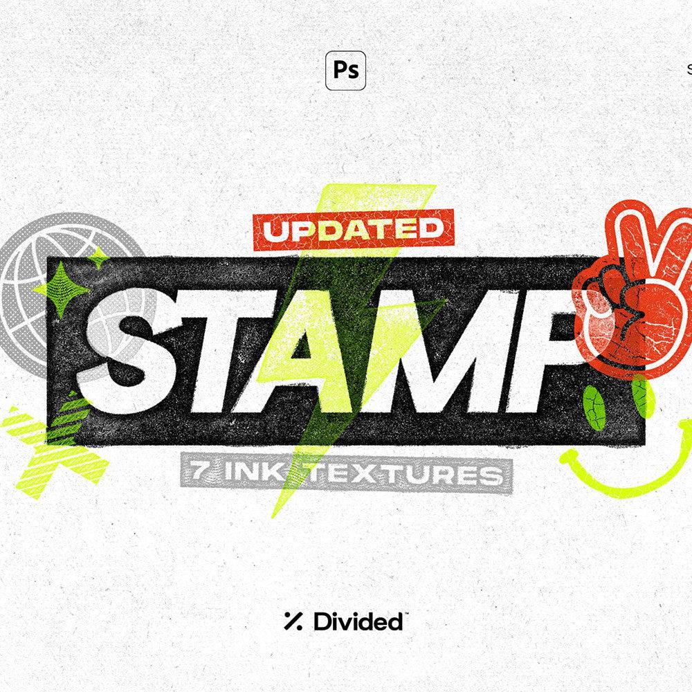
Dirty Stamp Text Effect by Pixelbuddha
![]()
There's a specific kind of roughness that's hard to fake well. Stamped ink, slightly overloaded, dragged across paper with uneven pressure. Dirty Stamp by Pixelbuddha nails it. Drop your type or logo in and it comes out looking like it was run through an old Risograph on a bad day: blurred edges, powdery grain, the kind of texture that reads as physically made. It earns its place on streetwear, merch, punk-adjacent branding, and anything that needs to feel like it came from a photocopier rather than a computer. The high-contrast output means it works well on light and dark backgrounds without needing much adjustment. This is the one you reach for when "clean" is the wrong answer.
Halftone Factory by Divided.co

Halftone Factory from Divided.co gives you six scalable halftone patterns via smart object, which means swapping your image in takes about ten seconds. The patterns lean toward the editorial and print side of halftone work rather than the purely decorative. Think newsprint, toner-heavy magazine printing, late-night photocopy aesthetics. There's genuine range across the six options, from fine-dot patterns that feel like offset printing to coarser grids that push into gritty poster territory. It's a strong pick for album art, editorial work, and any project where you want the image to feel like it was reproduced rather than rendered. If you're into halftones, there's more where that came from.
Halftoner by Studio 2am

Our own tool, so we're biased, but it earns its spot. Halftoner is built for speed. You want a dirty halftone treatment on an image in under a minute, with colour control and pattern scale you can actually dial in without rebuilding the whole thing. It keeps your original image intact, which sounds basic but saves you every time you need to iterate. Where Halftone Factory goes deeper on pattern variety, Halftoner is the one you have open when you need to move fast. Good for social content, poster work, quick comps. It earns its keep in the toolkit purely by not getting in the way.
Y2K Image Effects Pack by züli

Chrome, glitch, scan lines, that particular early-2000s sheen that is everywhere right now for good reason. The Y2K Image Effects Pack by züli covers the core treatments with three effect files, each with multiple settings. The workflow is the same as any decent smart object file: replace the image, done. What makes it useful is that the effects are calibrated to work across a range of images, not just the specific stock photo the creator used in their preview. Chrome treatments often fail on portraits because the highlights blow out. These hold. Useful for social content, album art, and anything that needs to sit in that late-nineties to early-aughts visual space without feeling like a costume.
Thermal by Ghost Who Walks

Fifty-two gradient maps across four distinct styles: Triad, Heatmap, Fade, and Surge. Thermal by Ghost Who Walks is the kind of pack that changes how you think about colour grading in Photoshop. Gradient maps are genuinely underrated as a workflow tool. Drop one on any image as an adjustment layer, set it to the right blend mode, and you can shift the entire emotional register of a photo in seconds. The Thermal maps sit on the vivid, high-drama end of the spectrum: the kind of palettes that make a portrait look like a thermographic scan or a landscape look like a digital oil painting. Strong for photo editing, cover art, and any work where mood is doing most of the heavy lifting.
HeatMaps by secret-cache

Where Thermal is curated around a specific vivid intensity, HeatMaps from secret-cache goes wider. Fifty hand-picked gradient maps covering both the hot and cold ends of the thermal spectrum, from molten oranges and reds through to deep cyberpunk blues and greens. The breadth is the point here. Having a large set of quality gradient maps loaded in Photoshop means you're always one click away from a completely different mood, which is genuinely useful when you're presenting multiple directions to a client or trying to find the right tone on an image that isn't quite working. The quality is consistent across the set, which sounds obvious but is not guaranteed with gradient packs of this size.
Styles Pack Vol. I by MiksKS

Ten layer style-based effect templates for logos, type, and vector elements. Styles Pack Vol. I by MiksKS covers a range that spans gothic blackletter treatments, chrome and liquid metal finishes, and dimensional effects with serious depth. The layer style format means these work non-destructively, which matters when a client asks you to recolour something at the last minute. The chrome work in particular is good. Not the flat, naive chrome you see in free asset packs; this has the kind of gradient complexity that reads as intentional craft. Solid for logo presentations, merch concepts, and type-heavy designs that need texture and presence. Place your artwork in, apply the style, adjust scale to taste.
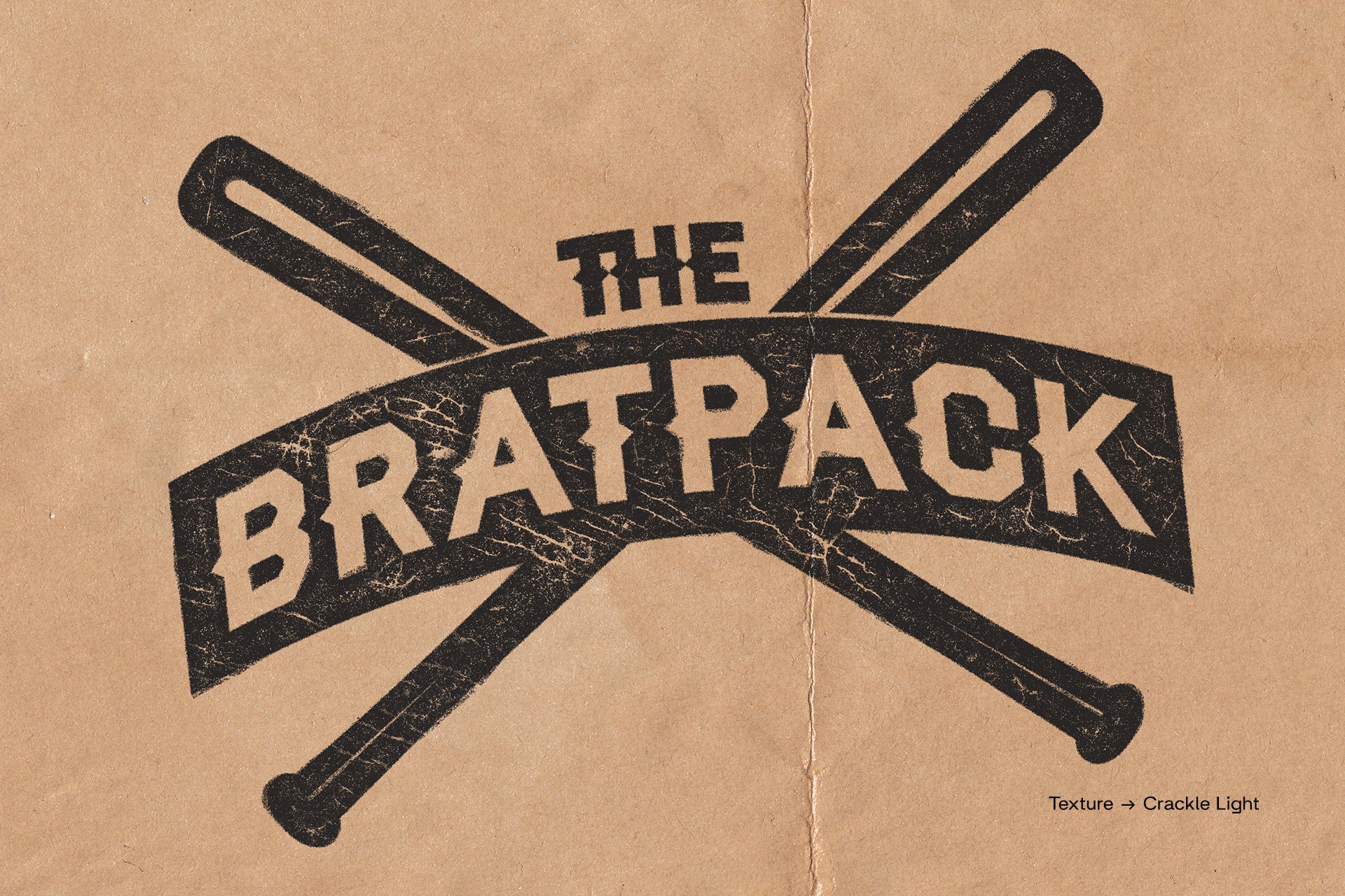
Burn by Studio Dusk

Realistic burnt textures as overlays for images and text, with the kind of contrast that makes a photo look like it was recovered from somewhere it had no right surviving. Burn by Studio Dusk works because the textures are properly built, with genuine tonal complexity at the burn edges rather than a simple darkened vignette. The warm, charred look sits well against dark photography and works particularly well for album art and poster work where you want the image to feel worn and heavy. It's a specific effect, not a universal tool, but if your project calls for it you'll know immediately, and having a well-made version ready beats building it from scratch every time.
The common thread across all eight is that they hold up when you put real work through them. That's the only standard that matters. The rest of what we'd actually recommend follows the same logic.