A few new products in the catalogue this week, skewing toward the kind of toolkit additions that actually get used rather than admired once and shelved. Fonts, effects, mockups, graphics. Here's what landed.
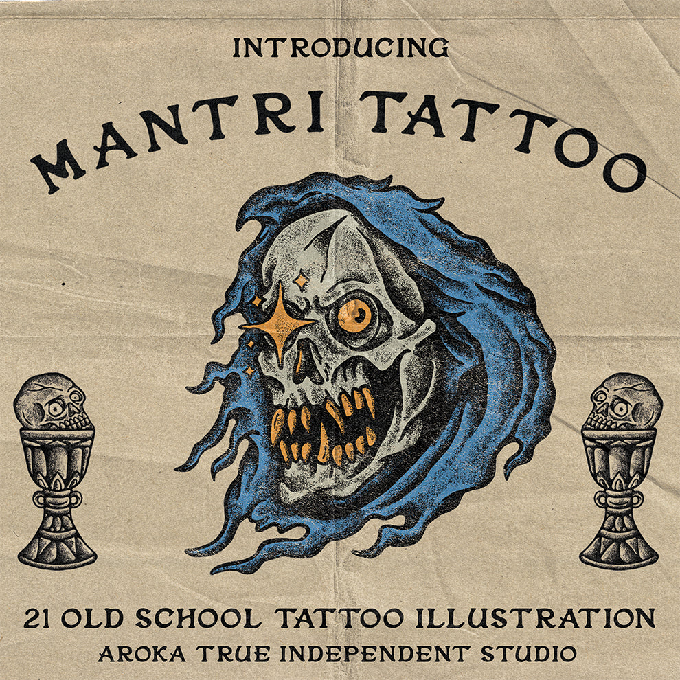
Forthword Signature & Serif by The Branded Quotes

Old scroll energy with enough contemporary grit to avoid feeling like a costume. Forthword pairs a flowing signature style with a complementary serif, and the combination sits in that sweet spot between handcrafted warmth and high-contrast editorial weight. The kind of duo that earns its place on packaging, apparel prints, and book covers without fighting with the rest of your layout. If you're doing brand work for anything with a heritage angle, or designing merch that needs to feel earned rather than assembled, this one's worth a look.
No Bones by Wingsart Studio

Built from ink bleeding into paper, which is exactly what it looks like. No Bones is a textured display font from Wingsart Studio with roots in skate branding and zine culture, and it carries that lineage honestly. The letterforms have that photocopied, analogue edge that's been in heavy rotation across gig posters, streetwear graphics, and band merch for good reason. It doesn't try to be clean and it doesn't need to be. Use it at size, let the texture do the work. There's more grunge type worth digging through if this hits the right nerve.
Grunge Paper Print Mockup by Pixelbuddha
![]()
What this does is give clean vector work the look of a printer that was having a genuinely bad day. Grainy pressure, broken edges, faded coverage, paper fibre, subtle displacement. The result sits somewhere between xerox and risograph, which is exactly the aesthetic driving a huge amount of independent poster and merch work right now. Pixelbuddha's approach here is precise in its imprecision. Drop your artwork in and it comes out looking like it was pulled from a stack in someone's basement studio. That's a compliment.
NV Dune Hero by NovaraType

Wide, geometric, built for scale. NV Dune Hero is an expanded sans serif family from NovaraType with the kind of proportions that command a poster before you've even read the headline. The geometric balance is tight and the clean cuts give it versatility across sports visuals, streetwear branding, and editorial headers. It reads confidently at large sizes without the novelty wearing off quickly, which is a harder thing to achieve with expanded type than it looks. Multilingual support makes it genuinely practical for broader client work too.
CS Felice Mono by Craft Supply Co

Monospaced fonts live or die by their neutrality, and Craft Supply Co have found a good balance here. CS Felice Mono is precise and readable without being cold, which makes it usable across editorial layouts, UI mockups, and anything that benefits from the fixed-width rhythm without the clinical edge of pure coding-oriented type. The spacing is consistent in the way that actually matters for tight layouts, and it holds up at small sizes. A quiet one, but solid.
Litane by Typeparties

Script and sans duos are everywhere, but this one earns its place. Litane draws from old storefront signage and mid-century print culture, pairing expressive brush lettering with a rugged sans that grounds it without flattening the warmth. The script has genuine character rather than the smooth, overworked quality that kills a lot of brush fonts. Together they work well for branding that wants a handcrafted feel without looking like a farmer's market logo. Motor brands, independent food labels, vintage-influenced merch. The contrast between the two weights does most of the compositional heavy lifting.
Soft Glow Photo Effect by Pixelbuddha
![]()
Dreamy bloom, muted contrast, film grain, a subtle rainbow flare in the highlights. Soft Glow by Pixelbuddha is sitting squarely in the visual language of current indie music and fashion photography, where that hazy, slightly overexposed quality signals a certain kind of sincerity. It works for album covers, editorial portraits, and indie film poster work, and the light spill detail is what separates it from a basic glow filter. The grain finish gives it texture that reads as intentional rather than processed. Worth having if you're doing any work in that space.
X30 Hologram Sticker Pack V1 by GFX DATABASE

Thirty holographic sticker PNGs, iridescent and detailed, built for the kind of mockup styling that makes packaging and product work look like the real thing. These are finishing touches, but finishing touches matter when the difference between a convincing mockup and a flat one is exactly this kind of physical-world detail. Drop them onto product shots, streetwear mockups, packaging comps. The holographic surface texture picks up the surrounding colours in a way that reads naturally rather than pasted. Small addition, high return on realism.