These aren't fonts we stumbled across and thought were fine. Staff picks are the ones earning a permanent tab in our Fonts folder, the ones we reach for when a brief lands and the clock is already ticking. Here's what we'd actually use right now, and why.
Rougho by Sekyra Lab

If a merch brief comes in for a band, an independent coffee roaster, or anything that needs to feel like it was stamped onto a crate in 1974, Rougho is the first font we're opening. The distressed edges and imperfect letterforms do the heavy lifting without needing a texture overlay on top, and the six styles including stamp and outline variants give you enough range to build a whole visual system from one typeface. Sekyra Lab clearly understands that a good rough font isn't just a clean font with a grunge filter thrown over it. The character is baked in from the start.
Bosden by Sekyra Lab

Condensed bold display sans serifs are having a sustained moment across streetwear, sport, and editorial, and Bosden earns its place in that conversation because the geometry is genuinely tight. Clean structure, strong vertical rhythm, four styles including Rounded and Oblique. It's the kind of typeface that works on a drop announcement graphic, a lookbook cover, or a poster for something that needs to feel like it means business. The Oblique style in particular has an energy that most obliques at this weight miss entirely.
Berguna by Mbonster Design Studio

The brief: restaurant rebrand, mid-range to fine dining, the client wants to feel considered and warm but not stuffy. Berguna is the answer. It's a classic display serif with the kind of high contrast and bold form that reads beautifully at headline size, and there's a cinematic quality to the letterforms that brings real personality without veering into costume territory. This is a typeface that would sit just as comfortably on a wine list as it would on a film poster or a heritage brand identity. Mbonster Design Studio has made something that understands the difference between classic and dated.
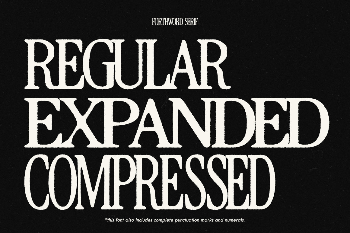
CS Damon Condensed by Craft Supply Co

Three styles, reverse italic included, and a condensed serif silhouette that earns its keep on editorial layouts where you need headline impact without sacrificing column space. CS Damon reads as vintage-informed without being nostalgic for nostalgia's sake; there's a crispness to the forms that keeps it feeling current. Craft Supply Co are consistent, and this is a good example of why their fonts end up in a lot of professional workflows. It would look sharp on a magazine masthead, a boutique packaging label, or anywhere the brief calls for elegant restraint.
CS Aither Blackletter by Craft Supply Co

Blackletter is one of those categories where the gap between the good and the mediocre is enormous. CS Aither lands firmly in the good column. The elaborate serifs and traditional gothic construction make it a strong choice for spirits branding, band merch, or any brief where you need that tension between old-world formality and something with genuine edge. It would work on a whisky label, a zine cover, or a limited-run streetwear drop. If you're interested in what else sits in this space, there's more gothic typography worth a look.
Fawkle by Softulka

Not every brief wants to be cool and restrained, and when a client comes in wanting to be genuinely weird and playful, most font libraries let you down. Fawkle doesn't. It's squishy, distorted, cartoon-adjacent in the best possible way, pulling from the kind of retro animation energy that has been filtering through maximalist brand design and social content for the past few years. Use it for a kids' food brand, a quirky event identity, a campaign that's deliberately unserious. The key is committing to it fully; Fawkle rewards confidence.
Sorpant by Jolicia Type

What makes Sorpant interesting isn't the weight or the proportions, it's the counters. Those distinctively rounded interior spaces give an otherwise clean modern sans a softness that you don't usually get at display scale, which means it sits in a genuinely useful gap between cold geometric neutrality and overtly friendly rounded type. It's a strong candidate for a tech brand that doesn't want to look like every other tech brand, or a beauty or wellness identity that needs presence without aggression. Minimal, but not blank.
Motley by Any-Type Foundry

Any-Type Foundry built Motley with over 300 glyphs and a full set of stylistic alternates, which tells you straight away this isn't a novelty rough font with one trick. The organic, handcrafted quality is controlled rather than accidental, and that's exactly what separates a display typeface you can build real work around from one you use once and forget. It has the raw energy that works for poster design, logo lettering, and packaging without collapsing into illegibility at smaller display sizes. If Rougho is your stamp and texture play, Motley is your expressive headline workhorse. There's plenty more grunge typography worth digging through if this direction is where your current briefs are sitting.