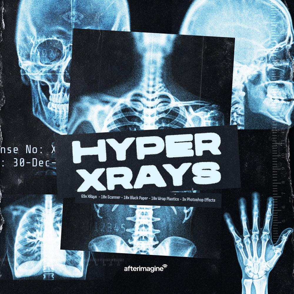
Y2K isn't one aesthetic. It's bubbly plasticky type on a neon background, it's gritty ink on a rave flyer, it's blurred digital text that looks like it's buffering. These 12 y2k fonts cover the full spread, from organic hand-drawn letterforms to geometric industrial display faces, giving you actual options depending on what the work calls for. If you're building posters, merch, album art, or social content and want type that reads immediately as that era without resorting to the obvious, start here.
1. BOTCH Typeface by hvnter

Bubbly without being baby. BOTCH has that organic, hand-drawn quality where no two letters feel like they came off the same assembly line, and that's exactly the point. The letterforms are rounded and inflated but carry enough irregularity to avoid feeling soft. It sits squarely in the early-internet, plastic-toy end of Y2K and handles poster headlines and streetwear graphics well. Where it struggles is anywhere you need consistency at small sizes; this one lives large or not at all.
2. Mamoth Typeface by hvnter

If BOTCH is loose and scrappy, Mamoth is its more composed sibling. The letterforms are softened and rounded with a custom quality that suggests something drawn rather than generated. It has genuine weight behind it, so it holds up as a headline without needing to shout. Good fit for branding that wants warmth without going saccharine, social content, and posters that need bold type with a human touch. It won't work for body copy and it doesn't try to.
3. Nectar Typeface by hvnter

Two styles, both hand-drawn, both built for display work where you want something that feels like it was sketched in a sketchbook rather than pulled from a font menu. Nectar sits closer to the graffiti-influenced end of the Y2K bubble font tradition, with letterforms that have energy and direction. It suits streetwear branding, poster titles, and any project where you're drawing on that mid-2000s graf-meets-digital sensibility. Don't use it for anything that needs to be read at distance or in motion; it's a close-up font.
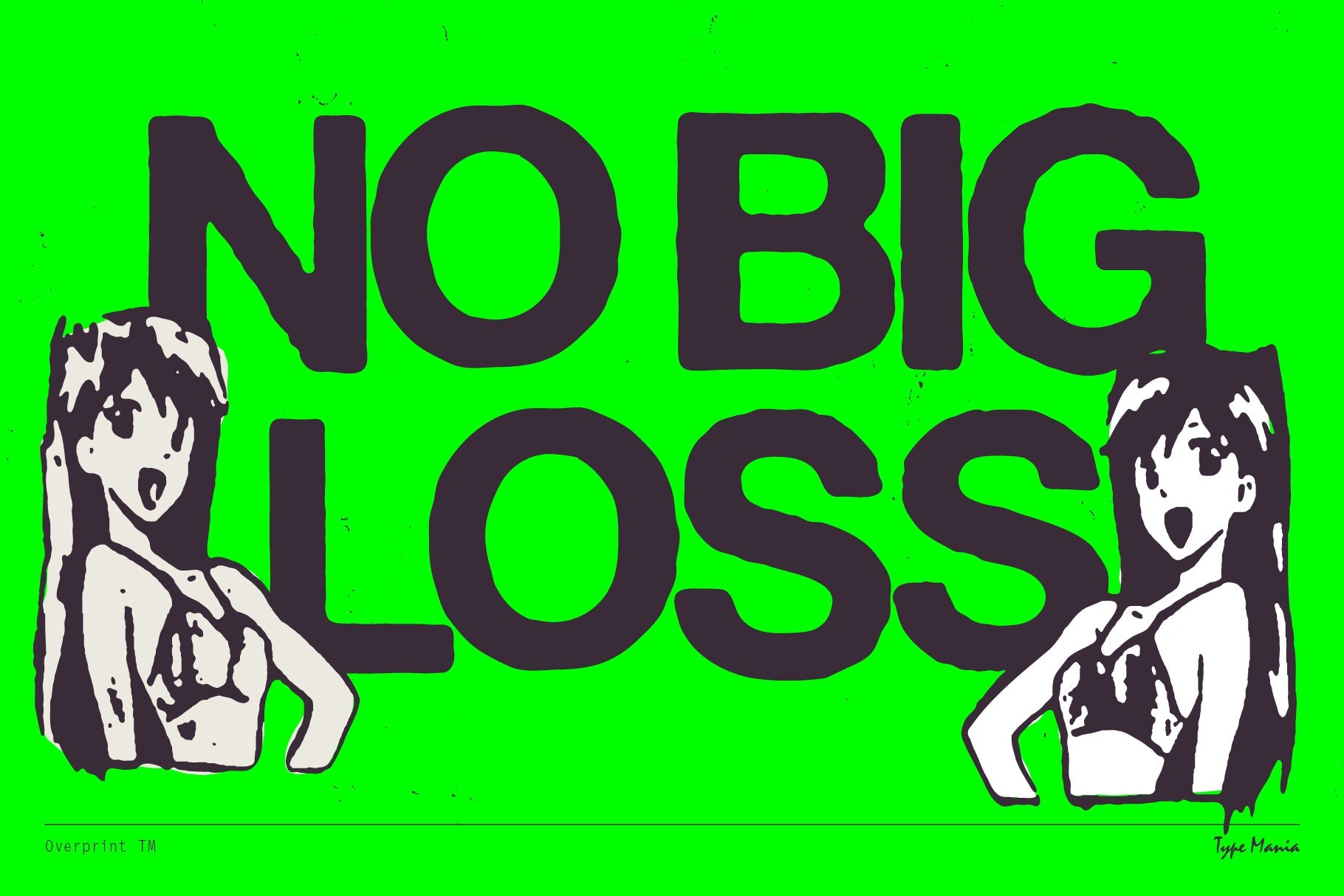
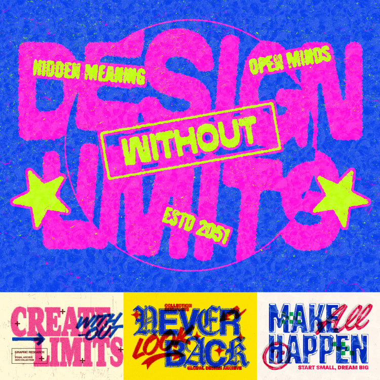
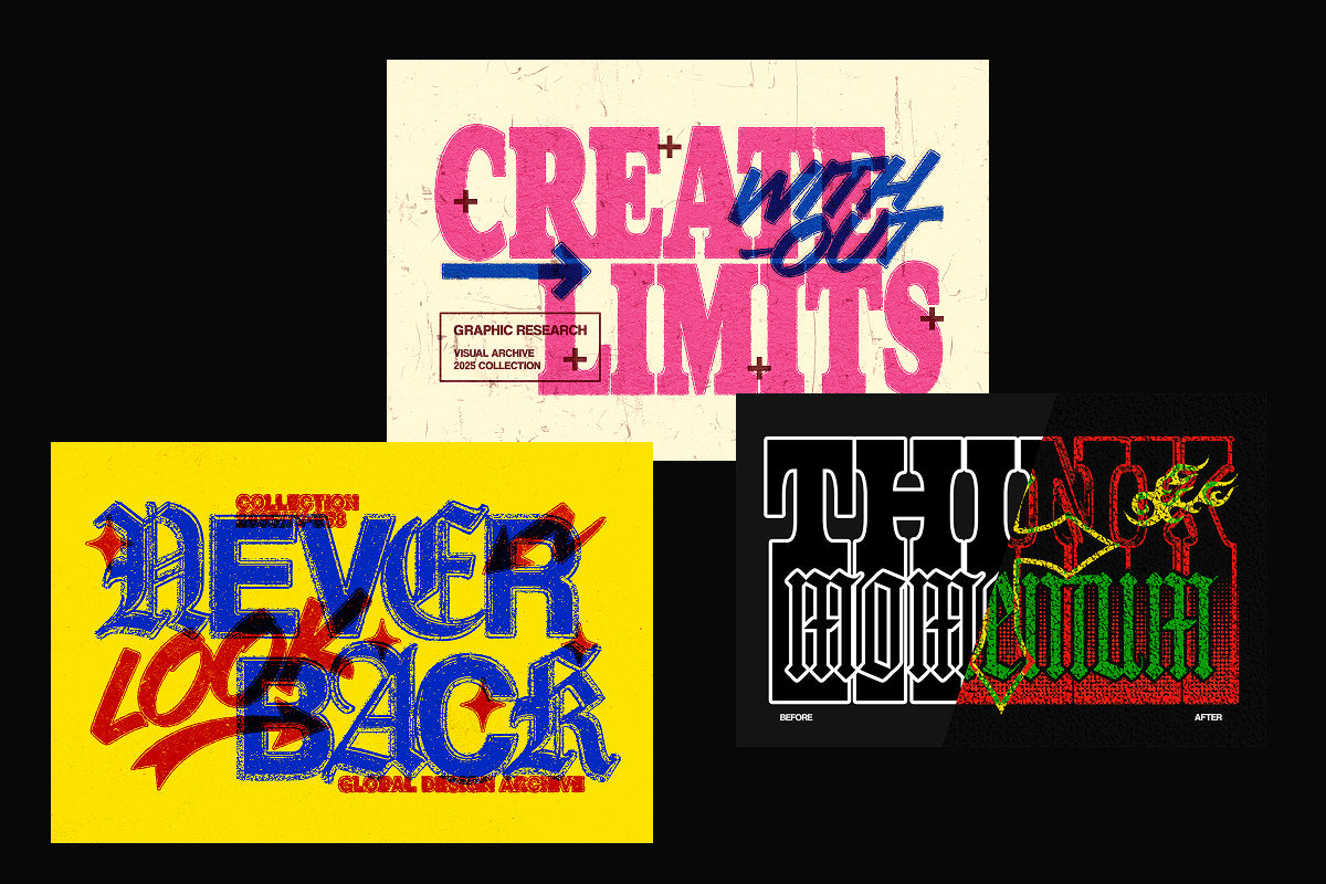
4. ink©t Y2K Typeface by züli

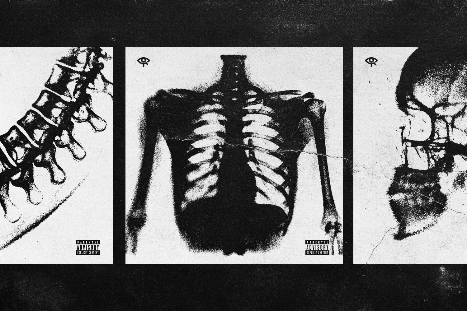
Raw ink texture applied to Y2K letterforms. ink©t by züli sits in an interesting space where the base structure is clearly digital-era but the surface treatment is gritty and physical, like a flyer that's been photocopied twice and then rained on. That contrast is what makes it useful. It cuts through polished layouts without looking like an accident, and it earns its place on album art, event posters, and anything that needs edge without full chaos. It's not a workhorse; it's a statement piece. If you want more in this territory, there's plenty more gritty type worth a look.
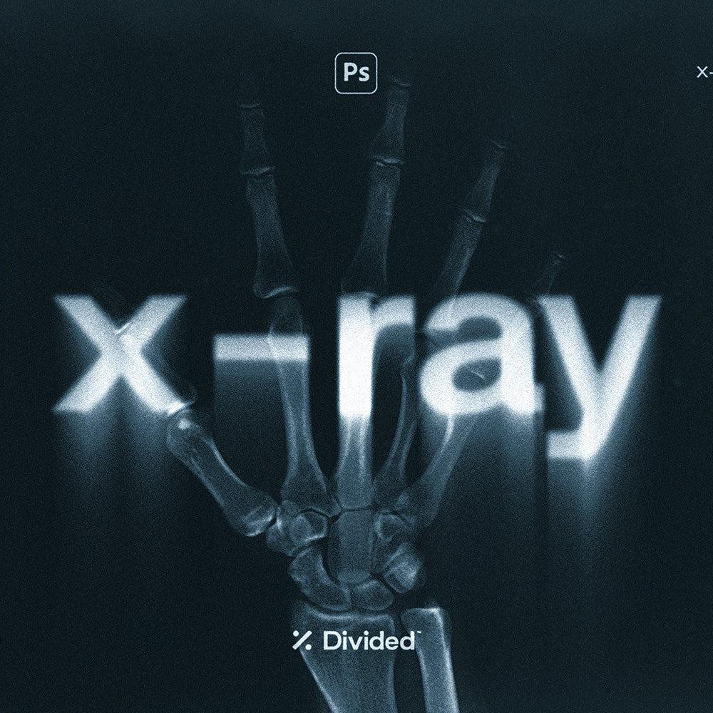
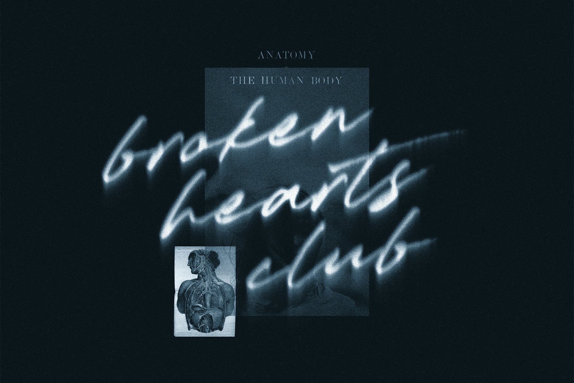
5. Obscura TM by Type Mania

The blurry font concept has been done badly many times. Obscura TM does it properly. Obscura TM by Type Mania uses three stylistic sets that rotate automatically with Contextual Alternates turned on, meaning every word you type produces a different degree of blur across its letters rather than a uniform smear. The result is genuinely unstable-looking text, which is exactly the right reference point for that early-digital, almost-broken quality that defined the tail end of the 90s into the early 2000s. Strong on nightlife flyers, rave posters, and anything playing with the aesthetics of degraded digital media. Not suitable for anything requiring legibility under stress.
6. Dripdrop Liquid Font Set by Set Sail Studios

Six fonts, all made from actual liquid ink, which shows. Dripdrop by Set Sail Studios sits in the physical-meets-digital corner of Y2K, where the aesthetic interest comes from something tactile being translated into a digital context. The drips, splats, and blobs are specific and varied enough that the set gives you range; some weights read more controlled, others are pure chaos. It works on merch, poster headlines, and branding that wants to suggest mess without actually being unreadable. The limitation is that it's a mood font, not a utility font. You're not using this for secondary text.
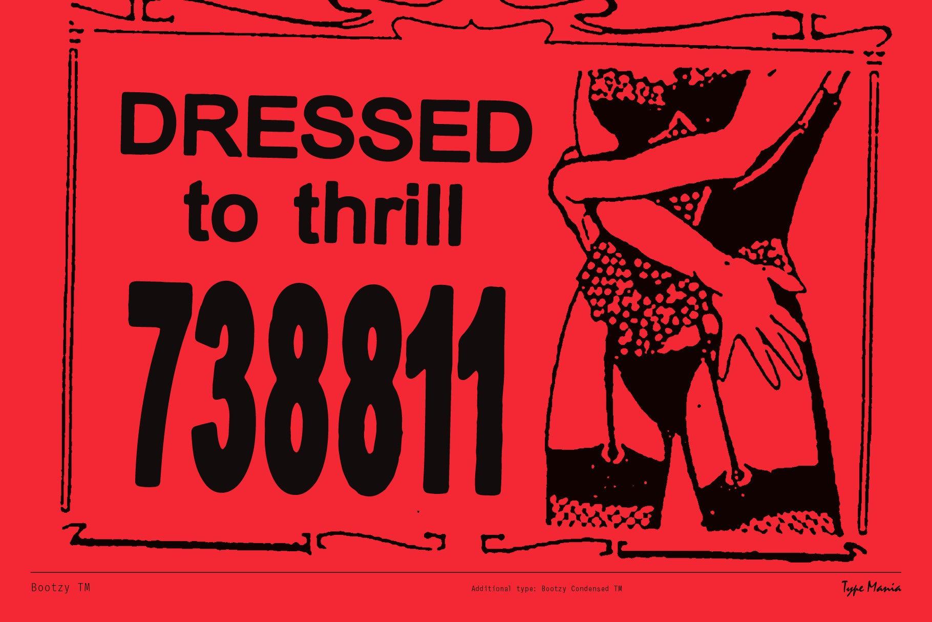
7. Charmer TM by Type Mania

Charmer TM sits at the softer, more personal end of the Y2K font spectrum. Charmer TM has a calligraphic looseness to it, the kind of letterforms that suggest a CD cover insert or a handwritten note scanned and printed on a zine. Type Mania describes it as fitting a bedroom pop band about to make it big, and that framing is accurate. It brings warmth and a slightly nostalgic, personal quality that harder Y2K faces don't offer. Use it for album art, intimate event posters, or anywhere the work needs to feel human and a little lo-fi. It won't hold up in contexts that need authority or visual punch.
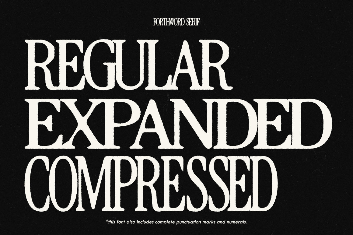
8. PS Apex Pits by Posche Type

Where most Y2K fonts look backward at the era's handmade and organic tendencies, PS Apex Pits looks at the other half of the story. This is geometric, sharp-angled, and monolinear, referencing the tech-optimism and futurist branding that defined the early 2000s just as much as bubbly type did. The tall x-height keeps it readable even at headline scale, and the industrial edge makes it useful for motion graphics, tech-adjacent poster work, and anything that wants to feel forward-facing rather than nostalgic. It's Y2K as ambition rather than playfulness, which is a different and useful register.
9. FBS Doms Typeface by Febspace Studio

Three styles in one package: Regular, Soft, and Rugged. FBS Doms by Febspace Studio is blocky and bold at its core, with the Rugged variant adding distressed texture that pushes it into genuinely gritty territory. The Regular holds its own as a clean brutalist display face. What makes it practically useful is having all three in the one file; you can run the clean version at headline scale and lean on the textured variant for subheadings or accent text within the same layout. Solid for poster work, merch graphics, and anything with a hardcore, streetwear, or underground music leaning. If you're deep in this direction, there's more streetwear-oriented type and graphics worth digging into.
10. Glapy Typeface by Chrphb

Glapy is deliberately, structurally chaotic. Glapy by Chrphb mixes conventional lowercase forms with alternative letterforms, creating layouts where the eye catches on specific characters rather than reading smoothly across the word. That's the intended effect and it works well when you want type that functions more like a graphic element than a reading experience. It's maximalist in the way a lot of 2026 Y2K revival work is maximalist, dense, layered, deliberately overwhelming. Best deployed in short bursts on posters, album art, or any context where legibility is secondary to visual texture. Extended use will fatigue fast.
11. Aürix Y2K Typeface by züli

Züli's second entry on this list takes a different angle to ink©t. Aürix is clean and geometric where ink©t is raw, pulling from the harder, more structured side of Y2K type design. The capital letterforms carry distinct era-specific shaping that makes the Y2K reference immediate without being cartoonish. It's the kind of face that works for branding and poster titles where you want the aesthetic to land clearly but the execution to feel controlled. Useful across album art, streetwear applications, and digital content. Less suited to anything that needs subtlety.
12. ATOMIC Marker Font by Set Sail Studios

All caps, hand-drawn with a real acrylic marker, and it shows in every stroke. ATOMIC Marker by Set Sail Studios is the loudest font on this list in terms of raw energy. The brush detail is high resolution and authentic, so you get genuine marker texture rather than a digital approximation of it. It belongs on skate and surf graphics, gaming poster work, anything that needs to feel handmade and urgent. The extras pack extends its versatility. It's single-purpose in the best sense; when a project calls for this kind of intensity, nothing else in this list will do the job better.