There's a reason the most interesting brand work in 2026 keeps reaching for fonts that look like something a person made with their hands. It's not throwback nostalgia, not a retro mood board reflex, and not a reaction to any single aesthetic movement. It's something more deliberate than that. When everything is smooth, optimised, and generated at scale, roughness becomes the signal, and letterforms that carry the trace of a human hand carry weight that perfect geometry simply cannot.
The Case for Imperfection
The hand-drawn and organic type movement sits inside a broader cultural shift that designers have been calling "proof of hand" for the past couple of years. The argument is simple: when AI can produce technically flawless typography on demand, visible imperfection stops being a flaw and starts being a credential. It tells you something was made, not generated. It says someone chose this line, this weight, this wobble, and made a decision with their body as much as their software. That specificity is hard to fake, and audiences are increasingly good at feeling the difference even when they can't name it.
LinkedIn's Spring 2026 Aesthetic Guide put it plainly: "Human-led imperfection is the new brand design trend in 2026. The rise of hand-drawn typography, tactile textures, and layered design systems is a direct response to AI-generated sameness." That's not a fringe take from a niche type blog. That's a mainstream business platform identifying something that working designers have already been living for the better part of two years. The clients are catching up to what the creatives already knew.
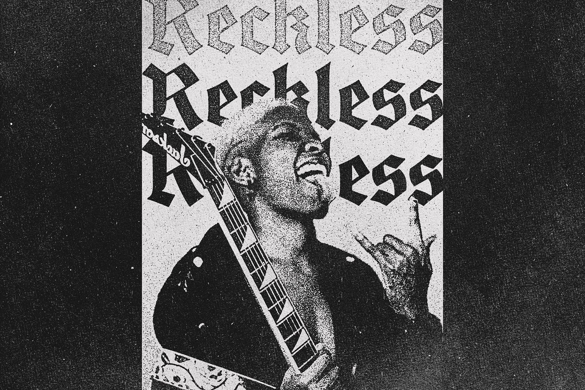
Early 2026 roundups from outlets like Creative Boom and We and the Color made the case even more specifically. Fonts like Pants On Fire, The Romantic, Jackie's Pen, Butter and Crumb, and Sorah were all highlighted for one defining quality: they felt genuinely made. Not scanned-then-cleaned. Not algorithmically textured. Made. The distinction matters because the letterforms carry the decisions of someone working with actual tools, and that specificity shows up in the details that make type feel right at small sizes and expressive at display scale.
The colour palette trend running alongside this is not coincidental. Brands reaching for hand-drawn type are also reaching for sage, olive, warm cream, and earthy teal. These are colours that resist digital brightness, that feel closer to print and paper and material things. Together, organic type and grounded earth tones are building a total aesthetic vocabulary, one that signals care, craft, and the kind of slowness that feels genuinely countercultural right now.
Not Just Nostalgia
The easy misread of this trend is that it's pure nostalgia, designers going back to the analogue well because the digital world feels sterile. That's part of it, but only part. The more interesting thing happening in 2026 is that the best organic type is technically rigorous. It reads well. It scales. It holds up in small body copy, on a tote bag, on a billboard. The imperfection is intentional and controlled, not a casualty of low craft. These are designers who know exactly what they're doing and are choosing looseness as a deliberate formal decision.
Type Mania's approach is a good example of this. Their fonts carry real personality without sacrificing legibility, and the auto-shifting stylistic sets in their work mean the irregularity is built into the system rather than applied as a filter. Set Sail Studios takes a similar position: fonts drawn with real tools, real marker on real paper, but engineered to function as professional type assets with ligature sets, alternates, and extras that give designers genuine flexibility. HVNTER's work sits in the same camp. Bubbly and organic on the surface, but thought through at a structural level. These aren't rough by accident. They're crafted to carry specific emotional registers, and that's a very different thing from slapping a texture overlay on a geometric sans.
The framing Type Mania uses for Oddball TM is worth sitting with: "perfectly imperfect, just like your favourite vintage band t-shirt." That's the right intent. A vintage band tee reads as authentic not because it's falling apart but because it carries evidence of use, of history, of being a real object in the world. The type equivalent is a letterform that carries the evidence of being drawn, of a hand making choices in real time. That's what separates the good stuff from the texture-filtered knockoffs.
The Products Leading This
Oddball TM

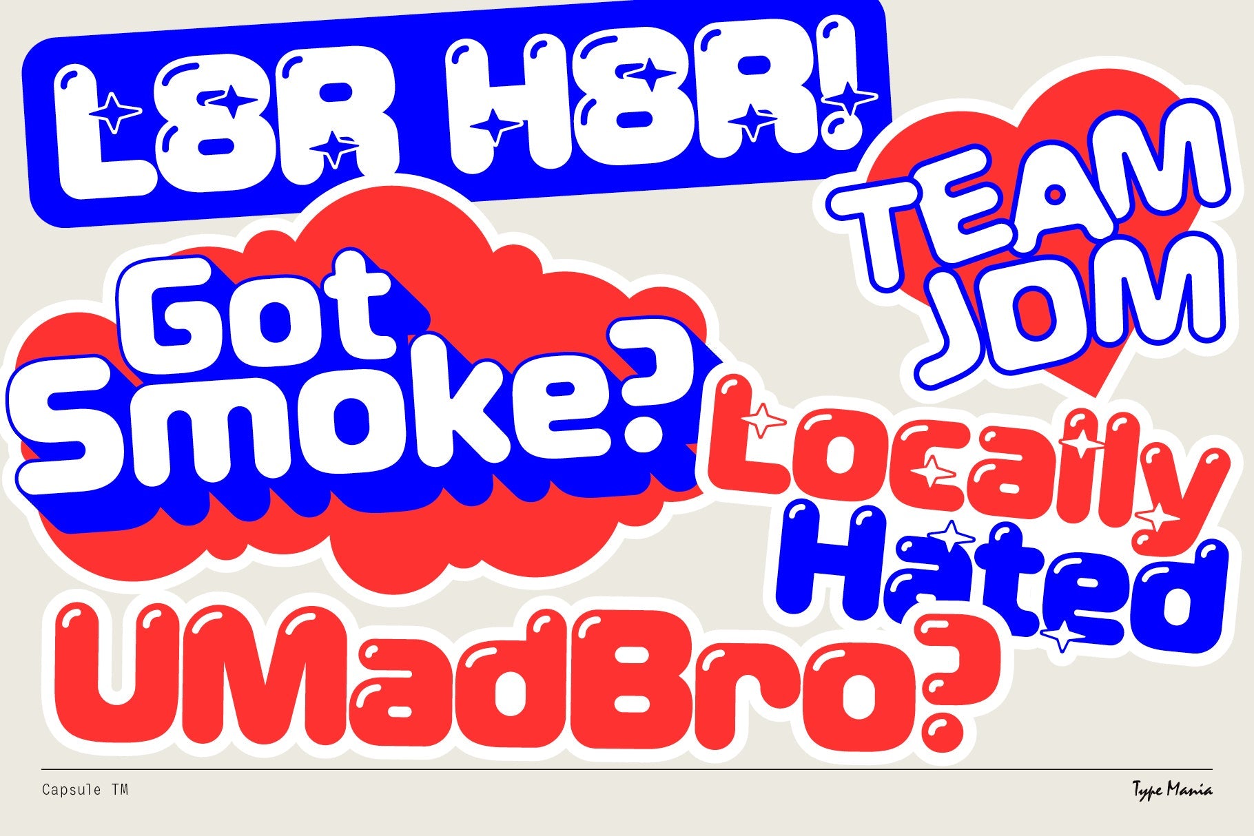
Oddball TM from Type Mania is the blob-y, attitude-heavy handwritten font that's been tracking as one of the stronger-performing organic type releases of the year. Three stylistic sets shift automatically, which means the letterforms vary across your copy in a way that mimics how actual handwriting works, no two instances of the same letter looking identical. The result sits somewhere between nineties grunge zine and streetwear drop, and it's built for work where energy and authenticity are the whole brief. Merch, posters, music branding, any context where clean and corporate is the enemy. If you're into more of what Type Mania does, there's plenty more worth a look from them.
Dreamer TM

Where Oddball goes loud and confrontational, Dreamer TM works a different register entirely. It's an emotive serif with two auto-shifting stylistic sets, channelling the particular emotional texture of early-2000s design: edgy but earnest, nostalgic but not ironic. The letterforms carry a handmade quality that comes through most strongly in logo applications and headline treatments, where the subtle variation between characters has room to breathe. For brand work that needs to feel like it has a genuine point of view rather than a trend mood board, Dreamer earns its place.
BOTCH Typeface

HVNTER's BOTCH is the most purely joyful thing in this group. Bubbly, organic letterforms with the kind of looseness that looks effortless but clearly isn't. Full upper and lowercase, numerals, basic symbols, all consistent in energy without being repetitive. It's the font you reach for when the brief asks for personality and you want to deliver something that feels hand-drawn in the best possible sense: expressive, a little unpredictable, alive. It's been the top trending product in this space for good reason. Streetwear graphics, poster work, and brand identities for anything that sells culture rather than product all benefit from what BOTCH brings.
ATOMIC Marker Font + Extras

Set Sail Studios drew ATOMIC Marker with a real acrylic marker, and the difference shows in every stroke. This is not a simulated brush font. The high-definition texture in each letterform is there because it was captured from actual mark-making, and the all-caps structure gives it the kind of graphic authority that works at display scale without losing the handmade quality up close. Two glyph sets, eighteen ligatures, six small caps, plus a separate doodles font and an underlines font make this a serious working tool rather than a novelty. For posters, packaging, and anything where you need the energy of a hand-written headline with the flexibility of a proper type system, ATOMIC delivers.
September Spirit Font Duo

Hyper-realistic is the right word for September Spirit. Set Sail Studios built this duo from real handwritten words, pulling the ligatures and alternates directly from actual handwriting rather than constructing them digitally, and the result is a script that reads as genuinely written rather than typed. The large ligature set, alternate characters, All Caps version, and Extras font with arrows, circles, and underlines give you the full toolkit for social content, brand identity, and anything that needs warmth and a human voice. It occupies a different tonal register from the grungier entries here, closer to the earthy-organic palette trend than the streetwear end of things, which makes it the right call for food, wellness, and creative studio branding.
NOSKALE

From Enxyclo Studio, NOSKALE sits at the industrial end of the organic type spectrum. Gritty strokes, raw handdrawn imperfections, an energy that reads urban and physical rather than warm and earthy. It's a branding font built for contexts where authenticity means something harder-edged: streetwear labels, independent music, creative agencies that want to look like they don't care whether you approve of them. Available in OTF, TTF, and WOFF, so it's deployable across print and digital without hassle. The imperfection here isn't softened for palatability. It's left intact, which is exactly the right call.
Guffaw

Marvadesign's Guffaw pulls from an earlier moment than most of the other fonts here, landing somewhere in the sixties and seventies with fluid, groovy strokes that feel genuinely warm rather than ironically retro. The letterforms flow in a way that rewards logos and headline treatments, where the organic rhythm of a well-drawn script has room to read as craft rather than casualness. For food brands, bottle labels, record sleeve treatments, or anything that wants to feel sun-warmed and handmade without tipping into twee, Guffaw is the call.
SFC Noble King

Not every entry in this trend is a script or a hand-drawn brush font. SFC Noble King from Skilline Fonts Co. makes the case that organic imperfection can live in a bold vintage serif just as comfortably. The sculpted serifs carry subtle irregularities that read as old-world craft rather than digital construction, referencing antique signage and classic print design in a way that feels earned rather than affected. Heritage branding, premium packaging, and apparel graphics that need weight and character without looking like they came out of a template. It's a different kind of handmade than the marker and brush fonts above, but the underlying logic is the same: evidence of making, visible in the form.
Where This Works
Organic type earns its keep anywhere authenticity is doing actual commercial work. Food and drink brands, independent music, creative studios, DTC products that are selling a value system alongside a product, merch for anything with a real community behind it. These are contexts where polish is not a neutral quality. It's a liability. It signals that something has been optimised for mass appeal, and mass appeal is exactly what the most interesting brands in 2026 are working against. The fonts here aren't for everything, but for the work where they fit, they do something technically perfect type simply cannot. If you want to keep exploring what's coming through in this space, the staff picks are worth your time.