Something specific happened to graphic design in the late 90s. It wasn't a movement with a manifesto or a school with a name. It was a convergence: illegal raves needed flyers, techno labels needed sleeves, early internet needed interfaces, and a generation of designers had just got their hands on Photoshop and a CD-ROM full of 3D rendering tutorials. The result was one of the most visually distinctive eras in recent design history, and right now it's being treated as source material by designers who were in primary school when it was happening.
This isn't nostalgia in the soft, sepia-toned sense. It's something more deliberate. The generation doing it now is more precise about the grammar than the originators were, because they're approaching it as a studied aesthetic rather than a practical necessity. They know what a Basic Channel record sleeve looks like. They know the Wipeout UI. They know the difference between a rave flyer that was photocopied in black and white and hit with a single neon ink versus one that was printed full colour with early 3D chrome text. They're picking and choosing, not just imitating.
Why This Particular Moment
The timing makes sense if you look at what's happening culturally. On Reddit's r/decadeology and across TikTok, the futuristic aesthetics of the late 90s and early 2000s are being named and taxonomised as a distinct design era. The Gen X Soft Club aesthetic (urban typography, cool muted palettes, train stations and brutalist architecture) is pulling serious engagement on social. Videos cataloguing what one creator called "the aesthetic of the millennium" are hitting millions of views. People are building language for something that didn't have a name because it didn't need one at the time.
There's also a direct counter-reaction happening to where design is going algorithmically. The current visual output of AI generation tools tends toward a kind of frictionless smoothness, perfectly blended gradients, hyper-realistic renders, nothing that looks like it was made under constraint or with limited tools. Late 90s techno design is the opposite. It's all constraint and limitation worn proudly. Scan lines because the screen had scan lines. Chrome bevels because that's what early Photoshop could do. Geometric industrial type because legibility at photocopied scale required it. The imperfection was structural, not decorative, and designers right now are finding that genuinely interesting to work with.
Trend forecasting for 2026 is already noting the carry-over of shiny chrome textures and the continued pull of late-90s futurism as a visual mode, not just a nostalgic reference. What's changed is the application. This isn't being used for retro-themed projects. It's showing up in DTC branding, music packaging, editorial design, streetwear graphics, social content. The visual language has been extracted from its original context and is being used on its own terms.
The Visual Grammar, Defined
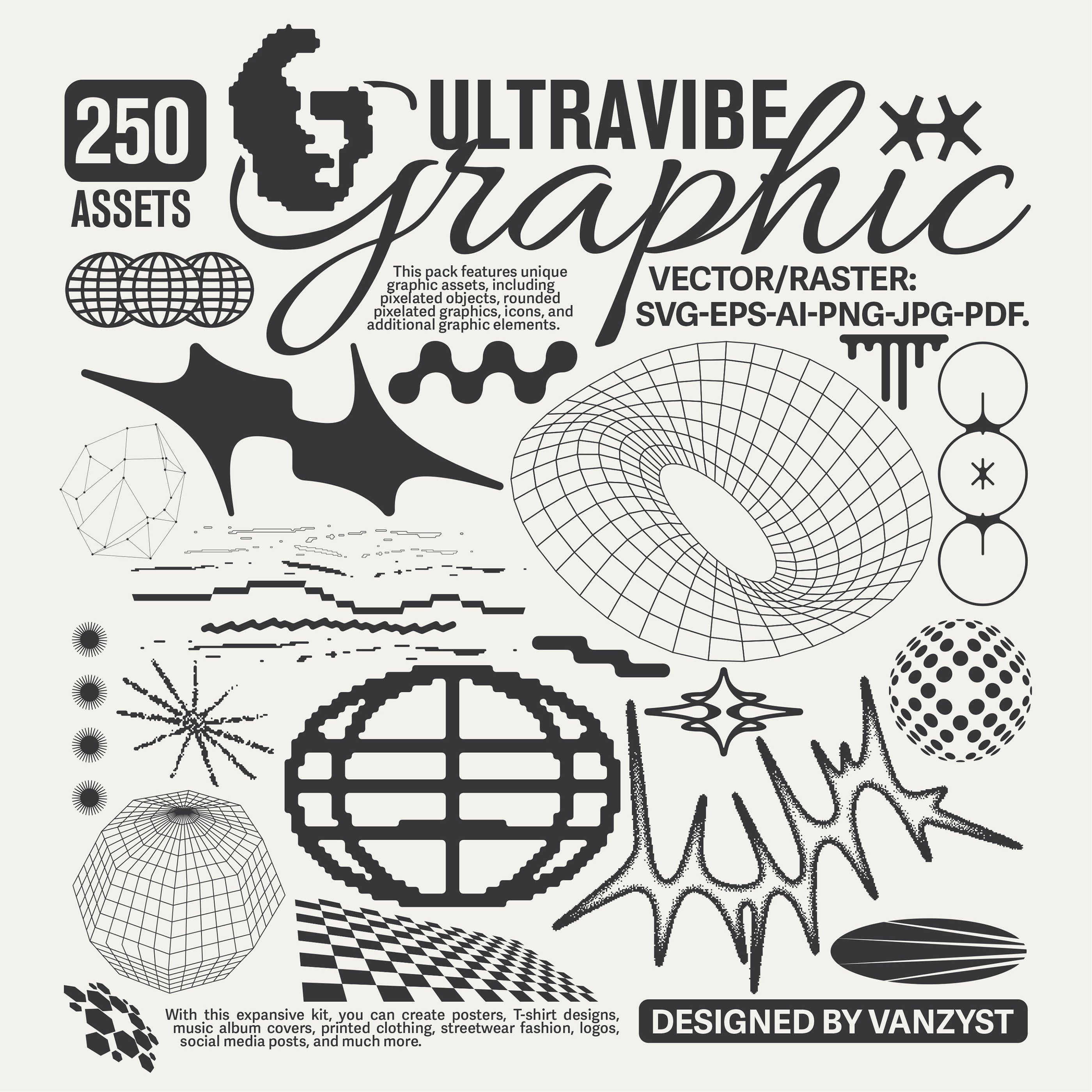
Before getting into the toolkit, it's worth being specific about what the aesthetic actually consists of, because "90s techno" can mean a lot of things and most of them are wrong. The reference points that matter here are: Jeff Mills and Surgeon record sleeves (high-contrast monochrome, machine-weight industrial type, zero ornamentation), rave flyers from the UK free party and warehouse scene (condensed all-caps, maximum information density, often photocopied), the Wipeout game UI designed by The Designers Republic (geometric sans, anti-gravity negative space, acid colour drops on black), early internet UI with its tiled backgrounds and bevelled buttons, and the specific visual language of early 3D rendering when it was still visibly synthetic. Chrome text. Lens flare as a design element. Cyber grids receding to a vanishing point. CRT scan lines. High-contrast monochrome cut with acid neon.
The type in this world was doing specific work. It needed to read at distance on a flyer, communicate technical information on a record sleeve, and feel like it belonged to a future that was still being imagined. That meant geometric, condensed, often monospaced, usually bold. Humanist warmth was actively unwanted.
The Typefaces
If you're building anything in this space, type is where it starts. Matech by Marvadesign is probably the most directly industrial of the group. Five weights of monospaced techno, clean geometric structure, the kind of uniform precision that reads like it was designed for a control panel or a data terminal. It sits comfortably next to reference material from the era without feeling like pastiche, which is the hard thing to get right. Use it at large scale for maximum effect, or set tight at small sizes for that UI-data-readout quality that the original techno sleeves loved.

Built around angled geometry with 450-plus glyphs, Astro Mono by Font For Zula applies a unique angular treatment to each letterform that gives it genuine distinctiveness. It's monospaced, so it carries that machine-text quality, but the geometric intervention makes it feel more constructed than clinical. Good readability across applications means it works at editorial scale as well as display size, which is useful if you're building something that needs to function as both headline and body element.

The Designers Republic had a thing for type that looked like it belonged to a future that was slightly hostile to humans, legible but not welcoming. OCR Pexsar by Oscuraworks operates in that territory. Bold geometric forms, sharp diagonal cuts, precise connecting strokes. It's a display typeface with real editorial presence, the kind of thing that works on a record sleeve, a poster, a magazine cover, anywhere that needs weight and confidence without softness. The diagonal detailing is what makes it specific rather than generic futurism.

For the rave flyer end of things, where type needed to be aggressive, forward-leaning, and slightly unstable, Nouther by Uncarving Nation has the right energy. Bold italic with a cyberpunk edge, it's the kind of face that works for album art, poster headlines, anything that needs to feel like it's moving even when it's static. Not a workhorse, but a statement piece when the brief calls for that kind of intensity.

Then there's Capsule TM by Type Mania, which is doing something slightly different and more interesting for it. Rounded and modular, it references the softer, more playful end of the era, the JDM sticker aesthetic, Italian modernist product design, the moment when the 90s techno future got a glossy consumer-friendly finish. It comes in three styles including Glow and Sparkle variants, which means it can go maximalist in ways the harder industrial faces can't. It's the choice when you want to reference the era's optimism rather than its austerity.

If you want more to dig through, there's plenty more futuristic type worth looking at and a solid range of cyberpunk-leaning faces if this direction is where you're working.
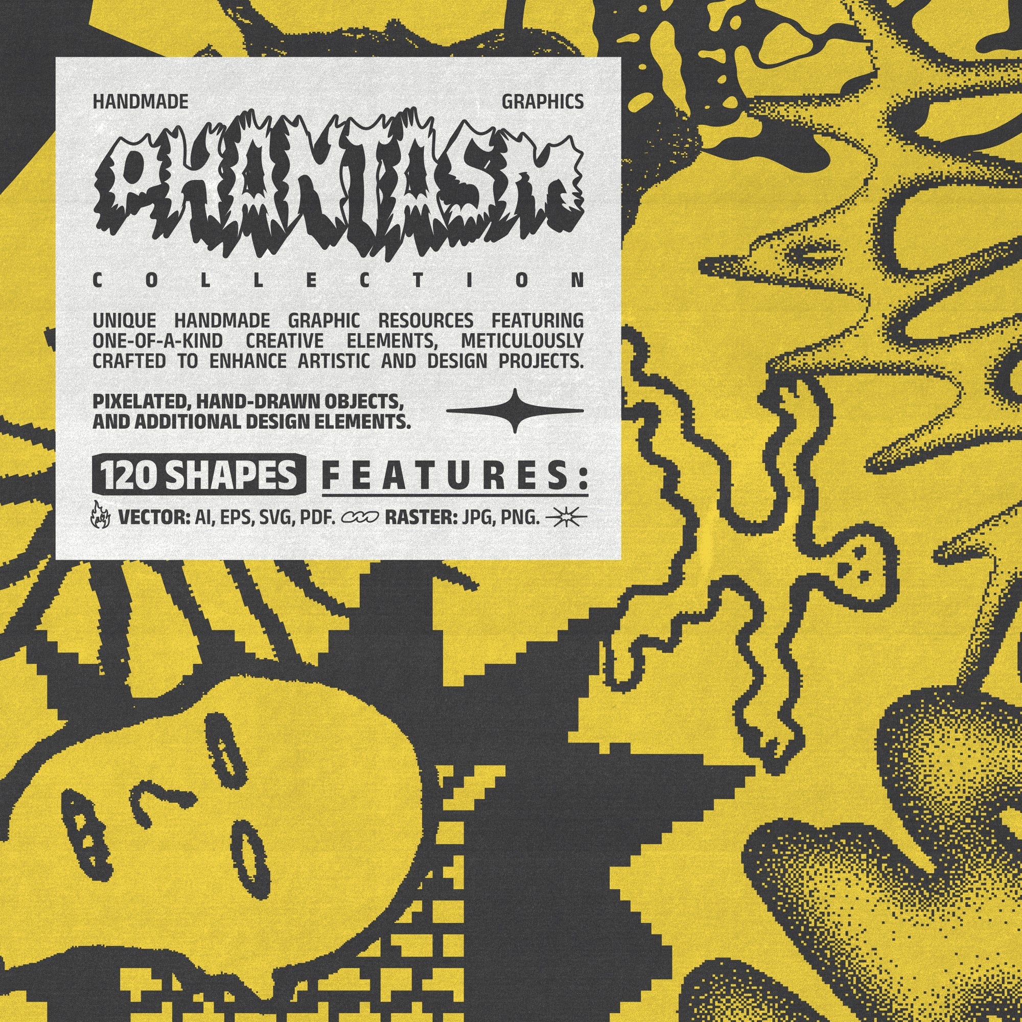
Texture, Distortion, Surface
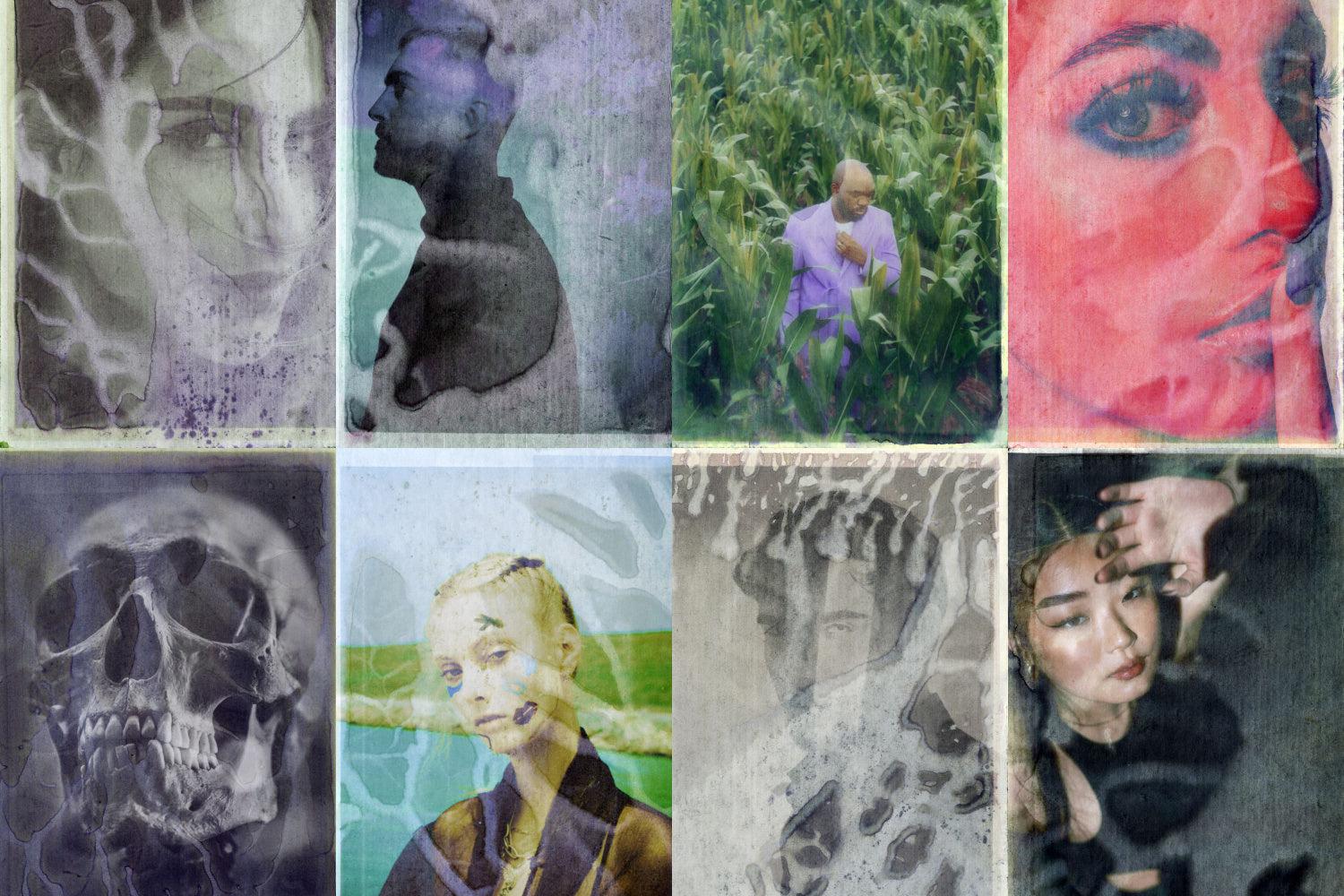
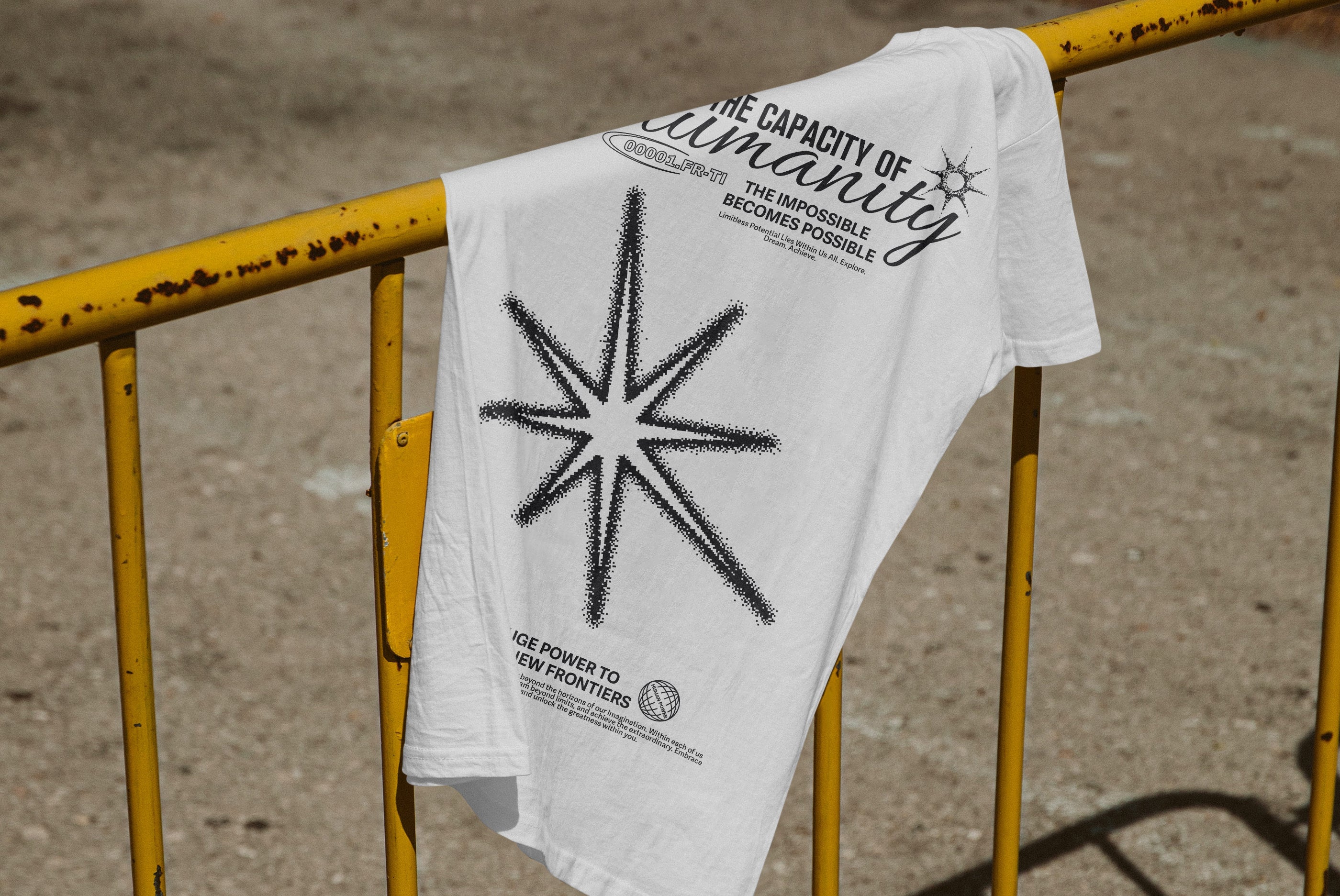
Type alone doesn't build this aesthetic. The surface quality matters enormously, because the late 90s techno look was always about the physicality of reproduction. Rave flyers were photocopied until they degraded. Record sleeves had print registration that drifted. Early digital imagery had compression artefacts and scan-line interference that became part of the visual language rather than errors to be corrected.
The Glitched Print Texture Pack by Textexp is built specifically for this. Sixty analog camera glitches printed to give them physical texture and then re-scanned, which means the distortion has actual tactile quality rather than being a clean digital simulation. There's a meaningful difference between a glitch effect generated in software and one that's been through a physical process, and this pack leans hard into the latter. Layer it under type or over photography and the result feels produced rather than processed, which is exactly the quality that distinguishes serious work in this aesthetic from surface-level imitation.

For the holographic and chrome side of things, the Y2K Hologram Badge Stickers V.2 by Parisa-Artstudio delivers 23 vector badge stickers with genuine iridescent quality. The chromatic, rainbow-shift holographic finish is specific to the era in a way that's immediately recognisable. Use these on packaging, social content, posters anywhere you need a hit of that physical/digital hybrid energy the late 90s produced when materials and computing started to cross-contaminate each other visually.
![]()
The acid-neon-on-monochrome quality that defined a lot of techno visual work has a direct contemporary equivalent in the Acid Warhol Pop-Art Photo Effects by Pixelbuddha. Six customisable Photoshop PSDs that apply bold pop-art colour treatment to photography, with halftone and riso-adjacent qualities that connect back to the screen-print and photocopied origins of the era. The Warhol reference is apt because the original techno aesthetic was genuinely influenced by the high-contrast repetition of pop art silkscreening, and these effects replicate that visual logic in a way that's directly usable for album art, poster work, and social content.
![]()
How to Use This Without Getting It Wrong
The failure mode for this aesthetic is genericness. If you're applying chrome type, scan lines, and geometric fonts without understanding the specific reference points, the result reads as a mood board of "vague retro futurism" rather than something with genuine visual intelligence. The designers who are doing this well right now are being specific: they're referencing particular visual traditions within the broader era, not just deploying the surface markers.
Know whether you're working in the warehouse rave tradition (high contrast, maximum density, industrial type, zero decoration) or the Wipeout/Designers Republic tradition (geometric precision, negative space, acid colour as punctuation) or the Japanese techno tradition (which was doing its own specific thing with grid systems and character-set mixing). These overlap but they're not the same thing, and the specificity is what makes the work land.
The other thing worth noting is that this aesthetic was never meant to be comfortable. It came from a subculture that was deliberately operating outside mainstream visual culture, and the visual language reflected that. If your application of it is too polished, too legible, too welcoming, you've missed the point. The tension between utility and aggression, between machine precision and physical degradation, is what makes it interesting. That's where the texture packs and the distortion effects earn their place in the workflow, not as decoration but as structural elements that introduce the right kind of resistance into the work.
The late 90s produced a genuine design moment. It's taken about twenty-five years to have enough distance to see it clearly, and the designers using it now are doing something more considered than the originators could have been. That's usually how it works.