Something has shifted in the visual language of design, and if you've been paying attention to the work coming out of independent studios over the last year or two, you've probably felt it before you could name it. There's a pull toward material with weight. Toward images that look like they came from somewhere specific, were made for a reason, and have the marks to prove it. Toward, in a word, provenance.
The Sourceless Problem
AI-generated imagery is everywhere now, and the most honest thing you can say about most of it is that it looks like nothing in particular. Not in a minimal way. In a vacant way. The outputs are technically impressive and historically groundless. They borrow from everything and belong to nowhere. No era, no maker, no friction. Just a statistical average of visual culture, smoothed out and served warm.
Designers are responding to this, consciously or not. Designmantic's 2026 design forecast noted that the output people actually want right now is 'intentionally warmer, messier, and more human' — bridging heritage aesthetics and contemporary work as a direct counter to what the report called AI's 'overly sleek, frictionless feel." That's not just a stylistic preference. It's a positional statement. When everything generated looks sourceless and interchangeable, assets with a traceable origin carry a kind of authority that's genuinely hard to fake.
Fashion has already caught up to this logic. A Forbes piece by Elizabeth Grace Coyne noted that major fashion houses are digging through their own physical archives for reproduction material, driven in part by emotional resonance with consumers who want to feel something when they look at a brand. The same instinct is showing up in digital design. DTC brands want to look like they've been around longer than they have. Editorial clients want visual texture that reads as earned. Streetwear labels want graphics with actual historical weight behind them. Archival illustration is a fast path to all of that, and not just because it looks good. Because it's real.
There's a broader cultural signal here too. Hand engraving, linocut, letterpress, woodcut illustration: they're all having a moment, and not because designers suddenly got nostalgic. It's because they offer exactly what AI cannot replicate. A specific origin. A specific era. A specific purpose. The TikTok and Instagram wave around archival and documentary visual language, paper textures, stamps, illustrated borders, library-card aesthetics, is less about trend-chasing and more about designers reaching for work that has a reason to look the way it looks.
That's the argument. Now here's the evidence.
Seven Packs That Came From Somewhere
What follows isn't a shopping list. These are archival vector packs sourced from actual historical material, medieval manuscripts, Victorian ornament sheets, 15th-century woodcuts, mid-century scientific and engineering manuals. Each one carries a lineage. That lineage is the point.
Medieval Vectors by MiksKS is where you start if you want scale. More than 400 elements pulled from historical sources spanning the medieval period through to the 19th century, including museum collections. You're getting ornamental borders, decorative initials, grotesque figures, heraldic devices, and the kind of hand-drawn detail that only exists when someone drew it by hand because that was the only option. This is one of the more comprehensive archival vector packs available anywhere. It covers enough visual territory to anchor a full brand direction, not just drop a detail into a poster.

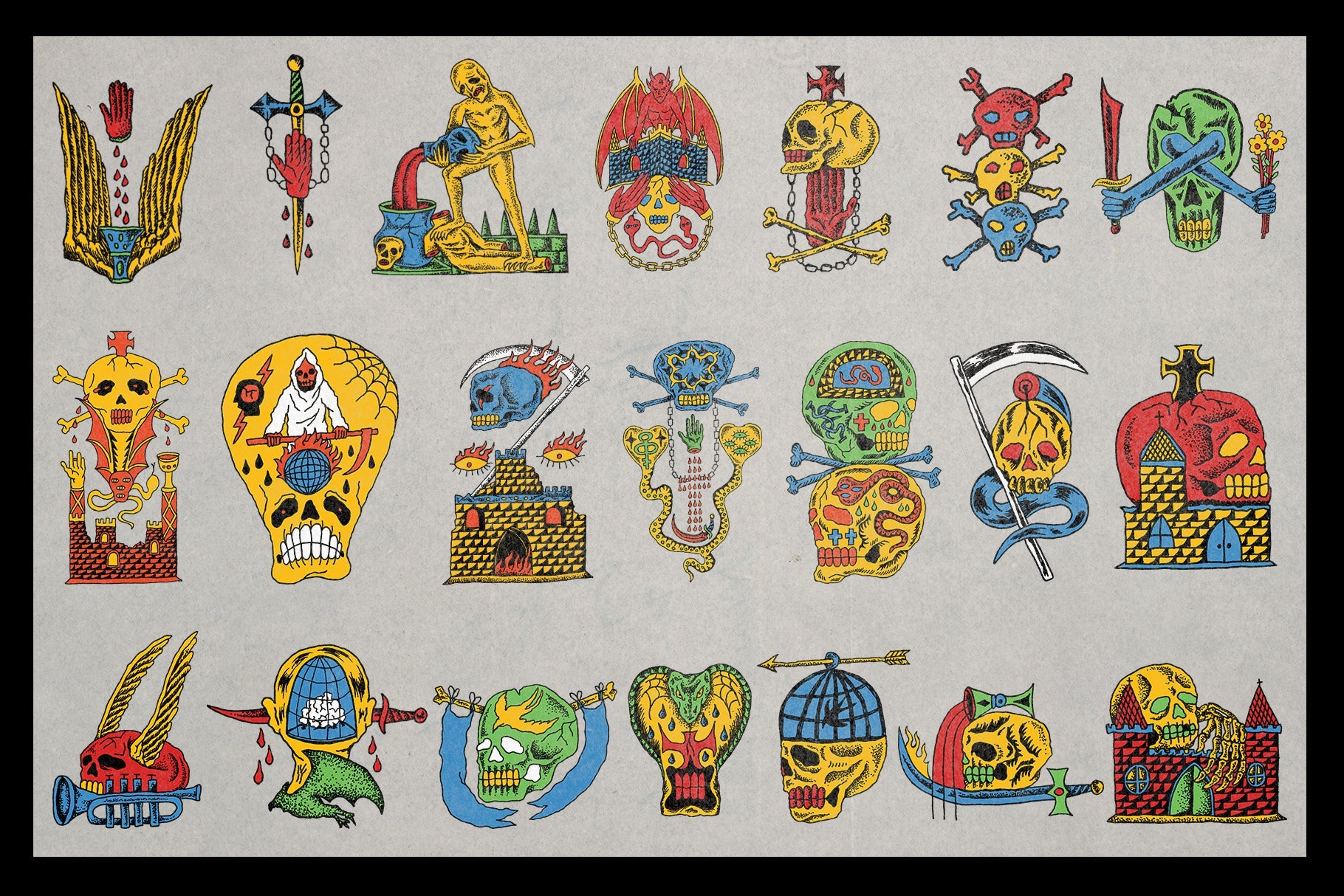
Sourced from medieval manuscripts and Renaissance-era printed books, Witches and Wizards by Nomad Visuals pulls from a visual tradition that's genuinely strange and genuinely specific. These aren't Halloween graphics. They're woodcut-style illustrations of witches, conjurers, alchemical figures, and occult symbolism drawn from the same visual culture that produced early printed books and broadsheets. The contrast and line weight sit somewhere between a 15th-century German woodcut and a Victorian penny dreadful. For editorial work, book covers, or anything that needs to feel unsettling in a historically grounded way, this pack is hard to beat.

Mid-century technical publishing had a design logic that's almost completely foreign to how we think about information design now. Everything was drawn by hand. Every graph, every cross-section diagram, every circuit schematic was rendered with ink and intention. Graphs and Diagrams Vol. 2 by God Control digs into that tradition, pulling 200-plus vector graphics from vintage books, manuals, and magazines. The results work as standalone graphic elements, as textural fill for poster backgrounds, as supporting detail in editorial layouts, or as the kind of unexpected design move that makes album art feel genuinely considered rather than algorithmically assembled.
If the Medieval Vectors pack is a survey, Ornamental Vectors by MiksKS is a depth cut. Two hundred elements sourced from Victorian and Renaissance ornament traditions, covering the full range of decorative grammar that dominated print design from the 16th through the 19th century. Baroque flourishes, Gothic borders, intricate repeat patterns. The kind of visual vocabulary that took master craftsmen years to develop and that modern designers can now drop into a zine or album cover in an afternoon. It sounds reductive, but it isn't: knowing where something came from changes how you use it.

There's a particular kind of authority that comes with scientific and engineering illustration, and it's almost entirely about specificity. Every line in a technical diagram exists because it had to. DIAGRAMS by Massive Supply Co. collects 250-plus vectors sourced from 19th and 20th century textbooks and manuals, covering blueprints, mathematical graphs, engineering schematics, and scientific charts. Used in contemporary design, these elements carry the credibility of their original context into new work. Streetwear graphics, editorial layouts, and poster design all benefit from that kind of borrowed authority when it's used with some intentionality.
Frame design has a long history that most designers interact with without really thinking about it. The decorative borders and ornamental frames that appear across centuries of print history weren't decorative for decoration's sake. They were structural, compositional, and deeply tied to the production constraints of the printing technologies of their time. Illustrator Frames Brushes by MiksKS takes that history seriously. More than 200 brushes built from archival sources, meticulously vectorised and set up as native Illustrator brushes so they actually behave the way you'd want them to. For print work, branding, and poster design, these are among the more versatile archival vector packs in the catalogue.

Not every entry into archival-sourced design needs to be a full investment. Free Pack Medieval Garden by Softulka is a sampler of a much larger kit, and it's free, so there's no real barrier to getting your hands on it. The elements sit in a tradition that spans medieval botanical illustration, post-Reformation decorative art, and early Art Nouveau: thorns, sigils, hand-drawn borders, organic flourishes. The aesthetic lands somewhere between a scribe's notebook and a contemporary tattoo flash sheet, which is exactly the kind of collision that's driving some of the most interesting branding work coming out of independent studios right now. If you're working in gothcore, dark fantasy, or any kind of underground streetwear direction, this is a natural starting point. There's plenty more worth digging through if you want to see what else has been catching our eye lately.

What It Means to Work With Old Material
There's a practical argument for archival vector packs that's easy to make. They're cost-effective, they're high quality, and they carry a visual authority that contemporary illustration often struggles to match. But the more interesting argument is the cultural one.
When you work with material that existed before you found it, you're in a different relationship with your source than when you generate something from scratch. The Victorian ornament sheet was drawn by someone, for a specific publication, in a specific printing context, for an audience that understood its visual conventions. The medieval woodcut was carved by someone who knew the grain of the wood and the pressure of the press. That specificity doesn't disappear when you vectorise it and place it in a contemporary layout. It carries through. It's part of why the work reads as grounded rather than generic.
This is what the tactile rebellion against AI-generated design is actually about. Not luddism, not nostalgia, not a rejection of technology. It's about the difference between material that has a history and material that has no history at all. One of those things has weight. The other one is just output.
Designers have always borrowed from the past. What's different now is that borrowing from something with a traceable origin has become a meaningful act in itself. The archive isn't just a resource. It's an argument about what design is for.
If you're building out your asset toolkit in this direction, there's more coming through regularly that's worth keeping an eye on.