Something shifted in the last twelve months. Not a dramatic rupture, more like a slow correction. After years of design work that looks like it was exhaled by a machine, polished to a finish so smooth it leaves no fingerprints, designers are starting to want the fingerprints back. The rough edges. The ink that bled a little too far. The texture that took actual time to make.
This isn't nostalgia for its own sake. Nostalgia is passive. What's happening right now is deliberate. Kittl's 2026 Graphic Design Trends report calls "human-made visuals" the number one trend of the year, framing it plainly: after years of AI-smooth perfection and over-polished branding, people are craving proof that a human made this. Adobe's own data showed a 30% rise in searches for hand-drawn and imperfect design elements as far back as 2024, which means this has been building quietly for a while. Now it's arrived.
The design community has been saying it out loud. "Design in 2026 is getting weird again. Less perfection. More emotion. More chaos." You've probably seen some version of this on your feed. Hand-drawn elements, real texture, anti-design layouts, collage aesthetics. And running underneath all of it: a growing refusal to let the work look like it came from a prompt. Small studios and freelancers are leaning into it as a straight-up business position. Made by hand. Made slowly. Made by a real person. For packaging work, branding, anything where provenance matters, this is becoming a genuine differentiator.
The reason it works isn't sentimental. Imperfection carries information. It tells you a human made a decision, held something, pressed something, drew something. That's a signal, and audiences are reading it even when they can't articulate why one piece of work feels more alive than another. The craft is the content. So here's a look at what that actually looks like in practice, and what's in our catalogue that's built for exactly this moment.
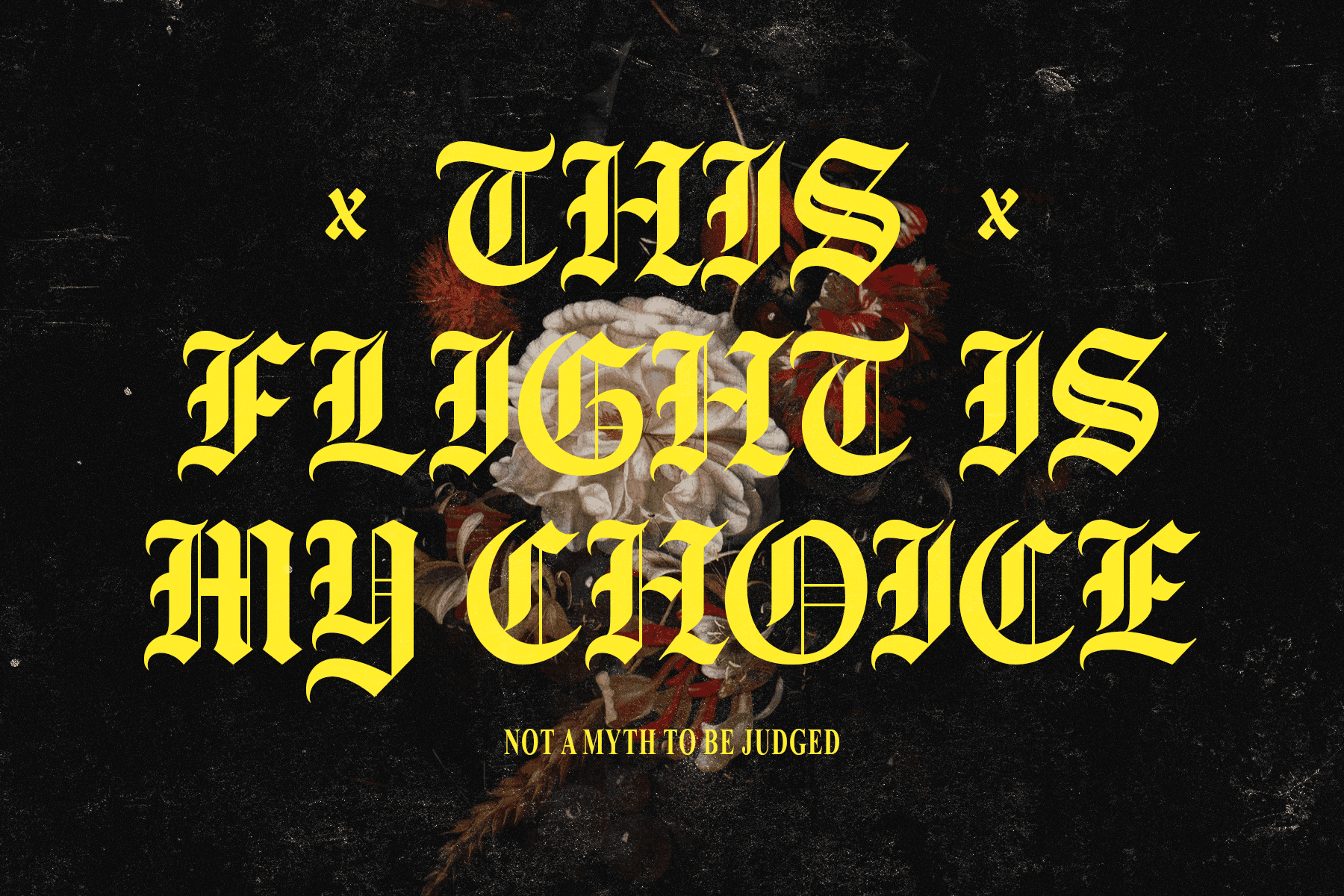
Tobeloved by Typeparties

The creator's own description cuts right to it: "type should feel human." Tobeloved is a handwritten display font drawn from spontaneous marker lettering, the kind of writing that happens when someone stops overthinking and just moves. You can feel that energy in the letterforms. There's weight to it, personality in the inconsistencies, a looseness that no type-generation tool is going to replicate convincingly. It pulls from the visual language of 80s and 90s poster culture, that era of bold, slightly chaotic hand-lettering you'd find on record sleeves and zine covers, but it reads completely current. Use it at large scale on a poster or packaging headline and it does exactly what a well-drawn display face should: it gives the whole piece a point of view.
Periphery by Sarid Ezra

There's a specific problem that comes up in logo and branding work: how do you make something feel personal without feeling amateur? Periphery solves it well. Sarid Ezra's rough handwritten typeface carries genuine organic texture without tipping into messy. The irregularities are the point, the slight roughness in each stroke, the way the letterforms breathe a little unevenly. It's the kind of face that works beautifully in personal branding, festival and apparel contexts, and packaging where you want warmth without whimsy. The craft is quiet here but it's present, and that restraint is what makes it versatile. If you're building a brand identity for a small producer, an outdoor label, or anything where authenticity is part of the positioning, this is a serious contender. There's also more grunge-leaning type worth looking at if you want to explore the territory further.
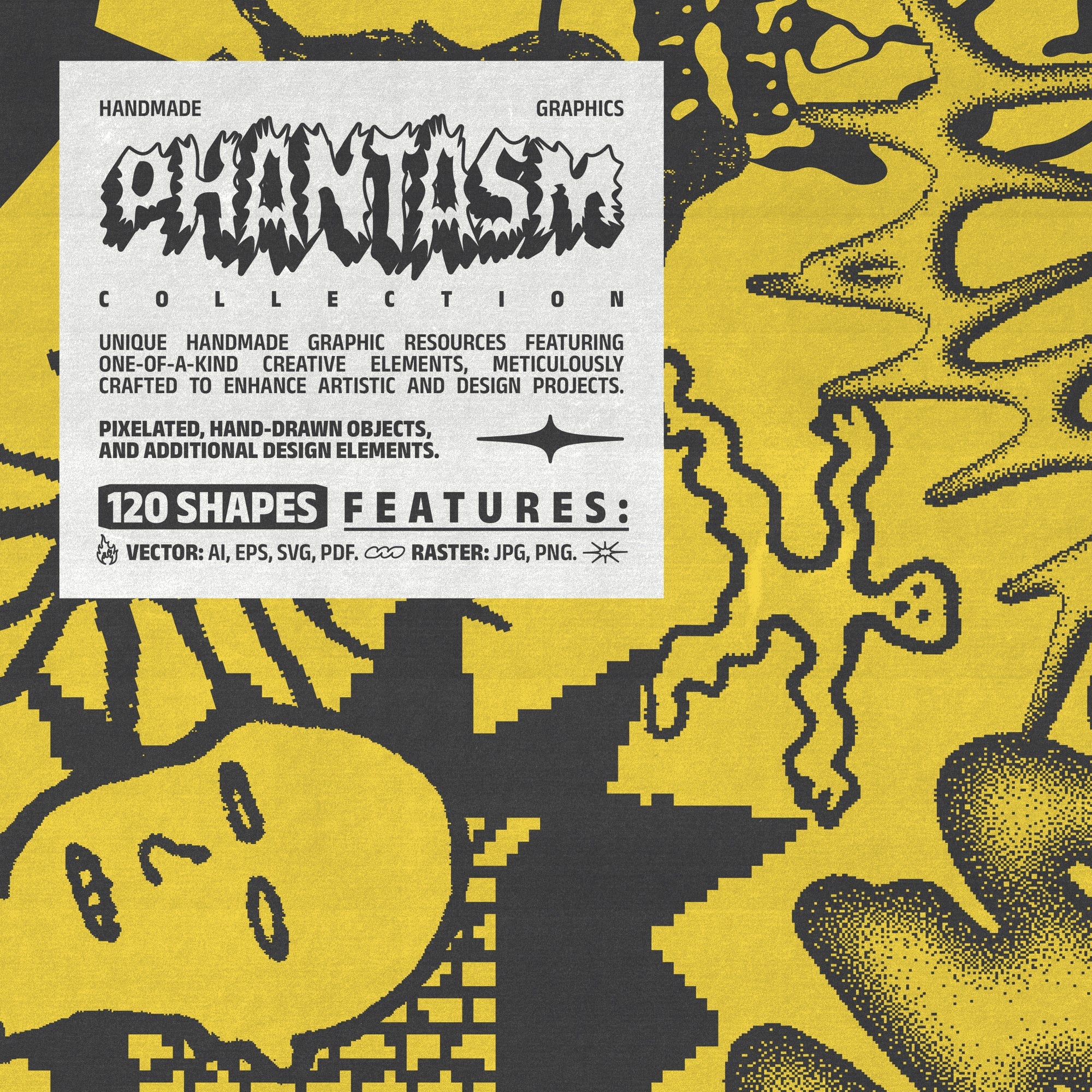
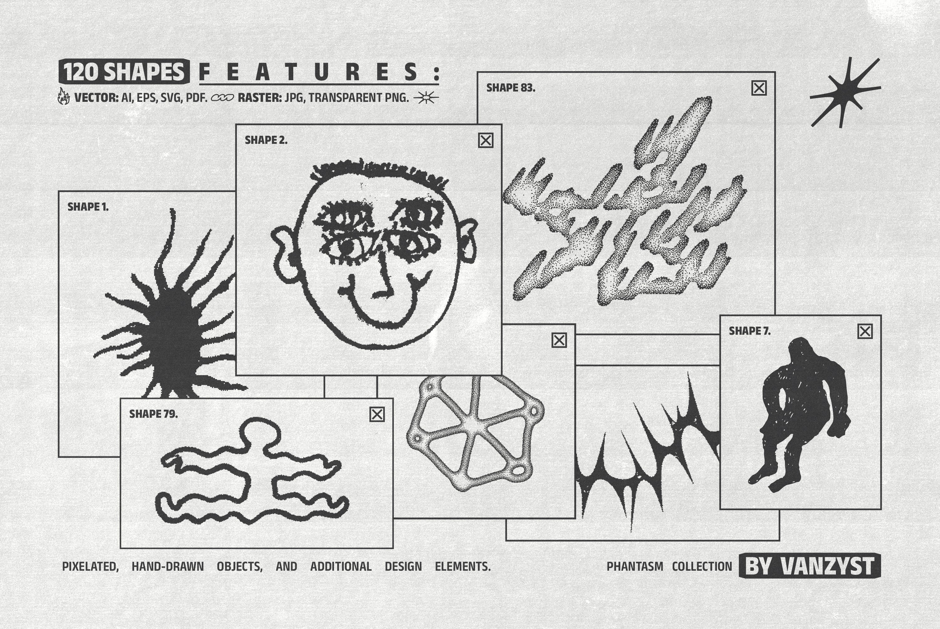
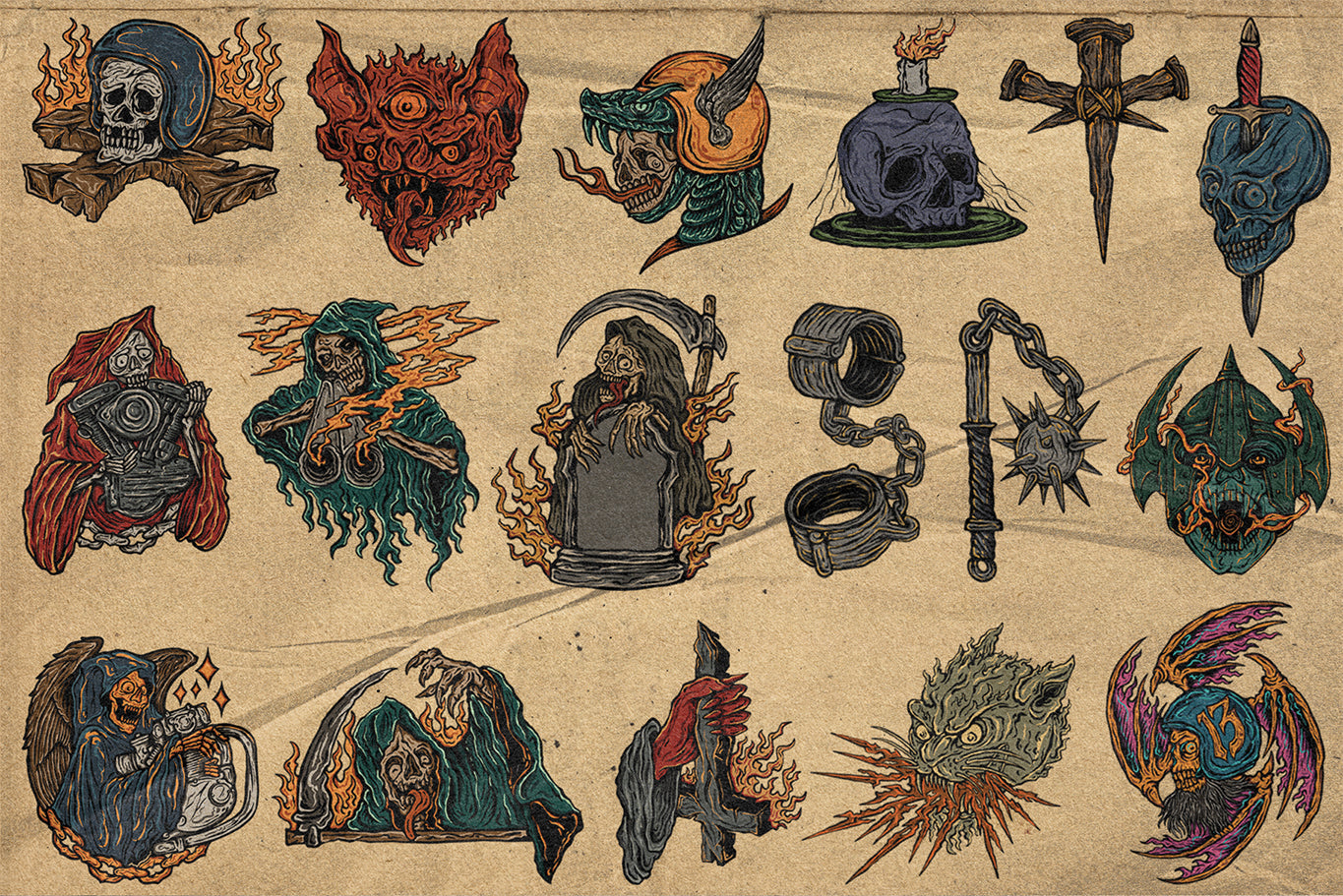
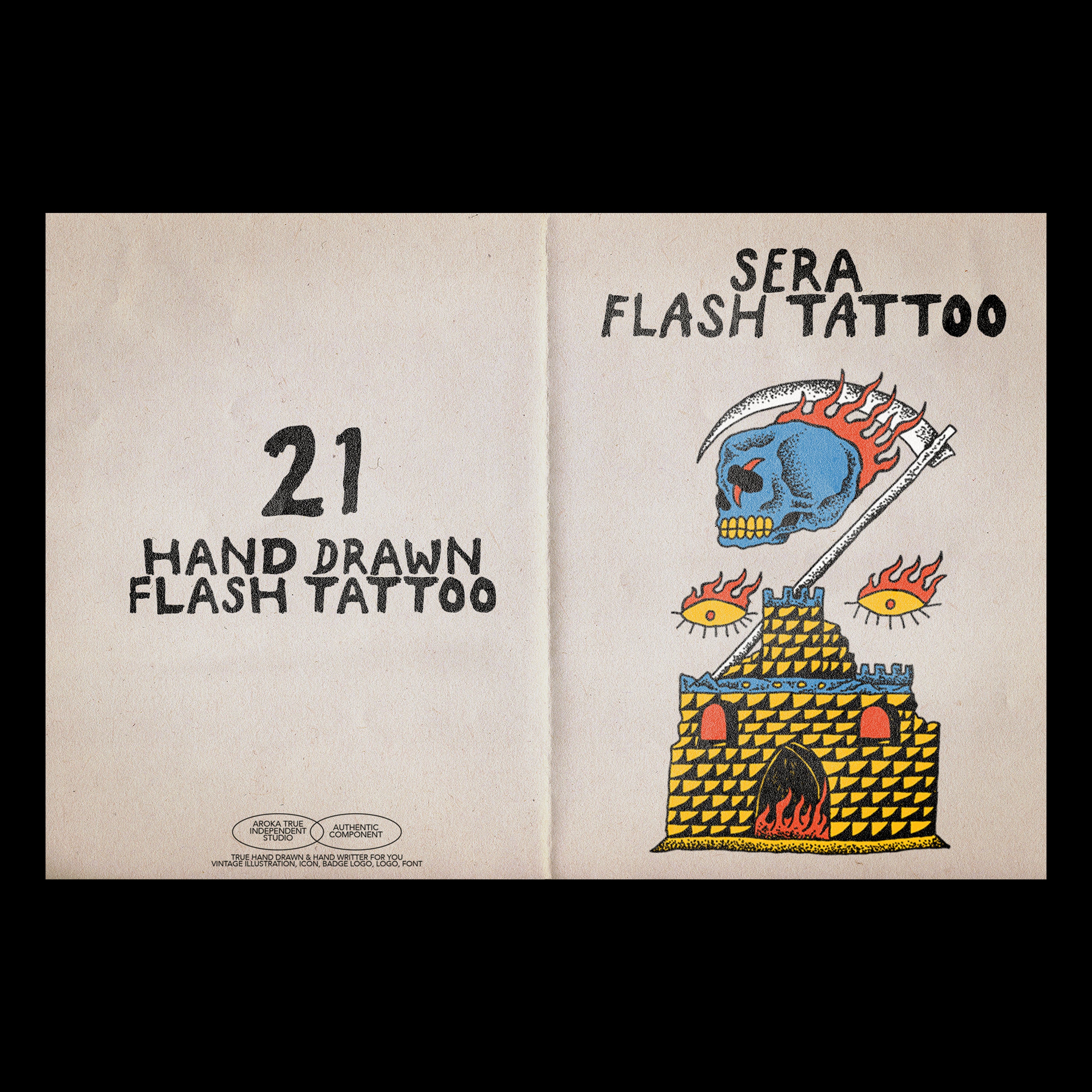
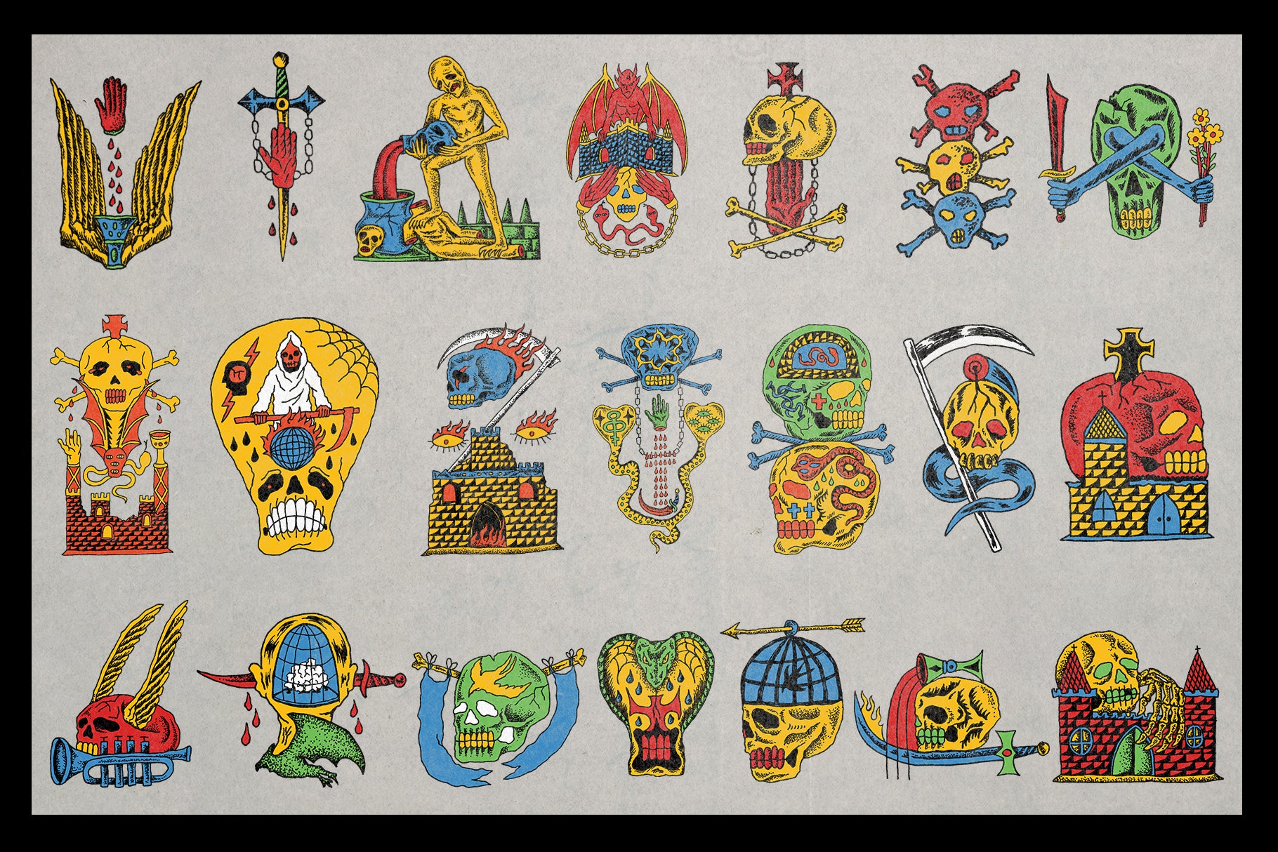
VILD Illustration Package by AROKA TRUE INDEPENDENT STUDIO

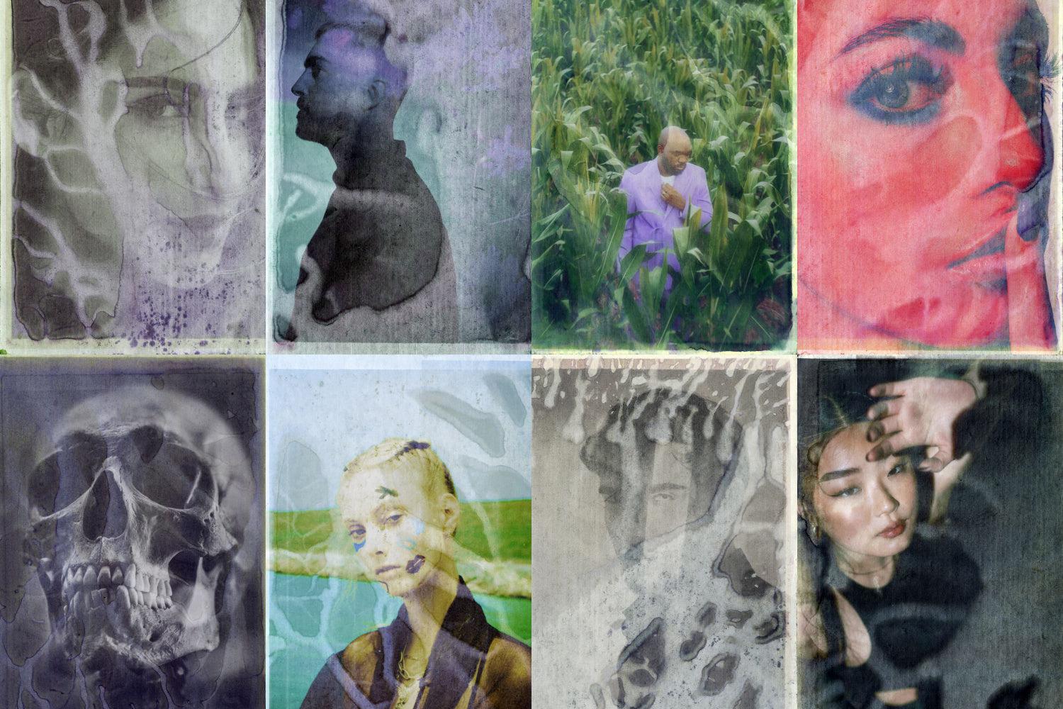
Twenty hand-drawn illustrated objects, described by the creator as looking "random" by design. That's not a weakness; that's the whole argument. VILD is built for the kind of merch and streetwear design where the work has to feel like it came from somewhere real, like a sketchbook or a screen-print studio, not a mood board filtered through an AI image generator. The illustration style pulls from 70s and 90s visual culture: skulls, grit, edge, the kind of iconography that has always appeared on band merch and music posters because it carries attitude without needing context. Drop these on a tee, a poster, or a music release and the provenance reads immediately. The hand is in the work and the work is better for it.
Kraft Textures Collection by Pixelbuddha
![]()
Packaging design is one of the spaces where the anti-AI authenticity movement is showing up most visibly, particularly for DTC brands that are actively trying to communicate craft, care, and human scale. The Kraft Textures Collection from Pixelbuddha is built for exactly that context. Warm brown tones, visible fibres, soft stains, subtle fold marks. The grain feels dry. The shading is uneven in the way real paper is uneven. Layered into a packaging mockup or used as a background in print work, it brings the kind of physical reference that tells you something was made carefully. No algorithm produces the specific quality of real kraft paper; you either scan it or you work with people who did. Pixelbuddha did the work.
36 Premium Rough Line Vector Brushes VOL.01 by drdlstudio

If you want control over where the handmade quality lives in your work rather than inheriting someone else's aesthetic wholesale, this is the tool. drdlstudio's rough line vector brushes give you thirty-six ways to introduce raw texture, movement, and handcrafted character directly into Illustrator work. They're built for production, so they hold up at the sizes that matter, but the quality they add is decidedly human. Use them for custom illustration work, branding elements, poster linework, or anywhere you want the mark-making to feel considered rather than generated. The distinction here is authorship: these brushes put the craft decisions back in your hands.
Vintage Print Text Effect by Pixelbuddha
![]()
Ink spread. Broken outlines. Off-register pressure. The Vintage Print Text Effect from Pixelbuddha reproduces the specific imperfections of vintage stamping with real attention to what makes those imperfections feel right rather than just rough. Fills carry subtle grain. Edges break in ways that read as physical rather than filtered. This is useful anywhere a logotype or headline needs to feel like it was pressed onto something rather than rendered onto nothing, which is a surprisingly large slice of branding, packaging, and label work. The "pressed by hand" quality it creates is one of those things that reads as right without the viewer needing to analyse why.
100 CRT Scanned Textures V.02 by Züli

The "signal graphics" trend, that revival of bold, chaotic visual language borrowed from 90s TV branding and music channel idents, needs material to work with. Züli's CRT Scanned Textures are the real thing: one hundred high-quality scans across ten different CRT texture styles, delivered at 4K. These aren't simulated. They're scanned, which means they carry the specific quality of actual screen artefact rather than a software approximation of one. For album art, poster work, or social content that's leaning into that particular visual territory, the difference between a scan and a plugin is immediately legible. The grit here is genuine.
Raw Paper Textures by Gromov Design

Not every project needs drama. Sometimes the work calls for something quieter: a base that adds depth and physical presence without announcing itself. Gromov Design's Raw Paper Textures are eight hi-res scans (5400 by 3600 pixels, 300dpi) in cool grey tones that function as the kind of neutral, honest foundation that elevates print and branding work without competing with it. The grain is real. The surface variation is real. Layered under type or used as a background in refined print contexts, they give the work a tactile quality that's hard to manufacture. Sometimes the most powerful thing a texture can do is make the viewer feel like they could reach out and touch the paper. These do that. If you want to keep exploring in this space, there's plenty more paper texture work to dig through.
The Skill Is Knowing When
None of this is about rejecting the tools that make design faster or more scalable. The point is sharper than that. When everything looks like it was optimised by an algorithm, the work that carries actual proof of human decision-making doesn't just look different, it feels different. Clients feel it. Audiences feel it. Even people who couldn't tell you what a texture overlay is can tell you when something feels real versus when it doesn't.
The designers getting this right in 2026 aren't the ones refusing to use new tools. They're the ones who know when to put them down. Who understand that the grain, the rough stroke, the ink bleed, the imperfect letterform isn't a limitation to apologise for. It's the signal. It's what makes the work theirs.