
You can spot fake watercolor in a second: the saturation is too even, the edges stop dead where the brush stopped, and there's no bloom where two wet passages met and bled into each other. Real watercolor does the opposite. It pools, it granulates, it dries lighter in the middle and darker at the rim, it backruns into itself when you touch a wet area with a wetter brush. That behaviour is exactly why the current wave of bold, slightly messy watercolor is landing on book covers, wellness packaging, and food branding right now, pushing out the tidy pastel florals that were everywhere a few years back. Editorial art directors are chasing illustration that reads as hand-painted, partly because real water on paper is the thing AI illustration still can't fake. The tool that gets you there has to understand how pigment and water move. Here are five that do.
For a wash that looks hand-painted: Realistic Watercolor Procreate Brushes
Say a food brief lands and the client wants visible brush character across the label, the kind of loose painted produce you'd find on a natural wine bottle. This is the set to reach for. Realistic Watercolor Procreate Brushes by Sko4 runs 39 brushes split by job: 14 for detail work where you need controlled passages, 8 for backgrounds and broad washes, and 8 for the odder effects that sell a painting as real. The part that does the heavy lifting is the 9 paper textures, delivered as a .procreate file of canvases. Pigment settles differently depending on the grain underneath it, and swapping the canvas changes how the colour pools and dries. That's the difference between a brush that mimics watercolor and a surface that lets the water behave. If you want more on the underlying principle, our piece on what makes a brush pack feel hand-painted covers the same ground from the Photoshop side.

Line and wash in one library: Sketchbook Procreate Brushes
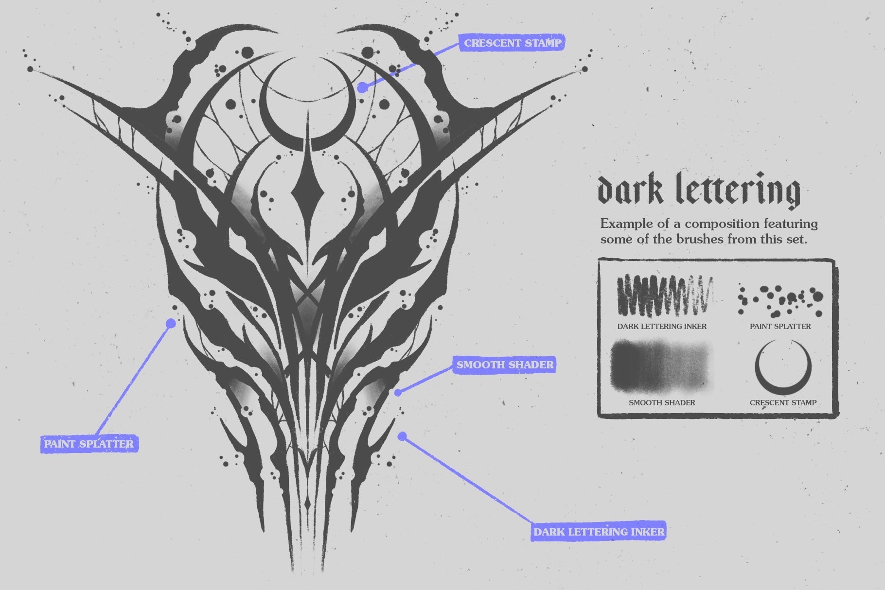
Editorial spot illustration lives and dies on speed. An opinion-page drawing often needs a confident inked outline and a tonal wash pass, and switching brush sets mid-job breaks the rhythm. Sketchbook Procreate Brushes by Sko4 keeps both in reach: 20 pressure and tilt sensitive brushes covering sketch, outline, marker, pencil, charcoal, halftone and splatter, with watercolor and shading brushes sitting in the same place. The line responds to how you hold the pencil, so you get varied thickness from a single stroke, and the wash and shading brushes let you drop tone without leaving the drawing. It skews neutral and monochrome in feel, which is the register most editorial linework wants anyway. For a whole day of fast tonal work, having the ink and the wash in one spot keeps your hand moving.

For literary covers that read classic: Alice in Wonderland Procreate Kit
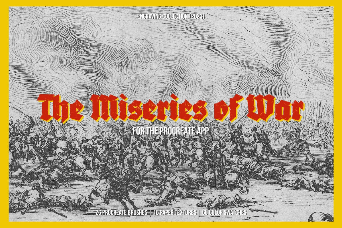
Publishers asking for a "classic" cover usually mean a specific thing: wash underneath, engraved or hatched linework on top, the look of an old illustrated edition without the stiffness of clip art. The Alice in Wonderland Procreate Kit by Digi Life is built exactly for that register, combining watercolor with engraving and cross-hatching across 17 brushes, 300 colour swatches, and 5 paper textures at 5715x3954px, 300dpi. The swatch count matters more than it sounds. A cohesive, muted, warm palette is half of what makes a cover read as period, and having it pre-mixed saves you building it by eye. The marriage of soft wash and engraved line is an old combination, and if you want to go deeper on that side of it, we've written about vintage engraving for editorial covers.

The moodier sibling: William Shakespeare Procreate Kit
Where the Alice kit leans whimsical, this one carries weight. The William Shakespeare Procreate Kit by Digi Life uses the same watercolor-plus-engraving approach but drops the clean paper for 5 cracked-canvas textures, which shifts the whole thing into darker, dramatic territory. Reach for it when a brief calls for gravitas: a poster that needs to feel heavy, album art with some grit to it, a book cover that wants dread over charm. It ships with 22 brushes, 300 colour swatches, and those cracked textures at 5715x3954px, 300dpi. The crack and stain in the canvas give a wash somewhere to catch and pool, so the pigment settles in looking aged and worn. It's the pick for work that needs a dark-academia weight to it.

For packaging that moves between apps: Multi-App Texture Brushes
Packaging production rarely stays in one app. You might sketch the illustration in Procreate, then move it into Photoshop or Illustrator to build the print-ready file, and the texture has to survive that handoff. Multi-App Texture Brushes by Pixelbuddha are built for that trip, 12 texture brushes that work across Procreate, Photoshop, Illustrator, Clip Studio and Affinity Designer. They cover watercolor, acrylic, gouache and linocut-inspired marks, with the kind of visible grain and warm, earthy character that suits modern folk and mid-century illustration. If your studio does a lot of print work that lands on shelves, these fit naturally alongside the rest of our packaging graphics. For more on brushes that hold up across apps, there's our rundown of brush packs that work across Procreate, Photoshop and Illustrator.

Every one of these sets reads as painted because someone sat down and worked out how granulation drifts, how a bloom edge forms, how water finds the low points in paper grain and pools there. That takes real time and real observation, and it's the thing a flat preset skips. The water behaving like water is the whole reason these hold up in client work while the filtered stuff gets passed over.