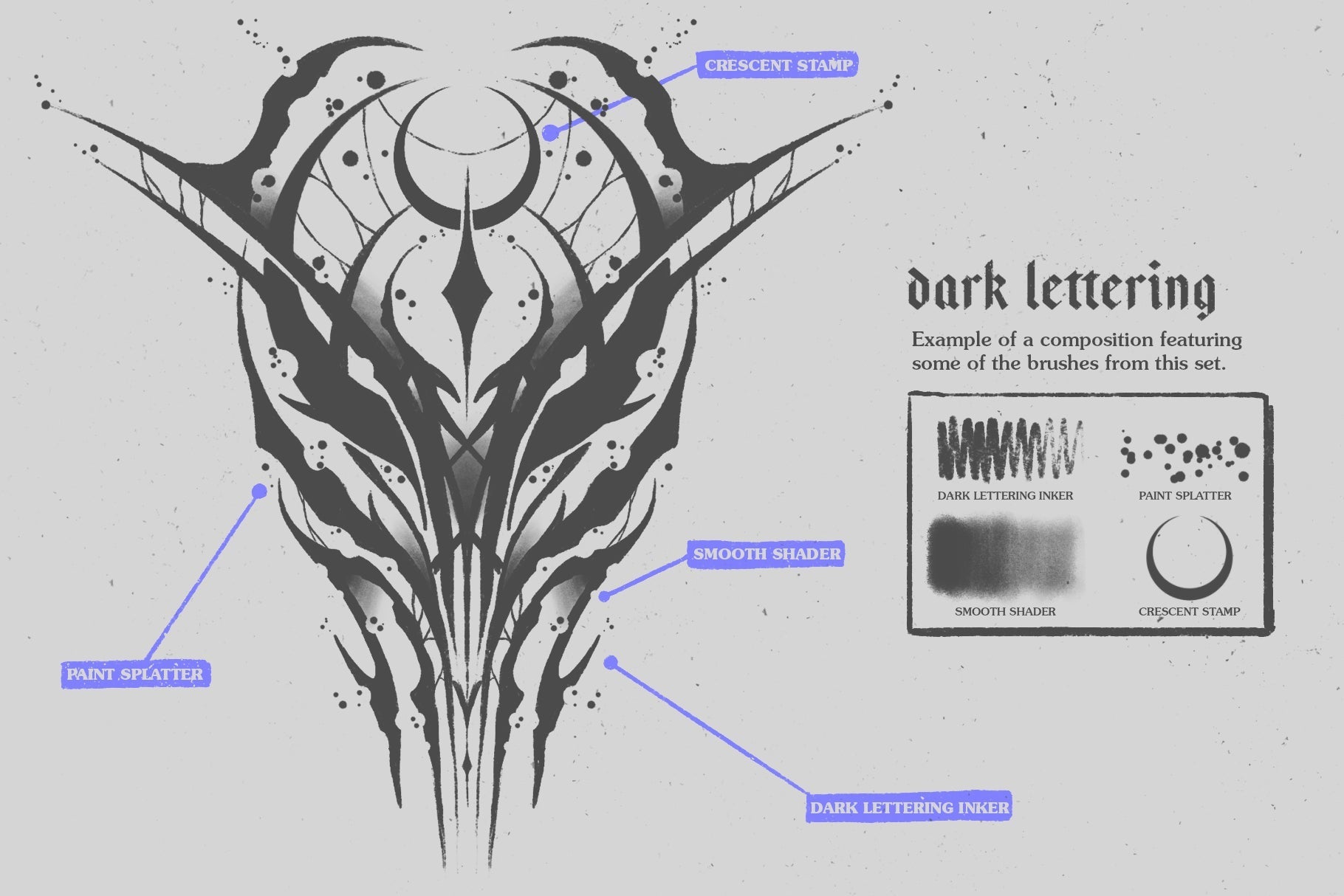
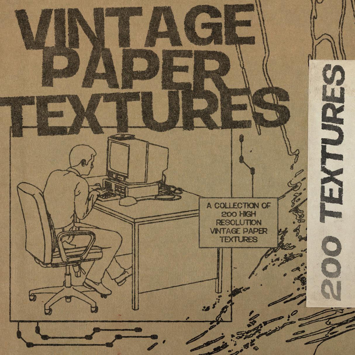
The brief says "retro" and suddenly you've got 50 fonts in a tab and none of them are quite right. That's not a supply problem. It's a specificity problem. A 60s underground comic hand and a 90s xeroxed grunge face are not the same thing, and using one where you need the other reads immediately. Decade matters. So does knowing whether you're after something warm and nostalgic or something that looks like it was photocopied four times and stapled to a telegraph pole. Here are ten retro fonts that actually know what era they belong to.
Overprint TM by Type Mania

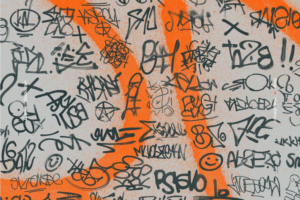
The platform's current number one, and it earns it. Overprint TM is a distressed xerox-finish retro font built for the gritty end of the 90s spectrum: bootleg merch, streetwear graphics, skate flyers, anything that should look like it survived a few too many photocopies. What sets it apart technically is the contextual alternates system: turn it on and the two stylistic sets rotate automatically, introducing subtle variations across words so no two letterforms repeat in the same way. That kind of built-in imperfection is hard to fake manually and it shows in the output. If you're after more grunge fonts worth a look, there's plenty to dig through.
Felony Condensed by w.m.works

Condensed, ink-bled, and unapologetically grunge. Felony lives in the same territory as Overprint but comes at it from a different angle: where Overprint leans xerox and noise, Felony is about ink bleed, that specific quality of type that looks like it was printed on an absorbent surface and left to spread just slightly beyond its edges. Available in both caps and lowercase, which gives it more range than a lot of distressed faces at this weight. Strong for poster work, streetwear branding, and anywhere you need grit without losing legibility.
Global Premiere Rough by Typeparties

Tall, narrow, and rough at the edges in the best possible way. Global Premiere Rough is a condensed display font with the kind of proportions that eat up vertical space on a poster without sacrificing presence. The textured edges read raw and expressive without tipping into illegibility, which is the line a lot of distressed condensed faces struggle to walk. Built for headlines, band posters, and editorial layouts where you need something that fills the frame and holds its nerve. The condensed structure also makes it genuinely useful when you're working with tight columns or stacked type.
More Brains! by Wingsart Studio

If your project lives in that very specific cultural pocket of 80s VHS horror, video store weekends, and hand-painted movie signage, More Brains! is the retro font you've been looking for. Hand-drawn and deliberately playful rather than po-faced about its influences, it comes supplied in both regular and all-caps versions with a full set of alternates. The alternates matter here because hand-drawn fonts at this weight can get repetitive fast; the variation keeps layouts feeling hand-made rather than stamped. Film titles, gaming visuals, Halloween posters, logo work for anything that wants that late-night horror VHS energy.
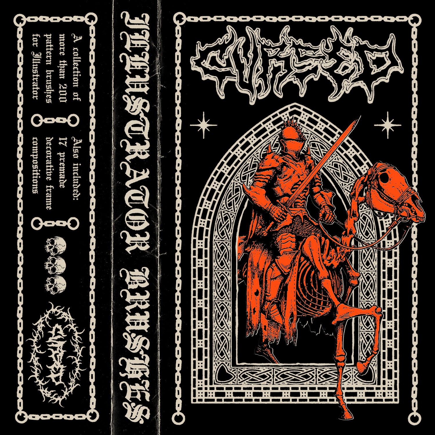
Peace TM by Type Mania

Rooted in 1960s underground comics, Peace TM brings the restless, slightly unhinged energy of counterculture print into something you can actually use in a contemporary layout. Like Overprint TM, it's built with an automatic stylistic set rotation, so the letterforms shift subtly across a word rather than repeating. That dynamic quality is exactly what makes hand-drawn type feel alive rather than like a font pretending to be hand-drawn. High conversion rate on the platform, which makes sense: it's specific enough to feel deliberate and flexible enough to work across poster design, album art, and branding without immediately dating your project.
Magik Typeface by hvnter

Bold, chunky, and sitting somewhere at the crossroads of early 70s display lettering and the kind of type that was everywhere on limited-edition drops around 2001. Magik comes in two styles: Regular and Mixed, where the Mixed version combines upright and italic letterforms in the same setting for a more dynamic, slightly off-kilter feel. It's the kind of move that looks deliberate and designed rather than inconsistent, and it gives you a built-in secondary look without buying a second font. Good fit for logo work, packaging, and streetwear graphics where you want personality without hand-drawn roughness.
Folkies Vantage by Jolicia Type

A font duo built around the visual language of mid-century signage: a strong, bold sans paired with a handcrafted script that has genuine warmth rather than that slightly sterile quality you get from digitally constructed script fonts. The pairing does what a good duo should, which is give you contrast that feels intentional rather than arbitrary. The sans can carry a headline on its own; the script can handle a secondary line or a logo lockup. Together they read like something that could have been painted on a shopfront window in 1968 and still look right on a craft product label today. Solid for branding, packaging, and merch where the brief is somewhere in the warm-nostalgia register.
403 Cusion by 403TF

Thick, rounded, and saturated with 70s display energy. Cusion's letterforms have that characteristic softness that defined the era's grooviest headline type: generous curves, heavy weight, nothing sharp or uptight. It's the retro font you reach for when the brief is explicitly nostalgic and needs to read that way immediately, whether that's a festival poster, a food brand going for vintage warmth, or a packaging project that wants some personality. The proportions are built for maximum impact at display sizes, so set it big and give it room.
HF Portanic by HolisFonts

Inspired by hand-lettered shop signage, HF Portanic is an all-caps block sans that balances firmness and softness in a way that's harder to pull off than it sounds. The corners are rounded just enough to take the edge off without going full bubbly, which keeps it feeling structured and confident rather than playful. Mid-century in its bones but legible enough to work across a lot of contemporary applications: poster headlines, logo lockups, merch graphics. The texture gives it enough character to avoid reading as generic, which is the risk with any clean block sans working in this space.
Onehart Script and Sans by The Branded Quotes

Onehart comes from a specific place: DIY screen-printed apparel, the kind of type that looks like it was drawn on denim with a marker and then pushed through a screen. The script carries genuine fabric-ink blot texture, and the sans complements it without losing that handmade quality. It's a pairing that works hard for streetwear and apparel graphics, album covers, and any brand identity that wants to feel like it came from a person rather than a brief. If your work sits anywhere near the space where retro type and textural effects overlap, this one is worth a close look.