Why Tattoo Lettering Is Everywhere in Graphic Design Right Now
Tattoo lettering has been bleeding into commercial graphic design for years, but right now it's everywhere. Craft spirits, DTC hot sauce brands, streetwear labels, band merch, album covers — all of them reaching into the same visual vocabulary: thick-thin stroke contrast, ink texture, ornamental flourishes, aged finishes. The visual grammar that makes a tattoo read as skilled and intentional translates directly into packaging and apparel that wants to signal the same thing. Craft and authenticity, communicated in a glance.
The traditions being borrowed from are specific. Old English blackletter carries the weight of motorcycle clubs and heavy metal. American traditional script brings nautical Americana. Neo-traditional lettering goes ornate and illustrative. Fine-line script reads as precise and modern. Chicano lettering connects to low-rider culture and West Coast identity. Each has a distinct visual logic, and good designers working in this space understand which tradition they're drawing from and why.
This list is for graphic designers working tattoo-adjacent: brand identities, streetwear graphics, merch, packaging, album art. These are eight fonts that genuinely know what they're referencing.
BAGESHRON Blackletter Family by Enxyclo Studio

Six weights, three styles, full OpenType features — BAGESHRON is the most developed system on this list, and probably the one you'll reach for when a project needs blackletter that can actually work across multiple applications. The letterforms sit squarely in the Old English tradition: sharp pen angles, pronounced thick-thin contrast, the kind of architectural structure that made blackletter the dominant script of medieval manuscripts before Gutenberg standardised it. The modern touch here is in the refinement. Nothing is rough or distressed for the sake of it. This is a clean, considered blackletter that works for brand identity systems where you need the cultural weight of the tradition without the visual noise of a hand-worn texture.
Best suited to: spirits packaging, band identity systems, apparel graphics that need to scale from chest print to hang tag without falling apart.
Blackwork Regular by Nomad Visuals

Where BAGESHRON is precise and systematic, Blackwork Regular is warmer and more approachable. The rounded edges soften the gothic structure just enough to make it feel hand-lettered rather than typeset, which is exactly what a lot of tattoo-adjacent design needs. The blackletter bones are still there — the vertical stress, the compressed letterforms, the sense that this was drawn with a broad-nibbed pen — but the handwritten quality brings it closer to the kind of lettering you'd see chalked onto a board outside a bottle shop or screenprinted on a limited-run tee. It references the Old English tradition without the severity. Good for projects that want the cultural signal without the intimidation factor.
Best suited to: craft beer labels, independent food brands, merch for acts that want gothic credibility without full metal commitment.
Organic Antique Blackletter by Sarid Ezra

Two styles, regular and true italic, with the kind of earthy irregularity that comes from type designed to look like it was drawn rather than built. Organic Antique sits in Victorian blackletter territory, where the letterforms carry a sense of age and naturalism. The texture is subtle but present. The italic adds genuine tilt and energy rather than just slanting the roman. Together, the two styles give you enough variation to build something that feels designed rather than just typed — which matters when you're working on packaging or branding where the lettering needs to feel like it has a history behind it.
This one pairs well with rough paper textures, wax seal graphics, and the kind of outdoor brand aesthetic that DTC food and spirits labels have been leaning into heavily. Think artisan hot sauce. Think small-batch whisky. Think camping and outdoor apparel that wants to look like it's been around since the 1890s.
Best suited to: artisan food and beverage packaging, outdoor apparel branding, heritage-adjacent label design.
Blome Life by Marvadesign

Some fonts know exactly what they are. Blome Life is a decorative display face built around black metal aesthetics — the fiery uppercase letterforms have the kind of dramatic, jagged energy that reads as tattoo-adjacent in the most direct sense. This isn't blackletter as a historical reference point; this is blackletter filtered through decades of extreme music visual culture, where the script became increasingly stylised, increasingly illegible, increasingly expressive. The sharp details and dramatic stroke variation put it closer to neo-traditional tattoo lettering than anything else on this list: ornate, illustrative, built to make an impact at headline scale.
Use it where restraint is not the point. Album art, band logos, apparel graphics for heavy acts, merch drops that are supposed to feel confrontational. Not a font for quiet projects.
Best suited to: album art, band identity, heavy music merch, any apparel graphic where impact is the whole brief.
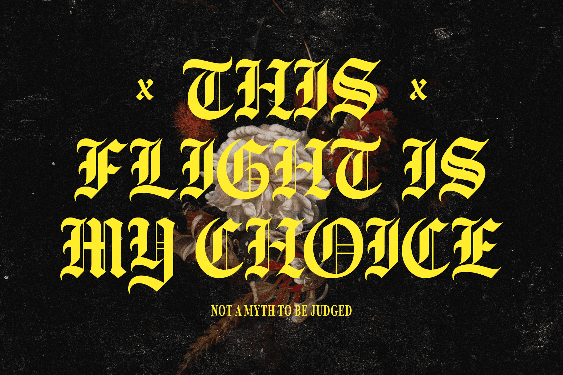
Arkham by Rémi Bordet

Rémi Bordet's Arkham is the most overtly ornate typeface on this list, and that's a deliberate strength. The gothic display structure carries strong decorative features — this is the kind of letterform that would have lived on the cover of an illuminated manuscript or above the door of a Victorian institution. In a modern design context, those ornate qualities make it exceptionally well suited to dark-themed apparel, logo design for independent labels, and any project where the aesthetic brief includes words like "occult," "gothic," or "dark academia." The tattoo tradition it references most closely is neo-traditional: detailed, illustrative, intentional about its own complexity.
Best suited to: dark-themed logo design, gothic apparel graphics, merch for acts or brands that live in the ornate end of the aesthetic spectrum. If you're building a visual identity around that space, there's more gothic type worth looking at.
Hellvetica by Le Zeste

The name is doing a lot of work and it earns it. Hellvetica is hand-drawn with spiky, jagged lines that sit somewhere between concert poster lettering and underground zine typography. The unholy curves and bold, irregular strokes give it an energy that purely geometric or historical blackletter typefaces can't replicate — this is lettering that looks like it was drawn fast and deliberately rough, which is exactly the quality that streetwear graphics and music industry design often need. It references the expressive hand-lettered script tradition in tattoo culture: the kind of lettering that reads as individual and made-by-hand rather than typeset.
Best suited to: concert posters, tour merch, streetwear graphics, logo design for acts or labels that want to look like they exist outside the mainstream. For more fonts working in this territory, there's plenty of streetwear-ready type worth digging into.
Casualte by Typeparties

The controlled one. Casualte brings hand-drawn expressiveness with a discipline that makes it genuinely versatile. The letterforms have natural rhythm and character without sacrificing readability at headline scale, which puts it in useful territory for brand work that wants the hand-lettered quality of tattoo script without the legibility trade-off that comes with heavier blackletter styles. The tattoo tradition it references is fine-line script: precise, confident, modern. The kind of lettering that sits on a product label or a logotype and reads clearly while still communicating that a human drew it.
This is the font on this list most likely to work for a DTC brand that wants to feel artisan without going full gothic. Food packaging, independent beauty or wellness brands, editorial headlines, apparel that sits closer to the contemporary end of the market.
Best suited to: brand identity, product packaging, editorial design, any project where hand-drawn expressiveness needs to stay readable.
Mograph by Sarid Ezra

Raw, wild, and deliberately rough — Mograph is the most unrestrained typeface on this list. The handwritten blackletter forms come with genuine texture and alternates that let you push compositions into organic, non-repeating territory. It reads vintage in the specific way that mid-century outdoor graphics read vintage: worn, adventurous, earned. The roughness isn't decorative noise, it's the point. In the context of tattoo lettering traditions, Mograph sits closest to American traditional flash: bold, unpretentious, immediately legible even with all that texture and irregularity in the strokes.
Sarid Ezra has form with this aesthetic — Organic Antique, also on this list, shows a similar sensitivity to handmade lettering with historical grounding. Mograph is the wilder sibling: less restrained, more energy, built for projects where the brief includes words like "adventure," "outdoor," or "independent." Camping brand packaging, merch for outdoor acts, vintage-style poster work, craft beverage labels that want to look like they were hand-drawn on a trail.
Best suited to: outdoor and adventure brand design, vintage-style poster work, craft label design, apparel graphics for independent labels.
Which One Is Right for Your Project
The tradition you're drawing from should inform the font you choose. If the brief is rooted in Old English blackletter — motorcycle culture, heavy music, heritage spirits — BAGESHRON or Blackwork give you the most versatility and the most typographic credibility. If you're working in neo-traditional ornate territory, Arkham and Blome Life have the detail and drama. For projects that want expressive hand-lettering without going fully gothic, Casualte, Hellvetica, and Mograph each offer something different depending on how much control versus rawness the project needs. Organic Antique sits in the Victorian middle ground, useful for brands that want heritage without severity.
Tattoo lettering works in commercial design because it carries cultural meaning that clean geometric type can't manufacture. The craft signals are built into the letterforms. The job is knowing which tradition you're referencing and being deliberate about it. There's more blackletter worth exploring if none of these are quite the right fit for what you're building.