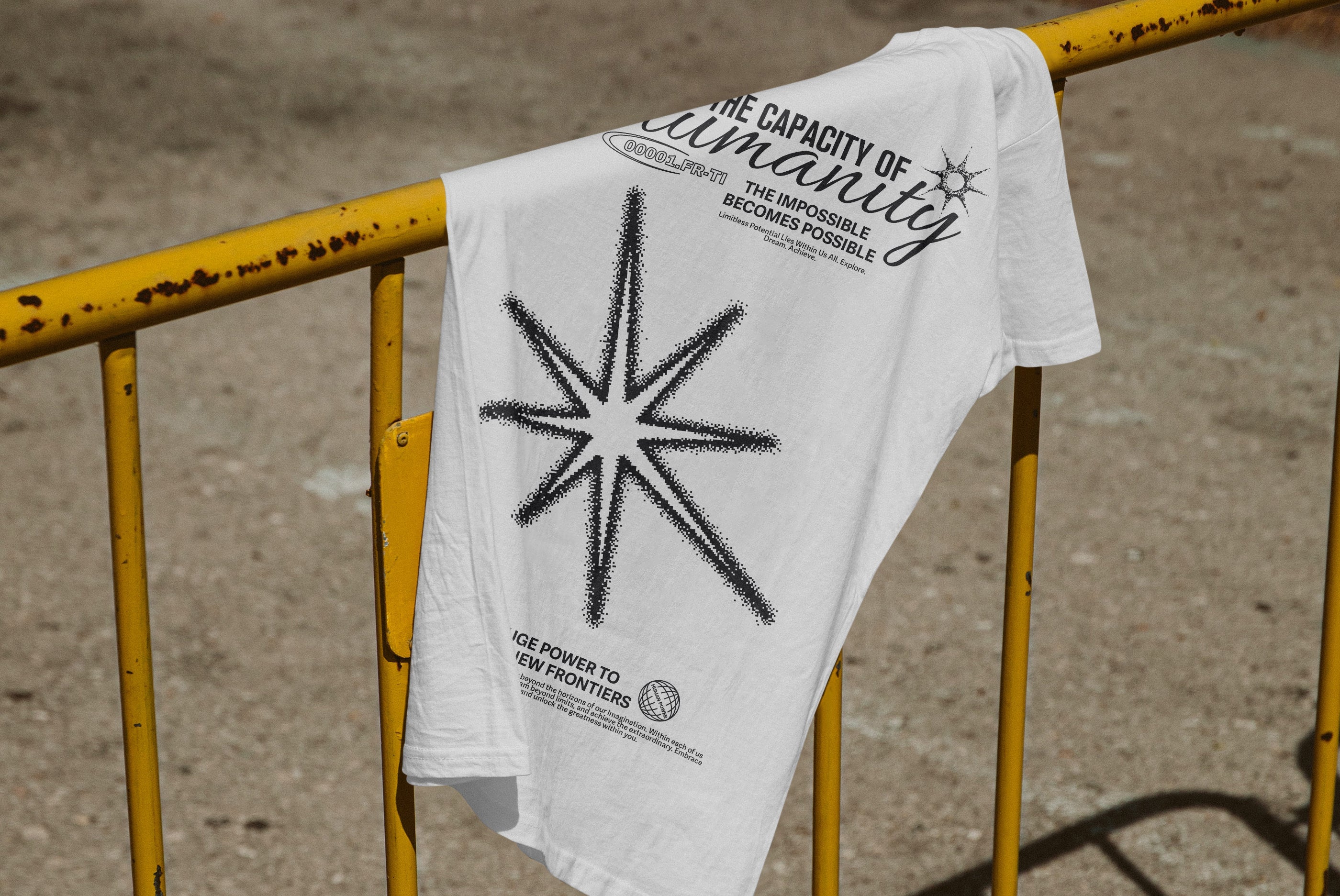
There's a particular kind of fatigue that sets in after years of thin sans-serifs on white backgrounds. Clean was good. Clean became safe. Safe became boring. What's happening in 2026 isn't a rejection of craft, it's a correction. The most arresting work in packaging, brand identity, and social content right now shares a common quality: you feel the type before you read it. Letterforms with physical presence. Geometry that casts shadow even when it's flat. Graphics that suggest material, mass, and texture without necessarily being rendered in 3D.
The cultural conditions for this were building for a while. The return of maximalism in consumer goods, the influence of gaming aesthetics on mainstream visual culture, and a generation of designers who grew up watching motion graphics and product renders means the appetite for dimensionality has been there. What's changed is execution. Better tools, faster iteration, and a creative climate that's rewarding boldness over restraint. Trend research from Wannathis and Envato both flag kinetic and dimensional typography as defining movements of 2026, noting the crossover between low-poly nostalgia and forward-looking geometry as particularly active territory. Retro-futurism, the blending of analogue warmth with digital precision, is running hot across packaging and brand identity especially. The result is a visual language that feels simultaneously like a memory and a prototype.
What makes this moment interesting is that dimensionality isn't just coming from renders and CGI pipelines. It's baked into the letterforms themselves, into graphic systems built on contrast, geometry, and structural tension. Type that looks engineered rather than drawn. Effects that simulate material rather than just adding shine. Vector elements that create depth through rhythm and repetition. The work that's cutting through right now operates at the intersection of all three. Here's what that looks like in practice.
Softness as structure: Mamoth Typeface by HVNTER

Bold doesn't have to mean aggressive. Mamoth by HVNTER makes the case for soft geometry as its own kind of presence. The letterforms are inflated, rounded at the edges, carrying the kind of dimensional weight you'd associate with embossed packaging or oversized signage. There's something tactile about it. You can picture it debossed into a sticker, printed big on a paper bag, or anchoring a social graphic where the type needs to be the visual. It's playful but not lightweight. The design sits in that specific intersection of early-2000s influence and current maximalist branding, where bubble-like forms carry nostalgia while reading as completely current. For freelancers working with lifestyle brands, beauty, or food and beverage clients who want something with personality but not chaos, this is a strong pick.
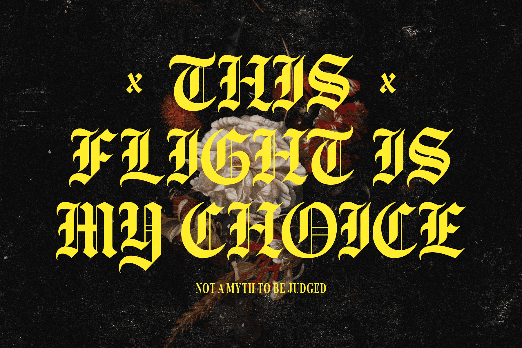
Engineered tension: Barok Display Typeface by God Control

Barok Display by God Control is built on a different logic entirely. Where Mamoth is organic and inflated, Barok is constructed. Sharp cuts interrupt the letterforms at angles that feel deliberate, mechanical. Every character looks like it was assembled rather than drawn, with hard edges that lock into each other with the kind of controlled tension you'd expect from industrial design rather than typography. The geometric rhythm across a word or headline creates a visual density that carries inherent depth, not through shadows or effects but through the letterforms themselves. At 211 characters with full ligature support, it's also properly built out. This is the font for album artwork, editorial headlines, poster work, or any brief that calls for something that reads as serious craft. Brutalist without being deliberately ugly. If you're working through projects that need a hard edge, there's more in this space worth digging into.
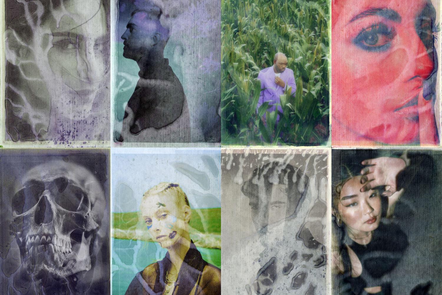
Material simulation: Chrome Text & Logo Effect by Pixelbuddha
![]()
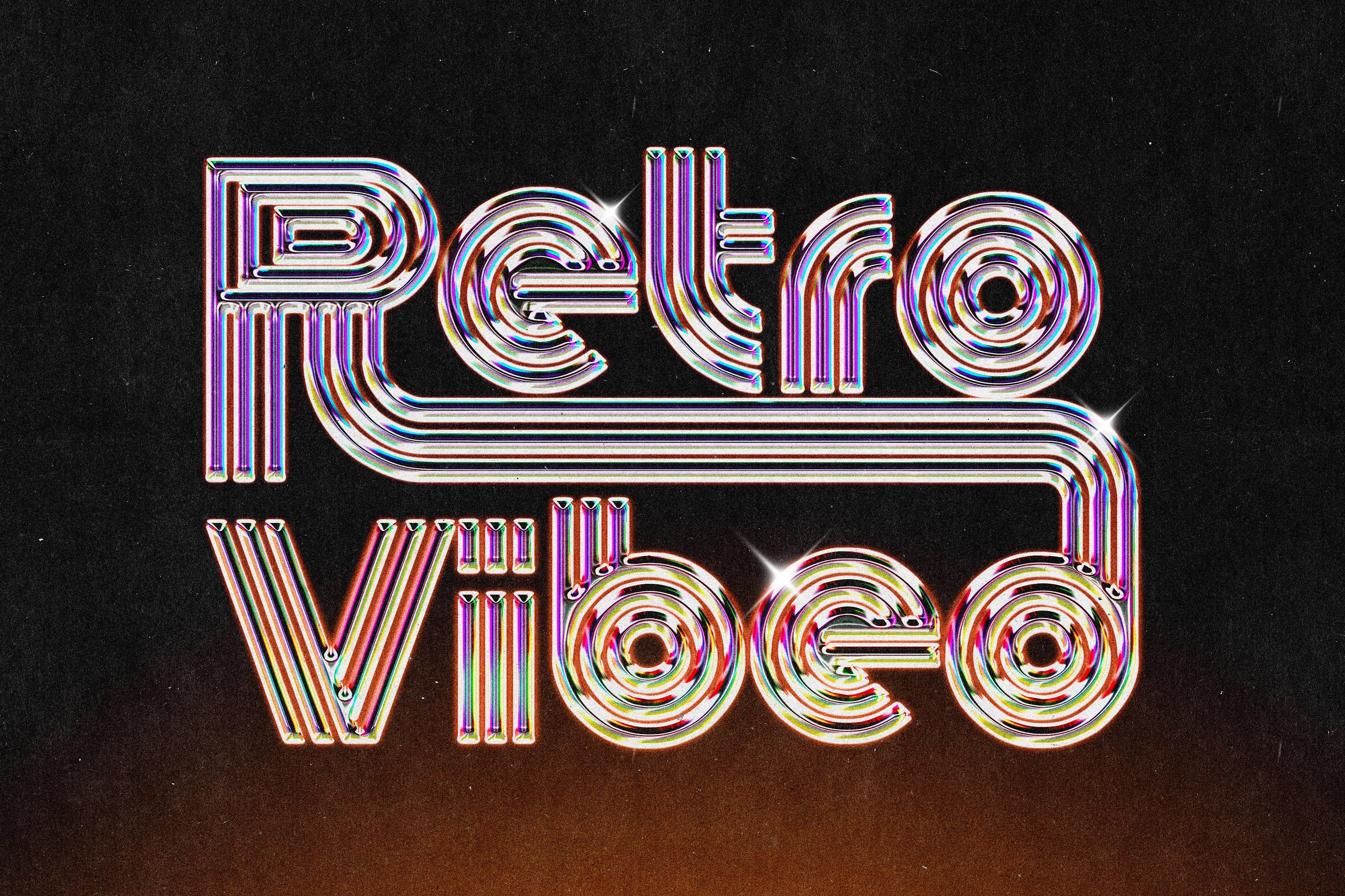
The chrome moment in visual culture is not subtle right now. You can trace it from luxury fashion packaging through to streetwear graphics and social content. This PSD effect from Pixelbuddha does what the best material effects do: it's not about making type look metallic for the sake of it, it's about giving letterforms physical mass. The Smart Object setup means it adapts to any typeface, which matters because chrome applied to the wrong font reads immediately as template work. Applied to something with genuine structure, the result is a graphic focal point that turns a logotype or headline into a three-dimensional object. At 4500 by 3000 pixels, it's built for print as well as digital. For branding presentations, poster work, or social content that needs the high-production-value treatment without the 3D software overhead, this is a smart shortcut that doesn't read like one.
Cyberpunk geometry: GESROB and BROESQ by Enxyclo Studio

Enxyclo Studio's pair of mecha fonts operate at serious scale. GESROB ships with 1,728 glyphs across four styles, including Regular, Slanted, Outline, and Outline Slanted, with full multilingual support. BROESQ follows the same four-style structure across 353 glyphs per style. Both fonts carry the kind of geometric complexity that makes them feel almost mechanical, as if the letterforms were cut from panel components rather than drawn. The slanted and outline variants are particularly useful for layering, letting you build typographic depth across a composition without needing additional effects. Gaming and tech are the obvious applications but the structural quality of both typefaces means they work wherever the brief calls for a system that feels engineered. The outline styles in particular have been having a moment in packaging and merch design, where a single word treated with this kind of letterform can carry a whole visual.
Clean forward momentum: Super Ground by Genetypeco

Not every dimensional typeface needs to lean into the mecha or brutalist end of the spectrum. Super Ground by Genetypeco builds presence through proportion and sharpness rather than complexity. Wide letterforms, sharp edges, and a geometric structure that creates strong visual rhythm across headlines. The two width variations give it genuine range, from tightly set wordmarks to broad, air-filled display headlines. It sits in a space adjacent to the sports branding and urban streetwear graphics that have been dominating social content, but the structure is clean enough that it crosses into tech and product branding without feeling out of place. This is a workhorse display font for designers who need impact across multiple deliverables. There's a reason this kind of geometric bold sans has become the default register for anything that needs to feel fast and credible simultaneously.
Sharp italic presence: Acrona by Uncarving Nation

Italics done right are one of the more underused tools in display typography. Acrona by Uncarving Nation is built for lean, forward-moving compositions, with a bold italic structure that carries genuine momentum. The 432-glyph set is well-built for a font at this end of the market, and the unique character shapes sit in a convincing space between gaming culture's visual language and the broader futuristic branding aesthetic that's moved from niche to mainstream over the last few years. The simplicity of the forms keeps it readable at large sizes, which matters in poster and apparel work where legibility across distance is the brief. It pairs well with the kind of mixed-media compositions that are defining a lot of current social and editorial output, where you're layering type over photography, texture, or motion.
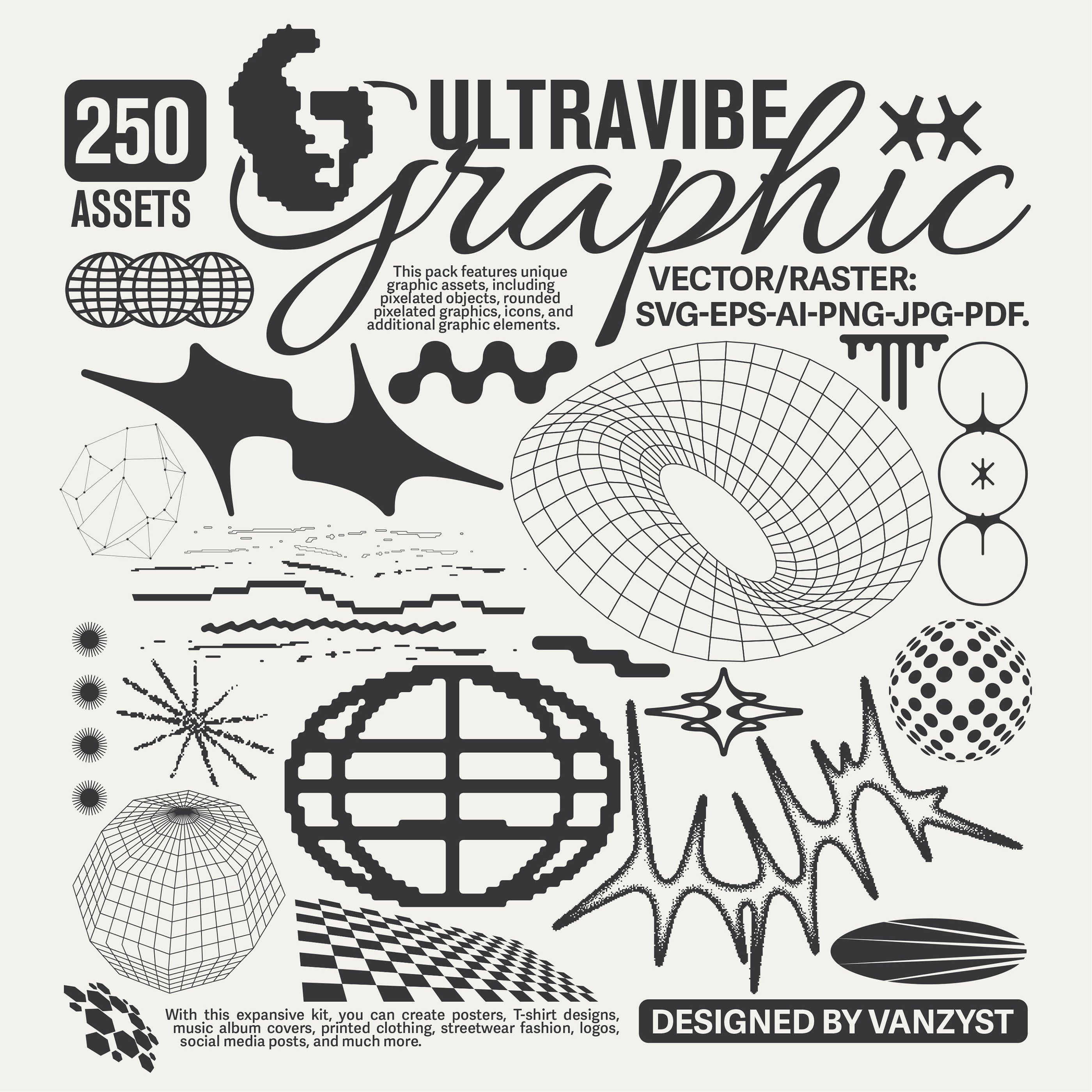
Systemic depth: Energy Fields by Nomad Visuals
Dimensional design in 2026 isn't only about the type. The graphic systems surrounding letterforms are doing serious heavy lifting, and wavy vector elements have become a key part of how designers are building depth into flat compositions. Energy Fields from Nomad Visuals is a set of 76 fully editable Illustrator vectors with that signature undulating line quality that's been appearing across packaging, poster work, and brand identity. The linear rhythm creates optical depth without adding visual noise. Outline strokes can be adjusted, shapes layered, and the SVG format means they scale without compromise. These are the kind of foundational graphic elements that make a composition feel considered. Used behind or around heavy display type, they add the sense of field and atmosphere that makes a layout feel like it has physical space. This is where systems-level thinking about dimensionality matters. The font can have presence, but the surrounding graphic language shapes whether the whole piece feels built or just typeset.
Where this is heading
The direction is fairly clear from here. As AI-assisted design tools make high-production-value rendering faster and more accessible, the competitive differentiator will shift toward type and graphic decisions that have genuine craft behind them. Anyone can generate a render. Not everyone can select a typeface that carries inherent structural tension, pair it with a graphic system that adds depth without clutter, and apply a material effect that reads as intentional rather than decorative. The designers who understand dimensionality as a design decision, not just a stylistic layer, are the ones whose work is going to keep cutting through. The raw materials are here. There's a lot more worth exploring if bold, heavy type is your current focus. The question is what you build with it.