Free fonts are everywhere, but most roundups serve you the same ten safe sans-serifs you've already dismissed three times. Studio 2am's free fonts collection runs differently. It skews toward display, hand-drawn, distressed, and character-heavy styles, the kind of type that actually moves work forward on branding jobs, merch drops, poster commissions, and album art. These eight picks are the ones worth your time.
SFC Bronkos – Skilline Fonts Co.

If you've ever studied the lettering on an old roadside saloon sign or a mid-century travelling circus poster, you already know the visual language SFC Bronkos is working in. It's bold, rough, and built from the kind of hand-drawn cowboy lettering that feels worn-in rather than designed. The weight is confident without being shouty, and the grit in the strokes gives it warmth that clean vector type can't fake. Use it for branding that needs a sense of heritage, merch with a Western or Americana lean, or packaging where you want the type to feel like it was painted on.
FIMARO – Enxyclo Studio

FIMARO is what happens when a designer stops trying to make every stroke perfect and leans into the wobble. It's a handwritten display font with a loose, playful character that feels spontaneous in the best way, like someone with a good eye picked up a marker and just went for it. That deliberate imperfection is doing real work here; it reads as human and expressive at a time when a lot of display type feels over-engineered. It suits creative agency branding, social content that needs personality, and logo work for the kind of small businesses that want to feel approachable rather than corporate.
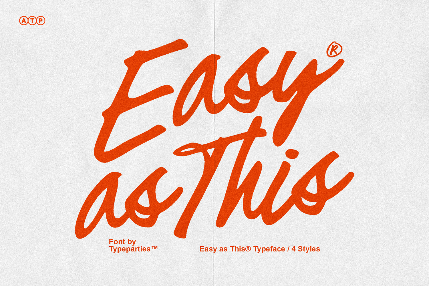
Heatwaze – Typeparties

Heatwaze is built for high-impact work and doesn't apologise for it. The letterforms are heavy and condensed, with irregular contours and torn edges that give it an aggressive, tactile texture, the kind of distress that looks like it came from a real physical process rather than a Photoshop filter. It sits firmly in grunge and punk territory without tipping into pastiche. Album art, streetwear drops, gig posters, heavy merch graphics; this is the font you reach for when the brief calls for something raw. If you're finding your footing in that space, there's more grunge type worth a look beyond this one.
Runners Society – Typeparties

Two weights, one cohesive aesthetic, and a texture that makes everything feel like it belongs on a vintage sports poster from 1978. Runners Society comes in regular and bold, which means you can actually build typographic hierarchy without switching fonts, and both weights carry the same rough, distressed character throughout. The serif construction has a strong mid-century influence, something between a woodtype display face and the kind of editorial lettering you'd find in a late-seventies sports magazine. It works hard for branding, advertising layouts, logo lockups, and merch where you want a period-specific feel without it looking like a costume.
MIGONEY – Enxyclo Studio

MIGONEY has the quality that's hardest to fake in type design: it looks like it was actually drawn. The strokes are uneven in the right places, the letterforms carry the weight shifts of a real pen on paper, and nothing about it feels constructed or templated. Where FIMARO is playful and loose, MIGONEY is more grounded, closer to the kind of handwriting you'd find in a well-made editorial spread or on considered packaging. It's a strong choice for branding work that wants to feel crafted, for poster design that needs a human touch, and for any project where "authentic" is doing more than just aesthetic work.
The free fonts in this catalogue are a genuine cross-section of what Studio 2am is about. If they're landing for you, the paid catalogue is worth exploring. There are 1,500-plus fonts from independent creators covering everything from refined editorial serifs to variable weight display families and expressive scripts, with new work added regularly. Browse the full fonts offering here.
Noeran – Damelev

The most structurally resolved font in this list. Noeran is a bold slab typeface with the kind of letterforms that make headlines feel like they actually mean something; dramatic without being theatrical, serious without going cold. There's a warmth to the proportions that keeps it from feeling imposing, which is a hard balance to get right in a display slab. It draws from a mid-century sensibility, somewhere in the sixties to seventies range, and it carries that heritage comfortably into contemporary work. Poster headlines, brand identities, editorial titling, packaging with a premium or heritage feel; Noeran is a workhorse that doesn't look like one.
The Unfinished Scream – Wingsart Studio

Originally an abandoned concept, The Unfinished Scream was developed further into a usable font with two styles: regular and an alternative. The gothic serif construction has roughly hand-drawn serifs and an antique texture that gives it genuine aged character rather than the flat gothic look you get from a lot of fonts in this space. Yes, there's strong Halloween energy here, but that's not the ceiling. It's a legitimate choice for book covers, dark editorial work, album art with any kind of gothic or folk horror angle, logo design for bands or gaming projects, and anywhere the brief allows for atmosphere. There's more gothic type worth digging into if this direction suits your work.
Alqaisumah – Damelev

Calligraphic display scripts live or die by their proportions, and Alqaisumah gets them right. The letterforms are bottom-heavy in a way that feels grounded and intentional, and the swashes have a confidence that stops just short of overstating it. There's a suggestion of the American West in the DNA here, filtered through a calligraphic tradition that gives it range beyond any single genre. It suits logo design that needs drama, packaging where the type needs to carry the visual, branding work with a vintage or artisanal brief, and poster work where a script needs to hold its own against bold imagery.
Studio 2am adds new fonts regularly, both free and paid, so the catalogue moves. If any of these have landed, bookmark the free fonts download page and check back. There's always something new worth finding, and the paid work from these same creators tends to go even further.