
A batch number is the smallest, cheapest lie a machine can't tell. Write "Batch 47 of 120" on a skincare label and you've made a claim that either happened or didn't: there was a run, it was finite, someone counted. A generative tool can render the scuffed edge of a worn rubber stamp down to the last broken serif, but it cannot produce a batch of 120, because there is no batch. Nothing was pressed, nothing was poured, nothing was numbered by a person watching the count climb. Craftcore's numbering and archive conventions are a packaging system built to make the hand behind the work visible and hard to fake.
This reframes an apparently nostalgic package style as a labour-authentication system.
What craftcore looks like on a shelf right now
The language is specimen-sheet clinical. Labels laid out on a grid, numbered and gridded, with the sort of measured spacing you'd find in a reference manual: lot codes, volumes, botanical Latin names, a little run figure sitting where a hero graphic usually goes. Hand-drawn botanical illustration crawls across skincare, small-batch beverage, tinned balms and waxes, the linework loose enough to read as drawn by a person and tight enough to hold up at label scale. Hand-pressed stamp marks and wax-style seals do the authentication work. Stencilling borrowed from shipping crates and archive boxes. And the type carries visible ink pressure, broken edges, the drift you get off a screen-printed or letterpressed surface, a long way from clean vector geometry.
The common thread is documentation. The label behaves like a technical record of a thing that was made, dated and logged, then handed over. Everything on it reads as evidence.
One clarification before we go further, because the word is doing double duty this year. There's a fashion "craftcore" circulating in parallel that has nothing to do with any of this: crochet, pointelle, lace, ruffles, patchwork and that quilted look, all over runway and streetwear coverage. Different trend, same label. We're talking about the packaging and label reading. Back to that.
Putting hands back on the work
Design-trend commentary covering forecasts into 2026 has a name for the broader mood: "anti-AI crafting," designers leaning into texture, warmth and visible human touch as a counterweight to hyper-polished machine output. Graham Sykes at Landor put it as designers "reclaiming their creative agency, literally putting their hands back on the work," with the story living in the process and the emotion sitting in the imperfections that make a thing feel human.
The sharp part comes from the same body of commentary, framed as a warning. Hugo Smith at Wolff Olins uses the phrase "creative necromancy" for generative tools reviving old craft techniques and their surface signifiers, the look of woodcut, of stamping, of hand lettering, with none of the labour underneath. A machine can resurrect the appearance of a process and leave the process dead. Craftcore's numbering and specimen conventions run the opposite direction. They document a real, finite process instead of simulating the texture of one. A stamp texture is a look. A batch code with a real count behind it is a receipt.
The specimen sheet has been showing the work for centuries
None of this instinct is new. Type specimen sheets are one of print's oldest honesty mechanisms: a foundry or jobbing printer would lay a typeface out in use so a buyer could judge how the face behaved on real paper before committing a single job to it. The specimen was a technical document first, a picture second. Belladonna, designed by Hildegard Henning in 1912 and believed to be the first German typeface created by a woman, circulated this way, distributed through specimen books and used for invitations, menus and short passages. The specimen carried both the working information and the record of who made it.
Craftcore borrows that exact instinct and points it at a jar of balm. The label as a working document, showing volume, run, date and origin, treating the buyer as someone who wants to judge the thing on its real evidence. The reference is old; the surface it lands on is small-batch consumer goods.
Why indie brands reach for this specifically
Batch codes and lot numbers exist for a dull, practical reason. In skincare, food and beverage, once a brand scales past one-off production, a batch code lets them isolate a specific run if something goes wrong: trace it, pull it, fix it. Label-industry guidance aimed at indie makers treats this as basic operational hygiene.
Craftcore takes that functional necessity and makes it the centrepiece. Small-batch brands already have the numbering; the design move is dragging it out of the fine print and setting it in the middle of the label where a logo would usually sit. Indie packaging has been drifting toward the label as a storytelling surface for a while now, and the proof-of-production code is the most credible story a small maker owns. It's the one thing shelf-scale competitors can't buy at volume, because volume is the opposite of what it signals.
Designers already building in this register
Start with the mark-making. Vintage Stamp Elements by Pixelbuddha is 24 emblems drawn on linocut and woodblock logic: bold white silhouettes on solid grounds, clipped inside chamfered rectangular frames, with birds mid-flight, botanical branches, florals, landscapes and abstract repeats. Four colourways, navy through forest green, terracotta and a near-black, each carrying a paper grain that keeps the ink from looking too resolved. This is the visual grammar craftcore runs on, the woodblock seal that reads like it was pressed into the paper, and it sits naturally on artisan food and drink, stationery and nature-brand identity. It ships as EPS, SVG and PNG.

A label needs a body to live on. The Tin Can Mockup with Screw Lid, also from Pixelbuddha, gives you exactly the object craftcore keeps landing on: a low round tin, lid closed, both the top and front branding faces visible at once so your numbering and your seal read together. The ridged edge, screw-top construction and soft reflections do the small-batch framing before you've added a single word, which is why it slots straight onto balm, wax, pomade, candle and cosmetic concepts. Delivered as a Smart Object PSD at 4500x3000px, 300dpi.

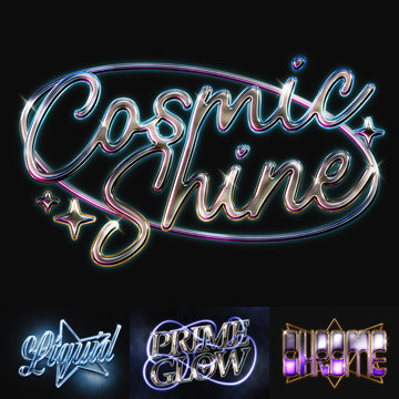
For the seal itself, Bold Rubber Stamp Badge Text Effect by Matsero builds the pressed-rubber look into editable type: embossed label texture, heavy seal-style framing, the ink-starved patchiness of a stamp that's been used more than once. Matsero pitches it at sporty badge titles and vintage label packaging, and it's the fastest way to get a credible authentication mark that flexes to your own wording. Five PSD files at 3000x2000px, with a help file.

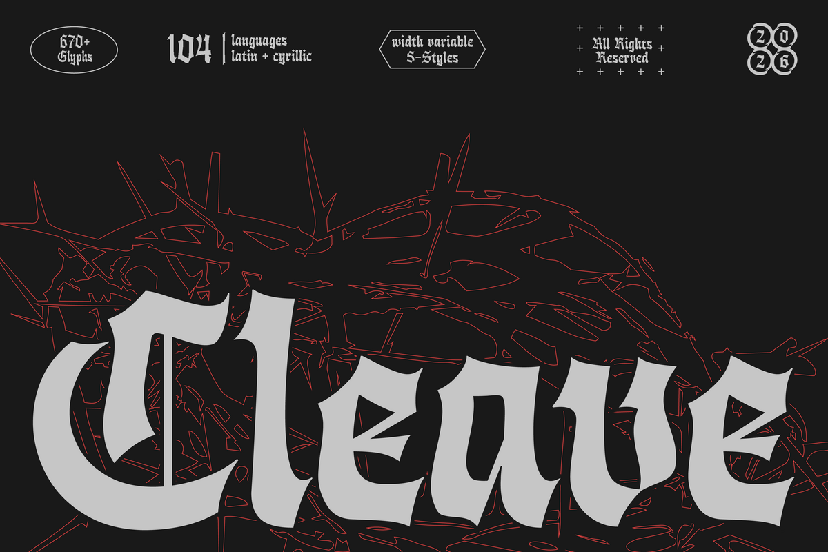
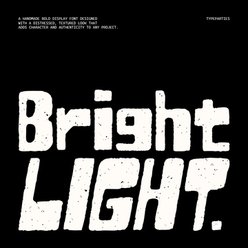
Type is where the fakery usually shows, so the type has to earn it. Basehand by Typeparties is a condensed display face engineered to carry "the emotional texture of real print processes, including ink pressure, rough edges, and the slight unpredictability seen in stencil or screen-printed lettering." The key word from the designer is engineered: those rough contours are drawn deliberately, every break considered, which is why the face reads like real ink on paper. Readable at working sizes, gritty by design, built for branding, posters and packaging. It ships in OTF, TTF, WOFF and WOFF2 with multilingual support.

When the brief calls for a full heritage identity built from a system of marks, Vintage Logo and Badge Collection by Skilline Supply Co brings 15+ handcrafted retro logos and badges, illustration paired with old-school typographic framing, drawn out of Americana and old packaging aesthetics. It's the register cafes, barbershops and breweries keep reaching for, and it gives you a pre-built set of emblems ready to carry your own archive numbering.

The single flourish is its own discipline. A specimen label often wants one hand-drawn line, a signature across the run number or the maker's name under the seal, and La Belle Epoque by Set Sail Studios is built for exactly that. An all-caps handwritten face with fast signature-style strokes and textured ink, leaning into its own imperfections, sharpest against a clean contrasting companion. A Regular and an Alternate set give you four variations of each letter to keep the handwritten feel from repeating. It's the human autograph on an otherwise clinical layout, and it holds up on branding, logo work and packaging.

If botanical linework is the direction you're chasing, it's worth reading our take on botanical vectors past the default eucalyptus sprig, and the paper-grain thread runs through recent drops built on hand-cut symbols and real scanned grain too.
Precision is the tell
The thing that separates craftcore that works from craftcore that reads as machine-adjacent is specificity. A studio that gets it right uses real numbering logic that follows a system, a named ink behaviour, a specific typeface weight with a reason behind it, a run figure that corresponds to a production run that really happened. A studio that gets it wrong waves at "vintage" and hopes the texture carries it. Vague craft signalling is the failure mode, the surface of handmade work with nothing counted underneath. Specific craft signalling, the batch that exists, the stamp that behaves like a stamp, the face drawn to hold ink pressure on purpose, is the entire point. The paper trail only works if there's a real process at the end of it.