

Dark academia used to be a costume. Tumblr in tweed, candlelit reading nooks, a stack of Penguin Classics arranged for the grid. Then it slipped the leash. Guillermo del Toro's Frankenstein and Maggie Gyllenhaal's The Bride! both landed in the same season, Simone Rocha staged her Spring 2025 show inside a gothic London setting, and Bratz posted a Halloween carousel of its dolls done up as horror characters and nobody blinked. Gothic visual language has crept out of album sleeves and film titles and into product branding, book illustration and editorial as a working current. It's Nice That called Gothic the thing that wouldn't die, and they're right; it keeps coming back because it keeps getting briefed.
Which means you'll get briefed on it too. A book cover, an album sleeve, a streetwear drop, an editorial spread that needs to read like it was pulled from a library that burned down in 1890. And every guide ranking for this look right now will tell you about forest green paint and cashmere throws. None of them tell you how to build it.
The genericism problem you're competing against
Here is the trap. AI image platforms have turned dark academia into a prompt category. Morphic sells "candlelit libraries, ivy courtyards, worn leather desks in sepia" from a single line of text. Type "gothic study aesthetic" into any generator and you get an oak-panelled room, a shaft of window light, some ivy, a leather chair, warm sepia grade, every time. The moody library is now infinitely reproducible, which is exactly what makes it read as filler. The moment a viewer clocks that composition, they've seen it ten thousand times this year.
Dark academia lives and dies on specificity. The appeal was always that it looked like it had provenance: real 19th-century book cover ornament, real occult iconography with historical roots, real paper carrying real foxing and creases. A prompt can approximate the mood but it can never manufacture the source. When you work from historical material, the look carries weight a generator can't fake, because the weight is real. That's the case for doing this properly, and for working from things made by people who went and found the source material. So: how to build it.
Two type registers: display drama and reading-room serif
The first fork in the road is your display face, and most people take the wrong turn. There is a big difference between type that reads antiquarian and type that reads horror poster. Blackletter and gothic display faces are aggressive, angular, high-drama. They belong on album art, band merch and streetwear, where you want the letterforms to hit before anyone reads them. They do not belong on a literary novel cover unless the book is about a metal band.
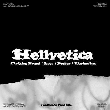
CS Alodia by Craft Supply Co is the display option when you want that drama on purpose. It's a gothic display serif with bold angular letterforms and intricate serif work, medieval in its bones, built for a logotype moment or a poster headline that needs to command the top third of the composition. Set it big, set it once, give it room. Push it into body copy and it turns into wallpaper. Use it the way you'd use a woodcut initial: a single hit that anchors everything under it.

For everything that has to stay readable, you want an old-style serif modelled on the real title pages. Sequana by Pixelbuddha takes its cue from early printed books and antiquarian title pages, with humanist proportions, gently bracketed serifs, moderate contrast and the slight irregularity of letters cut by hand. The looped Q tail and open bowls give it warmth up close, and it holds together at text sizes, which is where it earns its keep. This is your cover typography and your editorial body face, the one that carries the historical register without shouting. Pair the two and you have a full system: Alodia for the one loud gesture, Sequana for the sentence the reader is meant to read.

Archival graphics and ornament that came from somewhere
Ornament is where the difference between sourced and simulated shows up hardest. Illustration drawn to look old reads clean and even; material pulled from the real thing carries the asymmetries and printing quirks that sell the age.
The ARTEFACTS Academia Collage Kit by angelainthefields runs on 200 graphics built from real historical ephemera, and the creator frames it exactly right: the old-money academia look has been circling design for a while and it's turning darker and more surreal. That surreal turn is the useful part. These are classical fragments you can cut against each other, busts and hands and antique plates, for editorial openers, poster comps and social sets that want a strange, sophisticated edge over a tidy one.

When a cover or an invite series needs a proper ornamental frame system, The Decorative Frame & Border Repository Vol. II by MiksKS is the workhorse. It's an archive of ornamental vectors sourced from early 20th-century trade publications, 678 unique elements, corners and rules and borders you can assemble into a consistent decorative language across a whole set. Because they came from a shared source, they sit together without fighting, which is the thing you can never get by stitching mismatched clip art.

Same maker, sharper use case: Ornamental Book Covers Vol. 1 is 40 book cover designs sourced from 19th and early 20th-century publications found in historical archives and redrawn by hand in vector, supplied as AI, SVG and PSD. For anyone doing cover or sleeve work, this is close to a shortcut through the whole aesthetic, complete layouts with the ornament, the ruling and the proportions already resolved by the original binders. Redrawn as vector means you can recolour and rescale without the source scan falling apart on you.

For composition, statuary does the heavy lifting in this register, and the Angel Statue PNG Collection by Afterimagine gives you 50-plus classical and gothic figures cut out on transparent backgrounds, from serene to dramatically weathered. Drop one into a poster, a cover or an album layout and it brings marble gravity in a single element. There's plenty more hand-built graphics to dig through if you're assembling a fuller kit.

Occult iconography with real history behind it
The occult symbolism threading through dark academia is doing real work when it's used well. Tarot, palmistry, zodiac, alchemical marks: these carry centuries of visual grammar, and that depth is what separates the look from horror-for-a-scare. Used carelessly it's a spooky sticker. Used with knowledge of where it came from, it reads like scholarship.
Palmistry, Zodiac & Occult by Nomad Visuals gives you 120 illustrations rooted in the real history, chiromancy traced back to ancient Indian astrology and Romani fortune-telling traditions and popularised across Europe through the Middle Ages. Supplied as PNG and vector in EPS and AI, these work as spot marks, as branding devices, as packaging detail for anything that wants a mystic register with a straight face. The palm diagrams and zodiac heads have the diagrammatic seriousness of an old compendium, which is precisely why they don't read as costume.

Texture and hand tools for building it digitally
The last layer is the surface, and it's the one that most often gives the whole thing away. A dark palette alone is a colour choice. The aesthetic needs tooth, mark and age underneath it to carry any real weight.
If you're doing illustration in this register, the Charcoal Procreate Brushes, Paper Textures & Color Palettes by Digi Life are modelled on Odilon Redon's mark-making, a serious reference point for anyone illustrating in this register. The set runs to 17 charcoal and paper brushes plus 150 colour swatches. Redon's noirs are all smudge, depth and unease, and brushes built on that logic give your linework the murk this look wants, without the clean vector edge. The bundled paper textures and swatches keep the whole illustration sitting in the same tonal world.

Under any cover or poster comp, you want a real aged-document base, and Antiquarian Papers by Pixelbuddha is 20 sheets scanned from old encyclopedias, ledgers and letterpress ephemera, real paper scanned at high resolution, 4500x3000px and 300dpi, with a layered PSD included. They come with coffee stains, foxing, creased folds and torn edges, all the accidents a plug-in can only guess at. Multiply one of these over a layout and the piece stops looking designed today. If you like working on real paper grain, there's more of that worth a look.

Why the sourcing is the whole point
The reason dark academia works is that it looks like it has history behind it, and that history is the entire seduction. The only credible way to design in it is to work from things that have history behind them: real title pages, real archival ornament, real occult diagrams, real scanned paper carrying its own accidents. A generator can give you the mood in thirty seconds and it will read as the mood everyone else got in thirty seconds too. The provenance is the product, and provenance is the one thing a prompt can't source. Build it from the real material and the look holds up because underneath the styling, it's telling the truth.