
A script that looks charming in a 400px hero mockup will fold the second it hits a 40mm jar label. The loops that read as personality on screen turn to mud when a label printer shrinks them. Worse: set the phrase "Artisan Bakery" and the three As line up identically, the double letters clone themselves, and the whole thing announces that a machine drew it. That is the failure state directory pages never warn you about.
Search "handwritten script font" and you get scrollable grids sorted by download count. Thousands of cursive-looking files, zero curation for what any of them is built to do. None of those pages tell you which fonts carry alternate forms to break up repeated letters, which ones hold their legibility when they get small, which ones came off a real brush versus an algorithm faking pen pressure. That filter is the one working designers need, and nobody is building it.
Which matters more this year than most, because food and drink branding in 2026 has swung hard toward thick, confident script lettering. Packaging trend reporting keeps calling out typography as the main carrier of brand personality, sometimes standing in for imagery entirely, big letters doing all the talking. Chunky handwritten forms signal freshness and human hands at work, a deliberate push against the templated and AI-generated branding flooding every shelf. The artisanal and heritage movement leans on the same move: hand-drawn type as proof someone cared. It reflects a real shift in what food and drink packaging is being asked to do this year. Here are eight scripts sorted by how loud they need to be, all drawn by people who work in this register.
The loud ones, built to shout off a shelf
Folk art and old sign-painting are all over Merida by Any-Type® Foundry, a display face built on imperfect curves and irregularities that never tip into sloppiness. The silhouettes stay strong and the proportions stay friendly, so it reads clean at size while still feeling drawn by a person. It ships with multilingual support and more than 20 bonus hand-drawn illustrations, which means you can build a full label out of one purchase. Picture it wrapping a jar of small-batch preserves with a couple of those folk marks scattered round the lid.

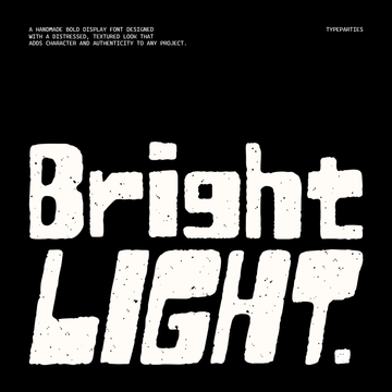
Long summer afternoons and sun-bleached storefront signage sit behind Palmwine from Typeparties. Chunky proportions, rounded corners, thick strokes with soft terminals, spacing that breathes like it was set by hand. The whole thing pulls from 1960s and 70s packaging, tropical cafés and vinyl sleeves. It ships in OTF, TTF, WOFF and WOFF2 with full multilingual support. Set it big across a hot sauce bottle and let the weight do the shouting.

There is a whole Italian trattoria stuffed into SFC Ham & Pasta by Skilline Fonts Co., a hand-drawn display face that lands nostalgic and modern in the same breath. It comes with more than 20 illustration extras: pasta dishes, wine glasses, bread, candles, shrimp. Enough to build the identity and the menu from one source. Think deli window sign, gold on glass, with a bowl of spaghetti drawn underneath.

The warm workhorses, built for menus and labels
Soft rounded letterforms give Warm Dough by Enxyclo Studio a plump, just-out-of-the-oven feel, warm and inviting the way a good bakery smell is. It was drawn for menus, café logos and packaging aimed at bread, pastries, pizza and coffee. Ships in OTF, TTF and WOFF with a full set of punctuation, currency and symbols alongside the upper and lowercase. Stamp it on a kraft bakery box and it looks like the box came from somewhere that bakes at 5am.

If your problem is repeated letters, Tropical Carnival by Wingsart Studio is the one that solves it outright. This sunny brush script carries a complete set of alternate characters for repeated letters and stop points, running on OpenType features so a line of copy flows like it was written once, not stamped. Full uppercase, lowercase, numerals, punctuation, symbols and language support round it out. It is the strongest technical answer on this list to the double-letter problem. Run it across a retro tiki drink can and no two Ns will match.

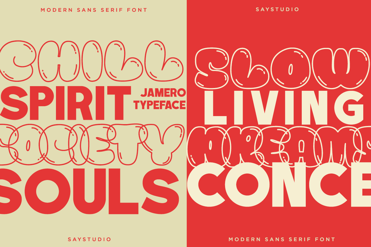
Bubbly and chunky, Drizzle Honey from The Native Saint Club has the relaxed hand of brunch-spot chalkboards and retro diner signage. The letterforms are round and cheerful without going childish. It comes in three styles: Regular, Outline, and a Dingbats set of matching food and café glyphs for dropping little illustrations between words. Handy for a café menu board where the specials need to feel handwritten and the coffee icons come built in.

The refined ones, built for restraint
RASIO STD's Ink Mokarino skips the script shape for a hand-painted sans, built on uneven strokes and a warm brush texture that keeps the handwritten character while adding sans-serif clarity. It was positioned for food packaging, lifestyle products and artisan labels from the start. Comes in TTF, OTF and WOFF with ligatures and alternates, numerals, punctuation and multilingual support. Use it as the calm body voice on a coffee bag while a louder script handles the name.

Quietest of the lot, Morally Northern by Marvadesign pairs a flowing script with a clean, rounded sans companion. The script moves with natural rhythm, soft curves and smooth connections, its slightly imperfect strokes giving it a personal, handmade warmth, while the sans keeps everything readable underneath. It is the pick when a premium or small-batch product wants a softer voice than a bold display face gives you. Think a single fold-over label on a jar of cold-pressed honey, script name up top, sans details below.

What the directory pages never tell you to check
Alternates matter more than the overall silhouette. Packaging copy repeats letters constantly, three As in "Artisan Bakery", double Ls, double Os, and a script without swapped forms for those repeats reads as computer-generated the instant you set real words. A gorgeous single character means nothing if it clones itself down the line.
Small-size legibility carries more weight than the hero shot ever will. Most of this type ends up on a jar, a pouch, a coffee bag, at a fraction of poster scale, so the loops need to survive real shrinking. A face that only sings at 400px is a face you will fight at 40mm.
Provenance is the newer filter, and it matters just as much. A wave of AI-generated "handwritten" fonts has flooded the market with letterforms that fake pen pressure and stroke connection badly, joins landing in the wrong place, pressure sitting evenly wrong across every stroke. If you want to read more on that pushback, we got into it in our piece on design going grainy and imperfect on purpose. Every font above was drawn by a named independent letterer or type designer who works in this register on purpose. That is the differentiator no browse page will point you at, and if you want to keep digging, there's plenty more handwritten and scribble type worth a look.