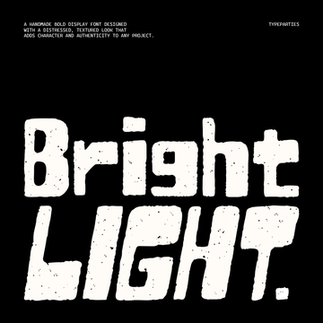
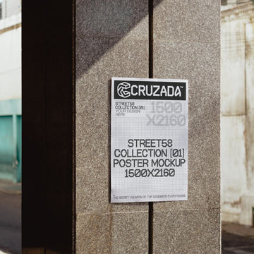
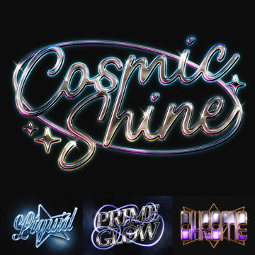

A flatbed scanner runs over a stack of paper sheets, one after another, catching every fibre and crease before it hits the glass. A drawer of rejected logo sketches gets pulled open and dusted off. Somewhere a scalpel leaves a silhouette rough on purpose instead of smoothing it out. This week leans on stuff that already existed and just needed a second look.
Paper Surface Archive by Pixelbuddha
Instead of dragging a noise filter across a flat white layer and hoping nobody looks too close, this one starts with real sheets on a scanner bed. Twelve of them, captured at high enough resolution to keep the pulp fibres, the faint creases and the little speckles that make paper look like paper. The range moves from clean smooth stock through laid paper with its fine horizontal ribbing to a rougher craft grain with proper tooth. Drop one under a poster, a book cover or an editorial spread and the whole thing stops looking like it was born in a browser. Paper Surface Archive is the kind of base layer you'll reach for on repeat, and if you liked the scanned stock in Weekly Drops #40, this sits right beside it. There's plenty more grain to dig through if you want to go deeper.

Chaos Kit by Pixelbuddha
Thirty-five vector symbols cut by hand and deliberately left ragged around the edges, so each one holds onto a bit of mess. The language sits somewhere between a spray-paint stencil and a blackwork tattoo flash sheet: solid black forms, brutalist and Y2K at the same time. You get a melting smiley, a kneeling devil, a rat caught mid-run, a skateboarder, a strongman, a baseball slugger, a coiled greyhound, a yoga figure, plus a pile of organic blobs, metaball clusters, bursts, flames, a spiked sun and an orbiting eye. A master sheet lays all thirty-five out together. Since it ships as vector, blow any of them up to a merch print or shrink them to sticker size without losing the crunch. Chaos Kit is built for logo marks, poster systems, apparel and record sleeves.

Street Icons Vol.02 by hvnter
This is the one that only makes sense on a site like ours. Every studio has a graveyard: logo concepts that were sharp but wrong for the client, marks that got voted down in the second round, sketches too good to bin but never billed. hvnter opened that drawer and turned the reject pile into something usable. Street Icons Vol.02 is 118 assets in total, over 110 unused logo concepts given a second life, delivered as AI, SVG, PNG and PDF. There's a particular honesty to marks that were drawn to solve a real brief, even a dead one, over something conjured from a blank prompt. These have miles on them already. Streetwear, logomarks, branding work; if you're after more in that lane, we've got plenty more logo work worth a look.

Green Noise Textures by GFX DATABASE
Where the paper archive is analogue in the truest sense, this is its interference-riddled cousin from the digital side. Ten abstract textures overloaded with heavy grain, built around acidic greens, scattered colour and blurred forms. The creator pitches them somewhere between analogue interference, damaged imagery and experimental photography, and the lo-fi instability is the whole point. Square format, so they drop cleanly into a record sleeve, a rave flyer or a fashion campaign that wants to look like it's fighting the screen. Green Noise Textures pairs well with anything that needs to feel unstable on purpose.

Jagged Spur by Vadova Studio
All-caps, rugged, and dusty in the best way. Jagged Spur is a Western display serif with frontier grit baked into the letterforms, echoing leather, dust and a certain lawlessness. It wants to sit on a bar logo, an outlaw-themed sign or a vintage poster where the type is doing most of the shouting. Set it big, set it heavy, let it look like it survived a saloon fight.

CS Casket by Craft Supply Co
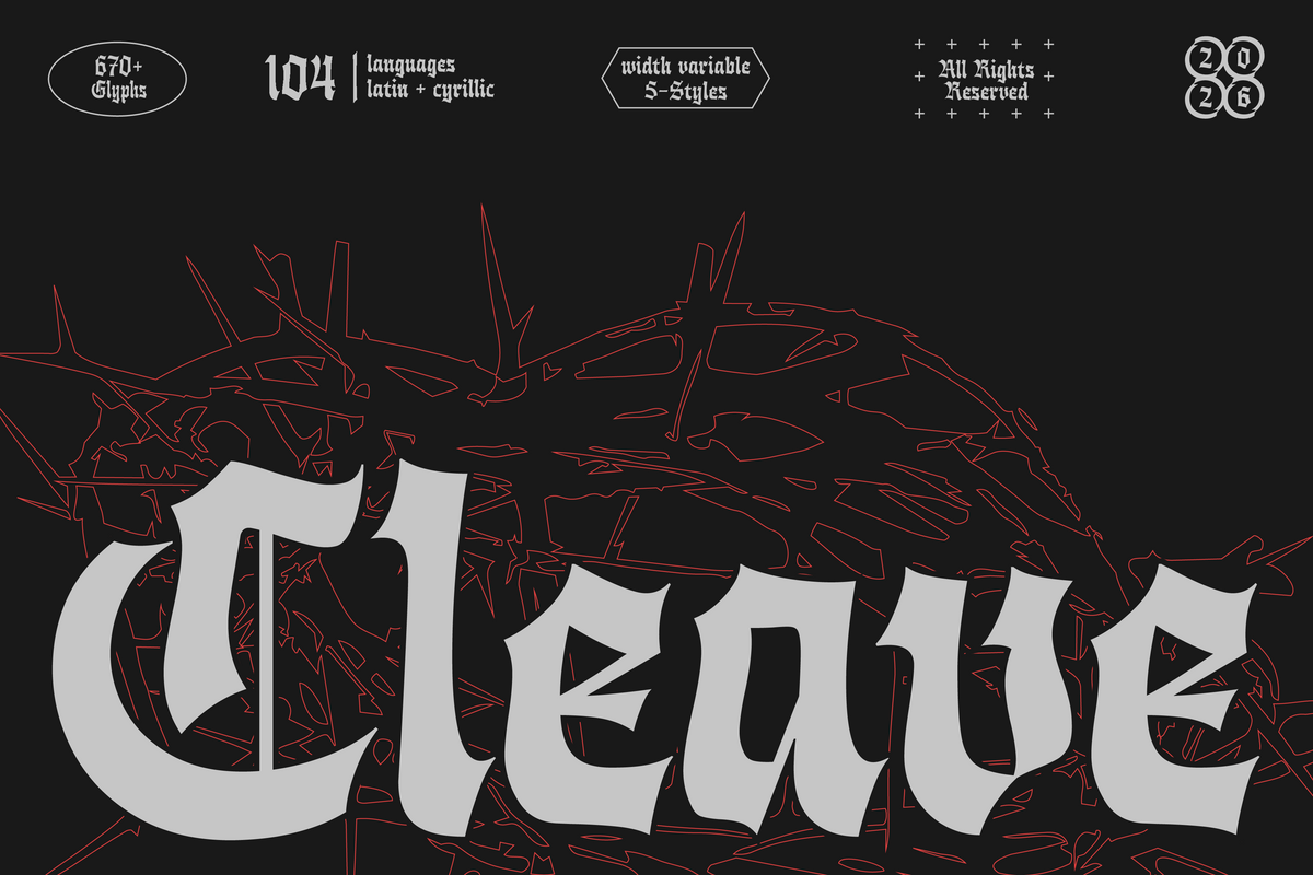
Drawing on the intensity of metal band artwork, this display serif comes with sharp letterforms, ornate lines and a fair bit of ceremony in the details. CS Casket carries an aggressive, off-kilter edge that reads ready for a tour poster. It's aimed at album art, merch and streetwear, and it earns its place there. We've got more dark, dramatic type worth a look if this is your register.

Sunnybite by Say Studio
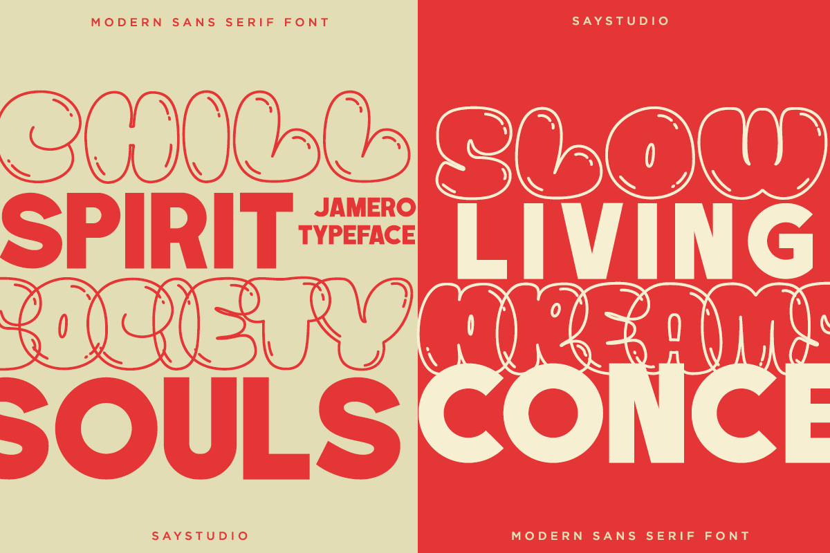
After two faces that want to burn the place down, a break in tone. Sunnybite is a warm, expressive sans with rounded, friendly letterforms and a cheerful streak running right through it. Think cafe branding, bakery packaging, a food label that wants to look like it's smiling at you. It's the sort of face that makes a small brand feel approachable without tipping into cute.

Hand-drawn Outdoor Illustrations by cd-design.co
Forty-five illustrations drawn by hand, covering wildlife, pine trees, mountains, campfires, canoes, fishing gear and the rest of the trailhead kit. The line work has that nostalgic, slightly rugged feel that outdoor apparel and camp merch lives on. Hand-drawn Outdoor Illustrations arrives as AI and EPS vectors plus separate SVG and PNG files with transparent backgrounds, so you can pull a single bear or a whole scene into an apparel print, a badge or a poster. If you're building an outdoor brand from scratch, this is a solid starting bank of imagery.

Stacked Boxes Packaging Mockup by Taboja Brand Works
A workhorse for when the client wants to see the packaging doing its job. Stacked Boxes Packaging Mockup gives you a tall column of boxes on one side and a lower arrangement with a bottle on the other, the retail-logic shot where product claims shelf space and stacks high. One high-resolution PSD with smart object layers, realistic lighting and natural shadows. Built for supplement, wellness and F&B pitch decks where the packaging needs to read like it's already on the shelf.

34 Kids Playground Branding Mockups by Vitora Mockup
The other practical one this week. This set of 34 PSDs covers playground signage, posters, tickets, merch, directional displays and packaging, the full spread you'd need to present a kids' brand identity in context. Colourful, energetic and built to show a playful mark living across real-world touchpoints. When a family brand pitch needs to look like it already exists, this does the heavy lifting.

Ten releases, most of them dragged out of a drawer, a scanner or a reject pile and given somewhere new to go. Old material, sharpened up and put back to work.