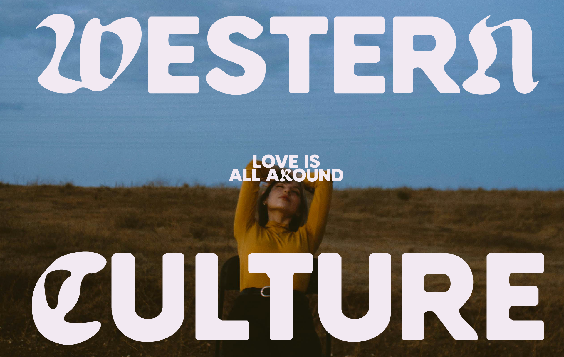
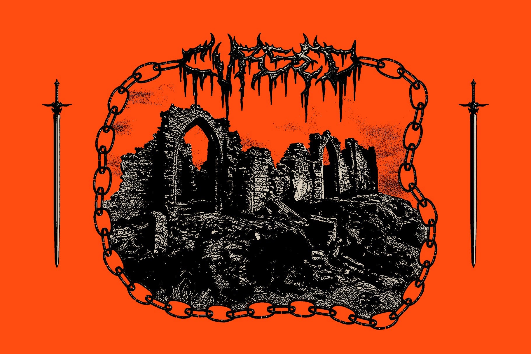
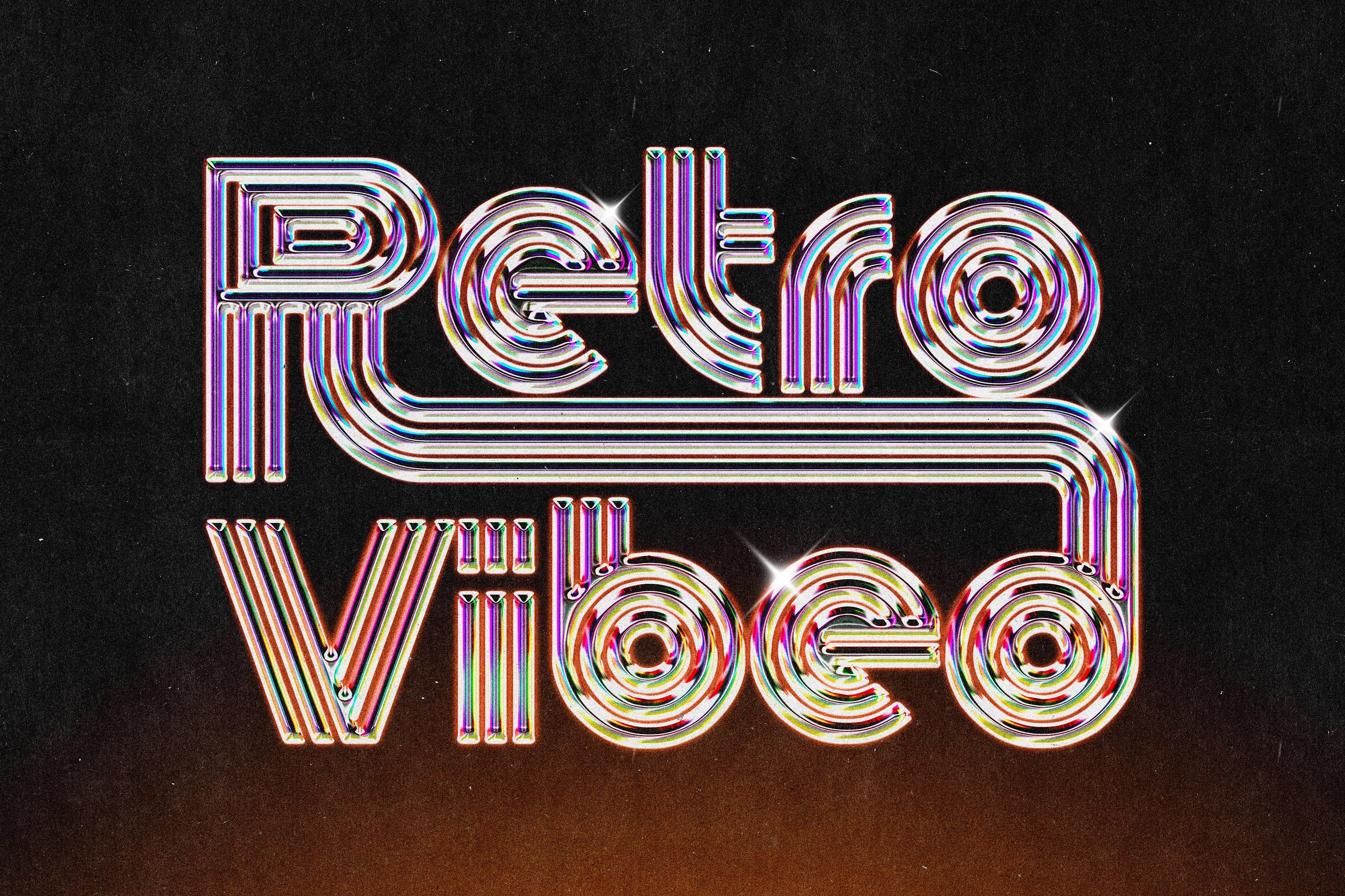
A bold font earns its place by doing more than being heavy. At headline scale, weight is just the starting point. What separates a genuinely useful bold font from a filler pick is clarity under pressure, a personality that survives scaling, and the kind of specificity that makes a brief click into place. These eight cover the range.
TRT Structa Pro – Rounded Modern Sans by True Type Lab

TRT Structa Pro is the kind of rounded sans that doesn't apologise for being clean. Built on a semi-grotesque foundation with smooth terminals and balanced proportions, it reads with authority at display size without sacrificing the clarity you need when a headline has to land in half a second. The variable font option gives you genuine flexibility across weights, which makes it useful well beyond a single campaign. Strong choice for brand work, editorial headers, and anything that needs structure with a softer edge. If you're drawn to this direction, there's plenty more display-ready type worth looking at.
SAENA Handwritten – Gritty Vintage Hand-Drawn by AROKA TRUE INDEPENDENT STUDIO

Three font styles, 45 hand-drawn vintage icons, and not a single Bezier curve that wasn't earned by hand. SAENA sits in that gritty mid-century space that's been everywhere in craft packaging and independent brand work lately, but the icon set is what pushes it past the usual hand-lettering fare. The organic weight variation across letterforms gives it real texture at poster scale, and the roughness holds up when you blow it up rather than smoothing out into nothing. Built for branding, packaging, and any brief that needs warmth with an edge rather than warmth with a smile.
HV Kanda – Brutalist Streetwear Display by hvnter

No frills, no alternates, no apologies. HV Kanda is A to Z, zero to nine, and a handful of symbols, and that stripped-back set is exactly the point. The letterforms carry a hard, confrontational energy that fits streetwear and limited-run print work without needing to shout about it. At large scale on a poster, the structure does the work. It's the kind of bold font that reads as intentional rather than loud, which is a harder thing to pull off than it sounds. Pair it with high-contrast photography or raw concrete textures and you're there.
Malcom Typeface – Bouncy Bold Playful Display by hvnter

Where Kanda is hard edges, Malcom is all bounce. The fifty-two-plus letter variations are what make it genuinely usable rather than just fun in theory. That kind of glyph depth means you can hand-set type that feels spontaneous without it looking lazy, which is the whole challenge with playful display fonts at headline scale. The energy reads like early-2000s pop graphics filtered through a contemporary eye. Strong for event posters, music merch, social content, and any brief where the font is doing a chunk of the personality work.
City Boy TM – Japanese Fashion-Inspired Bubble Bold by Type Mania

Inspired by the typography of Japanese fashion magazines, specifically the bubbly, maximalist lettering that publications like Popeye made iconic, City Boy TM brings that sensibility into a format designers can actually use across OTF, TTF, and WOFF2. The letterforms are full and round without losing legibility, which is a real tightrope walk in the bubble font space. It's a confident choice for fashion-adjacent branding, pop-up events, and social graphics where you want something that feels culturally specific rather than generically playful.
Boldine – Heavy Retro Display by Fateh.Lab
Thick strokes, solid construction, and a confidence that comes from keeping every decision clean. Boldine is the kind of display type that was built with large format in mind. It holds its weight on a billboard just as well as it does in a social tile, which isn't something you can say about most heavy display fonts. The retro lean puts it in territory that's been resonating across fashion, music, and independent brand work throughout the early part of this decade. Use it for posters, magazine headers, and anything where the type needs to carry the layout rather than support it.
Pressed Flaws – Industrial Distressed Textured Typeface by Softulka

Distressed fonts live and die by the quality of their texture, and Pressed Flaws gets this right. The imperfections read like genuine wear, somewhere between a worn letterpress print and an aged typewriter, rather than a Photoshop filter applied to a clean sans. Available in both Regular and Bold, the heavier weight at headline scale has the kind of rough-edged authority that suits album art, zine covers, and underground event posters. If you're building a visual world around grit and texture, there are more bold fonts worth digging through in that same direction.
Rinaz – Futuristic Geometric Tech Bold by Razetype

Sharp square terminals, uniform stroke widths, and geometric construction that doesn't waver. Rinaz is built for briefs where the type needs to feel like it belongs to a system. Gaming titles, esports branding, cyberpunk-adjacent editorial, tech product launches; the mechanical consistency of the letterforms makes it read as considered and precise rather than just futuristic for its own sake. At headline scale it has serious presence. The lack of optical corrections is a deliberate choice, and it pays off when the context is right.