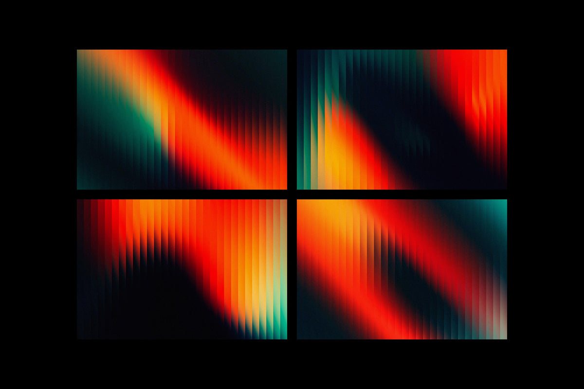
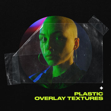

A holographic sticker only reads as confident if the surface behind it has already earned the shimmer. Same with a chrome wordmark, a bubble-lettered drop announcement, an iridescent event flyer. The prop gets all the attention, but the gradient sitting underneath is doing the load-bearing work. It sets the temperature before a single letterform lands on top.
This round of Y2K is being handled as a system, with its own working parts. The acid-gradient side of it, all toxic neons and vibrating colour and liquid-looking distortion, has a real lineage in early-internet rave visuals and late-90s club flyer culture; that overstimulated, retina-scorching contrast was built to grab a passing eye before anyone could scroll away, and it does the same job on a feed now. The glitch and scanline side gets used on purpose, a controlled language of degraded transmission built into the file by design. Both registers do the same deeper thing: they make work read as unmistakably made by a person, at a moment when generative AI is flooding every feed with the same frictionless, textureless sameness. Designers are answering that with grain, glitch and memory — a deliberate kind of aesthetic saturation.
What follows are nine working base layers for Reels covers, story templates, drop announcements, merch, gig posters, album art and packaging. Each one sits in one of three related registers: acid-gradient chaos, holographic and Y3K-chrome shimmer, or glitch and scan-line degradation. Three different tools for three different jobs. The arc runs from raw acid and glitch chaos through to modular building blocks you assemble yourself.
1. Futuristic Holographic Texture Set by angelainthefields
The anchor of the whole thing, because it holds all three registers in one place. angelainthefields built the Futuristic Holographic Texture Set as a futurist-retro read in acid-holographic colour, and it comes stacked: 20 glitched scanned JPG textures at 5000x3535px, 16 glitched objects on transparent PNG backgrounds, and a bonus of 23 vector frames and decorations in AI, SVG and PNG. The scanned textures give you the degraded surface, the transparent objects give you shimmer you can float over anything, and the vector frames mean you can lock a layout down cleanly on top of all that noise. It's a branding and social kit that already contains the chaos and the structure to contain it.

2. ACID Surreal Textures by assetpro
276 files gives you enough surface to run a full campaign without touching the same background twice. assetpro's ACID Surreal Textures is the most literally acid set here and the one built for volume: 276 grainy surreal textures across 14 unique designs, JPG, 4000x4000px at 300 DPI. The grain is heavy and the colour vibrates in that overstimulated, psychedelic way that pins an eye before the algorithm moves it along. When every poster in a run, every cover in a series, every packaging face needs to feel related without repeating, this set covers a full month of output on its own.

3. Retro Glitch by Kuro
Straight to the degraded end of the spectrum. Kuro's Retro Glitch is pure scanline and transmission-error texture, 120 JPGs at 4000x2800px across four distinct styles, each carrying that retro-broadcast decay. This is the register that reads as a signal breaking up, a channel not quite holding, and it plays beautifully behind clean type doing the opposite. If you're already deep in this territory, we've got a few glitch effect packs worth a look that pair well with these as base surfaces. Use it for album art and edgy social where you want the frame to feel unstable.

4. 90s Midnight Rave Gradients by angelainthefields
This one comes apart into layers you assemble yourself. angelainthefields loaded 90s Midnight Rave Gradients with the components of a flyer: 20 transparent gradient objects and 20 transparent gradient frames (PNG, 3000-5000px), 20 contrasting gradient backgrounds (JPG, 3750x5000px), plus a bonus of 10 distorted grid elements. The hyper-colourful gradients ride over the contrasting backgrounds, the warped grids pull in that late-90s club-poster depth, and the transparent layers let you composite as much depth as the job calls for. This is rave-visual lineage handed to you as separable parts, giving you the pieces to build your own look.

5. Holographic Backgrounds Collection by MiksKS
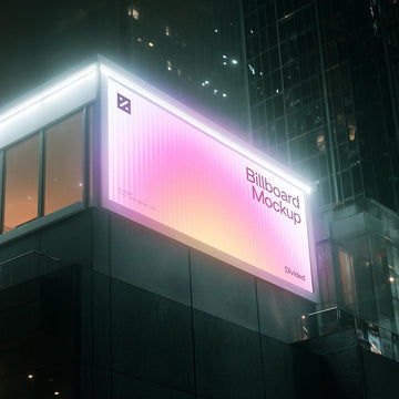
The polished, premium end of the shimmer. MiksKS put together 54 high-resolution iridescent backgrounds in the Holographic Backgrounds Collection, spread across three colour schemes, turquoise, purple and mauve, and two texture types, cloth and crystal (JPG, 6000x4000px at 300 DPI). This is the Y3K-chrome register done with restraint: liquid-metal and iridescent-surface vocabulary that reads to youth-facing and DTC brands as confident and slightly chaotic without tipping into noise. The cloth textures soften the shimmer for stationery and book covers; the crystal reads harder and more reflective for packaging and prints. The cleanest surface in the piece to hand a serious brand system.

6. 20 Vibrant Glass Backgrounds by Vanzyst
Bold and graphic where the others go textural. Vanzyst's 20 Vibrant Glass Backgrounds lean into a liquid-glass rainbow-stripe read, 20 backgrounds at 5000x5000px with iridescent textures that look like 3D liquid glass. The striped rainbow structure gives you movement and direction built into the surface, so type and marks sit on something already dynamic. These carry a poster or a Reels cover on their own, no additional layering required. Loud, reflective, and unmistakably materials-forward in that next-evolution way, where the shimmer is doing more advanced work than early Y2K chrome ever did.

7. The Gradient Backgrounds Pack by Pixelbuddha
The direct bridge between clean and degraded. Pixelbuddha built The Gradient Backgrounds Pack as 8 unique gradients delivered in two versions each, a plain one and a TV-texture-overlaid one, 16 JPGs total at 4500x3000px, 300 DPI. Having both cuts in the same file is the smart part: you drop the smooth version behind polished brand type, or reach for the scanline-overlaid twin when the same job needs some grit and transmission-feel. It's the single pack that lets you dial the friction up or down without swapping your whole base. There's more on why this surface is having its moment in our piece on grain, glass and gradient.

8. Surreal Gradient Waves by assetpro
Two registers in one set, so you're never locked into loud. assetpro's Surreal Gradient Waves runs 100 files (PNG, 4000x4000px): 25 smooth colour square backgrounds, 25 grained black-and-white squares, 25 smooth colour circle shapes and 25 grained black-and-white circles. The colour versions carry the full vibrating-gradient hit; the grained monochrome versions give you a restrained execution for jobs where the type has to lead. Having the same wave forms as flat colour and as gritty greyscale means you can run a consistent shape language across a system while shifting the intensity job by job.

9. Morpha Vol.2 by Kuro
Closing on the build-your-own pick. Kuro's Morpha Vol.2 hands you 200 transparent PNG gradient shapes (minimum 3000x3000px) plus a Photoshop PSD with a template carrying three different grain layers and a smart object for swapping the shape. Drag the PNGs straight in, or work in the PSD and change the form through the smart object while dialling grain up and down through the layers. This is the modular end of the spectrum, gradient treated as a building block you assemble into a system that flexes across covers, drops and merch. If you want more gradient work to dig through, there's plenty here.

The gradient is the argument
Treat the surface as an afterthought and you get a Y2K reference: chrome type parked on a flat field, a holographic sticker doing all the lifting on its own. Treat the gradient as the argument, the acid chaos, the iridescent shimmer or the glitch degradation carrying the mood before anything else arrives, and you get a Y2K system, one that holds together across a whole campaign because the base layer was making the case the entire time. Pick the register that matches the job, build up from there, and the props stop being decoration and start being confirmation.